Simple Mode for Beginners
Introduction
Simple mode is Clip Studio Paint’s new simplified user interface for mobiles and tablets that helps maximize the canvas space on these smaller screens while also keeping the essential tools within easy reach.
In this guide, we will learn to navigate this interface and how to use it to streamline your work.
1. Opening Clip Studio Paint
To install the Clip Studio Paint app, you can go to the following link and download the version that suits your operating system.
If you use Android or iPhone, you get one hour of free use every day even if you have not started your free trial or got a subscription.
2. Opening a New Canvas
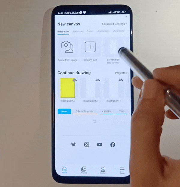
There are multiple presets you can use when opening a new canvas.
You can also click the plus button to create a custom-sized canvas and further go into the advanced settings to adjust the image resolution and other options.
3. Upper Rows of the Interface
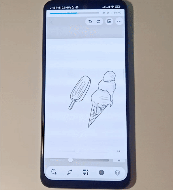
When the canvas opens, the initial upper interface will be as follows:
3.1. Time limit for free use
The top row shows the one-hour countdown for free use that renews every day. You can remove this row by buying the subscription license or starting your free trial.
3.2. Save and back
The first button in the next row is the back button which also works as a Save button. If you click back, your current progress will be swiftly saved before the canvas is closed.
3.3. Undo and redo
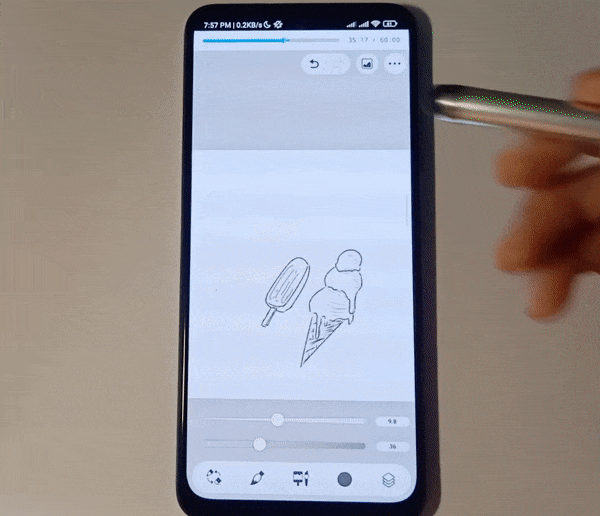
The first buttons on the right of this row are Undo and Redo. By default, you can also do a two-finger tap for undo and a three-finger tap for redo.
3.4. Materials for time-saving
To the right of the undo and redo button is the [Materials] icon. By tapping the icon you can access a wide array of ready-to-use materials including patterns, images, custom brushes, manga materials, 3D models and backgrounds, and more.
You can quickly search through the materials using the search bar. Furthermore, you can also access your favorites or previously used materials from the [Favorites] and [History] tab.
Tip: You can download even more materials from the Clip Studio Assets Library which has thousands of more materials made by Clip Studio Paint users for other community members.
3.5. First four menu options
The last button in this upper row is the Menu button.
Its first four sub-options are as follows:
i. Export image:
When you are done with your drawing and want to export it as a .jpg, .png, or .psd, you can use this option to do so.
ii. Export timelapse:
You can export your timelapse as a .mp4 file using this option. By default, timelapse recording is on for all canvases unless you change the setting under [Canvas setting] to [Stop recording timelapse].
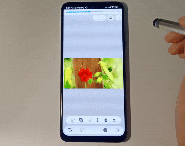
iii. Flip horizontal view
This option flips your canvas horizontally. It is very useful for getting a fresh perspective on your drawing and detecting errors in proportions.
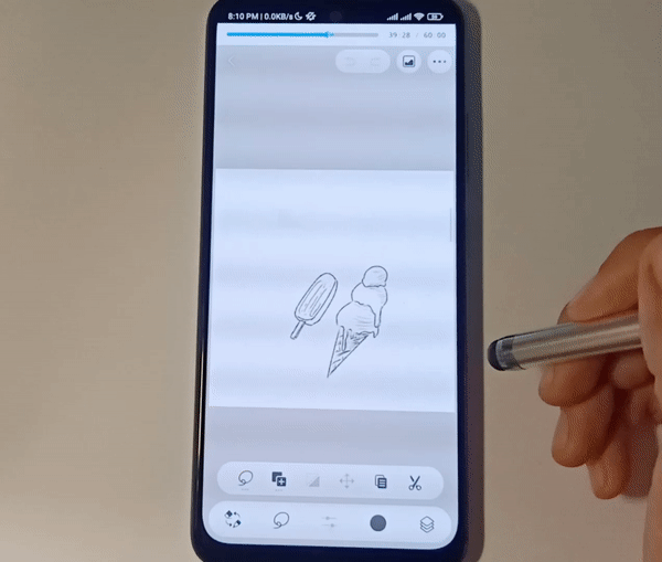
iv. Canvas setting
Whether your current canvas is too big or too small, you can resize it within the [Canvas setting]. You can also change the image resolution, and flip or rotate the canvas, or stop the timelapse with these settings.
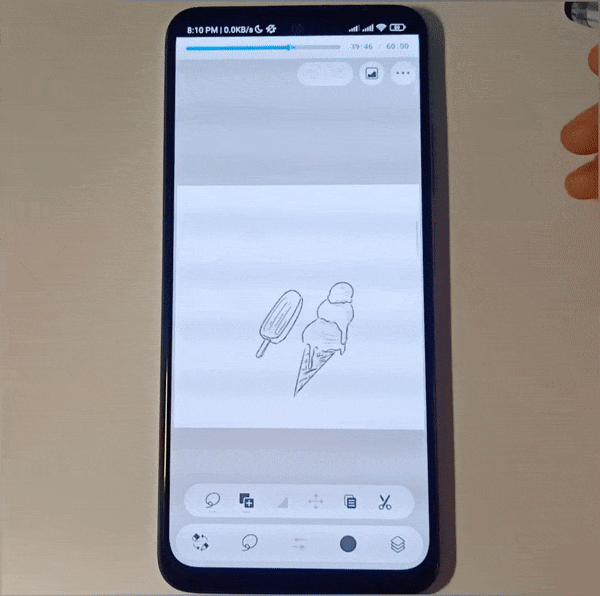
3.5. Preferences and touch gestures
The fifth Menu option is [Preferences]. You can use its settings to make some essential customizations such as follows:
i. Dark mode
You can choose between Dark mode and Light mode with the first toggle option.
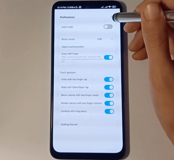
ii. Brush cursor visibility
You can choose to hide or show the brush cursor. You could turn it on for a stylus with the hover feature, to know the cursor position in the hover state.
iii. Touch position calibration
You can customize your touch position in case you want the the calibrate the stylus tip to the cursor on the screen, or if you want to adjust where the cursor appears when drawing with your finger.
iv. Touch gestures
You can toggle the touch gestures on and off separately, depending on the ones you want to use. They are all active by default and include gestures for undo, redo, moving canvas, rotating canvas, and color-picking.
v. An overview for beginners
If are new to digital painting, the last option in [Preferences], which is the [Getting Started] option, will be very useful for getting a quick overview of the app layout and icon meanings so you can better understand how to use the app and its tools.
3.6. Switching between Simple Mode and Studio Mode
Simple mode is ideal for simple painting processes like sketching and painting but when you need more advanced options you can seamlessly switch back to Studio mode. [Switch to Studio Mode] is the last of the Menu options.
So, whether it be for hue and saturation adjustments, working on vector layers, or for the manipulation of 3D models, you can conveniently switch the modes back and forth.
To switch back to Simple Mode click the top-left icon of three horizontal bars and then choose the second option [Switch to Simple Mode].
4. Lower Rows of the Interface
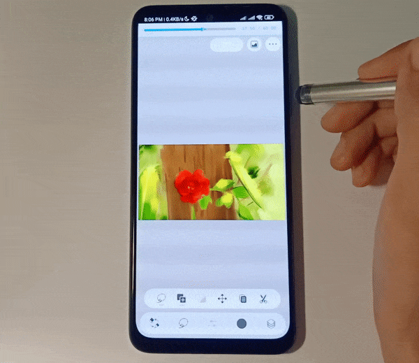
The bottom-most row has five options, most of which expand upwards upon clicking. Their functions are as follows:
4.1. Brush and eraser switching
The first icon switches between your brush tool and the eraser. It is very useful for quickly erasing any mistakes and returning to the drawing.
4.2. Tool options
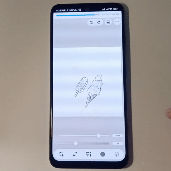
The second icon shows the current tool in use and upon clicking it displays the other essential tools to choose from.
4.3. Tool properties
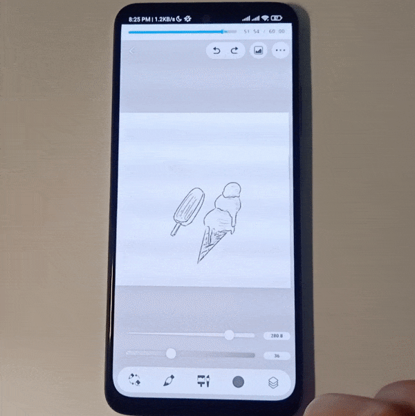
Depending on the tool in use, its essential sub-options are already on display above the bottom row. For example, if a brush is active, you will get size and opacity sliders, or if you have the Fill tool active, then you get the Fill sub-tool options, close gap toggle, and further settings.
Clicking the third icon in the bottom row can expand these options to give further customization settings.
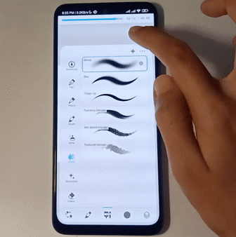
In the case of the brush tool, it expands to show a library of other brush tools, like the pencil tool and its sub-tools, and the marker tool and its sub-tools, etc.
By clicking on a selected sub-tool, you can get further customization options for that sub-tool.
Adding new tools: If you do not see the brush you want to use in the list, you can easily import it from Studio Mode or the Assets Library using the plus icon on the top-right of the panel.
4.4. Color panels
The fourth option opens up the color panels. By default, it shows two panels at the same time, namely the color wheel, and the color palette. You can switch between the color palette and color slider in the lower panel.
If you want to reduce the space covered by the panels, you can drag the top down and you will have one panel showing at a time and you can switch between the color tabs as you like.
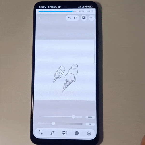
4.5. Layers panel
The last option in the bottom row shows and hides the layers. It makes it easy to access the layers when you need them, and hide them to free up space when drawing.
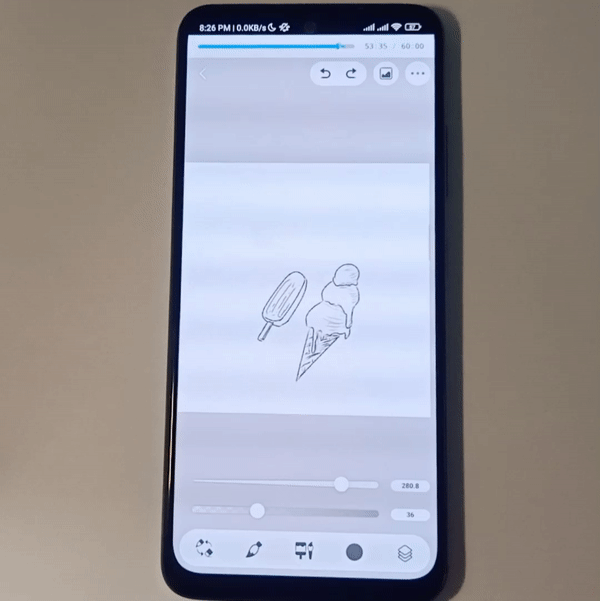
5. Working with Layers
There is a multitude of layer options available in the Simple mode. Let’s see how to navigate through them:
5.1. Accessing and expanding the layers panel
As we already know from the previous sub-heading, we can access the layer panel with the bottom-right icon. The panel shows up on the upper right of the screen. We click a layer to switch to it.
To expand the panel, swipe to the right. This will show the layer names as well as the new folder option. You can create a new folder with this icon and drag and drop layers into it.
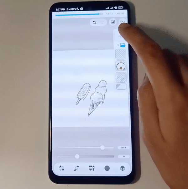
By clicking the plus icon a new layer is added above the selected layer.
However, if we long-press the plus icon, we can add the following:
i. New raster layer
ii. New layer folder
iii. Image from device
iv. Photo from camera
v. Add merged layer
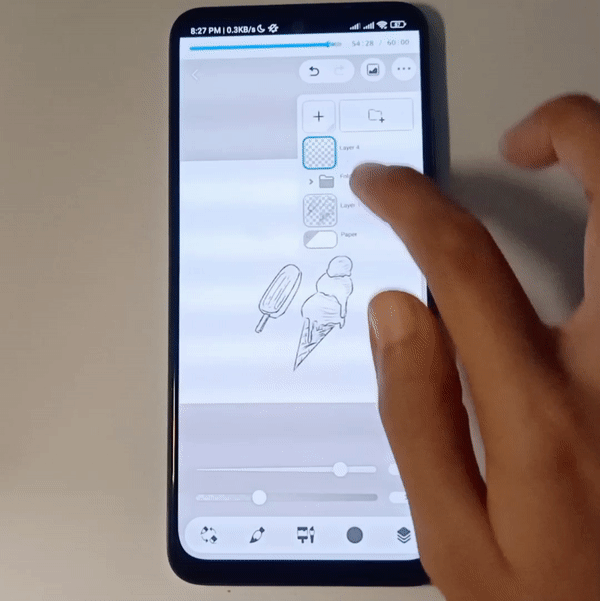
5.2. Layer options
Clicking on a selected layer gives us that layer’s options. From top to bottom, these include:
i. Hide layer
ii. Delete layer
iii. Blending mode
iv. Clip to layer below
v. Lock transparent pixels
vi. Further options
vii. On the left is the opacity slider.
By expanding the further options icon(three horizontal dots), we get a scrollable list that has the previous six options in expanded form as well as the following six options:
i. Edit layer name
ii. Blending modes
iii. Lock layer
iv. Border
v. Rasterize
vi. Merge with layer below
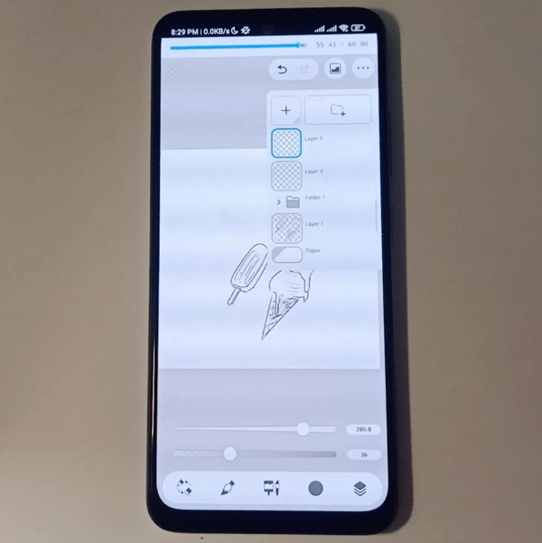
6. Layer Usage Tips for Beginners
Following are four tips for beginners who are new to using layers:
6.1. Stay within base colors by shading with [Clip to layer below]
When you start adding lights or shadows in a new layer, clip that layer to the base color layer or folder. Now the shading you add in the clipped layer will only show up if the base layer has a color in that area below it.
This means you don’t have to worry about out of the boundaries because the transparent part of the base color layer or folder will be transparent in the clipped layer too unless you unclip it.
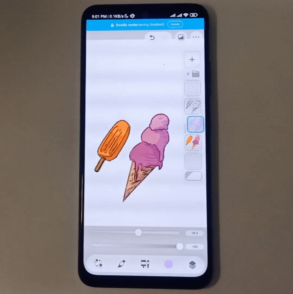
Note: You can clip multiple layers to the same layer/folder. They will be stacked on top of each other.
6.2. Do line art over the sketch using [Layer opacity]
Done with the sketch and ready for lineart? Just lower the opacity of the sketch layer and do your line art in a new layer on top so it is easier to differentiate between the two.
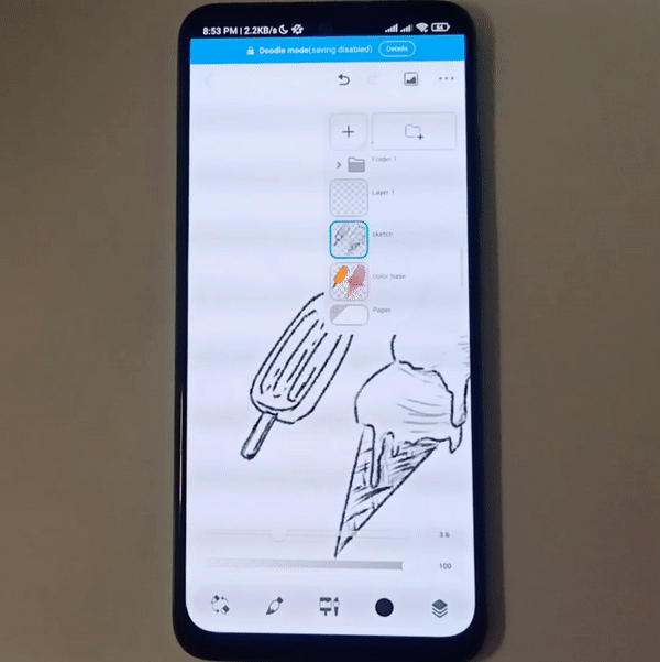
Once you’re done, hide the sketch layer with the [Hide layer] option.
6.3. Merge layers to avoid layer clutter
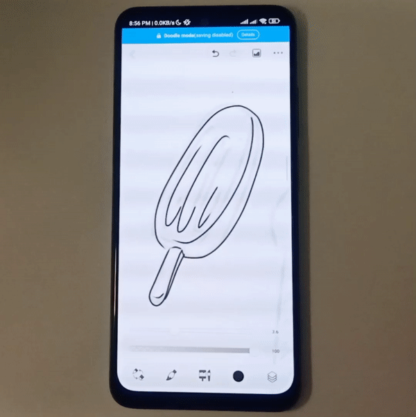
Having too many layers can lead to confusion and also make the file heavier. Avoid this by merging similar layers, like line art layers, sketch layers, shading layers, lighting layers, etc.
Naming the layers according to their content also makes navigation easier.
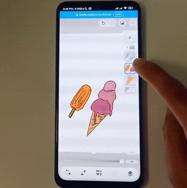
6.4. Use blending modes for shading and textures
Shading is a lot easier with blending modes. You can apply blending modes to a layer through its icon in the layer options by clicking the selected layer and then clicking the third icon from the top.
You can also access them from the last [more options] icon.
For shadows, choose a darkening layer mode like [Multiply] and use a light pastel color for painting shadows. The result will be a darker base color shifting towards the hue of the color you are using in the blending mode layer.
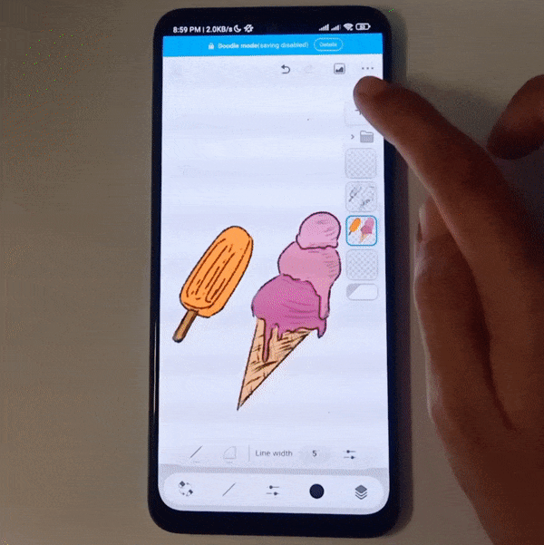
For the lighting layer, just switch to a lightening layer mode like [Soft Light] or [Hard light].
This saves you the effort of adjusting shading colors according to the base colors again and again.
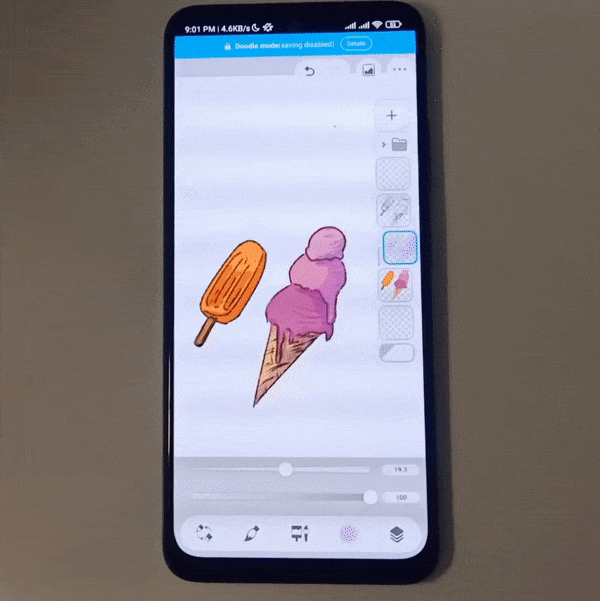
Paper textures:
To add any textured feeling to your drawing, paste a texture (like a thick paper texture) from the [Materials] panel into the top layer.
Then switch the layer’s blending mode to [Overlay]. This will give your drawing a textured surface feeling.
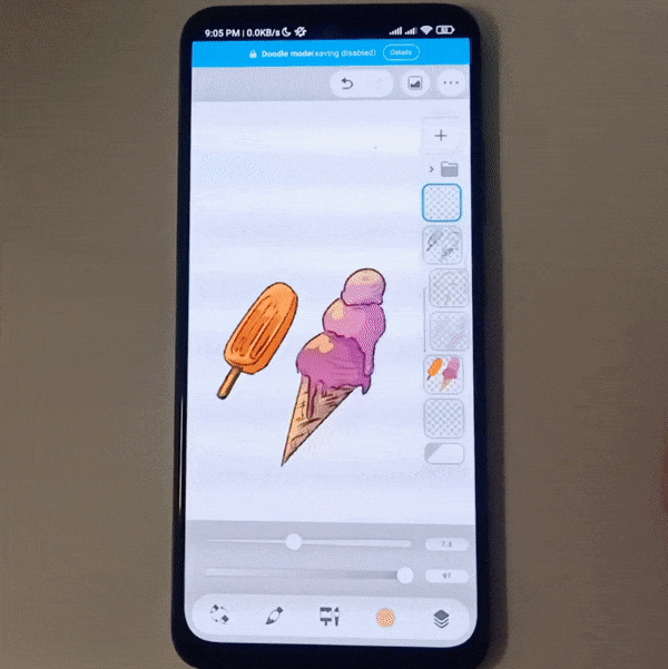
7. Three Tool Exploration Tips for Beginners
When using Simple Mode, here are three refreshing tool tips beginners can experiment with:
7.1. Try transparent brushes instead of eraser
If you are using a textured pen for drawing, erasing with a simple erase will spoil that textured feeling. What you can do instead is switch to the transparent color for your brush and erase with that.
This way you don’t need to look for a perfectly matching textured eraser for every brush, because each brush already has it within itself!
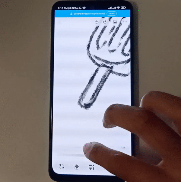
7.2. Try liquify for editing
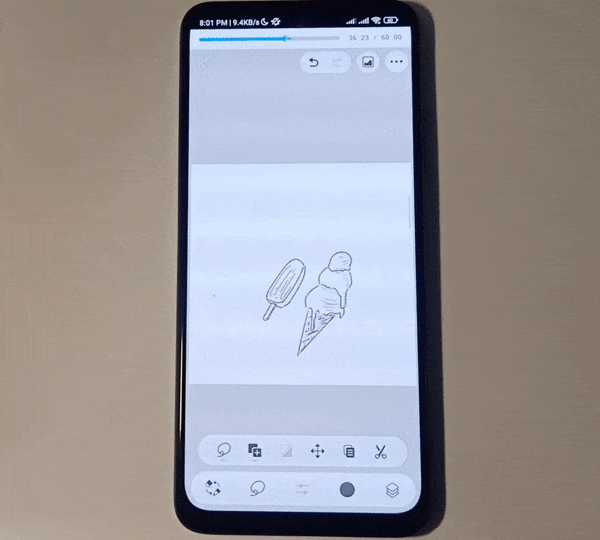
Liquify is great for modifying a painting without having to redraw it from scratch. You can use it for both your line art and colors. Here I’m using it to make my ice cream look melted:
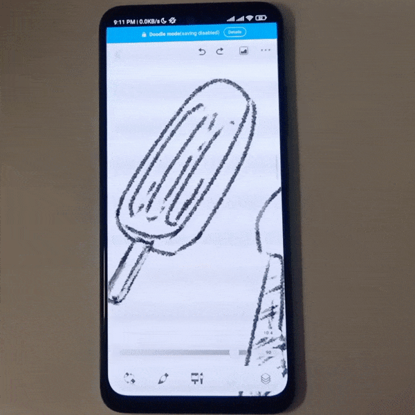
Try out its different sub-tools and see what you can do with them!
7.3. Try [Enclose and fill] instead of [Fill with tap]
The Fill tool has two two sub tools available in Simple mode, namely [Fill with tap] and [Enclose and fill].
By default, the Fill tool is set to [Fill with tap] with which you tap an area to fill it. But, if you are filling several joint but small areas, it can take time to fill them with [Fill with tap].
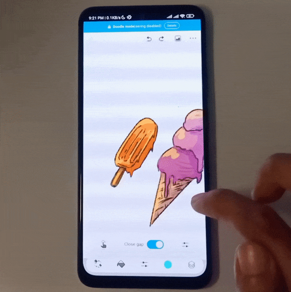
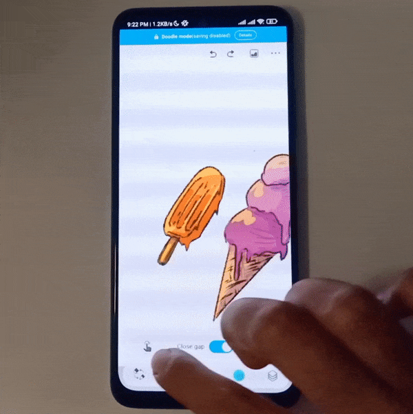
For such occasions, [Enclose and fill] can prove more useful. Just lasso around the area you want to fill and the enclosed spaces within that area will get filled while the open areas stay the same.
It feels great that you don’t have to be super precise for an area you want to fill!
Final Thoughts
Thank you for reading. I hope you found this article useful and that it helps you make the most out of the Simple Mode, especially as a beginner!


留言