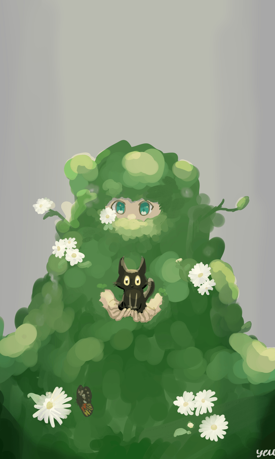
Frame your Characters or Else
Hello there, this is Tamil. Today I wanted to go over Composition Tips for Characters!
The best part is that you do not even need to be great at characters! Simple rules will help you with presentation and framing. It will elevate your character to the next level.
Basic Composition
When creating a character, you often start with a basic composition (see above ) used by many artists. However, don't settle for the ordinary.
Add your unique style and personality by customizing details like expressions, poses, costumes, and backgrounds.
Think about the story and emotions you want to convey. Transform this basic composition into something extraordinary, showcasing your individual artistic voice.
To enhance it, consider adding a floor beneath the character, creating a sense of grounding.
Furthermore, leave some extra space above the character's head. This not only provides balance but also allows for a smoother flow in the composition. It gives your character room to breathe and adds to the overall aesthetic appeal.
So, remember, don't limit yourself to a straightforward composition. Incorporate these tips to elevate your character illustrations, adding depth, balance, and a captivating flow to your artwork.
When creating character illustrations, avoid framing the head halfway. It disrupts balance, hinders expression, and limits the flow of your composition. Providing ample space for the full head ensures a more engaging and visually pleasing result.
Framing is a crucial aspect of character illustrations, and it's not always necessary to show the full body. Focusing on the character's torso and head creates an intimate and relatable connection with your audience.
Much like real-life conversations with friends, we often concentrate on their head and possibly their torso. This approach emphasizes the character's facial expressions, allowing viewers to connect on a deeper level, enhancing storytelling and viewer engagement.
The versatility of this framing style also opens up opportunities for creative experimentation, adding depth and meaning to your artwork. So, remember, in character illustrations, sometimes less can truly be more.
When framing for a portrait, you don't have to limit yourself to a tight composition. By widening the shot, you can encompass the background, environment, and additional details, making your artwork more versatile and engaging. This approach allows you to tell a richer story by incorporating context and atmosphere.
Moreover, it breaks away from the traditional tall composition, offering a fresh perspective and opportunities to explore the character's surroundings, enhancing the narrative of your artwork. So, remember, expanding the portrait frame is a creative choice that can add depth and visual interest to your illustrations while providing a broader canvas to convey the story you want to tell.
Character shape compositions
When drawing a character, the choice of pose and composition can significantly impact the mood and message of your artwork. A square stance, with a stable and strong feel, conveys confidence and reliability.
Opting for a triangular pose adds an edgy, dangerous, and powerful vibe to your character, evoking a sense of tension and dynamism.
In contrast, a circular pose can make your character appear cozy, friendly, and approachable. It suggests warmth and amiability.
So, remember, the way you position your character can speak volumes about their personality and the story you're telling. Be intentional in your choice of pose and composition to effectively convey the desired emotions and qualities in your art.
Camera Angles
When composing your character illustrations, consider the camera angle as it plays a pivotal role in how your audience perceives your characters. A low-angle shot from below can make the character appear strong and imposing, creating a sense of dominance and power that's not to be trifled with.
Conversely, an angle from above can make the character seem insignificant and isolated, evoking feelings of loneliness and helplessness. A straight-on shot with no dramatic angles offers a neutral and safe perspective, suitable for portraying characters without strong emotional or power dynamics.
The choice of camera angle is a potent storytelling tool. Be deliberate in your selection to convey the intended emotions and messages within your artwork, adding depth and meaning to your character illustrations.
Rule of thirds
The rule of thirds is a foundational composition principle that offers a straightforward starting point for artists and photographers. To apply this rule effectively, divide your composition into nine equal squares, often achievable using the grid function on modern cameras. The key to the rule of thirds is to position your main subject at the points where these lines intersect.
These intersections are prime focal points and where you want to place the most critical elements of your composition. This technique adds balance and interest to your artwork while guiding the viewer's eye to the most important areas of the image. So, while it's a widely used technique, it remains a valuable tool for creating well-balanced and visually engaging artwork.
The end
Thank you for reading! I really appreciate you spending time with me. Hopefully you learned something. I enjoy making videos more than writing, so if you want to get more from the tutorial, please check out youtube!
Let me know in the comments if you feel like I missed something or enjoyed a specific part of the tutorial ^-^
My socials in case you want to connect :3


留言