8. Painting the Background

-
 MVP ◆This user has contributed greatly to the management of the community, by posting many great responses to the questions asked. Once every three months, MVPs are determined based on the points earned during that period and will be recognized accordingly.
 -
 New Valuable Player (NVP) ◆These are the next-best contributors to the community after MVPs. This is awarded to users who have not yet won an MVP award, based on the number of points they have earned.
 -
 Official Expert ◆Chosen out of all MVP awardees, who are already proof of excellence, this is a testimony of outstanding correspondence in the community. After careful screening, they are appointed by CELSYS and assume their position.Note: Formally called “Evangelists”
 -
 CELSYS official moderators ◆Moderators are official CELSYS staff members who are fluent in Japanese as well as various other languages. As moderators are not experts on software or creative work, they will not be able to directly answer your questions. However, moderators will provide communication and language support to ensure that everyone can smoothly communicate with each other.
 -
 CELSYS officialThis is the official administrator account.
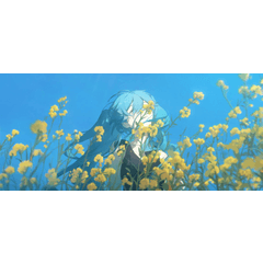
I’ll show you how I paint the background. To start, the background is divided into the following four groups.
Tree and ground(tree) / Sacred rope(sacred rope) / Tops of the steps(stone steps) / Background space(background)
For backgrounds, I’ll use the two methods of painting with masked fill layers and painting directly on the layer, like for the character.
I use the former method for man-made buildings and other elements I want to paint precisely, and use the latter method for nature and other elements where I want a rougher feeling with more variety of color.
In this case, I will paint directly on the layers.
[1] Roughly adding color
For a thick painting effect, I set the brush density around 70% to 90% so that the lower colors are slightly visible. I use the [Eyedropper] tool to pick up colors and mix the colors further.
My tools include the [Pencil] > [Darker pencil] sub tool, [Brush] > [Oil paint flat brush] sub tool, and [Decoration] > [Vegetation] > [Husky maple leaf] and [Foliage] sub tools.
[2] Painting and blurring the background
I paint the overall background.
To create a sense of perspective, I blur the distant background with the [Filter] menu > [Blur] > [Gaussian blur].
I use a strong blur area of 40 for the upper part, and choose a blur area of 22 for the mid section for a slight blur effect.
I thought the color was a bit dark, so I add some “distance” layers set to [Screen] and add a more blurred effect with the Airbrush tool. Then, I create a [Tonal Correction layer] > [Tone Curve] and slightly increase the brightness.
[3] Painting the steps and tree
I paint details on the steps and tree and add some effects.
Background painting layers
① Details, ② Blur, ③ Diffusing light 1
④ Diffusing light 2, ⑤ Tonal correction layer: Color balance, ⑥ Perspective
Note: I not longer need the background line art, so the layers are hidden.
① Details
I wanted to make the steps look crumbling and rough, so I paint the surface to look uneven.
② Blur
The top part of the tree looked too sharp compared to the rest of the background, so I blur it slightly.
③ Diffusing light 1
I use an [Add (Glow)] layer to brighten the areas hit by light.
④ Diffusing light 2
I add more [Add (Glow)] effects on a smaller area.
I slightly exaggerate the effect of the light diffusing.
⑤ Tonal correction layer: Color balance:
Using the [Layer] menu > [New Correction Layer] > [Color balance] layer, I adjust the color of the background to make it slightly more blue.
Even though it is a blue-toned background, it’s good to have some red tones as well. The blue tone simply helps to make the overall color more cohesive.
⑥ Perspective:
I felt that the dark colors at the top of the tree were too dark against the color of the forest in the back, so I use a [Screen] layer to blend it with the background color.
[4] Painting details on the foreground branches
After roughly placing the colors, I paint with the [Darker pencil] sub tool at a density of around 70% to 90%.
[5] Finishing the background
I paint the background so that it comes together as an environment painting even without the character.
Even when there is a character in the foreground, it’s a good idea to paint all of the background, even parts that won’t be seen, so that you can easily make changes to the position of the character later.
It’s also just good practice for painting backgrounds!
Next is the last part of my illustration making-of series. I’ll explain the final finishing touches I make to the overall illustration.
Users who liked this post


Comment