
In this comprehensive how to draw Fantasy Backgrounds, I will explain the essential principles to design your environment artwork using only Clip Studio Paint. I will NOT go for perspective rulers as it’s too technical and might be covered already with Clip Studio Paint official tutorials or by other users.
✦ This tutorial demonstrates what it takes to be a well-rounded environment artist, as I go from an initial sketch, to the step-by-step finalizing of a full shot without too much depending on technical skills, complicated brushes, tons of colors to choose; instead you will learn how to use the right elements to create a high-end illustration.
I will explain my workflow for conceptualization; understanding the work area, compositing, painting, lighting, and final rendering. For those looking to explore a professional pipeline for quick and effective environment construction with Clip Studio Paint, this tutorial offers a myriad of tips and techniques.
【1】 Conceptualization
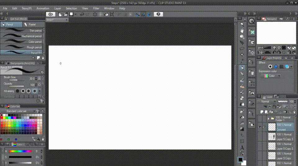
📌 Before we're going to make an illustration, usually we have to sketch it out from our imagination to paper, using Clip Studio Paint will be different as you're having an ability to access unlimited〚 Layers 〛to create compositions before drawing.
A good composition has a variety of sizes, and spaces, and make use of positive as well as negative space. Here's a few guidelines to keep in mind when designing your space.
[ ✘ ] Do NOT divide the area equally, either horizontally or vertically ▼
[ ✓ ] DO keep on the FOCUS of interest (Focal Point) centralized ▼
[ ✓ ] DO stay out of corners ▼
[ ✓ ] DO use a variety of shapes and sizes.
Be creative!
Bear in mind, that in layout as well as in concept stage, you're NOT drawing actual trees, houses, and characters, but are simply creating shapes (to the best of your ability) that recognizably represent these three-dimensional objects on a two-dimensional surface.
[ ✘ ] Having three trees all the same size and the same distance apart makes this composition static and boring ▼
[ ✓ ] Rearranging them using a variety of negative spaces creates a more interesting composition ▼
[ ✓ ] Varying the sizes of the trees results in an even more artistic composition and also gives the illusion of depth ▼
[ ✓ ] Applying three different values (light, medium, and dark) not only creates more depth, but suggests lighting and direction as well ▼
【1.1 - Exercise -】 Training Ground
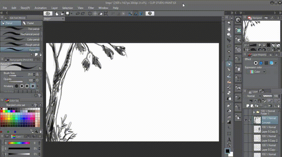
Now it's time to learn and create your own background composition! Animated GIF below is the example of 3x speed concept sketch to create composition with methodology above.
【1.1.1】 Create "framing" to my first tree composition. Add shadow directly after sketching to create illusion of front image. See image below for the result ▼
【1.1.2】 Adding the "middle ground" to put the balance of image (try not to make it too centered on your canvas, but slightly off below center line to avoid general or boring composition) as GIF below. ▼
【1.1.3】 Details such as stone in the middle of the image creates an interesting eye direction as well as the road. Adding another tree will also create balance as well as an illusion of depth to the image. ▼
【1.1.4】 Another tree is being drawn on the right composition on GIF below. ▼

【1.1.5】 That certain tree (right one) purpose to guide viewer eyes lead into the middle/center of image by using its small branch. The illusion of a contours (red lines) are a result of eyes leading guide; supporting by other elements such as road and leaves hanging on small branches from both left & right trees ▼
【1.1.6】 Now as you can see with GIF below, I'm adding further tress to finalize the composition as well as two additional trees on the right to fill the blank spaces. ▼
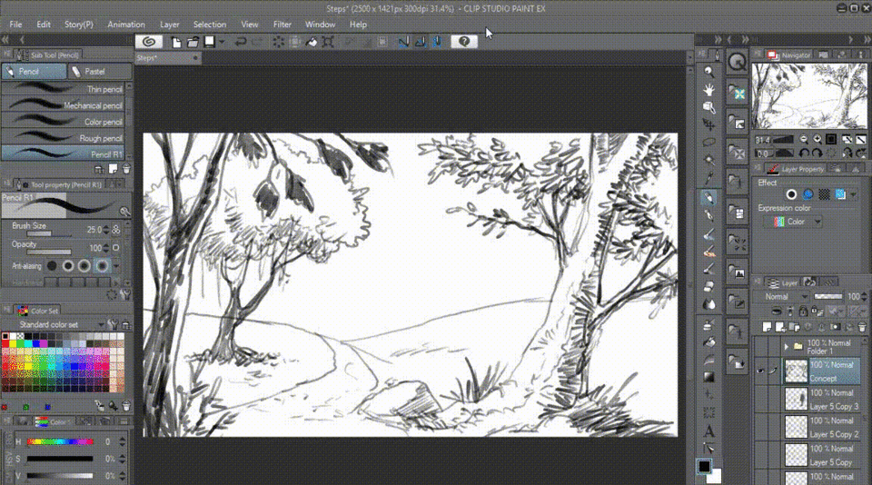
【1.1.7】 Finally our composition is done right. But always remember, in art; there's no such thing for right or wrong illustrations nor style. One of the greatest difficulties in creating concept art is knowing when to stop. Even when sketching or rendering final image.
Eventually, experience will tell you when you've worked enough. Say the most with the least.
Your job in creating fantasy background is to communicate to the viewers; concept arts aren't meant to be just illogical piece of artworks with only floating landscapes, castle in the skies, dragons roaming through mountains or even giant robots purge the humanity. But it's believable, realistic approach for the scenes, in the end.
Believable in composition is an important and crucial skill to create conceived design and story for most fantasy themed artworks. If you're not able to properly handle the compositions, your artworks will come out half-baked or even flat.
【2】 Visual Elements Design
In this part, let's talk about visual elements design and how do we start our visual approach using simple and basic shapes from our daily-life surroundings before going to the fantasy realm and beyond.
Your〚 Imagination 〛 + your〚 Conceptualization 〛=〚 Visualization of Shapes 〛
✤ Clip Studio Paint with its standard brushes already great to help us render our visual elements design. Below are some GIFs to show you how I create simple shapes to define bushes without even create custom brushes. I only use Pencil brush to do most of my creation, if you're more to the Pen person; so be it.

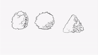
【2.1.1】 BASIC SHAPES
➊ Create simple shapes: ⬛ + ⬤ + ▲
➋ Only need 2 layers; first the layer for shapes (lower its opacity to 30%); second layer for the sketches. Try to follow its lines to create bushes.
➌ Develop the 'shadows' with Pencil/Pen brush only. You don't need complicated brushes to do this. Stay simple and concentrate on the shapes.
【2.1.2】 BASIC SHADING
➊ Create simple color pallets as shown.
➋ Always try to simplify your color rendering in sketch layer. I suggest to keep on 2 layers.
➌ Develop your artistic skills only with limited color pallets as well as brushes. Why?

【2.1.3】 LIMITED COLOR PALLETS
Light and color were precious to the old masters (artists from Renaissance time). Those amazing artists didn't have hundreds of available pigments, as we do today (especially digital artists).
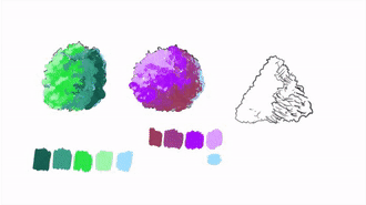
Simplify or limiting your color choices will make your artistic senses stay sharp and focus for the shape making, not adding too much colors in one particular bush.
As for me, I keep on 5 different pigments for 1 bush. You can try to make it 4 or even better 3. But on some cases; people tend to love colorful artworks. So it's back on you.
【3】 Rhythm In Composition
A well composed illustration will intrigue and invite the viewer and help communicate your artistic statements, shapes, and even stories. As you will scroll through, I put simple guide to understand how Rhythm in Composition will create your illustration breath-taking!
〚 Rhythm 〛= creating a visual tempo through the use of repetitive elements.
▲ Take a look at above trees, their trunks are what I called rhythm elements. Because they're representing the repetitiveness of shapes.
Allow me to ask: 〚 How much shapes do you see from those trees? 〛
The answers are vary depending on what kind of shapes you're trying to make on your head (imagination). It doesn't have too be complicated and (again) NO wrong answers.
As for me; my answer is: 12 shapes of cylinders for the left tree. 21 shapes of cylinders for the right tree. But when I designed those trees, I would never expect to create so much cylinders.
It's just how I see things with simple shapes and using repetitive elements of cylinders when drawing trees. By applying this rhythm of composition, we will have a dynamic and natural tree to 'grow' according to our imagination.
【3.1 - Exercise -】 Do It Your Style
▲ Plan for the outside shape of the image in your mind. This is a personal practice time, therefore you can learn to start from basic shape composition like image above then turn it into a couple of trees.
Everything in your image needs to relate to the final dimensions whether it's near or far, foreground or background. That’s why understanding the visual elements including basic shapes, values; rhythms are crucial. It creates the framing device for the image – the shape that the viewer will be looking through.
Once the outer dimensions are established, the design can be approached from a few different directions like image below ▼
【4】 WORKSHOP - Bone Sweet Home -
Using Clip Studio Paint, here I am going to illustrate 'Bone Sweet Home' for our Fantasy Backgrounds Tutorial. After we discussed through creating simple shapes, now it's time for me to show you how I maintain a traditional approach and keep any Clip Studio Paint trickery to a bare minimum.
As I mentioned before; no need fancy brushes; keep it simple. Of course, in today's world of digital art; it's absolutely necessary to use as many clever features of Clip Studio Paint to keep up with current trends such as perspective rulers, custom brushes, screen tones, 3D figures, etc.
But bear in mind that it's equally, if not more, important to have an understanding of basic art fundamentals and to NOT RELY TOO HEAVILY on the program, which is just a tool.
I start my background design with standard 〚 16 : 9 〛 or〚 1600 x 900 〛pixel wide. Because, after finished; I'd like to put it on my desktop wallpaper.
With of course 〚 300 〛 as my standard 〚 Resolution 〛for print purposes.
TIPS: you can start with any standard screen size of yours for ultra HD etc, just be sure to put it on 16 : 9 calculation; here's check in the link below to help determine what's yours:
【4.1】 MULTI PURPOSE - GOLDEN RATIO - Free to download -
《 Golden Ratio techniques far better than using complicated rulers 》
I sketch a thumbnail, usually with Golden Ratio that I created to be put on top of my sketch layer to help me define more precisely of what I want to be on the screen of mine.
🚨 NOT TOO MUCH DETAILS 🚨 on this phase, as I'm not trying to design the main object (Dinusaur's Cave) at this point. You can drag and drop below PNG to save as your Multi-Purpose Golden Ratio Guide.
▲ Find out more about the composition guide using Golden Ratio on this link. As you'll be having a blow in mind if you haven't thought about this when designing Fantasy Backgrounds.
✤ Sometimes, dynamic symmetry doesn't feel right for a piece and this is where The Golden Ratio is most useful. This Greek mathematical equation expresses itself as a spiral.
Many of the most famous pieces of art use this ratio to decide on the placement of elements and as a natural way to lead the eye across an image. It’s so embedded in our natural world and our humanity that we often use the ratio without realizing it.
【4.2】 Committing to Golden Ratio Grids
Greek mathematicians, after repeatedly seeing similar proportions in nature and geometry, developed a mathematical formula for what they considered an ideal rectangle: a rectangle whose sides are at a 1:1.62 ratio.
They felt that all objects whose proportions exhibited this were more pleasing, whether a building, a face or a work of art.
▲ In the case of the image above, the multi spiral has been used to create a harmony for the elements of interest, such as the Dinusaur's fangs (cave entrance), middle ground (green), the 'framing' trees both left and right, and those two hidden characters on the right tree branch.
Using standard〚 Real Pencil 〛brush, I try to add more details to the Dinusaur's initial design. For a while, I try to focus on this main object before adding those details surrounding this focal point; at this stage I keep the Golden Ratio off because I know I've been on the right composition.
【4.3】 Color & Tonal Foundations
I consider that tones, values, contrast, and overall lighting generally take paramount importance. Colors can be changed incredibly easily when working digitally. As long as I am near the mark, I don't worry too much about having a pallet laid out.
▲ Clip Studio Paint comes with my FAVORITE ALL THE TIME - 〚 Intermediate Color 〛panel which shown under〚 Color Set 〛with〚 Standard Color Set 〛on image above.
Basically I try to tone down this whole image using warmth color, with the knowledge that new light sources will be added at a later stage, I proceed to paint some grayish + brownish tones of differing brightness to give me basic ambience and an underpainting on which to work.
・ Intermediate Color panel is for you to have 'the intermediate' or middle colors ready by mixing two till four colors together. Try to change any colors on the RED CIRCLES above to find out it's GREATEST function.
TIPS: getting rid of the white canvas as quickly as possible. It's an effective starting point to color block and adding some tonal contrast like green to give more 'lively' look.
▲ Again with just standard〚 Oil Painting 〛brush, I prefer to manually draw a lot of it rather than use small brushes; it can make things look too much detailed and inefficient. With only one brush to keep your mind occupy, it gives you a chance to fully color everything out before change another brush to do details.
・ The key is simple; use larger brush to paint bigger area. Then don't decrease its size too much while on this stage until you fill everything. Just use your STR (Strength) or pressure maintain for blending with this brush. Do it like you're doing on real canvas while it's still wet!
【4.4】 Adjusting Dull Sections
If any area needs a bit of life or slight color variation, I'll simply create a new layer, change it to Overlay or Hard Light, and hit this layer with hints of my desired colors (either darker or lighter).
This keeps the texture (or blending) you have underneath but changes the underlying color, the intensity of it, and adds vibrancy in the process, I use this often to separate dark tones with light tones or vice versa.
📌 You can also use another new layer, add extra highlights as image above is the yellow peak mountain's.
HINT: the upper fangs on the cave entrance now can be seen easily with color difference. I also add dark clouds to the image to continue to the next step.
【5】 Painting The Sky 〸 Thinking About Lighting
I decide to bring in some menacing-looking clouds to match sinister looking giant Dinusaur's cave. Aiming to keep a loosely painted sky with bold marks and big swathes of dark cloud but a-somehow-sweet looking cotton candy colors.
🔰 I don't have any special advice as you might already learn a lot from other tutorials about cloud painting as it's what most people easy to learn topics to start with.
・ At this point onward, with the sky painted in and more work done on the background with a foreground texturing; I get a better idea of where I should be heading with the rest of image's atmosphere.
Because the focal point will be the Dinusaur's Cave, which will be face on to the sunlight; some areas will be in shadow and this suits the composition and color tones of overall image.
・ I begin to go back to first initial sketch and bring those trees in the foreground that will be the main frames with shadows as their appearances in contrast with our cave. Adding cracks on the ground makes the whole picture had a powerful background story to tell later.
【6】 Compositional Enhancements
Dead trees and characters on this scene provide ideal contrast points against the sky and foreground, which frame the picture and add interest. While painting the background, I try to incorporate natural patterns (using Golden Ratio) that will help lead the viewer's eye into the illustration and create depth and scale (see dead trees in front of the cave) ▼
Complementary light sources (bluish from the left, orange inside the cave, and another light blue from the cracks on the ground) often add color interest and balance. If placed correctly, they can also enable you to use rim lighting and highlight one edge, a technique often used in film and photography for dramatic lighting.
TIPS: It's most striking when used in high contrast.
【7】 The End Is In Sight
📌 The last thing I do before finishing a Fantasy Background painting is to take a day break or few hours away from it, see the beautiful nature outside of my house (of course I'm strolling at dawn) and even video-calling my lovely future wife!
When I come back; I may find it's either too vibrant or saturated, there might be something off or missing from my picture. So here I have used the Soft〚 Air Brush 〛to create a stronger sense of warmth sunlight beam to the foreground trees (especially on the right) and adjust the overall light value.
🔰 S U M M A R Y 🔰
It takes a great deal of time and effort to be able to put something down in a way that enables others to capture the essence of your idea or fantasy.
You need to balance technical ability with creativity and be willing to suffer plenty of frustration in the process. Painting a picture is often a struggle against yourself, but the sense of achievement when you are finished is enough to make you go through it all over again.
Overall, I think I manage to achieve a quite a few of my goals with this little guide with Clip Studio Paint, so I am reasonably pleased with the result to share you my knowledge!
I hope this tutorial has inspired you, and has helped demonstrate a workflow for creating your own fantastical universe from concept to completion.
Thank you
ありがとう
謝謝
Terima kasih
🐰🍅
Users who liked this post


Comment