Shading With Color Correction in Clip Studio Paint
Introduction
Take a look at this image.
Believe it or not, the color wheel, color slider, and eyedropper tool were NOT used during the process of painting the shadows in this image. No color palette was prepared at all! Instead, the colors were automatically determined by Clip Studio Paint's tone curve color correction layer.
Some of you might be scratching your head. What is this technique? Is it even worth using? Read on to find out!
Part 1 - What is Shading With Color Correction?
Shading with color correction is a technique that simplifies the shading process by letting Clip Studio Paint decide the colors for you based on a set of given parameters (in this case, tone curves).
Some of you may already be familiar with shading on multiply layers—that is, painting a dark color on a layer set to the blending mode, "multiply". Shading on these layers is fun because all the paint stays on one layer, and you don't need to pick colors—the blending mode picks (or should I say, calculates) the colors for you. However, the result usually doesn't look very good without significant post-painting adjustment because the multiply layer just does its own thing (multiply RGB values) without considering color theory.
Enter the tone curve correction layer! Shading with tone curve correction layers is efficient and can in most cases produce a result that respects color theory. I'll get into all the pros and cons later, but for now, here are some basic things you should know:
• This is an intermediate technique that uses layering, correction layers, and layer masks.
• This technique is non-destructive. You can adjust the layer's visibility and the resulting colors at any time without affecting the rest of the illustration.
• This technique can accelerate your workflow. You no longer have to think about colors or pick them while shading, and the correction layer can be saved as an asset material for quick and easy setup.
• This technique only affects color. It does NOT affect the shape, texture, and weight of your brush strokes.
Now, let's see this technique in action.
Part 2 - How to Shade with Color Correction
First, have an illustration ready for shading.
What constitutes an "illustration ready for shading" varies, but for the purposes of this technique, it's lineart on one layer and base color (midtones) on another layer.
Soft elements like blush spots can be placed on their own layers if you want to preserve the base colors for selection with the auto selection tool later.
Create a new tone curve correction layer ( Layer > New Correction Layer > Tone Curve... ) between the lineart layer and the base color layer.
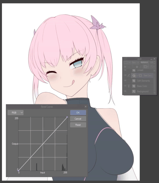
A window should pop up. At the top left is a drop-down menu with four selectable color channel modes: RGB, Red, Green, and Blue. RGB refers to the lightness or brightness (not exactly, but don't worry about it) of the combined layers underneath the correction layer while red, green, and blue refers to the respective color value of the combined layers underneath the correction layer. Each color channel mode stores its own tone curve (shown in the middle of the window). We'll be using all four curves.

Click and drag on the chart to add and move control points, adjusting the curve. To delete a point, drag it out of the chart. The two default points, (0,0) and (255,255), can be moved up or down, but can't be deleted.
Note that the white line is the actual curve. The blue lines and control points are vector guides for the curve.
When the curve changes, color correction of underlying layers takes place. x-values of underlying layers (input) are corrected to the y-values (output) they match up to on the curve.
For example, if I want 50% RGB output at 75% RGB input, I would do this:
What the actual x/y-values represents depends on the color channel mode.
In the case of the RGB channel mode, higher values means more lightness or brightness. Therefore moving the curve towards the bottom right of the chart results in darker colors (light input → dark output) while moving the curve towards the top left results in lighter colors (dark input → light output).
In the case of the red channel mode, higher values means more red. Moving the curve towards the bottom right in this mode results in cyan colors (red colors → cyan colors) while moving the curve towards the top left results in red colors (cyan colors → red colors).
If you're wondering, "Why cyan?", it's because cyan is red's complementary color under the RGB color model. Pick a color on the ring of Clip Studio Paint's color wheel and on the opposite side will be the picked color's complementary color.
Green channel mode: bottom right = magenta, top left = green.
Blue channel mode: bottom right = yellow, top left = blue.
This individual adjustment of input-to-output per channel allows for the generation of decent shadow colors. As an aside, the other color correction methods like hue/saturation/luminosity and levels don't offer the same level of control, which is why they're not used here. Color balance can do something similar, but I find tone curves easier to adjust and control.
Now, we want to "correct" the base color into reasonable shadow colors, so to start, adjust the curves to something like these:
The "bar graph" or "histogram" in the chart shows how much of a given x-value is present in the underlying layers. Target the peaks of the histogram when adjusting the curves.
For example, there is a peak at the far right from skin and hair, which takes up most of the canvas. To get my desired shadow color for those elements, I lower the red curve just a tiny bit above the peak while lowering the green and blue curves a bit more above the peak until I'm satisfied with the result.
Ideally, you want to adjust the curves so that a bit of the base color's complementary color comes out in the shadows (according to color theory, that makes the shadows look prettier) so wherever there's a peak, lower the curve by an amount relative to the height of the peak.
You don't have to do that or match my curves though. Follow your own instincts and color theory knowledge. If you have a particular palette, atmosphere, or tone in mind, adjust the curve to fit your style. If you're not sure, don't worry, you can always adjust the curve later at any time.
Some really crazy curves are possible if you have the courage... but if you're not sure, be subtle in your adjustments. To create straight lines and right angles, place control points right next to each other.
When you're done, click OK and rename the correction layer to keep your layers organized.
Now, it's time to set up the correction layer's mask.
If you aren't familiar with masks, they're like stencils for layers. They control what parts of the layer they're attached to actually shows up on the canvas. Masks are typically used on regular layers and layer folders, but they can also be used on Clip Studio Paint's color correction layers as well!

Delete the mask that was automatically created with the correction layer. ( Right Click Mask > Delete Mask )
If you have something selected, deselect it. ( Select > Deselect )
Create a new mask. ( Right Click Correction Layer > Layer Mask > Mask Outside Selection )
Now, you're ready to start shading!

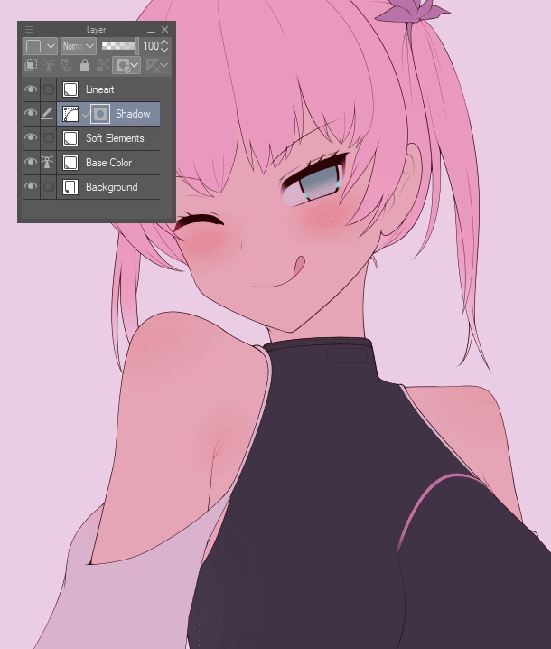
Select the mask and start shading on the canvas with your usual brush techniques. You'll notice that you're now shading in the correct "corrected color" regardless of which base color you are brushing over. Congratulations, you no longer need to pay attention to your brush's color while shading!
TIP: Before you shade, save the correction layer as an asset to your collection of materials so you can just pull out the layer in the future when you want to start shading.
TIP: If you feel one level of shadows is lacking (for example, you want stronger core shadows or occlusion shadows), duplicate the correction layer or make a new one on top of the old one and adjust as necessary.
TIP: Ideally, once you set up a decent set of curves you won't need to adjust them anymore. If you keep adjusting the curves you'll end up wasting time second guessing at the colors. However, if the colors don’t turn out the way you expect you may need to adjust the curves. Double click the icon of the correction layer (not the name or the mask) and the curves adjustment window should pop up.
TIP: Instead of adjusting the curves, you can also adjust the base colors instead.
Of course, just shadows isn't enough. Create new layers for highlights, reflected light, and ambient light if necessary. Since these aren't as involved as shadows, I use regular raster layers with various blending modes.
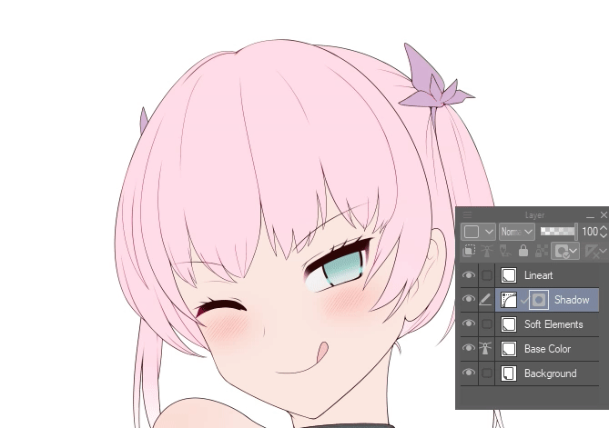
Here is the before and after. To the left is the lineart + base colors. In the middle is the result after shading with color correction. To the right is the final illustration with highlights and reflected light added.
Part 3 - Things to Notes
Here are some pros and cons to this technique.
PROS:
• The shading process is fast and efficient due to not having to think about colors and not having to swap between active colors.
• Shadow colors can be adjusted on the fly by tweaking the curves or base colors.
• All shadows are stored in one or two layer masks, improving layer organization and lowering file size.
• Colors are consistent across the entire canvas and, if the correction layer is reused, across illustrations.
CONS:
• No blending between colors, which is a key feature of certain art styles.
• Reflected light and ambient light can only be added through additional layers in post. In particular, scenes with lots of reflected light (ie., scenes with detailed backgrounds) makes shading with color correction hard to justify.
• Some color combinations are hard to produce. Adjusting the curve for one base color can affect the corrected color for another base color. This can be frustrating, and it can happen.
I recommend this technique to you if:
• You want consistent colors, and consistent colors across illustrations (ie., video game character portraits / CGs).
• Your illustration has so many base colors that swapping between active colors during shading is a hassle.
• You have deadlines and don't want to spend time choosing colors.
I do NOT recommend this technique if you have already internalized a specific aesthetic color palette to your art style and can pick colors by instinct, or if you like experimenting with colors and "going with the flow".
Conclusion
Whether or not you decide to adopt this technique, I hope you've learned something new through this tutorial!
For those interested, here is the original .clip file for the illustration featured in this tutorial with all its layers intact. In case you were wondering, the character featured in this tutorial is an original character for a personal project I'm working on 😀.
Thank you for reading!


Comment