Humanoid Hover Rider Robot design in CSP
In this tutorial I will show you my design process of vreation a Humanoid robot T-Max!
He is a desert hover driver, altough I havent designed a hover for him but it might be a cool theme for a the next tutorial.!
- How to make your Design Guide
Design is a very mindset driven field.
Its not actually about your technical skills but more about finding a creative directions and defining your goals.
Its pretty much universal for all the fields of design, and there is no particula “black magic” knowledge.
Its always simple steps which you need to follow.
Another important thing is- You don't have to design/ invent a bicycle from a scratch.
Thats Why I always start with a Design Guide for myself, gathering all the necessary information and References!
Here is an Deconstruction guide of 5 Steps.
1) Identify where you go (your goal which we just mentioned before)
2) Research a subject
3)Deconstruct /Analyze/ Understand
4)Emulate and Apply
5) Improve Upon
*Important Note: Always Write it down, it will help to stay on track with your design.
2) Rough Thumbnails and Ideation
After compiling my design guide I cam up to a series of sketches.
Not of them were really reflecting my vision but, that's why we do a DESIGN iterations
We are designing to get rid of unnecessary information and bring over an essence of a subject design and creative thinking.
After evaluating my sketches I have chosen one which I decided to bring further.
*Important note: Design is never only one iteration, pass, option. It is a variety.
Untill you havent done a few iterations - You havent done any design!
3) Refining a Chosen Sketch
Using a chosen Sketch I have done a few variations to check What I could improve upon here.
I was iterating some joints and supporting details here.
It was still very fast and dirty but it helps me to find out the direction.
I knew the purpose of these first steps is to not bring a beautiful image but just a design iterations.
*Important note: I used a Tapered Pen with its basic settings.
*Important note: Dont go into details and beautiful line art in here. Make it fast and Dirty!
Here was actually a sketchbash step.
I took some elements from a previous sketch and just combined them together.
I also decided to change the top part of the robot to bring more rounded look to its design.
After comparing these 2 I felt I really like the second option and I will be moving along with this iteration.
The reason was that These 2 separated elements brought more visuAL interest, by comparison to only a big one in the first sketch.
*Important note: Keep iterating unless you are not sure its a look you are after.
4) Fixing a pose to give a better shape read
Here I realized that the pose I have sketched not really dynamic and interesting and I made another pass to change it.
- Important note: Always check the readability and interesting shapes of a silhouette.
Details inside the silhouette are secondary. The most important the overal look!
Before I wen to a clean line art pass I had a look again at my Design board.
I did not wanted to stuck designing something without understanding a subject so this reminder was really helpful for a saving time sake.
- Important note: Keep looking at your references once in a while to stay on track!
5) Line art/ inking
I used the change layer color function to bring my line art to blue color to make it more visible while sketching in black, I also descreased the draft sketch layer opasity down to 62.
As you can see I kept all my line layers in a stack (1) and also I used some masking functionality (2) to erase some intersecting lines, which I dont want to erase at all till I finish my inking.
Working on inking I was keeping adding some extra details even though it was not reflected in my initial sketch.
Here what I found really helpful to keep the process semi- no- destructive way:
1)I kept my layers separately as you can see here.
2) I was moving from overall shapes to the details
3) When I was off with a line curve, I was using transform features of CSP which are pretty awesome!
4) I used a standard tools practically without changing any settings. Mapping Pen + Snap Eraser + Transform Tools. (CTRL+T)
I used Transform tools to correct some strokes which went not as I wanted it to be.
5) I was changing some details while moving trough, if I felt I do not really like something.
6) Screen rotation function was helpful as well (R)
Finally I came up with 2 layers of lines, Internal details and the outline, which wanted to color in the next step.
6) Color Thumbnailing
Doing color Thumbnailing I was trying to stay within Big / Medium / Small / Accent Colors.
My General Colors were nor to saturated vs vibrant accent in important areas as Robot's head and some interesting joints.
So This decision is very subjective and very depends on your initial design idea, and a vision.
- Important note: Do not go too crazy with amount of your colors your colors. And Keep them BMSA (Big / Medium / Small / Accent Colors)
6) Coloring
So after choosing one of the previous Color thumbnails (The green palette)
I started coloring.
I tried to keep my coloring process non-destructive as well. What does it mean?
I kept all my layers in a stack. Doing so I could come back any time and make any changes.
My very bottom Layer was the Background layer (2) and I moved my line art almost on the top (1)
Moving further I created a silhouette underlay and kept all my 3 coloring layers above in a 'clip to layer below' mode.
Layer below is our silhouette.
So what it does?
If you work in such a mode nothing above your clipping layer does not go over its borders.
It works similar to an alfa channel masking
I made it to make sure that all the layers above gonna be clipping automatically.
In the next step I colored My robot in the same palette as I have chosen just before.
Mostly I used the Fill tool, while keeping my line art layer as a reference layer above.
It was allowing me to fill all the outlined by lines details.
When I neede to correct it I also used Lasso fill tool, which is amazing tool and I really like using it.
Also I created a darker and a lighter version of the same flat colors.
I applied both of these over the base -flat layer using masking.
And painting shadows and highlights where I wanted it to be.
Painting in white means transparency and black is opposite.
Shadow pass
Light pass (optional)
it is totally fine to use only shadow ans base layers.
In this step I painted some highlights using color dodge blending mode.
I was painting in white color.
And used 2 layers one for a broad effect and another one for more detailed, such edges and so on.
In this step I have done some color correction, as I felt I needed more saturated look.
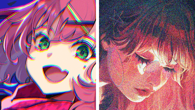
In this step I added some eftra effects such a dust (1) on a top of the robo. Also I added some grain looking effect using very fine Perlin Noise settings. (2)
I Added it via 50% gray layer with overlay blending mode.
Grain Effect really helps to "stick together" all the composed elements.
And in my opinion an image looks a bit better with such an addition.
In any case you are welcome to experiment with all the techniques I showed in my tutorial.
I really hope you liked it and it was usefull somehow.
See you later
Thanks for going trough!


Comment