
1. Presentation
Hello! I'm V21e, professional illustrator and cartoonist, author of the Webtoon Canvas "LEVEL UP!".
Clip Studio Paint is an excellent drawing program. It has many functions that make my workflow easier, whether it is making comics, illustration or artistic drawing.
Today I'm going to show you how to make a drawing simulating a sharp photograph using some of the features available in Clip Studio Paint. I will explain the fundamentals to make beautiful compositions taking advantage of the background, my logic of thought when illustrating and my methods to enhance my drawings with the program's tools.
I will divide the article into sections. If you want to go directly to applying effects on the image, go to the section "7. Photo effect".
This article has video. I focus on explaining the process in the "7. Photo effect" section. I attach it below.
2. How to get inspired
Before starting to draw we must answer some questions: What do I want to draw? What do I want to express? What reference images inspire me and/or remind me of the idea of my drawing?
For this tutorial I will answer these questions as an example:
➤ What do I want to draw?
"My character in a tundra as part of a photo shoot."
➤ What do I want to express?
"Although my character has city clothes, I want her to show harmony with the natural environment. Beauty and calm. A cold place but warmth in the character. "
➤ What reference images inspire me and/or remind me of the idea of my drawing?
"Landscapes from Alaska and Argentina, especially Bariloche. Its range of colors is ideal for what I want to illustrate."
Remember that these are only examples. Do not hesitate to draw what you are passionate about and inspires!
3. Planes and angles
We cannot talk about the photographic effect without first talking about the angles and planes used in photography.
✦ 『 Blueprints』 ✦
✦ Great shot
Plan used, generally, to represent the scenarios.
✦ General shot
Used to represent the setting in which a character finds himself.
✦ Entire plane
Mainly used to present characters and represent fights, it covers from head to toe of the represented characters.
✦ American plane
Character plane that goes from the knees to the head. There is a balance between background and the actions of the character.
✦ Midplane
Character plane that goes from the waist to the head. It focuses on the actions of the character.
✦ Short medium shot
Character plane that goes from the chest to the head. Focus attention on the person rather than the background.
✦ Foreground
Character plane that always comes, approximately, from the trapeze to the head and that seeks to present mainly the character's face and its expressiveness.
✦ Extreme close-up
Character plane that represents the complete face of the character and occupies all or most of the panel.
✦ Detail plan
Focus on important actions or events, such as someone doing something (someone pulling out a gun or giving money, for example). Focus on the details.
✦ 『Angles』 ✦
✦ Front angle/plane
Horizontal front view.
✦ Back Angle/Plane
Horizontal back view. The opposite of the frontal plane.
✦ Zenith angle/plane
Seen from above in perfect vertical. If there are characters on the scene, it will focus on their crown.
✦ Angle/plane nadir
View from below in perfect vertical. The opposite of the zenith plane.
✦ Chopped Angle/Plane
View from above with an approximate inclination of 45 degrees.
✦ Low Angle/Plane
View from below with an approximate inclination of 45 degrees. The opposite of chopped plane.
✦ Angle/plane aberration
Frame in which the view is tilted between 25 and 45 degrees. Adds dynamism to an image.
✦ Angle/flat 360 or fisheye
Framing that has a vanishing point towards which the entire panorama escapes. Usually combined with other angles.
4. The outline and composition
Clip Studio Paint greatly facilitates the drawing process with all its functions (automatic coloring, use of 3D models, transformation of photos into manga-style drawings, etc.), but the planning, the creative part of a good image, comes from the artist. .
A good image starts from the outline of the draft or sketch.
The draft has the purpose of showing in very few strokes a preview of the final illustration. This first step allows you to compose many images with minimal effort.
Composition is the management of the elements present in the drawing such as light, contrast, characters, elements of the environment, etc. Additionally, I personally define it as "Attention management", since depending on how it is used, it is one of the best tools to transmit sensations through images. A good composition is your best tool to convey what you want from the subjective and emotional.
Focusing the viewer's attention on what I want them to see is achieved through the compositional elements mentioned above: lighting, perspective, symbolism, color, poses, etc. For example, do you want your audience to focus on a character's hands or precisely what they are holding? Composition and camera angle are your best companions.
4.1 A spectacular image
In our composition we will seek to make a spectacular, beautiful, clear and attention-grabbing image. All this with a professional execution. All spectacular images -Of those that we keep in our social networks for being beautiful- are clear in what they represent.
They have contrast.
Is the character distinguishable from the background? Can I distinguish what happens in the drawing from a distance? Is body language understood? All this is achieved through contrast. Contrast is a pattern break, be it color, shape, lighting or imaginary lines. These elements are usually of visual interest. Therefore, they serve to guide the narrative in an image.
Clip Studio Paint has tools that help increase the contrast and beauty of our illustrations. These tools and their features are specifically mentioned in the section "6. A Clip Studio Paint!" and its practical application in "7. Photo effect" and "7.1 Images with outline".
The composition is usually simple and intuitive. For those who need examples, I leave the following section. I will explain pattern breaks and narrative elements for a better understanding.
I will use image 2 as an example.
4.2 Examples of composition
✦ 1. Visible lines:
Generally, various areas of the landscape form "horizontal lines". In this example, these are interrupted by the figure of the character, vertically. They serve us to define the horizon, the height of the "camera", the angle and even the perspective. They help us to contrast the character with the background and even to define the distance of the elements present in the landscape.
✦ 2. Imaginary lines:
They are more subtle than the previous ones, but it is easy to identify them. Usually, our view finds their intersections attractive. They affect both narrative (as a moving element) and focus. The focus that imaginary lines give us can often be used to focus attention on a point, in this case on the character. Imaginary lines are a good resource to give intensity to certain areas of the drawing or greater interest. In this case there is no movement, only the character is highlighted and the action he does around this point (Holding hands).
✦ 3 (Light Blue) Narrative elements:
It encompasses common sense, symbols and/or associations, as well as body language. For example, for a bird to fly it must move its wings, so when we see them spread we immediately assume their movement.
In this case, the character's face shows some surprise. From his expression and the position of his head we can assume that something caught his attention, be it a noise or someone mentioning his name.
Hands behind the back are usually held in a repose or formal pose, sometimes used in contemplation or service. However, he looks quite relaxed overall.
People often create mental animations while looking at the image, looking for meaning in these small details. It happens involuntarily. Everything happens in your imagination.
In this example it is normal to interpret and imagine that the character turned his face slightly, paying attention. The water and the birds moving, some strands of hair moving in the wind, give life to the environment, in the background.
Thanks to this implicit narration, an image feels more "alive".
✦ 3 (Rosita ❤ ) Similarities:
In this type of pattern, beyond the area of the elements that we associate as similar, any object attracts attention.
In this case, the character towers over the height of the mountains. Standing out over the mountains and looking at the viewer, further enhances the natural attractiveness of the face at the attention level.
✦ 4. Opposites:
The background has more complexity in detail and color compared to the character. Generally, the greater the detail, the greater the importance of what is portrayed. But be careful, because excessive and inharmonious detail tends to saturate, generating the opposite effect.
In this case, the background detail level is appropriate because it is more detailed than the character. The visual simplicity of the character helps direct the limelight to the background, balancing our image.
Who really is the protagonist of this image? The background or the character?
As a final detail of this section, I would like to leave additional information so that your backgrounds are not only beautiful, but also relevant. The background often allows us to convey atmosphere. When you create comics, webtoon or manga, consider that depending on the genre you want to make backgrounds in one way or another. For example, terror or mystery is not represented in the same way as beauty or contemplation.
✧ Left, terror. ✧ Right, contemplation.
5. Light and color
This section is dedicated to all those who want to know about my drawing procedure and my criteria in color management. If it helps, I hope you will use what is written here as a guide. I am, after all, an artist who loves to play with color. To work!
I will mention Clip Studio Paint tools to enhance the colors of an image. But, its explanation and use will be detailed later.
Without further ado... let's start with the explanation.
✦ 『 COLOR 』 ✦
✦ Color is a very powerful element in any illustration. It has the power to change "the narrative" of an image, for example, from joyous to terrifying. All this, with the mere use of different shades of the same color.
The trick of color in spectacular images is that it always has combined colors. Color theory is present! There are "classic" color combinations in this type of image (for example, the autumn/winter color palette).
✧ Beautiful color palette example. Left, original color. Right, fall/winter lighting.
✦ When illustrating natural environments, I recommend using photographic references according to the environment you want to portray and extracting its color tones.
✦ Prove your level of lighting mastery!
Dusk and dawn, dawn and dusk, are references that you should also look for when shooting natural environments due to the interaction of light with the environment, characters and objects. These interactions highlight the volume, the setting, the lights and shadows, the nature of the materials, etc.
As I mentioned, contrast is essential for a clear and spectacular image. The images set in dawn or dusk style, propitiate high-contrast lighting in a natural way. This generates quite interesting and attractive light/color/material interactions for the observers. Its good management increases the professionalism of the image.
✦ There are elements that, when interacting with light, cause it to pass through them. For example, hair, clothing, skin on some parts of the body (such as the hands) better reflect environmental tones when they are backlit. Taking this detail into account will give your drawings more realism and beauty. In this case, I invite you to look for references (preferably photographic) to understand this phenomenon.
✧ .o1. Example focused on orange colors and interesting tones expressed in the skin. base colour.
✧ .o2. Shadow.
✧ .o3. Apply orange tones (in this case) on the boundaries of light and shadow. Use the "Soft Airbrush" brush. The tone depends on the ambient light.
✧ .o4. Here you can see the bounce of light. Notice how ambient light affects the shadow. Use the "Soft Airbrush" brush for the final finish. The bounce reflected in the shadow area indicates that there is an element that reflects the ambient light under the hand.
This type of lighting has powerful narrative elements due to its ability to provide a clear setting. Additionally, it helps integrate the characters with the background.
Here's another example: a light illuminates our character from behind. In the drawing you can see how the interaction of light with the hair highlights it and contributes to the contrast. This light also adds a narrative factor: where does it come from? it can be a lamp or a ray of sun, even some magical light. Although other elements in the scene are needed to deduce what is happening in the illustration, the light undoubtedly helps with the harmony and integration of the character with the background.
✧ To the left we can see a calm mountain-like environment. Its color combination is typical of a natural environment. The lighting is frontal and simple, with some pink details on the skin and hair to convey vitality. There are not many color interactions. On the right you can see a dark environment, typical of, for example, a night party. "Split complementary" colors (red/orange in the presence of dark green/aqua blue) are used. The notable color (and therefore lighting) interactions are the hair being illuminated by a lamp, and the small illuminated areas in the shadow area (cheek and part of the jacket) help the integration of the red color to the character.
➤ Are there tools to improve our color scheme in Clip Studio Paint?
Yes, one is the tool is the "Blending Modes" present in the layers. Another is the “Correction Layers”. Later in this tutorial I will delve into its use.
If you want to check out color schemes for an illustration, I suggest checking out the "Color And Illustration" gallery on Instagram. It is a good source of inspiration and learning to understand more about color theory.
If you want to delve into how to achieve curious color interactions, continue reading the tutorial.
In the next section I formally introduce the Layer Blend Modes and Correction Layers tools. In the sections "7. Photographic effect" and in "7.1 Images with outline" I make use of both tools. In the latter, I demonstrate the use of Layer Blend Modes to achieve colorful images with little effort.
Now yes, let's open the program.
6. ¡A Clip Studio Paint!
The functions that we will use from Clip Studio Paint to enhance our drawings are the blur filters, Layer Combination Modes, Correction Layers and the brushes that the program has. We will use both the default ones and those that can be found in Clip Studio ASSETS.
6.1 Gaussian Blur
Gaussian Blur is one of the favorite tools to increase the focus and attractiveness of points of interest in the image.
✧ Gaussian Blur: Demonstration. 1. Original image /2. Slight use of the /3 filter. Greater use of the filter than section 2.
This function can be accessed in [Filter]→[Blur]→[Gaussian Blur]
(Image below).
Next, a pop-up window appears that allows you to change the Gaussian Blur Amount. Its use only affects the active layer, so it cannot be used on multiple layers at the same time. Later I will explain how to apply it more precisely in our illustration.
✦ The following example shows how it affects only one of the layers.
✧ .o1. Imagen original
✧ .o2. Layer content and organization
✧ a. and b. Influence on different Gaussian Blur values in the selected layer.
✧ Final result.
6.2 Motion blur
Motion Blur is a filter that helps a lot, precisely to provide a narrative of movement to the environment.
In this example I will use leaves and branches, for which it is ideal. In the manga it is used for the moving arms or legs of the characters, especially in action scenes.
✧ (Left to Right) Image without use and with use of Motion Blur.
This function can be accessed in [Filter]→[Blur]→[Motion Blur]. In fact, it's above [Gaussian Blur].
(Image below).
Next, a pop-up window appears that allows you to configure the amount of movement displayed, as well as the angle of the movement.
It uses the same principles as the Gaussian Blur. Its use affects only the active layer, so it cannot be used in multiple layers.
✦ The following example shows how the filter affects a single layer. I'll skip layering. It has the same layer order as in the Gaussian Blur example.
✧ Original image.
✧ The top bar of the pop-up window (Distance), changes the intensity with which the movement is displayed. The bottom bar (Angle) changes the direction from which the movement is applied. The lower box (Distortion) changes the simulation of where the movement comes from: backwards, forwards or from both sides. It is better to prove it than to describe it.
✧ Final result.
6.3 Combination modes
Blend Modes are an editable feature present on layers. They allow you to add interesting color interactions between the layer and the rest of the drawing.
✧ Combination modes. o1. Original Color /o2. Darken /o3. Focal Light /o4. Darker color /o5. Original image.
Typically, these types of layers and their edited blend modes are used to add shadows, highlights, and as a filter.
✧ Combination Modes: Demonstration. On the active layer I traced some Light Yellow brushstrokes with the "Airbrush" tool. By changing the layer's Blend Modes, interesting brightness, shadow, and color effects can be achieved.
Unlike blurs, Blend Mode affects all layers you select with a single click. Be careful!
You can access the Combination Modes of the layers in [The Layers window], in the upper section of it.
In case you don't have the [Layers Window] in view, you can turn it back on in [Window]→[Layer].
(Image below).
By using the Blend Mode of the layers in conjunction with an Opacity change, interesting color interactions can be achieved.
Opacity is "how opaque" or "transparent" an element is, in this case a layer. This function can be accessed in the [Layers Window]. In the upper right area next to the Combination Modes there is a moving bar and a window with a percentage. (Image below)
✧ If you alter the opacity values its transparency changes. Left: Layer with blue color. Normal combination mode. 100% Opacity / Right: Layer with the same shade of blue. Normal combination mode. 50% opacity.
My intention is to show a practical use of Combination Modes, but not to limit experimentation. Doing "Trial and Error" is easier than trying to gain an understanding of the mathematical foundation that shapes each Combination Mode and then applying it...
》For those curious who want to know the mathematical foundation, the reasons for each Layer Combination mode, I enclose the link to the CLIP STUDIO PAINT User Manual. It is really enlightening if you have doubts about the subject.
》I show a demonstration of shading and lighting in the section "7.1 Images with outline"
6.4 Decorative brushes
The use of Decorative brushes (drawing flowers, flashes of light, raindrops, etc.) I add in this section for their practical use in the drawing process: they save time and are very complete in terms of quality and detail.
✧ "Soft Pentagonal" Decorative Brush in one of my drawings. Default brush in Clip Studio Paint.
Decorative Brushes can accompany our character as an outstanding decorative element. They can also help accentuate the perception of depth in the illustration.
There are many interesting and widely applicable brushes in Clip Studio Paint ASSETS, made by both community members and the official Clip Studio Paint account.
The following brushes are part of my inventory. I selected the ones that could interest them for a photographic style image. It is worth mentioning that while some of these brushes are free, there are also some paid ones:
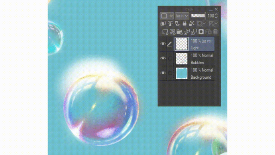
Bonus: The bubbles used in this tutorial
6.5 Correction layers
Correction Layers are similar to Blend Modes, but have a greater scope when it comes to altering color values. They serve both as filters and to correct tones, make interesting textures, etc. Also, and unlike blur filters, they are reversible.
In this tutorial I will only use them as a filter (sorry, I am not doing this Q.Q tool justice). I will include practical examples for the curious.
✧ Graphic poster style tones achieved with a Correction Layer using "Gradient Map". Custom color range.
This function can be accessed in [Layer]→[New Correction Layer]→[(Options)].
(Image below).
It can also be accessed from [The Layers window].
On an active layer, [Right Click]→[Correction Layer]→ [ (Option) ]. (Image below)
Depending on the type of option you select, different pop-up windows will appear.
》 I enclose a specialized article on the subject. It explains each of the layers and their practical uses. This is my favorite tutorial on this subject.
》In this one below, they explain how to integrate a character with the background lighting.
》Lastly, in this one they explain how to achieve holographic cloth clothing using Gradient Maps.
7. Photo effect
With all that previous information, all that remains is to draw and apply what you have learned!
The effects that we will add to make our illustration in a photography style, are done until the end of the drawing process.
✦ I advise keeping your drawing process in separate layers and/or folders. Separate the background, character, and decoration. It is for a matter of order and practicality.
✦ Using filters like Gaussian Blur or Motion Blur will only work on a single active layer. If you work with several layers in your drawing, it will be necessary to merge the layers that make up each element separately: The background elements, the floor, the character, decorations, etc.
If you want to keep your drawing's layer data separate, I suggest making a copy of your document or (in the same layers section of your document) having a copy of your layers. One set of layers is for holding the backing, and the other for merging and working with it. I personally like the second option.
✧ Example of two sets of layers: 1. The original layers and 2. The merged layers.
To duplicate layer sets, they must be selected first.
To select elements of the layers window I suggest the following keyboard shortcuts. Agility when working is key!
●To select a single layer, just click on it.
●To select continuous layers, [Shift]
●To select multiple layers, but specifically, [Ctrl]
✧ Selection of continuous elements. Click on the first layer. Next, while holding down [Shift] the last layer of the range of layers you want to select is selected.
✧ Selection of individual elements. Click on the first layer. Next, while holding down [Ctrl], you select the layers you want to select specifically.
Once selected, you can duplicate your layers simply by using the keyboard shortcuts copy [Ctrl+C] and paste [Ctrl+V] or you can [Right Click] on a selected layer and select "Duplicate Layer" (whatever seems best to you)
To merge layers select the layers to merge, from [Right Click]→[Merge Selected Layers]. (image below).
Now we can work with the filters.
For this drawing I visualize a blur in the plants and in the background, as well as a little blur in the character's hair. I achieve this by enhancing spatial depth.
✧ Simplified representation of my drawing. a. Current status /b. What I aspire to achieve.
I want to add the Gaussian Blur filter to the entire layer where the plants are in the drawing. For this, I simply select the layer and go to [Filter]→[Blur]→[Gaussian Blur]. I select the amount of blur and click accept.
✧ (Left to right). Initial result / Final result (slight blur in the background)
✧ (Left to right). Initial result / Final result (strong blur on plants and light blur on grass)
To apply the filter to specific areas, it will be necessary to select the area to be affected.
I want to apply a slight blur to only the character's hair and some edges of the trench coat. For this, I go to the tool palette and select the marquee tool. Next, in the sub-tools section I select the [Lasso] tool (image below).
To select an element, simply draw on the area.
I suggest the following keyboard shortcuts for the use of the [Lasso] sub tool
●To increase the selection, hold down [Shift]
●To decrease selections, hold down [Alt]
✧ These are the shortcuts to increase and decrease the selection. To increase a selection, keep [Shift] pressed and drag the cursor selecting a new zone. If you want to deselect an area, hold down [Alt] and draw over the area you want to deselect.
✧ Selection example.
In the layer to be edited with the selected sections, we go to [Filter]→[Blur]→[Gaussian Blur]. Alter the blur values to the desired ones and hit OK.
To deselect, with the lasso tool you can click outside the selected area or go to the pop-up window that appears when you make a selection by clicking the first square on the left (images below).
To smooth the blur transition I used the blur sub tool of the color blend tool (image below).
✧ How the blur sub tool works.
I've also added hair and small details to add sharpness.
✧ (Both images, Left to right). Initial result / Final result. Greater detail in the hair.
I added more blur to other parts of the character until I was satisfied with the results. Now it's time to add the glow effect in illuminated areas and special effects.
1. I add a new layer.
2. I draw with the Airbrush tool on my drawing a yellow tone on the highlighted areas.
3. I change the blend modes of the layer with the lighting to the ones that seem most suitable to me.
4. (Left to right.) Initial image without lighting layer / Final image with lighting layer with altered blending modes. In the image to the right, the values for the lighting layer are as follows: Layer Blend Mode to Dodge (Glow) and Opacity to 60%.
5. Finally, I add light particles with decorative brushes.
(I enclose the link to get it in the Clip Studio ASSETS store. It is paid.)
✧ Image display with light details.
As an extra detail I will add a light filter on top to make it look lighter.
In the layers section I go to the top layer of all.
I go to [Layer]→[New Correction Layer]→[Gradient Map] (image below).
A popup will appear with many filters.
✧ a. The area called "Gradient Set" allows you to move between folders with different types of default gradients in Clip Studio Paint. I selected the folder called "Heaven". In the scroll bar, we move until we find a filter that we like. The one I selected is called "Sunrise (Clear)” (image below).
Clicking accept forms a layer. You can edit its blend modes and opacity, just like a normal layer.
I change the opacity levels until I find a value that I think is suitable (image below).
✧ Gradient map correction layer values. (Left to right) Correction Layer at 100% Opacity / Correction Layer at 25% Opacity.
✧ Final result.
7.1 Images with outline
The photographic effect is not limited to semi-realistic or realistic lighting images. It can be used in digital art with outlines such as manga style illustrations or scenes in webtoons.
The tools that are best used in this type of illustration are Layer Blend Modes and Correction Layers. This is because they have a series of steps that help implement these tools in a simple and practical way.
I will show my drawing process from scratch using Layer Blend Modes and Correction Layers to achieve a colorful image. I will also implement the photo effect. Additionally, I will attach relevant articles to deepen the subject.
✧ 1. Sketch. I focus on the pose and expression. Use the "Pencil" brush with the "Tipped Pencil" sub tool (default brush in Clip Studio Paint).
✧ 2. Outlined (Lineart). Made in vector layer. I used the "Pen" brush, sub tool "G" (default brush in Clip Studio Paint).
✧ 3. Base colors. The background and the character were separated into different (layer) folders. The color combination is of the "Complementary Separation" type (Misty Pink in the presence of Sky Blue, Mint, Cornflower and Ultramarine Blue). As neutral colors I used White, Black and its Gray scale.
✧ 4. Shading. Base color of the shadow in original state / Final result. In the image to the right, the layer values are as follows: Blend Mode Multiply, Opacity 41%.
✧ Lighting. Base color of the lighting in original state / Final result. In the image to the right, the layer values are as follows: Blend Mode Dodge (Brightness), Opacity 41%.
✧ Ambient lighting details. Ambient lighting base color in original state/Final state. In the image to the right, the layer values are as follows: Blend Mode Dodge (Brightness), Opacity 67%.
✧ Touch-ups. Small details such as blush and more intense shadows in the clothes I specify here. Color of details in original state / Final state. In the image to the right, the layer values are as follows: Blend Mode Multiply, Opacity 50%.
✧ Setting. Original/result layer color. In the image to the right, the layer values are as follows: Blend Mode Differential, Opacity 20%. These opacity values are to show how the filter works. Final Opacity values are 5%.
✧ Decoration. It was added on a separate layer. Start Image/ End Image. The image to the right shows how I used the soft Pentagonal Decor Brush. This brush is the default in Clip Studio Paint.
✧ Blur. I added Gaussian Blur to the background, to the character's sleeves and hair. In the image I highlight these areas for better appreciation.
✧ Result
As an extra step, a Correction Layer can be added as a filter. I used the Gradient Maps, the "Daytime Sky" Gradient, Default in Clip Studio Paint and altered their opacity values.
✧ Gradient map correction layer values. (Left to right) Correction Layer at 100% Opacity / Correction Layer at 40% Opacity.
✧ End result.
In addition to the articles recommended in the "6.5 Correction Maps" section, some extra articles to enhance our coloring are the following:
The first is illustration oriented, the second is animation and webcomics oriented. It explains how to color and integrate the character into the background in a few steps. I consider that both are complementary and there is very good information about it if you want to delve into the subject.
8. Acknowledgments
I thank my family for always believing in me.
I thank my boyfriend for being my editor and encouraging me to get out of my comfort zone.
Finally, I would like to thank you for reading the article (it's long [laughs]). It was a pleasure and an honor to have somehow facilitated this training in your artistic journey.
For my part, it has been everything. Thank you!
Users who liked this post


Comment