Tips to make more dynamic poses!
Hi!
In this tutorial I'm going to talk about tips that can help you draw more dynamic poses!
These will be the topics covered in this tutorial:
•Brief introduction to 3d figure models:
Where to find it and how to use
How to move the camera
How to pose the 3d model
•Tips about pose:
Start by making a simplified mannequin
Line of action
Think about the execution of the action
Simplify the volumes of the figure
Make it clear and instantly readable
Try to represent movement (even if it doesn't exist)
Build the figure in perspective
•Two examples of some tips in action!
I will be using references both from some photos (that I’ve taken with a friend) and from a VERY useful tool present in any version of Clip Studio Paint: 3d figure models!
And we're going to start our tutorial with a brief introduction to this tool and in the following topics we'll explore ways to use it as a reference for our poses!
If you already know how to use it I recommend you to jump to “•Tips about pose:” onwards
•Brief introduction to 3d figure models:
Where to find it and how to use:
You can find it by clicking on this icon that opens a menu next to the [Navigation] window, now click on [All Materials] and go to the 3D tab and click on [Body Type]
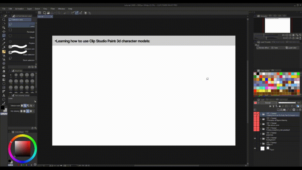
here we have 4 model options:
two bodies with “anime proportions” (3D drawing figure-Ver.2 (Male) and 3d drawing figure-Ver.2 (Female)):
and two with “normal proportions” (3D drawing figure (Female) and 3D drawing figure (Male)):
I personally prefer to use the last two because I have a style with more normal proportions, but the choice is yours! To use the 3d models all we need to do is simply drag the model onto our canvas, it automatically creates a layer with the model and a ruler showing the perspective the model is in.
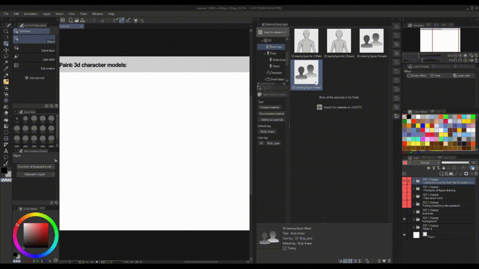
How to move the camera:
To move the camera around the model all we need to do is move the mouse in any direction while holding the LEFT mouse button (only works if you’re selecting the figure as an object with the [Operation] tool)
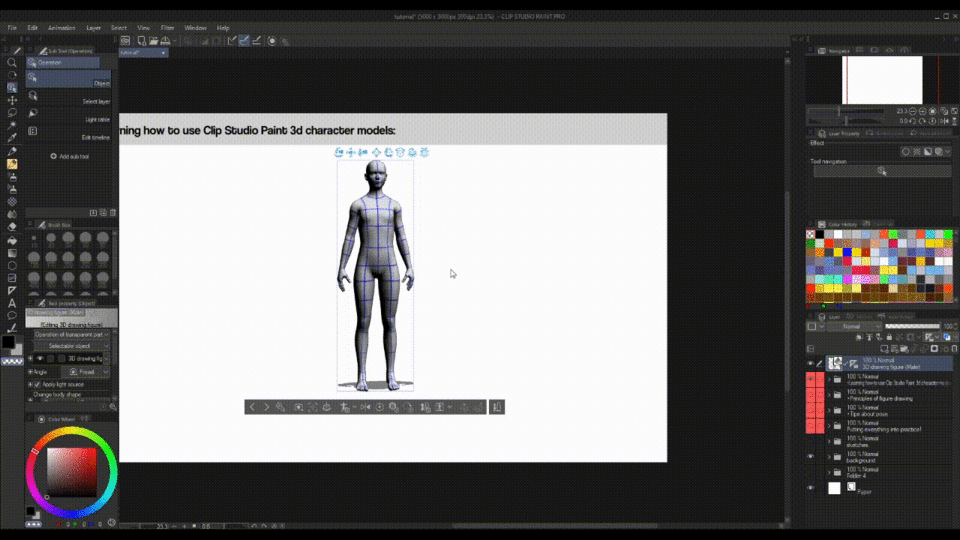
We can zoom in on the 3d model by dragging the mouse up (zooming out) or down (zooming in) while holding the RIGHT mouse button (also only works if you’re selecting the figure as an object with the [Operation] tool)

Now the most important thing: how to pose the model!
How to pose the 3d model:
Hovering the mouse cursor on the figure we’ll see some parts turning blue, these are the available joints that can be rotated, when we click on any of these blue parts it displays manipulation axes, you can manipulate the model by click and move these axes or just by clicking and holding the limb for any direction, it’s quite intuitive!

You’ll notice that depending on where you click you can also access a “central axis” for the entire body, with that you can rotate or move the entire body in any direction.

Try to make some poses to get used to manipulating this model! You can save any pose you’ve made by clicking in [Register Full Body as Material], then decide the name of the model and where to save and it's done!
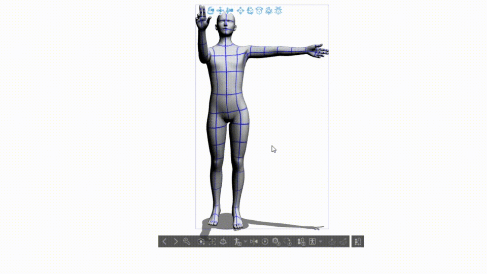
Another way of pose your model is using Clip Studio Paint default poses, the tab with the poses is below the tab where we find the 3d models, all we need to do to use any of them is just drag and drop in your model!

You can also drag hand poses to your model, which hand the hand pose goes to depends on where you drag the pose:
·When a part on the right side of the body is selected, the pose will be reflected in the right hand!

·When a part on the left side of the body is selected, the pose will be reflected in the left hand!

·When a part in the center of the body is selected or specific parts are not selected, the pose will be reflected in both hands!


And now you already know how to use the 3d figure models of CSP! Now I'll gonna talk about tips that you can combine with the 3d models to make more interesting poses!
•Tips about pose:
Start by making a simplified mannequin:
When starting to draw any figure in some pose it is better not to start with the figure with the whole anatomy already defined, starting a drawing trying to deal with so many elements at the same time may be why your poses are rigid!
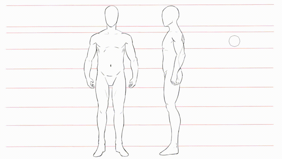
A good way to start drawing the human figure is using a simplified mannequin as a base, having few features to worry about you can put all your focus on the dynamism and life of the pose you're going to draw!
Here we already have everything we need to represent a human body in a simple way: we have the chest with a cape on it that represents the shoulders and chest, a column, arms, legs, head, and pelvis bones to represent the waist.
Don't worry about drawing the mannequin all perfect, the goal here is to focus on movement and be able to do many versions of various poses in order to practice dynamism in the figure and decide which one will be used as the basis for a drawing.
I've put a example of how to draw this mannequin in the gif below:

Practice drawing this mannequin to train weight distribution in a pose, all poses are based on that, even a person standing is dealing with the weight distribution of the body, in this case, the weight is usually concentrated on the feet.
Also try to feel the “balance point” of the pose and distribute the weight from that point, the balance point is usually both the feet.
It's good to try to evade symmetry to keep things varied and interesting.
Try to tilt and twist the figure to make it more dynamic!
Use photos and the 3d model as a reference to train poses for the mannequin but also try drawing some without!
If you have difficulty understanding a pose it's okay to trace over a photo or the 3d model to be able to understand it better, BUT REMEMBER:
this practice can help us to create foundations concerning observation BUT just doing this makes us dependent on tracing AND simply tracing over the reference generally is not enough to achieve a good result (you'll probably end up with a stiff pose, even with the character moving), modifications will always end up being necessary, mainly in the 3d model.
My advice is even if you get a good result simply by tracing ALWAYS try to make more versions without tracing the references, it's better to use tools as a foundation to help you understand something, not as a crutch
Okay, we now have a good way to start drawing our figures, but how to make them more dynamic?
This is where the line of action comes in!
Line of action:
Think of the line of action as an imaginary line running down a character’s spine, from the top of his head until to the leg that is supporting the body weight, it’s a simple curved line that evokes movement, it shows the primary force of the action.
All of the parts of the body should coordinate to either work within the flow of that line OR complement it in some way.
Look at the examples below, which one does the character have a more dynamic pose even with the character just standing?
It is quite clear that it is in the example on the right! Note that even though the character is just standing "still", there is still a force being projected, simply by having the body flow follow the line of action.
Remember the weight distribution that we talked about earlier, in the example of the right even if he's just standing with the weight and the balance point in his two feet we can see that he's distributing the weight leaning his torso to the front, this makes the pose looks WAY more dynamic!
Below are more examples of poses utilizing lines of action as a base:
When drawing from a photo or 3d model reference (as in the example below), try to find the line of action and build the figure from it exaggerating it!
Think about the execution of the action:
If the pose you’re trying to draw shows some action, try to think through all the steps of that action in order to find the “frame” that best expresses the motion, usually it can be best expressed if you use the start or finish of the action, like for example when a football player kicks a ball he expresses movement best at the start or at the finish of the kick,
if you were to draw him on the point of hitting the ball your drawing would have a stiff and unconvincing motion.
By drawing an action at the start of the movement we can make the viewer complete the motion.
By drawing an action at the end of the movement we can make the viewer sense the motion that has just been completed.
Try to use the mannequin to sketch all the "frames" of the character's movement to find the one that best fits the emotion you want to convey and even if it doesn't reveal a better pose, surely it at least will help you to find a way to improve the chosen one!
After practicing drawing the mannequin and getting used to giving dynamism to your poses, it's time to give volume to it!
Simplify the volumes of the figure:
We've already made the base of our character and learned how a line of action help us make his pose more dynamic, what we need to do now is give volume to this figure!
This is a subject that I feel is little addressed when it comes to how to improve poses, line of action is always something talked about but the way our figure transmits volume within a space is something just as important!
Representing the volume of the body masses well is important as it makes our drawing have a sense of depth and helps to convey even more the idea of weight distribution we talked about earlier, thus making our poses more palpable, this also helps a lot when we're drawing a figure in a pose with perspective since it's easier to deal with the volumes of the body when you have more simple shapes!
The objective here is to simplify all parts of the body in basic shapes so that way we can position them and understand their volumes more easily and ONLY AFTER THAT we will add the anatomical details.
You can also draw in a even more simplified way with cylindrical, spherical and rectangular shapes,
any of them, BUT USE 3D GEOMETRIC SOLIDS (a figure with height, length and width), NOT 2d figures,
this way gets easier to understand where each face of the muscle is directed and then when you put the anatomical details on the figure it's easier to know where each muscle fits!
Try using the previous poses you did with the mannequin as a base to practice but also try to draw new poses (always varying) with the objective of train the volume of the figure!
You will notice that adjustments in the pose and proportions of the mannequin will probably be necessary when giving volume to it, it's ok, it's a normal thing to happen, the goal in using it was to achieve a dynamic pose, not necessarily a pose already all anatomically and proportionately perfect, the time to focus on fixing the proportions is now!
Remember to imagine the torso almost so flexible as a pillow, twist it to give dynamism to the movements!
As with the mannequin, if you have trouble trying to get the volumes of a pose you can trace over the reference, but I repeat: after that, I strongly recommend that you try to make other versions of the same figure without tracing over.
The next tip is:
Make it clear and instantly readable:
When we look at something we usually try to first think about this thing as a whole AND THEN AFTER look at the details, so it’s ideal that the pose is clear enough so anyone can be able to tell right away what that character is doing, clear enough that even if you looked at that character in silhouette you’d still be able to tell what they’re doing, like in the examples below
BUT if you REALLY need to draw a specific pose where many elements overlap creating a messy silhouette, like in this pose below,
you must focus on separate the elements of the figure with contrast, either by:
contrast by the line thickness:
you can separate the elements that are more important or that are closer to the “camera" from the less important elements or that are farther away
contrast by the colors, light and shadow:
separate overlapping parts of the character by painting them in different colors so the viewer can more easily separate all the elements, here you must focus in use shadows and highlights to help convey the volume of each body part.
By doing any of these things, you can guide the viewer to more easily understand the elements in the pose of your character, even in a pose with elements overlapping.
Try to represent movement (even if it doesn't exist):
It's expected that when you draw your character moving you make him be affected by the force of movement, making his hair, clothes and accessories sway against the wind.
My tip here's is let's not limit ourselves to representing the force of movement ONLY when the character is moving!
If you need to draw a static character blow a random wind in him to make the pose more interesting, depending on the character it can give either an epic, mysterious or melancholy air!
Build the figure in perspective:
My final tip is to build the figure in perspective!
Yes... I know, it might seem like something difficult, that's why people generally prefer to draw only characters and not scenarios, since that way you can “escape” from learn perspective, BUT this is something that can greatly improve our poses!
Even if you're not going to draw a scenario in the background, drawing a character in perspective helps convey his volume and gives more dimension to his movements, and it doesn't even have to be in complex perspectives.
With the help of what we talked about and practice in the topics of "Start by making a simplified mannequin:", “Simplify the volumes of the figure:”, the 3d model, and the [Perspective Ruler] tool of Clip Studio Paint we can do this more easily!
We normally already can move the camera and the 3d model freely, now to make it be affected by the perspective all we need to do is click on it, go to the Tool property panel, click on [Display settings for editing] and change from Fast to Normal.
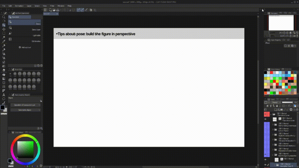
Now, on the side of the layer of the 3d model click on the ruler icon (it's called [Perspective Ruler]) and then disable [Fix eye level] in the Tool property of the ruler,

then click on the 3d model again, now the ruler and the model appear at the same time and any movement in any of the vanishing points will affect the perspective of the model!

From that we can use the 3d model as a reference to draw a mannequin and the volumes of our character in the pose and perspective we want!
But if you don't want to use a 3d model and only use the Perspective Ruler as a guideline you can use [Perspective Ruler] separately by going to:
[Layer] > [Ruler/Frame] > [Create Perspective Ruler] and then choose how many perspective points you want to use, the only thing we need to do now is turn off [Snap to Special Ruler], otherwise, we would only be able to draw in relation to the vanishing points, this is useful for drawing scenes but not characters, after that if you want you can move or edit the vanishing points.

My personal recommendation is: in the Tool property panel of the [Perspective Ruler] enable a grid in the ground so you can guide yourself more easily and disable the [Fix eye level] option so you can move the vanishing points more freely and create scenes with more varied perspectives.

Important things to remember are that the closer an object gets of the vanishing point smaller it gets,
and objects ABOVE the horizon line are being seen from below,
while objects BELOW the horizon line are being seen from above.
Use that to make the perspective of the pose more dynamic and show the volume of the figure!
Now, in the next and last topic I'll show some examples of drawings where I've used the [Perspective Ruler] together will a 3d model and things that I've talked about in this tutorial!
•Two examples of these tips in action!
First example:
In this first example I've used as reference the 3d model in perspective and in one of the default poses (the "grid up" pose), I started the drawing, as I recommend, drawing the mannequin!
It's not visible in the gif but I've drawn a line of action from the top of the head until the leg in the front to try to get the flow of the pose, that's is generally as I prefer to do:
I first draw the character in the pose I want and then draw the line of action above him and try to fix his pose until it gets in the flow of the line.
After finishing the mannequin I've give volume to the figure so I could better understand your positioning in perspective.
You can see that as I've talked about in the topic of "Simplify the volumes of the figure:" adjustments ended up being necessary, in this case in the legs of the character, in the mannequin they were too long.

After giving volume to the character and fix some things in the anatomy I've started to draw his features, my idea for this character was something like a monk that's wounded but still wanna fight, so I've put bandages around his head and arms, that's was something that helped to bring some volume to this areas.
I've done the same thing with the pants and the shirt by drawing pockets, folds and seam marks on them, drawing the seam marks is a simple and easy way to convey the volume of something, I personally do this a lot.

The end result was this!
It's a simple pose but I feel that the legs being at different levels of the scene helps make the drawing more interesting
Second example:
In this second example, I've used the [Perspective Ruler] without the 3d model.
The character here's a mage raising a staff, kind of casting a spell, in this example the way that I use the line of action is visible in the gif, after redo the mannequin following the flow of that line I've give volume to the figure.

Here I didn't make the seam marks in the clothes but instead did another trick to try to bring the volume of the clothes and the body: I put patterns on the character's robes!
Imagining that he would be a fire mage I've put fire patterns in his robes, with that I was able to transmit the volume of the cloth bending in his legs, arms and hat!
I also put his hair and the cloth over his arms to sway, like the spell was pushing them behind.

The end result was this!
I think that even if it's a simple pose, the dynamism given by the line of action and the volume helped to make it vivid!
And those were my tips and examples, I hope they could have helped in some way!
If you have some doubt or feedback please leave them in the comments below!


Comment