
Introduction
Hello. This is Kim (@kimkun_manga).
Today, I would like to introduce the method and tips for painting color manga that I use under the theme of efficient "comic coloring". This method of painting is especially suitable for Korean and Japanese color comics (webtoons) that require you to continue drawing high-quality works in a short period of time. Thank you.
Precautions when drawing color manga
Before I show you how to paint in earnest, I would like to talk about one point to keep in mind when drawing color manga. That is, "color manga is not a collection of illustrations."
Of course, you can see the cartoon pictures as good illustrations, and you can also collect the illustrations to make a manga. For example, unlike Japan, American comics take longer to complete each frame than Japanese and Korean comics. What I want to say here is not so much about perfection as it is about "purpose". I think the purpose of the illustration is [to clearly express what the author wants to say in one picture, and at the same time to complete the picture as beautiful as possible and stop people's eyes]. On the contrary, the purpose of the manga is [to gradually tell the author's message through the story of the characters]. If you want to make something that faithfully utilizes this purpose, the comic strips must focus on creating a "flow" rather than stopping your eyes. If there is a frame that is emphasized, it is also necessary to refrain from expressing it.
Furthermore, in places like South Korea and Japan where weekly serialization of color manga (about 60 frames or more per week) is generally required, I think that efficient manga painting is indispensable.
How to divide layers
(▲ How to divide inefficient layers)
In order to paint efficiently in a short time, it is necessary to use layers effectively separately. If you work by separating all parts such as skin and eyes, it will take time as the number of layers increases. Today's practice uses as few layers as possible and uses 15 layers, including paper.
(▲ Layer structure introduced today)
I think that the number of layers will increase if background writing and lines are included, but this is enough for the layer used for coloring the character.
How to paint the base color
First, prepare a line art and add the base color.
How to paint the base color basically depends on the type of line art, but if you are using a highly opaque pane like this line art, we recommend using the "Auto Select" tool. It's easy to make a selection and you can work faster. If the line art is faint and it is difficult to use the automatic selection tool, make a selection with a pen with high opacity and then use the automatic selection tool. Please refer to my other tutorials for details on how to do this.
Let's paint the color. Make one layer (normal) to paint the base color, and make one background layer (normal) under it. Select one dark color and fill it in the lower layer.
(▲ Fill the background with a dark color)
When choosing a color, select the color on the right (highly saturated color) from the color circle. You can choose your favorite color and use it, but I think it's better to use a color that is not too tight for eye health. There are two reasons to paint a dark background.
1 ‣ "To understand whether the color depth of the base is appropriate"
2 ‣ "To check if there is any unpainted area"
You can prevent the picture from becoming too light by drawing a darker color down and then painting. Our eyes will compare the base color with the background color and choose the right darkness.
(▲ Easy to adjust the base color depth)
① The color of the base is light, but it does not look so light because the background is white.
② If you apply a dark color to the back, the thinness of the base color will stand out.
③ If you adjust the concentration to an appropriate level, the character will stand out.
At the same time, if you lay a dark color on the unpainted part that was easily overlooked when the background is white, it will be noticeable and easy to notice.
(▲ It is easy to notice the unpainted part)
I think you should be careful because it is especially easy to leave unpainted areas on the white of the eyes and the gaps that occur at the tips of the hair.
Tips for shortening the base coloring time
Painting the base color is an easy and fun task, but it takes a considerable amount of time. Therefore, completing this work as soon as possible is one of the points that can save time. Here are two tips for applying the base color faster.
1 ‣ "Automatic selection tool TIP"
2 ‣ "Character Palette TIP"
(▲ Inefficient usage)
If you do not know that you can "drag" with the automatic selection tool, you have to hold down Shift (Windows standard) and select each area, but if you understand this function, you can see many areas as follows. Can be selected very easily.

(▲ The automatic selection tool can be dragged)
In this way, you can easily select small details without using the zoom function. This is a particularly useful tip when painting parts with many small parts such as hair. When you make a selection, a paint icon will appear at the bottom, so it's one of the small tips that you don't have to use a brush or abbreviated keys.
In my case, I use different settings for base painting and color. I think you should adjust the "gap closure" function and "color error" depending on the type of line art.
The second trick is to use the "color set" feature.
In manga, you need to draw the same character over and over again, so it is very convenient to decide the color of each character once and save it.
(▲ Color set that collects the base colors of the characters)
If the number of colors increases too much, you will forget what it is, so I think it's a good idea to create and use a color set that contains only the base color of the character. You can separate the color set for each character by pressing "Add new setting" from the setting button.
(▲ I feel the distance from the screen is unexpectedly far)
However, if the number of characters increases too much, it will be difficult to manage each set, and the distance from the screen where the selection work is being done is quite far, so I will introduce another method.
(▲ Character color set)
It's about making a small color set for each character. Any shape is fine. Create a file that collects the character's color sets, and work while moving this color set when painting the character.
(▲ Paint the color while moving the custom color set)
By painting the color while moving this character, the work of base painting will be faster. Also, if you have a character that needs a lot of colors, you can easily find out where and which color to apply by shaping it into a character shape. Apply all the base colors except the eyes like this.
💡 TIP
If you hold down Ctrl + Shift (Windows standard) and click the screen, the layer of the clicked screen will be selected automatically. Use this abbreviated key to reduce the chance of coloring the wrong layer.
I intentionally removed the eyes in order to add eye color as efficiently as possible. The method I use is to duplicate the eye template I made for each character.
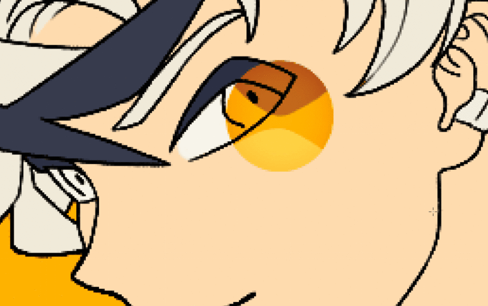
(▲ Example of eye template & application)
If you create an eye base template that excludes difficult-to-deform pupils and highlights, you can apply high-quality eyes (?) In a short time. Considering the number of characters drawn in one weekly series, I think this method is the most efficient. Some people may be reluctant to do this, but completing a manga quickly is one of the skills required of a cartoonist, and it means that you will spend more time on stories that are more important than painting. So think about it once.
This completes the base painting! The time I spent painting 8 frames was about 1 hour. Considering that the number of characters will increase to 60 frames, it will take 8 to 10 hours just to apply the base color. When I was challenging the weekly serialization for a short time, I had my assistant do this work (except for my eyes). It's actually one of the most fun tasks, so I'd like to do it myself ... Overall, I think it's best to finish this section as soon as possible.
Apply bass tone
The next thing to do is determine the background color and character tone. Although it is a very short section in terms of the total amount of work, it is an efficient work that can improve the completeness of the manuscript.
(▲ Add one clipping layer)
First, create one clipping layer (normal) to change the color of the background layer. You can create a clipping layer by creating a new layer and clicking the reference image icon. Clipping layers allow you to draw only where the reference layer is colored.
(▲ Add background color)
Put the color of each background on top of the clipping layer. This time, I tried to paint with as many colors as possible, but I think you should choose the color while considering the flow of the entire manga and the location of the character.
When viewed with the base layer, it looks like this. Now it looks like a color manga. However, if this is left as it is, the characters will float from the background, so I would like to add a color that will be the base tone to the characters according to the background color.
(▲ Add a clipping layer above the base layer)
As before, create a clipping layer on top of the base color.
(▲ Select the background color with the eyedropper)
Then use the eyedropper tool (short key "I" or "Art") to select a background color.
(▲ Adjust the color from the color circle)
Select a color from the color circle and change it to a light color mixed with a little gray.
(▲ Add tone color and change layer mode to multiplication)
① With the base color painted
(2) The selected tone color is filled on the clipping layer.
③ Layer composition mode changed to "multiplication"
Fills the entire character with the selected color and changes the layer mode to "Multiply". When you use the multiplication layer, the selected color is added to the base color and the base tone blends into the background at once.
(▲ Example of hue / saturation / brightness correction)
Tone Color can be adjusted at any time by opening the Hue / Saturation / Brightness Correction (Ctrl + U) screen. Basically, you can use the same series of colors, but you can select different colors as in this example. Choose a color that suits your scene so that your character doesn't float too far from the background.
(▲ Tone color added to each frame)
Tones are added to each frame to match the background color. Compared to the time it takes, it greatly improves the completeness of the manuscript. I think it's the most efficient of all the tips I'll show you today.
The main frame (webtoon "spread" scene) has a light yellow background and pink tones. It's a fairly light color, but you can tell the difference at a glance.
💡 TIP
In order to paint in this way, the character's base color must be a color that makes it easy to add multiplication layers. If it is too dark, it will be difficult to put other colors on it, and if it is too light, it will lose its strength. I think it's a good idea to update the color set as soon as you find a better color.
Add the shadow of the first layer
This time, I will paint the "shadow of the first layer", which takes the most time in the whole process. Even when we don't have enough time to complete the manga, we aim for quality that can be put out in front of people here. Personally, this is my favorite work throughout.
(▲ Create a clipping layer)
Create a new clipping layer and change the layer mode to "Multiply", just as you did when you created the tone.
(▲ Paint a rough shadow)
Select a slightly larger brush and apply a large shadow to it. The point is not to worry about the details. Apply roughly while considering the direction of light. It is okay to clean up the protruding parts and fix small shadows later.
This is the color used for the shadow of the first layer, but since the base tone already has some saturation, I mostly use gray. Even so, it is easier to use color correction later if there is some saturation, so I think it is better to mix colors a little.
(▲ Adjust the shape of the shadow)
Once you have a rough shadow shape, organize the shadow shape neatly and add a small shadow. As some of you may have noticed, although it took some time, I can't feel the difference in quality compared to the above picture. That's why I said I didn't have to worry about the details. Spending time on small shadows and small details is very inefficient. Personally (not bad), I think it's better to keep the small shadows only where you really need them and divide the time you spend there into sections where you can use them more effectively.
(▲ General frame)
I added shadows to other frames and adjusted the color. I only painted a big shadow, but I think it can be used as a general manga frame.
(▲ Main frame)
I spent more time on the main frame than on the other frames. Creating a certain quality gap between the general frame and the main frame adds strength and weakness to the manga, and I think it will also improve readability.
Add the shadow of the second layer
This time, I will paint the "shadow of the second layer" to give the picture a more three-dimensional effect. The shadow color used here can be exactly the same as the color used when painting the shadow of the first layer, or a slightly lighter color. The time required to apply the shadow of the second layer is relatively short compared to other work, but this makes the picture close to completion.
(▲ Add one clipping layer)
Create another new clipping layer on top of the shadow layer and change the layer mode to "Multiply".
(▲ Put the shadow of the second layer in the back)
Select the color you used earlier and apply the shadow of the second layer only to the deep part. Don't worry about the details like when you painted the shadow of the first layer, paint the part where the three-dimensional effect of the whole picture increases first.
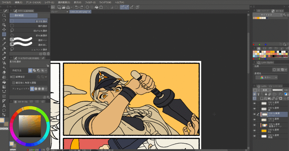
This was the only part I painted. If you take advantage of the automatic selection tool, you can spend even less time in this section. I used about 5 minutes for this frame and about 2 minutes for the lower frame.
(▲ It looks like the shadow of the second layer has been added)
I finished painting the shadow of the second layer. By dividing the work of painting shadows into two parts, the three-dimensional effect of the picture was increased, and the time used when selecting the shadow color was greatly reduced. It's also nice that color correction is easy because the number of layers is small.
Add highlights
This time I will paint "highlights". Adding highlights will add brightness and three-dimensionality to your painting. I think of this work in three main parts.
1 ‣ "Expressing the light that hits strongly"
2 ‣ "Add a light gradation"
3 ‣ "Change the color of the line art"
(▲ Create a clipping layer)
First, let's add "strong light". Add one "overlay" clipping layer on top of the previous layer.
Choose a highlight color. Basically, I think it's okay to choose a bright color from yellow to orange, but of course you can use different colors depending on the type of light in the environment where the character is standing.
(▲ Paint the part that is exposed to strong light)
With the selected color, paint the part that is exposed to strong light first. As with shadows, I don't think I'll draw all the shining parts, but I'll paint some parts where the overall three-dimensional effect is likely to appear and where the reader's eyes should go.
💡 TIP
As for highlights, it's difficult to get all the colors you want with just one color, like in the shadows. In this case, the black and orange areas did not show that much noticeable color even with the yellow overlay. In this case, try the following methods.
(▲ Add clipping layer)
Above the highlight layer, add a clipping layer in "normal" mode.
(▲ Add highlights on normal layer)
Select the color of the part of the frame that is used as the color of the light, or a color close to it, and paint it elsewhere. Layers are usually easy to pick up colors, so they can also be used to modify the picture in this way.
(▲ Add highlights to the main frame)
We will spend more time highlighting the highlights than the other frames. In particular, I think it is more effective for hair and eyes to shine only at certain times rather than always shining.
The same light depiction was added to all the frames. As shown in the picture on the second line on the right, there are scenes where there is a lot of light around the character, but basically the number of highlights is suppressed so that the eyes go to the main frame.
Now let's add a "light gradient".
(▲ 2 layers added)
Create one "normal" layer on top of the background layer and one "* soft light" layer on top of the base color.
- Sometimes overlays are used here. Please select according to your preference.
First, paint from the background. Click the layer you just created.
(▲ Add gradation to the background)
Select a background color and change the color slightly lighter from the color circle. Then select the Gradient (G) tool to add a light gradient to the background color to match the direction of the light.
Looking at the background as a whole, it looks like this. Since it is quite thin, it may be difficult to notice, but the completeness of the manuscript will definitely improve.
Now add a gradient to your character. Select the "Soft Light" layer you just created.
Select the color of the light (background) you want to add from the color circle. It doesn't have to be exactly the same as the background color, so you can paint it with a slightly different hue.
(▲ Add gradation to the character)
After selecting the color, lightly apply it on the character with a large airbrush while considering the direction of the light. You don't have to think that it will make a strong change. I think it's enough to change the color even slightly.
Similarly, I added a gradation to the entire frame. It wasn't a section where you could feel a lot of change compared to other tasks, but the expression of light became more natural than before.
Finally, I would like to change the "color of the line art".
(▲ Add one layer)
Add one "normal" layer on top of the line art.
(Select the line color)
Select a slightly darker color from the color circle. This color is the reddish color I chose to use for the flesh-colored lines. Please adjust the hue according to the color of the part.
(▲ Change the color of the line)
Select a pane with high opacity and trace over the line. I use these colors as accent colors only in certain areas such as lips and eyes.
Adding highlights like this completes the painting of the characters. Finally, add a texture and you're done.
Add texture
(▲ Open the material tab)
Click the arrow (<<) in the upper right to open the Materials tab.
(▲ Select texture)
When the tab opens, click Solid Color Pattern and select Texture.
Find the texture you like and drag it onto the picture. I chose "fine".
(▲ Adjust the strength of the texture)
From "Layer Properties", click the "Texture Composite" icon and adjust the "Strength". I adjust it to about "10".
This is the end of the whole process.
The time I used is about 5 hours. I am glad that I was able to complete some frames with satisfactory quality.
Postscript
Was the article helpful?
As a complete supplement, the names of the characters I drew today are "Xiphos" for boys and "Magnolia" for girls. Thank you.
I recently made and uploaded a video of a drawing course on Youtube.
If you are interested, please stop by.
(Https://www.youtube.com/channel/UCuB2Ub9AldXxt-vouSnvSXQ/featured)
Finally, I will upload a video of the process of the painting I painted at the bottom. The video fits the screen of your smartphone, but you can also watch it on your PC.
(▲ 🦁 Xiphos)
(▲ 🌼 Magnolia)
That's all.
Thank you for reading the long article.
Users who liked this post


Comment