
Introduction
Hi, I’m Siobhan, and in this tutorial I’ll show you how to design a cozy room. I’ll explain what gives a room a “cozy” feeling, talk about how to find inspiration and ideas, and how to draw a room from a floor plan using perspective rulers and various assets in Clip Studio Paint. Then I’ll show my process for how I made mine.
Video Version
How To Come Up With Ideas
First, what Makes A Room “Cozy”? A “cozy” room is a place that is comforting and relaxing. What are places that make you feel this way? A couple examples of places that make me feel cozy are coffee shops or my bedroom. But really any room can be made to appear cozy by including details like warm drinks, indoor plants, blankets, warm lighting, and calm or neutral color palettes.
To come up with a design for a cozy room, you can look in your own home or other places that make you feel comforted. It can help to make a mood or inspiration board using images you like. A mood board is a collage of images that you can use as a reference for your drawing. I like to make mine using a large canvas in Clip Studio and then copying and pasting images in separate layers on that canvas. You can find images for yours by using keywords such as “cozy interior design” in your online browser. There are also stores online where you can find furniture and decor. For color palette ideas, try searching online with keywords like “cozy color scheme”. I think “cozy” feeling palettes are typically warm, with less saturated colors, like pastels.
Using your reference images and/or mood board, try making thumbnail sketches to figure out your composition. Think about things like where you want light sources and whether your drawing will be in landscape, portrait format, or even with square (equal) dimensions. Where do you want the “viewer” to be when looking into your room? Will your drawing be viewed at eye level or from above, like the ceiling? Thinking about these kinds of details, making sketches, and preparing reference images can help a lot with making your room design. To start, try making a floor plan to help design your room.
How To Make A Floor Plan
When designing a room, it can help to make a floor plan first. A floor plan is a diagram with accurately scaled architecture, appliances, and furniture from an above view. There are a few ways you can go about making one: you can use online tools, draw one yourself, or you can use ready-made 3D models in Clip Studio and change the camera view to overhead. Online floor plan makers are fast and easy to use. Drawing one yourself will allow you to be more specific in what you want in your design and fully customize a room, but is more time-consuming. And the 3D model option is easy too, but you are limited by what the modeler has made. Another option is to use a combination of all three methods, which is what I did for my room design. This saved me from the time-consuming process of creating grids and converting the dimensions of every object and structure in order to scale everything down to size for my floor plan. I’ll show you how you can use each of these methods.
1. Using Online Floor Plan Tools
If you don’t know how to make a floor plan, that’s okay! I’m not an interior designer/architect, but there are tools online that can help. Search using keywords like “floor plan maker” to find sites where you can design a room.
For example, Floor Plan Creator is very easy to use compared to others I have found.
You can design your room’s plan with doors, windows, and change the size or width/length of the room’s walls. Then there are furniture options you can add to help figure out your layout. If you need help understanding room and furniture sizes, try measuring a room in your home by width and length with a tape measure. Then measure furniture in your room, like a desk or bed.
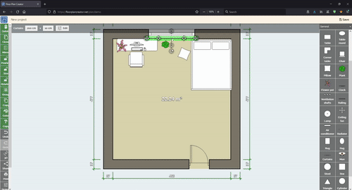
And you can see your room in 3D using this site.
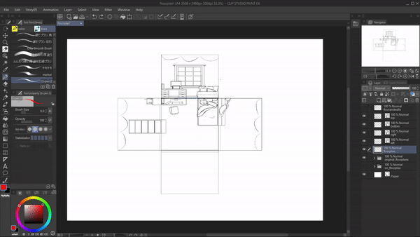
2. Drawing A Floor Plan In Clip Studio
You can also draw a floor plan yourself in Clip Studio (or other art programs) using the figure tool. First, start with the rectangle shape tool, and draw in your room. Thin rectangles are used to make windows and also the doors. For doors, you draw it facing the way the door opens. In mine, that means a door that opens inward, and you draw in a curve to show that. From there, you can use more rectangles or other shapes to show furniture placement. Keep in mind the furniture sizes in relation to each other.
3. Using 3D Model Assets

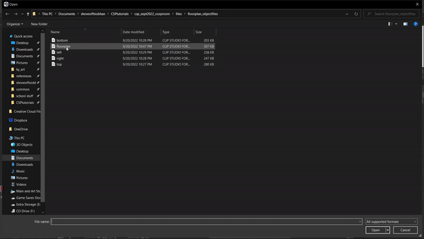
Either by using the Assets tab in the startup window of Clip Studio or using your browser and going to Clip Studio’s Assets website (https://assets.clip-studio.com/), you can find many 3D models. Search using keywords like “room”, “furniture”, “doors”, etc. Specify your search by clicking “detail” and under “type” choose “3D” and under “price” choose your preferred price. When you find something you want to use, click on it, and then “download”. This asset will now show up in your “materials” window when you open Clip Studio Paint. When you want to use it, find it in your materials window and drag the model onto your canvas.
My Process
1. Sketch And Floor Plan
For my cozy room, I knew I wanted to use a landscape format and to include:
✨A desk and bed.
✨A pastel color palette with soft, warm light coming from the fairy lights and the computer monitor.
✨My art tablet because drawing is something I find relaxing.
✨A window with a view of the night sky outside.
✨My cat sitting on my chair.
✨A bookcase that has books and figurines.
Using the thumbnail sketches and mood board from earlier, I cleaned up and adjusted my floor plan in Clip Studio, then added in details. For this, I referenced the website I mentioned earlier to help determine sizes and scale.
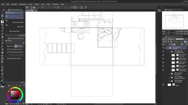
I then added walls with matching “heights” (floor to ceiling length), keeping each wall and the floor plan on separate layers. Then added in the furniture, the window, and decor from the floor plan to adjacent walls. This all helps later when drawing in perspective. I didn't bother drawing in many details for the bottom wall because I already knew I was only drawing the upper half of the room for this artwork. You may want to include all walls, structures, furniture, etc. if you haven't decided what your view and angle will be, or if the room will be used repeatedly for comics/animation and need consistency. After I’m done drawing the walls and furniture adjacent to the floor plan, I converted each wall and the floor layers into File Objects just in case I needed to edit these layers later.
2. Convert Layers To File Objects
File Objects are special layers of images that can be loaded into a canvas in Clip Studio, but keep original visuals.
Any new and saved changes to the original file object will then appear in any files it was imported into. It also retains the original resolution, so it can always be resized in another work but keep the original file object layer’s quality.
To convert a layer into a file object, just right-click on the layer and select: File Object > Convert Layer To File Object. Then choose the settings you want to use; I used Area: Drawing Area, and Keep Original Layer. Changing your layers into File Objects isn’t absolutely necessary, however it can be very helpful if you need to add in extra details or make edits later, but don’t want to redraw everything.
3. Perspective Ruler
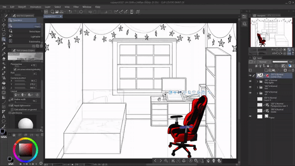
On the floor plan layer, I first used Edit >Transform > Free Transform or Perspective. For my work, I used one point perspective, meaning one vanishing point is used. So I widened the bottom edge of my floor plan and decreased the height of the layer. Now the top edge is shorter than the bottom.

Once I had my floor and walls roughly where I wanted, I added a Perspective Ruler. This is located at Layer > Ruler/Frame > Create Perspective Ruler. Choose one, two, or three point perspective. For this, I used one point. I used this to help correct the angles of my lines.
I dragged the guidelines and grid until it mostly matched up with the edges of the floor plan. Then I transform the walls layers to match up with the floor plan and ruler.

I lowered the opacity of the walls and floor layers, turned on Snap to Special Ruler (an icon for this is located at the top of the window), and used new layers above the walls/floor. I start drawing in the furniture using the information from my floor and wall plans. Using the Snap to Special Ruler setting lets me draw in straight lines that match the perspective ruler I made earlier. I clean up some of the intersecting lines as I go, turning on/off the Snap setting as needed.
If you need help to decide which angle of your room is best, either you can use the online floor plan makers or 3D assets, or you can reuse your file object layers to create sketches of the same room but with different perspectives, using the same steps as before.

Once I had most of the furniture drawn using perspective, I changed the size of the image, so I could have a more zoomed in composition that was closer to my initial idea and sketches. I did this by selecting all my drawing layers and the perspective ruler layer, and while changing the size of these layers, I used the shift button as I dragged the sides/corners to keep everything at the same scale.
When done, I lowered the opacity of all sketch layers, so I could start line work.
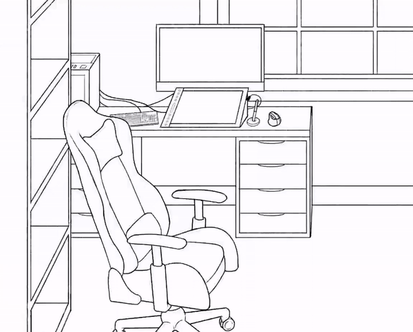
4. Line Work
Using new layers above the sketches, I start tracing over my drawing with clean lines. I like using a pencil brush for my lines to give a more organic look. Below is a link to the brush I used (specifically (Pencil 2"):
I keep my lines for each piece of furniture/object in separate layers. I show and hide the visibility of the perspective ruler as needed, hiding it when I don’t need to see it and need my drawn lines to be easier to see.
Something that helps me when drawing lines for several objects in one space, is to use Change Layer Color. This is located in the layer menu below the opacity bar. This can make it easier to draw objects overlaying each other.
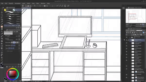
At this point, I used 3D models to help draw the chair and keyboard at the desk, as well as the stars for the fairy lights lining the ceiling. I used the Object tool under Operation to change the 3D models in size and rotation. With the star models, I rotated and shifted each model, so they were more random. I moved the chair model until its grid matched up with my room's angles. This makes the 3D model exist in the same perspective as the rest of the room.
Here are the 3D models I used:
When I was happy with the placement of the 3D models, I extracted the lines of those layers to create 2D lined images of those objects. This helps speed the drawing process and make accurate three-dimensional objects that fit into your drawing. This is really helpful for illustration and comic work.
To do this, while having the layer with the 3D model highlighted:
✨ Go to Window > Layer Property > Extract Line (this is the icon with the overlapping circles image)
✨Next, choose Convert Layer To Lines And Tones. This will open a new window with multiple choices. Click on Preview, so you can see how the extracted lines will look
✨Then choose your Line Width and then Accuracy Of Detection. Adjust these for your desired look. I needed to turn down Accuracy Of Detection for the chair lines to avoid having it line all the textures of the model
✨Then you can make decisions about Tones and Posterization; I only wanted the lines for my models, so I skipped these options
✨When you like how the lines look, click OK
There will now be a new folder of layers, including the new lines and the color fill underneath. The original 3D model will be below the new folder with visibility hidden, which can be helpful if you decide later you want it changed, in which case you can just repeat the above steps using the original 3D model layer. Now you have lines that you can change the color of and can also color underneath since the lines have transparency.
You can choose to leave these as they are, but personally I wanted everything in my work to have the same line widths and a more pencil-y look, so I traced over the layers with the extracted lines. (For example, I wasn't able to get the extracted lines of the stars to look just right to my liking.)
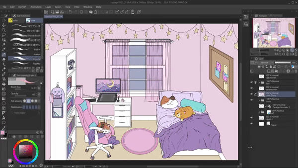
5. Flat Color Fill
I made new layers below the line art to use for color. At this point, I like to keep color layers in separate layer folders for each part of the work. This helps if I need to edit anything later on. I don’t worry about exact colors yet, these are just for making clipping masks to help the coloring process so I don’t go outside lines. I used the default wand tool and the bucket tool, but I also used an asset that speeds this process by allowing me to draw in selections that it automatically filled with whatever color I’m using.
Above each color mask layer, I add a new layer and clip it to the mask. This is when I make decisions on colors for each object in the work. If I need to tweak anything, I use Edit > Tonal Correction > Hue/Saturation/Luminosity.
Before moving onto shading and light effects, I checked my value range by changing the Expression Color.
You can do this by going to Window > Layer Property > Expression Color > Gray. If you have multiple color layers like I did, you’ll need to first duplicate the folder of color layers and merge them, then change its expression color. I avoided messing with my original layers by highlighting all layers I wanted to merge, right-clicking them in the layer menu, and then choosing Merge Visible To New Layer. If the value range isn’t varied enough, you can make adjustments using Tonal Correction again.
After finishing my flat colors, I decided against my original idea of using carpet for the floor, and chose to use floor paneling instead. I added in lines for the flooring by using the perspective ruler on a separate layer. I then added in a wood grain texture using a Clip Studio Asset brush:
I used Free Transform to match the texture to the perspective ruler and the floor edges.
6. Shading And Lighting
I thought about where I wanted my light source(s) so I would know where shadows and lighting should be. I added new layers above the flat colors and clipped them to the layers I want affected when I added in shadow and light. For both shadows and lighting, I included a combination of soft and hard edges by using different erasers and used the default G-Pen brush to draw in the shapes for light and shadow.
For shadows, I used layer modes Multiply, Color Burn, and Linear Burn and used cool colors like mid-value blue and purple. I changed the opacity of each shadow layer to whatever looked best, but usually about 20 - 40% opacity. Then I added in any additional and darker shadows, by using the same process.
Then for lighting and highlights I did the same steps as before - adding new layers, and clipping them to the flat colors. The differences are that for the lighting I used layer modes Overlay, Glow Dodge, and Add Glow and used warm pastel colors like yellow and white. I kept adding various layers of shading and lighting until I was satisfied with my work.
Something that helps me when shading, is to have another view of my canvas that is zoomed out. This helps me see how my color choices and shadowed areas look overall. You can do this by going to Window > Canvas > New Window. You can also resize your Navigator window. Changing the Color Expression to gray again here can also be useful when checking the value range.
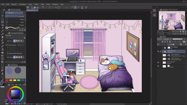
7. Color Lines
Once I was done drawing in the main shading and lighting, I decided to color my line work. Changing lines to something different from black can help make an artwork more cohesive. More importantly for this tutorial, it can help soften an artwork, helping achieve that “cozy” look.

Above, you can see how this affected my drawing. To color lines, add new clipped layers above the layers with the line work, and use brush tools as well as the bucket fill tool with the new desired color.
8. Paint Over Areas
In this artwork, where I had a lot of fabric, I decided to paint over my previous color layers in order to have more realistic looking folds.
I added new clipped layers above the necessary color layers (for example, I had the blankets and sheets in separate layers) and using a combination of the two brushes below, I painted over the different areas.
I kept in mind where light would hit objects and how the blankets would fold on themselves and create shadows. I checked the value range and zoomed out of the canvas often as I went.
9. Finishing Touches
After I’m satisfied with the artwork’s lines, color, and shadow/lighting, I’m ready to adjust color and saturation. I made new layers above everything else and using the Gradient tool I added in lighting and shading effects. I did this by using layer blend modes again like Overlay, Multiply, Glow Dodge, etc.
I then finished the work by adding this noise texture:
I dragged the texture onto my work, then set the blend mode to overlay, and lowered the opacity to about 15%. This helps break up lines and edges, which softens the look of the artwork.
Conclusion

Thank you for looking at my tutorial! I hope it was helpful and successfully explained how to design a cozy room in Clip Studio Paint. Below is a link to my Twitter in case you want to see more of my work or want to chat:
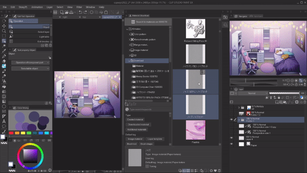
CSP Assets
Below are links to all the assets I used for this tutorial:
Users who liked this post


Comment