
Hello and welcome to this tutorial! My name is Dove, and today I'm going to give you some tips and techniques on how to easily add color to your character illustrations.
Let's go !
HOW TO CHOOSE YOUR COLORS
• Find inspiration with color palettes
In Clip Studio Paint Assets, you can find color palettes already made and pre-made by other users, you can find them in the search bar “color set”.
The Internet is also a wonderful source of inspiration, and having the little tricks can sometimes help a lot: if you have no idea which color to choose, I invite you to search for “movie color palette”, which lists several color palettes from film and can give superb compositions. Another nifty site to know is “coolors”, which is a color palette generator and can help you out if inspiration is lacking.
Once you have chosen your palette, you can save the image, import it to your canvas and pipette the different colors into the Clip Studio Paint palettes.
Using the meaning of colors is a good idea depending on the mood you want to give your drawing. For example, cooler colors can give your illustration a more melancholic side, while warm colors can bring a more festive side.
The use of complementary colors (orange/blue, red/green, yellow/violet) is also a very good idea for a successful composition.
The secret is not to be afraid to combine amazing colors with each other, it is important to dare!
• Using the color wheel
The color wheel is a wonderful tool that should not be overlooked.
When you select a color, you have several color viewing models available, including the color wheel.
Once you have selected a color, there is an easy way to choose the shade that corresponds to it: on the color wheel, move your slider down to the bottom right, and turn the wheel towards warmer tones. You get a warm shadow result, and it avoids a color fade if you just drag the slider down. It works for everything, for skin, hair, clothes...
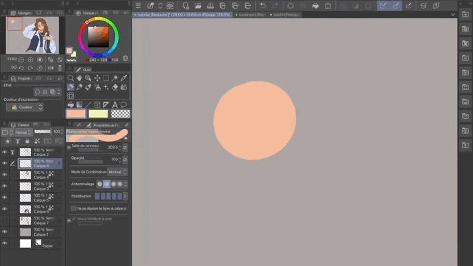
It is my little technique that allows me to have uniformity in the values of my illustration. Afterwards, it's up to you to dose as you see fit, and according to your preferences. I advise you to work on a low saturated gray background, it helps to see the color values better than a white background.
PLACE BASIC COLORS
• Fill tool
A tool to know to save you time when drawing is the fill tool, also called a paint bucket. Once your sketch is clean with line art, you can turn your layer into a reference layer. This will allow you in a few clicks to fill your shapes on different layers.
To do this, look in layer, layer setting, set as reference layer.
This should bring up this little icon, here in red:
Now you can fill your forms very easily. You just need to put a new layer below the reference layer, use the paint bucket and click where you want to put the color.
You can switch between the different settings to get the best possible results depending on your drawing, such as the “level” tool which allows the color to extend further than the lineart and avoid gaps. holes in your color. Example with leveling (right) and without leveling (left).
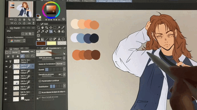
• Organization of layers
I advise you to distribute your layers by elements: one layer for the skin, one for the hair, the clothes... This isolation system allows you to see more clearly in your work, and also leaves you room for change. if you finally decide to start something again.
For example, let's imagine that I would have preferred my character to have red hair and not brown, I can always change that at the end by going to edit, hue correction, hue saturation brightness.
And hop, no more need to go to the hairdresser; )
To finish with the organization of the layers, I advise you to check the “lock transparent pixels” feature (in blue here). This will simply serve not to exceed your layer, you do not take the risk of coloring next to it.
At the end of this step, my drawing looks like this:
PREMIERE OMBRES
• Shadows: how to place them
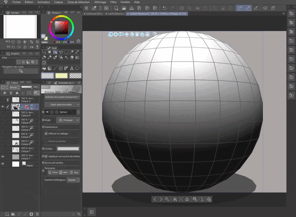
Clip Studio Paint has some wonderful resources to help with shadow placement: when you import a 3D model onto your canvas, you can use the “apply light source” tool to see your object get illuminated by a spotlight and therefore you needle in the placement of your shadows.
• Airbrush, hard brush and soft brush
I usually only use three brushes. An airbrush, to place the first shadows and give a start of volume; a hard brush, like a pen or a marker, and finally a softer and blending brush like the oil paint brush.
Place a first shadow with the airbrush, and then start placing sharp shadows in the other places. Do not be afraid to make a mistake or to make it too marked, you can always tone it down afterwards! I use two shadow color thresholds, a first for the majority and a darker one for places that require more depth.
Once all this is placed, you can use a paint brush to soften and blur some shadows, depending on the rendering you want to obtain.
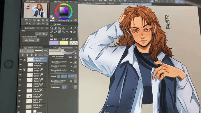
This is what my drawing looks like at the end of this step:
HIGHLIGHT AND BONUS EFFECTS
• The lights
And finally, my favorite moment! Take a lighter color, and place small accents of light in the desired places. I like to put a lot of it in, but you can also keep your design more restrained.
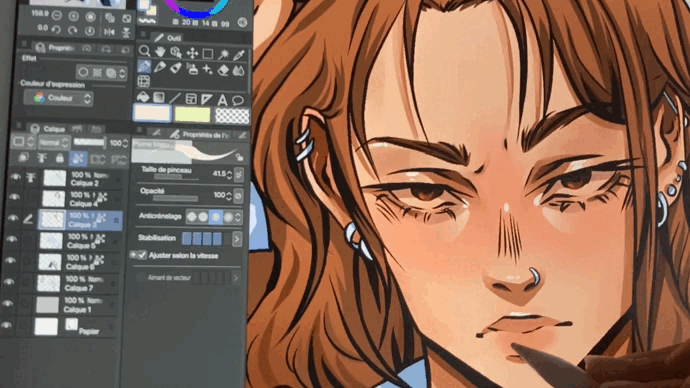
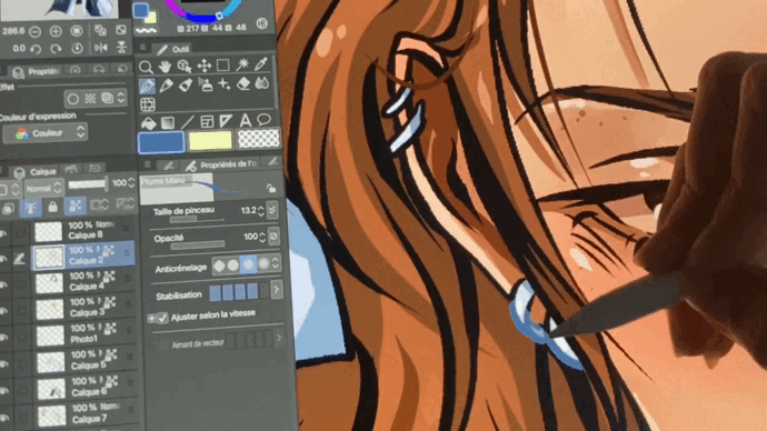
• Color the line art
It's time to add small details. Personally, I take advantage of this moment to color my line art. I lock the adjacent pixels on my layer, and I color the edges with a more suitable color than the one I put to color the element.
• Fusion mode
Finally, here is a small additional step. It is a question of playing with the blending modes, and more in particular the “overlay” mode. The latter will be added to your illustration and play a kind of color filter effect. Here is an example with a light purple:
Or with an orange tone:
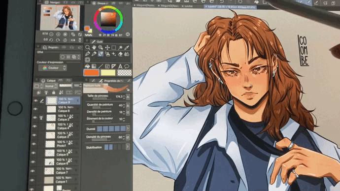
This can really transform the mood of your final room, and can be very useful depending on what you are doing! If you make a character in the middle of the forest for example, if you put an orange it will give a golden hour effect, but if you put a cold light blue it will produce more of a full moon atmosphere...
There you go, you are now ready to tackle the color of your illustration!
This was my technique, but there are obviously plenty of others, it's up to you to find the one that works best for you. The golden rule is to always have fun, and not be afraid to make a mistake!
Thanks for reading this tutorial! I wish you a wonderful day, and if you want to find me on instagram or on tiktok: @colombe.art_ <3
To have the tutorial in video format:
Users who liked this post


Comment