
Hello Hello !
Welcome to this new clip on studio paint clip!
Today, I take you traveling with me in the history of my country: France! 🇫🇷
We will see together how to write imitating the appearance of the old French calligraphy!
But before, a little French history course is needed to understand where this old style of writing comes from ('∀ `)
1: HISTORY AND ORIGIN OF FRENCH CALLIGRAPHY:
French calligraphy or European calligraphy, developed in the Middle Ages, was born around the 7th century, then gradually disappeared after the invention of printing in the 16th century. At the time, this type of writing was closer to art than mere writing. In France, it was used by copyist monks who specialized in manuscript copy and Catholic writing.
The calligraphy, at that time, was decorated with small drawings, as well as many gilding. In particular, the capital letters, at the beginning of sentences, were voluntarily much larger than the rest of the letters, in order to be able to decorate them in a meticulous way.
The copyists and illuminators could spend hours and hours on a single page, polishing every detail to the nearest millimeter, with remarkable precision.
Calligraphy and illumination were therefore used mainly by the monks in the Middle Ages to illustrate, decorate and write religious texts.
2: THE MINUSCULES:
In French writing, words are written with "lowercase" letters, and letters at the beginning of sentences are called "uppercase".
In this second part, I will show you how to write lowercase letters with Clip Studio paint.
I use here an iPad Pro 12.9 ", as well as the Clip Studio Ex paint software, to realize this tips (⌒ ▽ ⌒)
A: Prepare the workspace
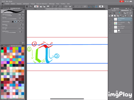
First of all, before you even start writing, it is important to place writing references to be able to write more easily, and in the right way the letters ( 'ω' )
To be able to draw lines, we will have to put the grid on the whole of the sheet to be able to make lines very straight and perpendicular.
To do so, go to the [View] tab and select [Grid].
The grid is thus laid, so we can start to place the marks of writing!
B: Place the lines of writing
To draw lines, I used the tools: [Straight Line] set this way:
Then I drew the first main lines this way:
Always with the same tool of tracing, I drop a little the size and trace other marks. In another color this time to not get tangled brushes once I started writing ☆ ~ (ゝ .∂)
Once done, I remove the grid, the same way I put it.
Here is the result ( '▽' ):
All these lines are on the same layer.
C: Useful traits in calligraphy
Well ! Now that our landmarks are drawn, we will be able to move on to the writing of letters!
In this tip, I will use the pen tool: [Calligraphy], set like this:
The size does not really matter, however, the adjustment of the direction is essential for the shape of the calligraphic feature. To obtain the same results that I will present to you, it is important to calibrate your pen in the same way shown above (〃ω〃)
Below, these are the features used in calligraphy of lowercase letters. I used a color code so that beginners in this way of writing are more comfortable, I really hope that it can help your understanding! (* '-`)
Translation of traits:
1: wave (red)
2: right loop (yellow)
3: left loop (green)
4: bars (blue)
5: rhombuses (pink)
With a few exceptions, these features are all used to draw lowercase letters in calligraphy, if you have never used the calligraphy pen in a studio paint clip, you can practice drawing these traits to familiarize yourself with the technique:
D: The path of the letters
I drew the example below to show you how to draw what I call "The three types of letter" x)
Normal category: a
Bottom category: y
Top category: k
The color code of the plots shown above is here illustrated, and a plotting order is also explained:
(I also made a video on the process of drawing the letter a)
The letters of the normal category are between the two blue lines, and do not overtake it. (Letter a)
The letters in the low category are between the blue line at the top and the red line at the bottom. (Letter y)
The letters in the high category are between the bottom blue line and the red line at the top. (Letter k)
E: The entire small alphabet
Here is the alphabet of lowercase letters from A to Z, of course the color code and the order of the lines are present, to facilitate the understanding of this tips (· ∀ ·)
And here it is written in a normal way, in black:
3: CAPITAL LETTERS:
In this third part, we will see the capital letters!
(I feel like a teacher haha)
Capital letters are therefore the letters at the beginning of the sentence, in French, to show the beginning of a sentence, the first letter is capitalized. Capital letters are larger than lowercase letters. This ratio of grandeur is respected in French calligraphy.
In French calligraphy, the capitals are very large, and can alone represent a true work of art! We call them drop caps!
Unfortunately, there is not really a color code or even a plot order for uppercase letters.
These are all different from each other, so it's hard to separate them into several categories of features.
Here is the capital alphabet in full:
First with the writing references:
Then in a normal way without anything:
Small precision: to trace some of the fine straight lines in the middle, I had to change the direction of the calligraphic pen, like this:
But if not to trace the rest of the letters, I did not change the settings of the pen that I had previously shown: 3
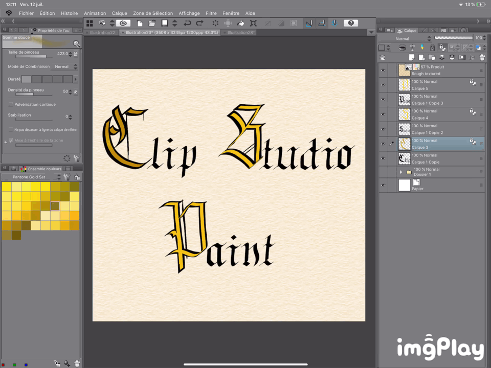
4 : ILLUSTRATION CALLIGRAPHIQUE :
In this third part, I will explain how I realized this illustration with Clip studio paint:
First, I will write the text.
I will do as I showed above in the tips, and write in a calligraphic way the words that I want to represent.
So I take the pen [Calligraphy], without changing the settings, then I trace the letters. I represent the capitals much larger than necessary, because I will decorate them towards the end, so I want it to take much more importance compared to the rest of the text: 3
That's what it gives once written:
Then I will add texture to the illustration to reinforce the calligraphic look of the drawing by giving it an area of old parchment / manuscript ( ^^ )
To do this, I will select the texture [Rough Textured]
I will then place it at the top, above the layers on which the words are written, then change the color of the texture, just to give it this old parchment aspect:
Once these two steps are done, I just change the layer as [Product]:
Important: This layer must always remain first, no visible layers must be above!
Once done, I just add a layer above the layer where I wrote: Clip
On this layer, I will come to draw some kinds of gilding on the capital letters, I will now start the decoration of the initials! ( _ )
So I take the pen [Calligraphy] set this way:
I chose to take a yellow color, with a note of orange in it: 3
Once the parameters are ready, I just draw light gilding in the capital letter, like this:
Then I use the transparent pixel lock option to be able to shad, and give a golden impression to my feature.
This option allows you to draw only where you have already drawn, without having to add layer, or even overflow.
A picture will be more telling than my explanations:
So I repeat the same step for each capitalization, and lock the three layers as below:
Once my layer is locked and ready, I change tool for the Airbrush [Sweet Eraser], I choose a darker orange color, and adjust the tool like this:
I next shade the borders of my yellow lines, like this:

I then change the color of the Airbrush for a shade of glass / brown, set like this:
And I come back shading very slightly my gilding:
I repeat steps on the other two capital letters ('∀ `)
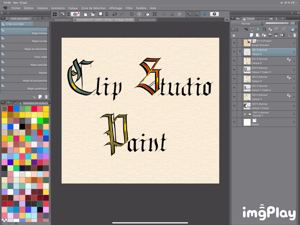
Once this step is finished, I take again the tool [Calligraphy], reduces the size of the brush, and takes another color at the same time.
I chose a blue that is very close to the one used by medieval monks.
So I come again draw traits in the capital letters, without exceeding the gilding previously made of course, the goal is not to cover it entirely (¯∀¯)
That's what happens when you finish on the capital letter C:
For the letter S of Studio, I chose a pretty pure and deep red like this:
And to finish with the P paint, I took a rather dull green, which corresponded well to that used in the Middle Ages:
This is what the illustration shows at this stage of the work:
I will now group all the layers in one (except the one of texture at the top), it does not serve me any more to separate them, it makes me the work plan clearer (◠‿◠)
Once done, I'm going to add a layer over all the ones I just grouped:
I decided to draw light and elegant decorations on capital letters, which will extend the shape of the letters. I also make slight lines in the letters: 3
I used the pen [Calligraphy] set this way:
I also refocused all the letters because they found them slightly too much aside, I used this little button at the top to be able to move it:
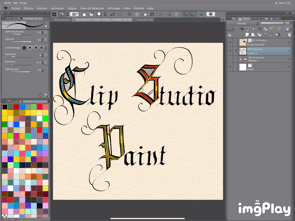
The illustration is now finished !!! ( '▽' )
Here is the final result as shown at the very beginning:
4: SMALL GIFT:
Before going to the end of this tip, I wanted to make you a little gift! ('◒` )
During the realization of this tips that took me a lot of time, I understood and learned that calligraphy, regardless of nationality, is an art in its own right that requires a lot of energy, concentration and attention to detail. gesture. This is not anodyne writing, it is quite difficult.
That's why an idea sprouted in my little head when I was doing this tips! (1 · 1 · ̑◡)
I created pens that write for you in a calligraphic way! Exactly the same way that we saw everything at the top! ('∀ `)
Here is a small excerpt from its use:
Of course the 27 letters of the alphabet are there, there is a pen for each of the letters!
The same version also exists for capital letters!
The lines of writing are also available with the pens! (^ ∀ ^)
So you can either write by yourself, or use these pens that are a considerable time gain in terms of French calligraphy!
Here is the link of the download page:
5: END
So this is the end of this tips!
I hope that it will have helped you, and also interested to discover a tiny page of the magnificent French history!
I took a lot of fun to teach you all this in any case! ( ≧ ∀ ≦ )
And as said in France:
Bisoussss! : * +. \ ((°° °)) /.:+
Instagram : Hedonie_art
Users who liked this post


Comment