
Introduction
Hello, this is Dangily. I have been drawing on Clip Studio Paint(smartphone version) for almost 2 years now.
Today I will talk about the topic "Shading" ( For your information I will be talking about lighting too as they are complementary and one cannot be described without the other one!)
Also this tutorial ended up a bit bigger than I expected it to be, so tap on the topic on the "Index" you might be interested to check first<3
In this tutorial I will be going to this things:
1) Basic concept and theories on how shadow works.
2) Examples of how different tricks in shading can enhance your art.
And MAINLY Tips that will help you for shading quicker using features in clip studio paint(some of the features only available for ver 2.0 and upper)
Now without further delay let us get started!
BASICS OF LIGHT AND SHADOW
So if you have basic science knowledge you would know light travels in straight path. If it get interrupted by an opaque object/surface some of the energy of light gets absorbed inside the hit object and the other part bounce away aka reflects (depending on the angle)
I will not blabber too much about all the too basic stuff about shading as most already know about them and can be easily found online.
Things mainly you need to keep in mind:
i) Sharp and intense shadow when the object is closer to the surface where shadow is created.
ii) If the object which is making the shadow is far the shadow is blurred and vague.
iii) Some places will always create shadow without a specific light source(for example: nostrils, inside ear, clothes wrinkles etc)
Color concept of shading
i) Using a saturated midtone
ii) Using reflected light desaturated but less intensed (depends on what type of colored objects are near, neon and fluorocent colors reflections are intend to have a strong effect)
iii) Use a bit different color for every change of plane. (For example, between eyebrow and eyelid)
iv) Among the skin tones, darker tones tend to absorb colors more. So light skins are more reflective and as a result the real tone isn't really seen. It is more like the color around it makes it seem the way we see it. Also light tones are more transparent and that's why veins are often scene through the skin.
So if you’ve understood the concepts upper I hope you can use your knowledge and creativity to achieve better results.
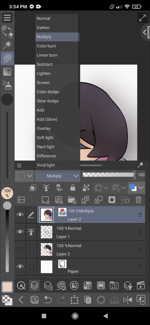
Blending modes
Blending modes can be tricky so learning what they do will help you enhance the shading and overall art.
Darken, lighten work only on certain values so using them can create unique effect.
It is helpful for changing color, hue, saturation,invert and so on.
-The darken, multiply is mainly used for shadows
-While color dodge, add, glow, soft light for light and highlight.
-Overlay for color change.
Experimenting with them in my opinion is the best way to find what you're looking for.
(A texture image on selected part of hair with screen blending mode)
Examples of how shading can ENHANCE your art
Shading
-gives depth
-can change the mood
-shading shapes can have dramatic effects(under tree, directional light)
But when you do not have a specific way of shading (this is me, I never find any shading that I like and end up changing, experimenting and more-TO FIND THAT I LIKED THE FIRST ONE (joking).
Actually experimenting throughout all the features made shading less intimidating and versatile! And fun too hehe.
So finally below I will show you some features that you can use with quick tips at the end of the features that can enhance shading.
"FEATURES" IN CLIP STUDIO PAINT THAT CAN HELP SHADING EASILY:
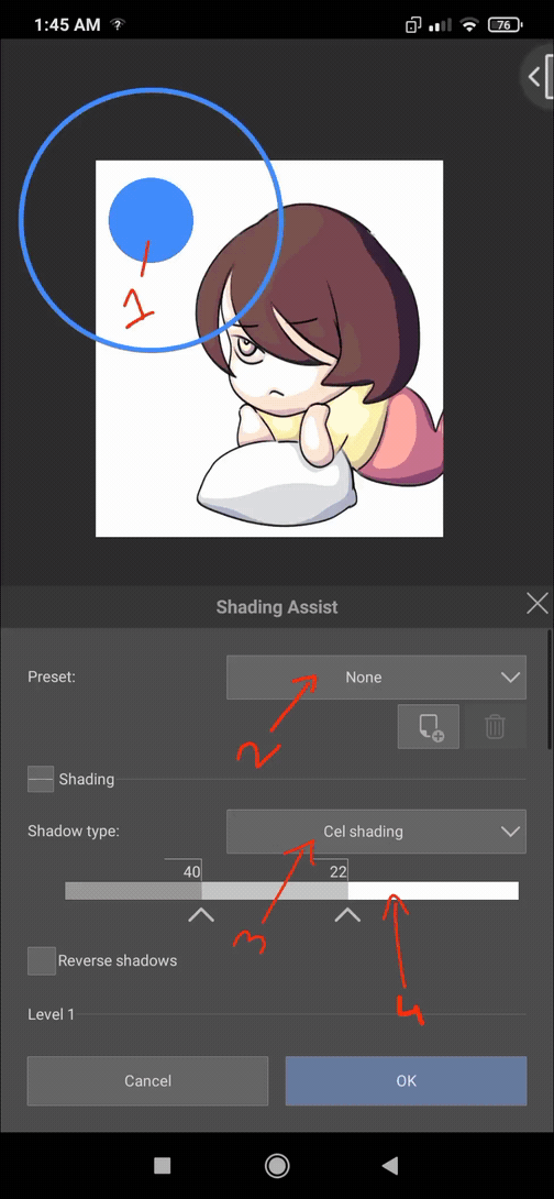
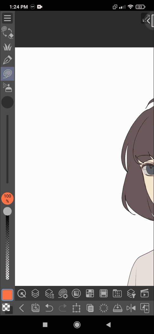
1)Shading Assist
A new feature launched in version 2. It creates beautiful shading (cell or smooth) automatically.
It can be specially helpful for comic art or etc when near deadline. Or you can experiment with this for what type of shading would look good before you shade yourself.
For using shading assist:
1. Have a lineart. (works better if it is clean and dont have confusing details)
2. Set the lineart layer as reference layer. (Can work without it but helps with details and stuff)
3. Now go to the next layer and add flats. You can have a folder too with flat colors on different layers. Just select them and insert them in a folder .
∆Remember∆ the flat color layer/folder needs to be your "current layer/editing layer" for shading assist function to work.
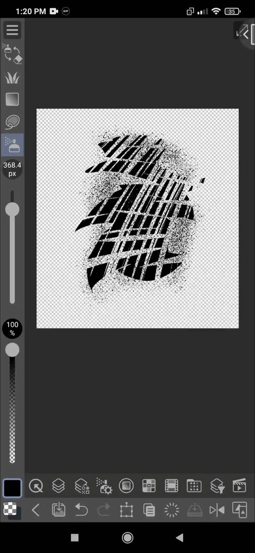
*Do not use gradient or shadows in flat layer as it will break down the shading(I will show what happens at the end of this discussion)
4. Go to [Edit] menu>"Shading Assist"
(In pc menu is on top)
5. A pop up setting window will show up.
In smartphone, you have to scroll to see every option there.( Everything is same with pc version )
SETTINGS:
[check the number of first slide in GIF]
1|Light source
(By scrolling down you will find two types of light source:- Ball light and Directional light.
In directional light you can change the direction of light by moving the arrow )
  2|Presets drop down. Theres a list of defaults here( standard, evening, night..)

Beside, there is a icon with (+)is for saving custom presets. After editing settings of the default ones you can save them with a name.
And after that is deleting presets. Defaults ones can't be deleted.
3|Shadow type: Two option here Cell and soft.
4|The scale or meter(idk whats this called tbh ^^') the different points (nodes) represents different shadow layers. If you have 4 nodes ,there will be 4 layers(max 4 layers). The right side is for light part and left side shows shadow layers. If you take the point for light from right to left it will expand, whereas shadow points will expand when moved left to right.
(Sorry for adding this slideshow type of gif- :'D since shading assist function takes a long time in phone I didn't add the video gif)
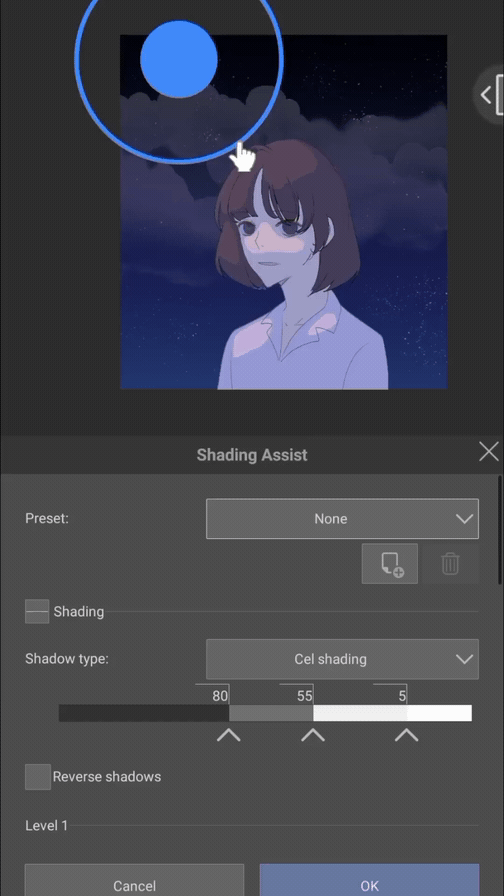
You can alternative the size of the light source too.
There is an official thorough guide for every options and their works. I would suggest you look that up and experiment with them.
My recommendations are:
~ click okay (✓) refer to lines on reference layer. And play with the strength (useful for detailed lineart)
~using 2-3 nodes (layers) for CELL SHADING (one for lighting with blending mode like screen, soft light, color dodge, add glow)
And (another 1/2 layers for shading with multiply,darken )
~my favourite is the SOFT SHADE,
Both highlight and shadow parameters have hue saturation blur etc..
I like to take highlight as layer color(change hues and blur a bit)and shadow as base color( a grayish or mid saturared blue/sky/purple color)
If I want a warm look, I choose highlight- base color, a saturated dark orange.
4| After you have gotten the result you're satisfied with, tap on [OK] at the bottom.
EDITING THE LAYERS AFTER RUNNING SHADING ASSIST:
I tried blurring the cell shading to create a different look and then used a soft airbrush to add other colors in the shading.
It is better to use only two nodes(to create two layers- one for light and one for shading)
Then select the shading layer and,
[Filter]menu> blur> gaussian blur or motion blur.
If you want you can blur the light layer too.
Then for adding colors to your shading layer, tap on [lock transparent] icon and use a airbrush with a different color.
If you feel like it you can edit the blending modes too.
(added blue for ambient light)
🌆We can use this for blending the characters with background.
Just erase or paint things you need to change with a brush ;) or paint over if you prefer that. (Make a new raster layer on top of every layers and paint by picking colors)
I used clip studio official image material from asset store for the upper drawing, id:1358832
During experimenting I came to find something interesting. When I have use a flat color layer but with a bit of shading or making gradients with soft airbrush and then run for shading assist. A wavy design like this creates.
That is why you need a solid flat color for using shading assist the right way
So, we are finally done with shading assist tutorial. Heres a tip: do not use shading assist always as it isn't the most perfect look. But at times with tight deadline or you dont aim for perfection (MOBs or BACKGROUNDs where there is no focus) it is very helpful. You can take the colors and use your hand to make the result look better!
2)Using 3D MODELS For Shading Reference
3D models can be very helpful for drawing complex and dynamic poses. But thanks to the light source and shadow features... We can use this to understand which parts to shade and overall use as a shading reference.
Shadow shapes can help with expressions, mood and dramatic effect. ( For example, using a real dark shadowed face can express horror or sometime malice )
I'll demonstrate this in video GIFs but first I will show the 3D materials I can use.
New face blending feature (launched in ver 2.0) is pretty amazing and can be helpful for reference for different face shape characters!
I haven't checked the other 3D objects yet but I'm pretty sure we can use the following settings for those too.
Now [for smartphone] double tap on a 3D head model/body for inserting it on canvas.
[For PC, drag and drop the 3D head/body on the canvas from the material window]
Resize or give pose as you want. (I'm not explaining everything here as it isnt my main focus but for your information Clip Studio Official tutorials has a in-depth guide for 3D materials and face blending, check that out)
Now
i)Tap on the wrench icon (🔧) down left of the model and you will have see all the settings on a pop-up dialogue.
ii)There you will see a list of options, where you can see ambient light and directional light which we will work on.
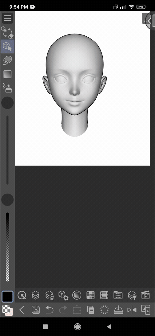
Here in the middle is a ball which repesents light direction on the 3D head. Under are: i)Directional Light Color
ii)Directional Light Intensity
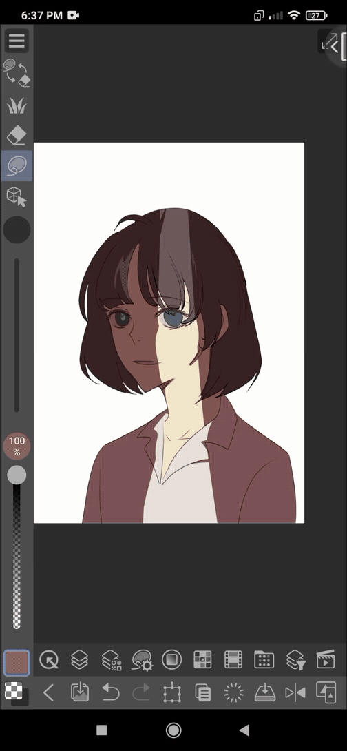
Tweak the parameters to find a nice tone
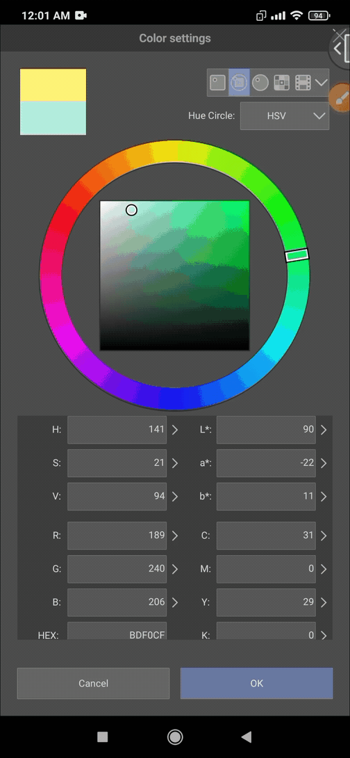
Now tap "Ambient Light" and same with the options. Choose a color that you want comes from the surrounding of the character. For example I chose light sky+green here.
NOW, after finalizing. Pick colours from your 3D model and use the head/model as reference for shadow and light
.
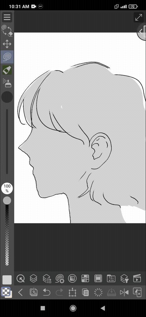
3)From Grayscale to Colorful (Gradient Map)
This is very useful for those who have better understanding of values and grayscale drawings but struggle with colors. (You do not necessarily have to have value knowledge, you can turn a colored art into grayscale and use this)
1. I have a grayscale drawing here. ( I did it from scratch so its not looking so good :'))
2. It is easier if you have the parts separated in different layers. You can also use the lasso tool to use gradient map on specific parts in one layer.
3. Now I used the lasso on the skin of my character and go to
"Edit bar"> "Edit"> "Tonal Correction"> "Gradient Map"
I tried the default gradient "Somber shade(red)"
4. You will have this pop up window on your screen with gradient map settings. There is a scale where the different values are selected. You can add select value by tapping.
5. You will see presets here. Also recommended there are lots of great gradient map sets on clip studio assets. You can check them out.
6. Now under here is, the color settings. From above scale tap on of the the value and select a color for that value and all the place with that value will be that color.
.
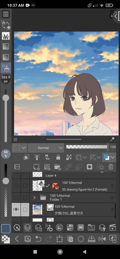
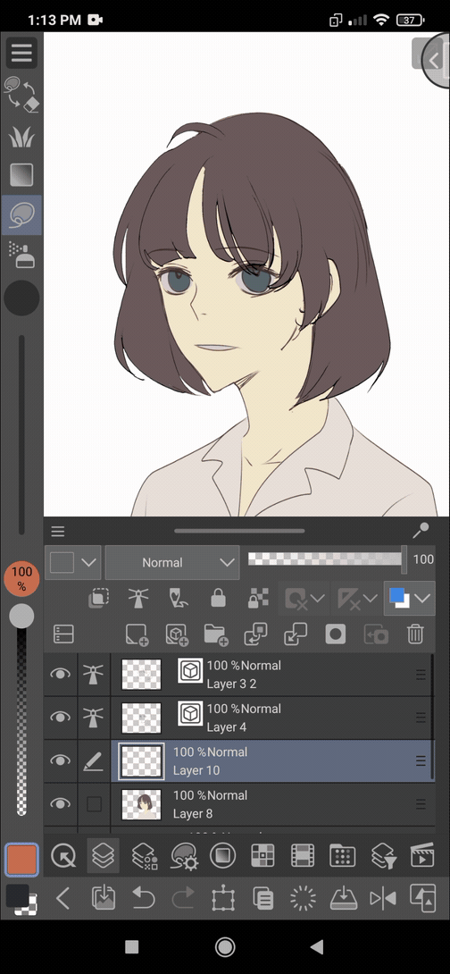
4)Tonal Correction/ Correction Layer I
When you complete drawing characters and want to put them in a background,it is important to do color adjustments to make it look natural.
Blending your characters in an environment/background you have to do some steps. First using tonal corrections (tone curve, gradient map, hue/saturation/luminosity etc)
Then adding some shades manually and using blending modes.
I used the following image for the right upper drawing.
The steps are:
i| Choose your background layer(s) under the character layer. Then on the character layer make a [correction layer]
~you can go to [Layer] menu>new correction layer. You can also-
(For smartphone, tap a bit longer on the character layer and you will find options> click on new correction layer)
(For PC, right click on character layer and rest same as phone)
*You can see the "edit>tonal correction" and this "correction layer" has the same option. It is just the layer one is easy as it can be deleted or edited and the main layer won't be affected. Also can use layer blending modes and opacity.
Tonal Correction:
Correction Layer:
The rest is pretty self-explanatory. Choose one of which you would like to make adjustments.
There are many tutorials about what each of the tonal correction options does including official ones.
So try and tweak everything to see how it works.
In this case I used the default preset gradient map "night sky", made a bit change in color-> changed blending mode to harf light -> made two more layers for manual adjustments.
🟩Tone curve in selected area
Sometime I use tone curve to only the shading part and adjust coloring.
🟨Level Correction
You can create some "glitch" or "chromatic aberration" effect by using tonal correction layers. It can enhance the art very much. Unfortunately Clip Studio Paint do not have a default shortcut way for that. Manually we have to make:
1) Duplicate the complete art layer 3 times.
2)Select one of the duplicate layer and [edit]menu> "Tonal Correction">"Level Correction" and right top choose "Red"
and then go to the bottom and you can see "Output" .
Take the right scale to all the way left.
Like this do everything same for the other two duplicate layers with one with "Green" and "Blue".
3| Set the three duplicate layers to "Difference" blending mode.
And use the move tool to move each of those 3 layers.
Btw you can make a auto action easily and use it without going through all these step!
I'll explain about it on to the later part of the article.
🟧Generating eye-catching saturated colors through posterization:
After a bit rough painting. Sometime I like to posterize and see if I find some colors not so boring and are more eye-catching.
For this I used posterization and at this level I found the changed colors in hair. I can erase the face part, adjust the hair color by painting over by picking colors from there and desaturating some tones to make a balance.
5)Lasso and Lasso Fill Tool
⏬Lasso:
Lasso tool is known by most people. And using it can make the shading easier, more accurate and saves time from erasing or repainting (if you like to paint on a single layer)
Lasso and soft airbrush
Lasso and gradient tool:

⏬Lasso Fill:
I have seen a lot of people not knowing about this tool. It works as
Lasso fill= Lasso + fill/bucket tool
To tell you the truth, this id the tool I USE ALL TIME
[Color blocking, design, sketch base, silhouette, quick cell shading, quick rim and highlight and so on......]
Can alter blending modes and others!
Works great for a clean eraser too
How I use this for cell shading :
I will use this on next topic (7)
6)Using and Making Custom Brushes
A lot of brushes are quite useful while shading (paint-style, texture, soft brush, hatching for monochrome or grayscale manga style)
Here is a demo of default hatching brush (tone scraping)
A texture or paint style brush can help enhance the shading.
I'll show you how you can use "perceptual mixing"(new in ver 2.0) and making a brush tip and using the tip in a brush.
For adding texture use this option.
I have downloaded a paint style brush from the asset store and now am addicted to this.
(Note this pen is not mine by the way!)
ID: 1842465 (filbert dual by marredae)
🖌️🖍️Brush tip making
1)Use a bigger canvas with basic expression color to gray or monochrome (using color will limit your brush color to black only)
2)Draw a shape. Hide the background paper layer for a transparent canvas.
3)Go to [Edit] menu>register material>image
4)Give a name and MUST select the option ( ✓)use for brush tip
5)Select a file and save
Now let's make a brush with the tip 🖌️🖍️

All you have to do is duplicate
And select the brush tip> material(+)
And done.
For a location like- the character is under the trees, using a leaves brush for shading can help emphasize the setting and mood.
I used :
Default leaves brush in csp for 1
A brush from asset store I purchased
ID:1992733 (komorebi brush 2 by nise)
7)Using blending modes for quickest light and shadow
I do not think there are any digital artists who do not know about blending modes( except MS paint users maybe 🎨)
Lets make a drawing using add and multipy blending modes.
Only two layers over image layer.
1.clipping layer (set to Multiply)
2.remove a part for light, add motion blur/gaussian blur so the shadow isn't so sharp.
3.on top add a new raster layer and set blending mode to [Add]
Now use low opacity soft airbrush .
Tip: add little highlights and if use a background add cast shadow behind and some glowing dusts for effect
Note: using a blur filter is very much recommended here.
I have used the same method except used the leaves default brush in clip studio with a dark green color for shading.
.
8)Adding textures and noice filter to your drawing
Textures are always so great for making your plain look to a interesting art.
The basic Idea is using a texture image on top of your art layer and set the blending mode to overlay.
Search textures on material window.
Double tap (smartphone/PC) or drag and drop the texture from material window.
I set the layer mode to (overlay/soft light).
You can change the layer color to remove the fully black tone a bit. Set layer opacity according to your choice.
Adding texture in the upper drawing with some parts erased created a shade type look.
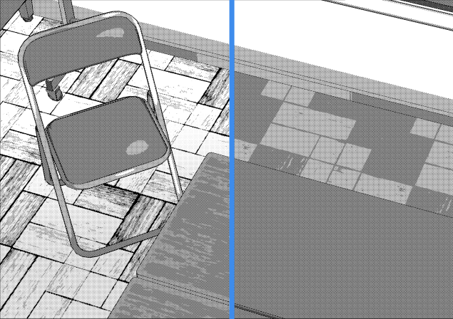
⬛Perlin Noise
For making noise texture,
First make a new raster layer over your drawing layer and go to
[Filter]menu> [render]> Perlin noise
You will have a result like this
Now I set it to overlay and turn on clipping
Check the other filters out! You can use them for creating different texture images.
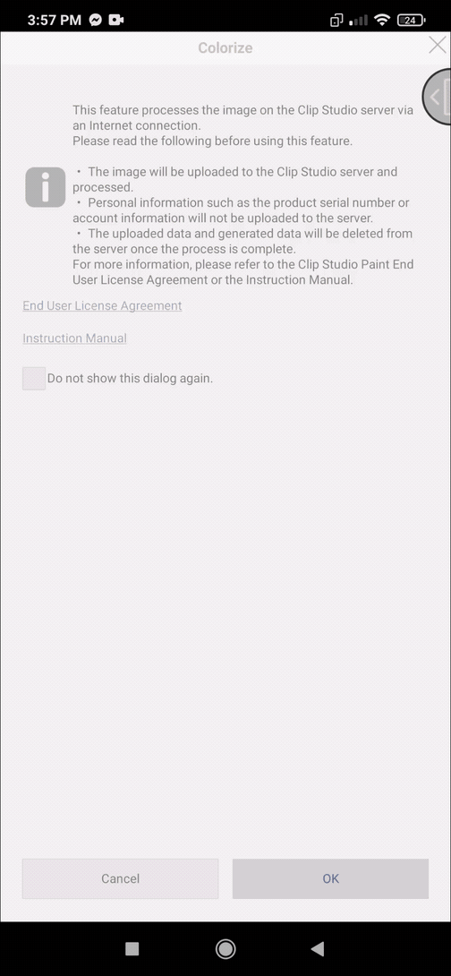
9)Colorize (AI) for creating shadow
In the first image(below 🔽) I have this result after colorizing with hint colors.
For colorizing:
1)Have a lineart set to reference layer.
2)Under the lineart layer, in a layer add some hint colors.( The AI only takes hint for max. 10 colors, more colors will be ignored)
3)Go to [Edit] menu> [Colorize]>[use hint image and colorize]
This creates a hint colors mixed base in a multiply layer over the lineart layer and keeps the hint color layer hidden.
I now changed the blending mode of it from "multiply" to "normal" and arranged the layer below the lineart layer. (Also erasing the parts outside of lineart)
Now for shadow effect I'm gonna make another colorized image but with a bit darker(for shading purpose).... Its ok you can choose any color depending on your shadow and blending mode.
This is done very roughly, but here I'm now erasing parts where theres no shadow. Like this I can get a automatic shadow without much effort.
10)Auto Actions (and a bit about clip studio asset store)
So there is this feature in Clip Studio where, certain things that needs to be done frequently, doesn't need any creativity and takes a lot of time.
Those things could be recorded in the right order and replay them when needed.
It is specially helpful in color adjustments, effects with no manual touches and like adding and setting layer and mode etc.
There are some pretty useful defaults already. You can create or download as well.
So for finding auto actions, in PC you can easily find it on
🎥[Window]menu> [Auto Action]
But finding it on smartphone is not the same process since in smartphone version apparently there's no "Window" menu.
So It took me a while to find it.
🎬Go to [Menu]>[App settings]>[Palette bar settings] and a list of options will show up.
Most things on "pc version window" is there. Choose the ones (✓) you want to keep on the palette bar.
I chose auto action
Now we will see the auto action window. From here onwards everything is same as pc.
In the upper screenshot:
Red: record
Orange: play
Green: Create new auto action
Cyan: (bin) delete auto action
Blue: Create new auto action set
Purple: Add auto action set
I have tried making adjustments for myself.
Most important is the sequence should be maintained during recording as undo and redo commands are not recorded.
Also everything cannot be wholly recorded. I would suggest you read official guide for auto actions.
Anyway I brought this here because it saves a lot of time and can enhance shading if you can use your brain and creativity properly.
3 auto actions I used for the three results
ID:1905243
ID: 1991382
The 3rd one isn't available anymore sadly
Search for auto actions on assets (or anything specific) and go to "popular" and you can find a lot of great assets. First download the free ones and see if it does the work( sometime paid ones aren't as good as free ones lol)
I hope you find your desired materials.
I also made some brushes for experimenting and uploaded... If you want you can check them out.
Outro
Almost done with the article, lastly check the asset store you will find a lot of useful things like auto actions, gradient map sets, brushes, effects, color pallets etc. Very much recommended <3
Keep in mind that practise is the key to everything. Using references and studying them takes patience and time but it indeed is best for improving.
Use reflected colors too not just a solid color for more natural look.
Comment if you need to know about anything I will try to give a solution if I can!
HAPPY DRAWING<333
Users who liked this post


Comment