
Hey!
The internet is an ever-changing place. While webcomics started out imitating regular comic pages or newspaper strips, with the rise of mobile phones there came a new way to experience comics: the vertical scroll format of webtoons!
If you’ve ever wanted to make a comic, but couldn’t pick between making a typical page comic or a mobile oriented webtoon; or if you already HAVE a comic and want to adapt it to the other format, this tutorial will try to give you some guidelines and tips on how to best do that using clip studio paint
NOTE: I am using the latest version of Clip Studio Paint Pro (1.9.7.). It has an updated interface with different icons compared to some older versions, so if you find yourself struggling to follow the tutorial, consider updating to the newest version!
Also, if you prefer, you can watch a video version of this tutorial here:
0. THE BACKSTORY
I am currently working on the fourth chapter of my webcomic/webtoon Weirdogs. Reformatting a comic isn’t the easiest or most natural thing to do, so I’ve used different approaches to do so. As a result, I have been able to figure out a process that works very well for me!
For the first chapter, I just drew normal comic pages, without ever intending to make it into a webtoon. But when Webtoon Canvas announced a contest, I decided to reformat the comic and enter it. Because it was my first time doing so, I struggled quite a bit with the process!
For the second chapter, I thought it would be smart and help me have updates ready sooner if I finished my comic as a webtoon first, and only then reformatted it into comic pages. This was a mistake, because reformatting a webtoon to comic pages is even more challenging than the other way around!
For the third chapter, I learned from my mistakes and figured out a good methodology. This is not an end-all-solution, but it is a process that works very well for me personally. Your experience may differ, and I definitely recommend trying different approaches if mine doesn’t work for you.
So, what we are going to do is first create our comic pages, and then reformat them to Webtoon. The reason for it is simple: Pages are a more constricting format than the vertical scroll. An episode on Webtoon can be as long as you want it to be. However, a comic page can only fit so much content. It makes more sense to first stick to the tighter restrictions and then open yourself up.
If you have already made a webtoon though, don’t fret! Hopefully, this tutorial will still provide some good advice on how to optimize your reformatting process, or at the very least, offer you a better process to follow for any future chapters of your comic!
1. CREATING THE PAGE
Now, let’s actually start by creating the file for the comic page.
I would recommend already thinking about what size you want your comic printed at! While you can resize things later, you will ensure the best quality if you stick with the intended format all the way through.
If you make a new file in Clip Studio, you can select the second button on top to create a comic page, and then select a number of useful presets:
You could also select the third button, if you want to have more influence over your options:
Near the top right corner, you can select the unit (millimeter, centimeter, pixels, inches…), then set a custom format (maybe you want to make a square-shaped comic?), select custom border options, and bleed options!
What’s bleed? It’s a term for excess image data added beyond the intended format. Its purpose is to avoid white edges in case the print format isn’t precisely cropped..
Though, for now, let’s just go with the A4 color template!
This is what it will look like, though I have already annotated the guidelines that pop up:
There are three rectangle guidelines. The innermost one is where you should draw your main page content. The second rectangle is the final page format. If you want to have art extend to that, you can fill it. However, I would not recommend adding any dialogue or important visual content in this section! The third rectangle will need to be filled for bleed if you add any art in the final format rectangle.
For future reference, if you don’t want to see these guidelines, simply go to "View" and deselect “Crop mark / default border”.
2. CREATING THE PANEL BASE
Next, let’s make a frame sized to the page content rectangle!
Simply use the frame border tool to draw it up. You can already define what you want the border to look like, but if you’re still figuring that out, you can just draw the border now and change its look later.
To change the border, use the “Object” tool and select the border. Now you can adjust options such as the border color or thickness (Brush Size option) in the Tool property window!
Personally, I find the purple “Mask Area” view distracting that you get by default when making a frame border, so I always disable it!
You can do this by selecting the layer with the border in the layer window and disabling the “Show Mask Area” option:
We will split up the big frame into smaller panels later. You can, of course, simply draw panels instead. Personally, I find it easier to keep a uniform look and distance between panels by dividing one big frame rather than pulling up individual panels!
3. CREATING DIALOGUE
The next step is to add the dialogue from my comic’s script to this page file.
I do this BEFORE sketching the comic to ensure there is enough room for both the dialogue and the artwork. If I were to start sketching without already knowing how much space I need to leave for the text, I might end up having to cover parts of my drawing that I would want to stay clear!
One important thing is to ensure that your dialogue is in a uniform size (except for special occasions - for example, whispered dialogue can be smaller or screamed dialogue can be bigger).
You’ll also want to make sure that it’s big enough to be read easily - different people have different preferences for how big that is. To figure out what works for you, print out a test page or simply refer to other comics as an example!
Now, for adding the dialogue, I would recommend making a single sample text and copying it for each speech bubble on your page - even if you already know you want to increase the size later on! I find it easier to make the adjustments after I have added all the dialogue rather than as I am adding it!
For example, if there are five speech bubbles on the page, I’ll paste the sample text onto the page five times:
And here’s what a finished page dialogue might look like:
A quick side-note: You might notice that I’m using a custom font. It’s based on my own handwriting, and if you want to set apart your comic from others, I would absolutely recommend making your own font as well! I used Calligraphr to do so, which is a very easy and powerful tool to use - and the base version of it is free!
As you arrange your text, it’s important to keep in mind not to add too much text for a single bubble. It’s always good to split things up, especially if you could imagine your character making small pauses while speaking.
Compare the two speech bubble arrangements below: The above one is not as visually interesting as the bottom one. The more visually interesting that even your dialogue is, the easier it can be for people to read!
4. CREATING PANELS
Once you have all the dialogue in there, you can split up the big frame into panels! As mentioned before, the reason I do it this way is to keep a uniformly sized gutter (the space between panels). Start by selecting the “Divide frame folder” tool:
You can set how big you want the your gutter to be in the Tool properties:
Now simply drag the tool across your frame. If you hold down Shift, you can make sure that you are pulling up perfectly horizontal or vertical lines.
Your page might look like this now:
5. THE SKETCH
Now it’s time to sketch! Don’t be afraid to try a lot of different compositions, even if you divided things up differently in the previous step. Try to create a good readability and flow to the page by rearranging dialogue in an orderly manner, and work with the compositions and character action to match the flow.
Here is the finished sketch for the dialogue I’ve previously placed. I’ve added some arrows to visualize what I mean by page flow.
In the first panel, Sammy is looking to the right, which is also the direction the speech bubble is coming from. The composition of the background in the second panel leads directly to Dodger - the source of the speech bubble. Sammy is also still looking at him in this panel, so the viewer has multiple focal points leading straight to Dodger.
For the third panel, I decided to open up the page and scrap the panel border (this is where bleed will come in).
As you can see, I changed things around from my previous arrangement of the text and panels! Nothing is set in stone as you work in comics, and you may even change things after the sketching stage!
These kinds of fluid compositions would be very difficult to achieve if you work on a Webtoon first and then rearrange it to a page. Most webtoons only display one or two panels at once. On one page, you often have between 5 and 10 panels visible at once!
I hope you are able to see why it’s better to first plan your pages, and then your vertical scroll version!
(OPTIONAL STEP: Adjusting the Sketch for Webtoon)
If you’re new to the process of reworking pages into the vertical scroll format, it makes sense to take your finished sketch for the page and rework it. This way, you can move things around more easily and try different compositions for your artwork, without things needing to look polished and perfect right away. It will also help you figure out if there are any panels where you might need to rearrange speech bubbles or artwork!
For some pages, this process isn’t that important. The sample page we’ve worked with so far is one of those cases, it’s pretty simple and unambitious. I’ll show an example of reworking a sketch to the Webtoon format later, so let’s move on for now.
6. FINISHING YOUR PAGE ARTWORK
For reference, this is what the final artwork for the sample page looks like. I don’t want to get into the illustration and coloring process in detail, as it’s not the focus of this tutorial. However, there are some organizational things you may want to keep in mind as you work on a comic for two different formats!
The main thing to know: YOU WILL NEED TO DO SOME REARRANGING.
There’s just no way around it if you want to offer an optimal reading experience on Webtoon in addition to regular comic pages. And if you don’t want to go crazy due to the workload, here’s my number one tip: SEPARATE YOUR LAYERS!
This page isn’t the BEST example for what I mean, so let’s briefly look at a different page!
On the left is the page, on the right is a section of the Webtoon episode.
The last panel of the page was intended as a big, important splash panel that would surprise readers and include fun details. If you want a panel to have more impact in Webtoon, a good way to do so is to make it very tall. This way, readers will have to scroll for a longer time until they’ve read the entire panel.
I have included red borders in the image to signify how much of the comic will fit on a typical phone screen. By constraining the dialogue to one phone screen before showing the scene, I create more of a surprise. The reader has a moment to wonder, what could possibly be happening? And then, they scroll down to see it’s a paintball match!
This WAS one of the cases where I adapted the page sketch for the webtoon format before finalizing the artwork. I already knew that I would need to change the text layouts and even rearrange the position of Dodger and Sammy!
Since I knew I needed to make more changes, I also knew that I had to go with a special approach of drawing ALL of Sammy, even if Dodger is in front of her, drawing MORE of the background, and even drawing some of the other background elements on separate layers, because it would make rearranging things easier later on!
Here is a look at all the elements moved around, so you can see how much of the background I actually filled out:
This is of course, an extreme example, and having to fill in backgrounds behind the characters will only occasionally be necessary.
But even for something more simple (like our sample page), there are some things I would absolutely recommend you do:
Create separate layers for different characters in a panel Create separate layers for different background elements (such as foreground layers, “main” backgrounds and “far distance backgrounds” (such as clouds or skylines)) Always fill in the art behind where speech bubbles or any foreground panels are supposed to go!
Let me give you an example based on this page:
This is how things are split up:
Notice how I’ve drawn the full artwork behind the foreground panels. This was done because I can separate the foreground panels in the webtoon version. However, I did not draw in the bottles behind Sammy’s pan! It won’t be necessary to move her around, so I didn’t need to do so.
Even if you don’t have to rearrange things, this approach does help keep things organized, and it’s easier to form this habit if you do it for every panel!
One small caveat: If you use many layers, you will definitely need to name your layers to stay organized. This is a good habit to have, especially if you ever want to work with assistants, who will be very thankful for having descriptive layer names such as “Dodger Inks” or “Background Colors” rather than “Layer 0” and “Layer 123”! Even for the rearranging process, which we’re about to look at, it’s a lot easier on yourself to know which layers you’re actually moving around!
Sometimes I even prepare the layers ahead of the drawing process rather than make them as I’m drawing. Separately working on these mundane aspects of making comics is a good way to make progress even if you’re feeling too creatively drained to draw or write.
Here are two more tips to help speed up your comic making process and get organized better!
You may have noticed in previous screenshots that I use the Color Set and Sub View menus.
Let’s look at the Color Set menu first! It makes sense to create one for each recurring character in your comic! To add a new color, select the color in your color wheel first, then press the little Paint Drop + icon (1). The color will be added to your currently selected Color Set. You can now reorder it, rename it, or delete it.
You can also make a new Color Set by clicking the little wrench icon up top (2)! If you click “Add new settings”, you will get a template Color Set that is full of “empty” colors. I personally prefer not having those, so I’ve deleted them and now duplicate existing color sets instead, and rework them.
Second, the Sub View menu!
Here you can load reference images. If you have made character sheets of your comic’s protagonists, are drawing a background from a photo or just want to copy the colors of a finished comic page, this can help you always have a quick reference handy. Simply click the folder icon in the bottom, and load any reference images you might want. You can select multiple ones at once, and then cycle through them. If you are done with a reference, you can delete it. You can also zoom in and out, move through the image, or even rotate and mirror images (3). I personally like having the “Switch to eyedropper automatically” option selected (4). To move the image, I now need to hold down the spacebar, but this way when I mouse over the image, I can immediately pick up any color from it. In a way, this is an alternative to the Color Set, but I like having both, since the Color Set is always more exact!
7. EXPORTING YOUR PAGE FILE
When you are done with the comic page, it makes sense to already export it before you move on. Now, if you publish your comic in page form digitally and not JUST for print, you’ll want to export it as an RGB JPEG file first!
After you have done so, now you need to adjust your page file to CMYK.
To find out more about what CMYK is and what it means, you can visit this tutorial:
To explain it very quickly, it’s a different way of mixing colors for print (additive) rather than for screens (subtractive).
Some artists work in CMYK first, but since we intend to ALSO publish the comic digitally in RGB, I would recommend working in RGB first and converting to CMYK only at this stage.
If you use a lot of bright and vivid colors (especially greens), converting to CMYK will mean your colors are going to look different. So, instead of just exporting straight to CMYK without any sort of quality control, let’s take a look at what we can do to optimize the result!
Start by selecting the View > Color profile > Preview settings option:
This window will pop up. You can now select your intended color profile. Check with your printer service which color profile you should be using before moving on.
You’ll notice that the vivid green “BLAM” panel on the right or the paint splat in the bottom panel looks a lot more dull now. This is why we are not exporting to CMYK right away.
Let’s look at the “Rendering intent” drop-down menu. This offers a variety of options in which your colors can be converted from RGB to CMYK! It can be a good idea to go for the "Saturation" option, especially for comics. I’ve selected it, and you’ll already notice an improvement in the way the page looks!
While you won’t be able to actually make the green more saturated (there is a limit to what standard CMYK colors can do), these options DO change the contrast of your colors. And if you know your color theory, you know that more contrast can make things look more vivid.
If you are unhappy with all four “Rendering intent” options, you can also select the “Tonal Correction” checkmark and fine tune the contrast on all four color plates (Cyan, Magenta, Yellow and Key tone)! I’ve made the greens look more teal by adjusting the values in the “Cyan” section:
Once you are happy with the result, make sure to select the “Save on canvas” option! Otherwise, your adjustments won’t actually be saved when you export the image.
You may want to now save your .csp file as a new file with a different name to signify that this is the CMYK version of your page. Otherwise, if you ever want to make a change, such as fixing a typo, you would have to redo the color adjustments!
Finally, let’s actually export the CMYK file. It’s the same as the RGB version, only make sure to select “CMYK color” in the “Expression color” menu!
8. REARRANGING TO WEBTOON (THE BASICS)
All right, now we’re getting to the good part. The first thing you want to do is pull up a long, vertical scroll format. Clip Studio Paint Pro has a maximum image height of 50,000 pixels! That’s a lot. If I had an image that tall open in Photoshop, it would not just lag and crash my computer, it would probably murder me and my entire family in our sleep. But CSP is fast and zippy even with these huge dimensions!
Webtoon itself has a maximum of 800 x 1280 pixels per image file. An episode can be split into multiple image files.
I would recommend making a new file in Clip Studio Paint that’s 800 x 50,000 pixels and then; after placing your panels, crop it down in height if you find that you don’t need the full 50,000 pixels.
Personally, I also like to go with the triple value of 2400 pixels in width rather than 800 pixels. If I add any new art or extend any panels for the Webtoon version of my comic, that way I already have it in a higher resolution, should I ever need it! But this is, of course, optional!
Once I have that file set up, I open my page in a separate tab in Clip Studio Paint...
and then, simply select a frame folder in my page, press CTRL+C (or select Copy in the menu), switch over to my vertical scroll file, and press CTRL+V (or select Paste in the menu). When doing this, make sure that you are NOT using the “Object” tool, or you might only select and copy the frame, not the contents of the folder!
I like to do this panel by panel and immediately resize each panel to how I want it, but of course, you could also select multiple panels at once and then copy/paste them all at once, making the adjustments later.
I usually make up a single episode from 2-4 pages. Of course, that’s not a requirement and you can make shorter or longer episodes as well! However, do make sure to keep in mind pacing and drama as you plan the length of an episode!
9. REARRANGING TO WEBTOON (THE DETAILS)
Just as on a page, reading flow is important on Webtoon! The thing to consider here is that thanks to the theoretically infinite format, you can give your art a lot more room. As I’ve already mentioned before, making people scroll longer can have an emotional impact for them as they are reading! Here’s a few more techniques you can utilize:
Make impactful panels tall (as described before) Split up speech bubbles and move them apart further than you would in a comic page
Spread out panels that cover different actions or scenes (but panels that are part of a single dialogue shouldn’t be spread too much, otherwise the dialogue might feel like characters are pausing or taking breaks)!
Switch up panel compositions. It can get boring if every panel is the exact same width and positioned the exact same way. Changing where panels are located can make the reading experience feel more natural and less rigid.
Of course, if you are showing actions that belong together, it makes sense to keep those panels uniform.
Switch up panel sizes. Panels that extend to the full width of the Webtoon format have more impact if there are also panels that AREN’T extended to the full width. Split up wide panels. Sometimes you can get away from having to rearrange elements in a wide panel simply by splitting up the panel. You can even slightly adjust the action in a panel, by adding small variations in the art (such as character expressions). Going back to our original sample page, I’ve split the wide panel into two panels here:
Add bonus panels where necessary or desired. Sometimes, in the Webtoon format, adding small details can improve the reading flow! Here’s an example where I added an extra panel to a sequence to give more visual impact to a section of the dialogue. On the page, it would have cluttered the composition, but on Webtoon, without the panel, it could have felt like there are too many dialogue bubbles without art in between them!
It’s also important to keep a uniform dialogue size in mind, even for Webtoon! I’ll be honest, I don’t give quite as much attention to it as I do on pages (where you CAN see multiple panels at once and thus notice size differences more easily), but you should at least try not to have the size vary too wildly. And just like in print, make sure you have a good text size that’s easily readable even for people with smaller phone screens.
With this information in mind, I also want to point out some tools native to Clip Studio Paint that make rearranging things a lot easier than some other software!
First: Did you know that you can make a selection across multiple layers?
Let’s say that I want to change the angle of Dodger’s arm here! Thing is, I’ve already colored it! But, in Clip Studio Paint, I can transform or move selections across multiple layers. Simply make the selection and then add multiple layers to it by clicking them while holding down Shift!
Tada! No need to do the same thing for both layers separately or straight up redo the colors!
Second: Resizing small panels to be big and vice versa.
Sometimes for a Webtoon, you might want to give a small panel on a page more room and make it appear bigger.
Sometimes you might want to take a panel that appears small on a page and depict it bigger on the webtoon version or vice versa. Only problem: after doing so, the lineart might be thicker (or thinner) than all other lineart! Well, don’t fret. If you have created your lineart on a vector layer, you can now change the width of the lineart!
Simply use the “Correct line width” tool and we can go from this:
To this:
And with some final cleanup, to this:
Way better than having to redraw the whole thing, huh? Vector layers are GREAT.
If you don’t already create all your lineart with vector layers, then man, GET ON THAT. I’ll not go into this in detail, and I’m sure you will find plenty of tutorials that explain some of the other wonderful advantages of vector layers, but yeah, this is one aspect of them that’s especially useful for working on comics in two formats!
Here are two tutorials that delve into some of the other advantages of vector layers, if it’s something you’re not familiar with yet:
Finally, when you’ve finished up rearranging your pages to an episode, it’s important to test your comic out natively! When you work on your computer, you might not notice or think of things that could feel better when you actually read the comic on your phone and scroll through it with your thumb rather than your mouse! To do so, I export the episode, upload it online (on Imgur, for example), open the uploaded file on my phone and test read it. I often make small arrangements after that.
10. UPLOADING TO WEBTOON
Now, if you remember, I mentioned that Webtoon has a 800 x 1280 pixel maximum image format. But I told you to make a big huge file that’s 2400 x 50,000 pixels tall! How in the world are you supposed to upload that?
For starters, I always export my vertical scroll file in 33,33% (bringing it down to the 800 pixel width), and then I let Croppy do the rest.
It’s an utterly wonderful tool that automatically splits apart your long image file into the maximum height for Webtoon.
You’ll notice that sometimes, resulting images come out VERY short. This is simply because there may only be a very small excess over the 1280 pixel height. This is okay! It’s also okay if your images are cropped in the middle of a panel or dialogue! Don’t worry about it. Webtoon automatically stitches the images back together, with no border or distance between them.
THE END
And that’s it! I hope this tutorial helped you figure out some useful methods in making comics for both webtoon and print! If you have any questions, feel free to reach out to me by leaving a comment.
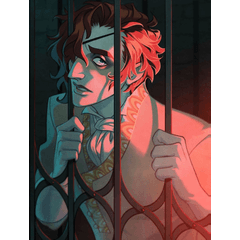
If you would like to read my webtoon Weirdogs, you can do so here:
Users who liked this post


Comment