
While Clip Studio Paint isn’t a photo editing program, there are a lot of ways you can use photos! This tutorial will go over how to do some basic color correction and cropping, how to use photos as quick backgrounds for your drawings, and how to turn pictures into art using a number of effects!
Here’s the video tutorial, but if you prefer text, keep scrolling!
Where to Get Photos
You can use your own photos, like I'm doing for this tutorial. It’s really fun and rewarding to use pictures you took yourself, and cel phones are getting better and better at taking great shots!
There are a bunch of sites online where you can download images that are in the public domain, or that people have put up with a license to use for free.
My favorite site is Unsplash, but there's a lot of options!
You can also find photo assets both free and paid in Clip Studio Assets.
IMPORTANT: Don't just grab random photos off the internet, though! Photography is under copyright unless stated otherwise.
Photo Editing
Image Cropping
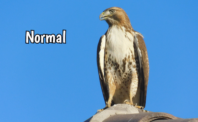
Simple photo editing is a great place to start, so here's a picture I took of this gorgeous hawk in my neighborhood! Let's say we'd like to crop this picture down to a square.
Go to Edit, and select Change Canvas Size.
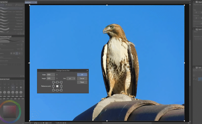
Here, you can drag any of the handles to change the crop, or click and drag in the middle to move it around.
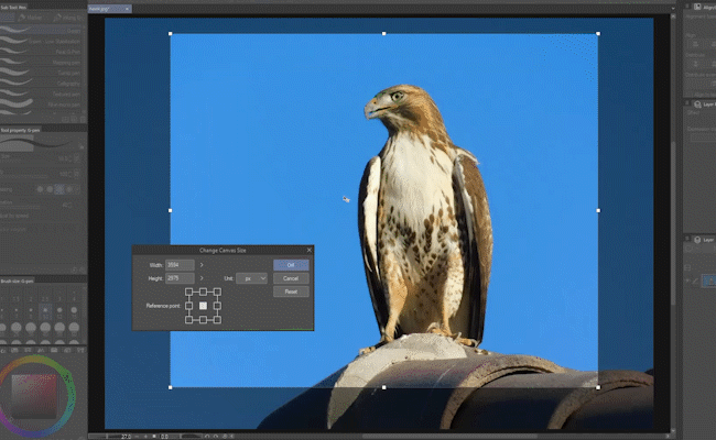
To get a square, change the width and height to match each other, then hold Shift to make sure it stays square as you resize it.
Press OK when you’re done.
Brightness/Contrast
Here are some pretty oleander flowers, but they're a little dull.
Let's start by going to Edit, Tonal Correction, and selecting Brightness/Contrast.
A quick way to enhance a washed out photo is by upping the contrast and lowering the brightness.
In this case, I’ve reduced the Brightness by -10, and increased the Contrast by +10.
Click OK when you’re done.
Level Correction
The effect of Level Correction is similar to Brightness/Contrast, but more advanced, and it gives you more control.
Go to Edit, Tonal Correction, and choose Level Correction.
This one shows a histogram - basically a graph of the color information in your image. For example, in this image, you can see at a glance we're missing a lot of darker tones.
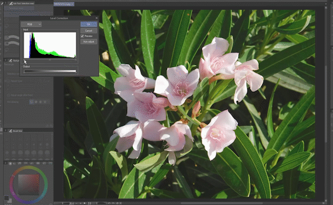
Move this slider to compensate, and the picture instantly looks better! Tweak the sliders to your liking.
Note: The output bar at the bottom removes darker and brighter information from the image, which isn't what we want in this case.
With the dropdown at the top set to RGB, we're adjusting all colors in the image, but you can choose to adjust them one at a time.
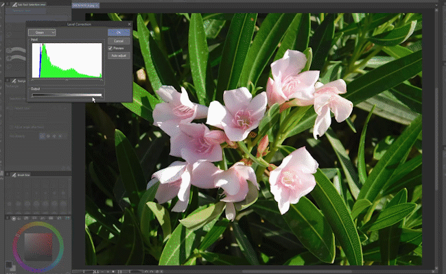
Here's where that output bar at the bottom comes in handy! There's a little too much green in the upper tonal range of this picture, so if I bump it down a bit, suddenly the pink of the flowers really pops without losing the green of the darker background leaves.
Color Balance
Speaking of colors, if you want to do some fine color tweaking, the Color Balance tool is perfect!
Here’s a photo of a robin I was lucky to get when I was up in northern Arizona.
Go to Edit, Tonal Correction, and choose Color Balance.
Each of these sliders allows you to move between a warmer and cooler hue - cyan to red, magenta to green, or yellow to blue.
At first, you’ll notice we're editing the mid-range of tones in the image (the radio button labeled “Half tone”), but you can switch to the Highlight or Shadow and change the sliders independently there as well.
This gives you the power to do a wide range of color adjustments on your image!
Hue/Saturation/Luminosity
The last adjustment feature I’ll talk about is one I use all the time, Hue/Saturation/Luminosity.
Note: You’ll sometimes see this type of adjustment tool referred to as Hue/Saturation/Lightness or Hue/Saturation/Value.
This one is under Edit, Tonal Correction, Hue/Saturation/Luminosity.
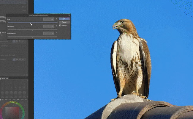
Simply put, you can use this to shift the colors, how vivid the colors are, and how bright.
You can also use the saturation slider to make your photo grayscale.
Non-Destructive Adjustments With Correction Layers
Up to now, we've been making edits that permanently change the image.
However, in the Layer menu, under New Correction Layer, you'll find basically the same features listed. There’s Brightness/Contrast, Hue/Saturation/Luminosity, Level Correction, Color Balance - all the ones we’ve looked at so far!
These work a little different, though. These are something called non-destructive adjustments.
Choosing one will add a new layer above your photo. The name of this special Correction Layer will be the same as the name of the effect.
Note: You can change it if you wish by double-clicking the layer name, just like any other layer.
Correction layers give you the same effect, with the added benefit that you can turn them on and off just like any other layer. Double-clicking on the correction layer’s icon will allow you to edit the effect’s properties.
Correction Layer Masks
Notice that they always come with a built-in layer mask that you can edit!
If you're unfamiliar with how to use layer masks, I've got a whole video on them: What Are Layer Masks? Clip Studio Paint Tutorial
How Correction Layers Interact
Correction layers normally affect all layers underneath them. Even if those layers are in a folder, they’ll be affected.
However, putting the correction layer in a folder means it'll be limited to only the other layers in that folder.
Note: This is because the folder’s blending mode is set to Normal. If you change the blending mode of the folder to Through, the correction layer’s effect will pass through to the layers underneath.
Adjusting a Selection Only
If you make a selection before creating a correction layer, it will automatically apply the selection as a mask.
Likewise, if you make a selection before using any of the tonal correction features, only the selection will be affected.
Photos as Backgrounds
Those are several ways you can edit photos in Clip Studio Paint, but what about using them in your art?
Layer Tone
Say you've got a character, but you want to make the presentation of your drawing a little more interesting.
Let's start with this photo I took in northern Arizona.
A really easy and fun settings is the layer tone! Just click this button to enable it.
Hint: If you don’t see the Layer Property palette, go to the Window menu and choose Layer Property.
It looks grayscale, but when I zoom in, you'll see it's converted the layer to pure black and white values.
This is a method to make images cheaper to print, but it also has a really cool look of its own!
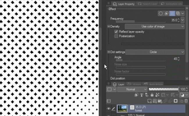
You can change both the size and shape of the dots, as well as the angle at which they appear. There are a lot of settings, so don't be afraid to play around with it!
Note: The layer tone is another non-destructive adjustment, so you can just turn it on and off whenever you want.
One of my favorites is to change the shape to line, which makes it almost look like crosshatching.
Here, I've added my unicorn drawing, adjusted the angle of the tone lines to suit the art better, and added an outline around my line art so it stands out. Not bad at all!
Hint: The outline is just the layer’s border effect. It can be found right next to the layer tone effect.
Gaussian Blur
Another effect you can use to make backgrounds is the gaussian blur.
Here's a lovely, foggy clifftop photo I took when I was in England, along with one of my dragons.
If I copy just the dragon into the photo (with a few hue/saturation/luminosity edits like I showed you earlier), he fits pretty nicely. But the realism of the photo is a little distracting.
Be sure the photo layer is selected. Go to Filter, Blur, and select Gaussian Blur.
It's a simple effect - the higher the strength, the more it blurs!
Using a photo this way gives your art an interesting look and a lot of depth, without looking too realistic for the scene.
Photos as Art
Of course, you can also just leave out the characters and turn your photos into art! Here are a couple ways to do that.
Corrections as Stylization
You probably noticed that bumping the corrective effects I showed you earlier to their extremes gives you some pretty wild results!
You can do a lot with your photos simply by playing around with the Tonal Corrections or the Correction Layers.
Posterization
My hawk here has a lot of contrast and concentrated color. One fun effect you can do with a picture like that is called Posterization.
Go to Layer, New Correction Layer, and add Posterization.
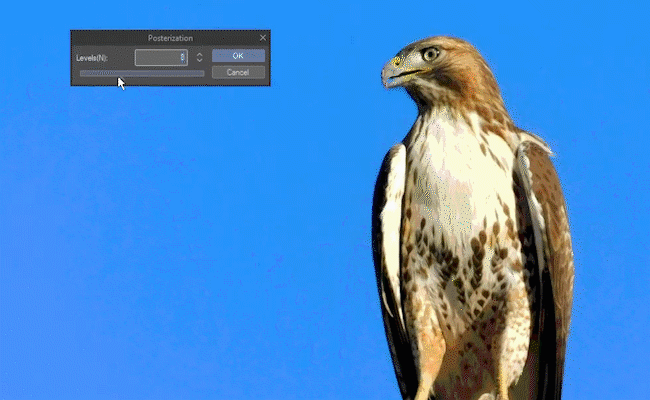
When your levels setting is high, the photo mostly looks normal. However, using a lower number of levels reduces the colors in the image, which can give you a really striking pop art effect.
Artistic Effect - Turn Photos into Line Art
One last feature I'll talk about is an effect that can turn photos into line art.
We’ll keep using this same hawk photo for this one, as it also works best with a picture that has a lot of stark contrast.
Go to Filter - Effect - Artistic.
The panel that comes up looks complicated, but it’s really not. It’s divided into two sections - lines, and color.
If you reduce the number of colors, you may notice the effect is very similar to posterization. But the part I think is really cool is the lines.
Change the Process dropdown to Lines Only.
Turn the Line Opacity all the way up. The other settings - Thickness, Simplicity, Density, and Anti-aliasing - will all depend on the size and details of your image, so adjust them until you get line art you’re happy with.
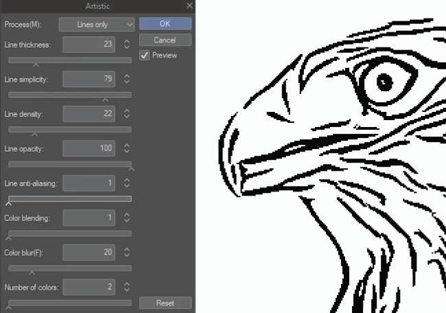
For the anti-aliasing, reducing it all the way will give you pure black and white, but too much goes quite blurry. Usually you’ll want a value in-between.
Hint: You can zoom in even when you have an effect window open by holding down Ctrl-Shift (Command-Shift on Mac) and left clicking your mouse. To return your zoom to full screen, hit Ctrl-0 (Command-0 on Mac). Note that is a number zero, not an O.
Hit OK when you’re done.
You'll see if I remove the background, the photo's color has been completely removed, leaving only the outlines with a transparent background.
This method probably won’t give you perfect line art, but it’ll give you a great place to start!
Conclusion
These are just a few ideas of how to use photos in Clip Studio Paint, and I've barely scratched the surface. Don't be afraid to experiment with different tools and effects. How do you use photos in your art workflow?
Be sure to follow me @MsRedNebula on Twitter, Instagram, Bluesky, or Mastodon to see when I announce new tutorials. You can also follow me here on Clip Studio Tips, or subscribe to my YouTube channel.
As always, have fun making art!
Users who liked this post


Comment