
Presentation
Hello!!, welcome to this new TIP. On this occasion I will share with you the knowledge I have for creating striking fonts in CLIP STUDIO PAINT, which I can use for posters, covers, cards, postcards, etc. We will use a series of tools such as: Text, combination modes, layer mask, gradients, textures, etc. I hope it is useful to you, without further ado...
Let's get started!!
1. Text Tool
Let's start by learning the basic editing features of the text tool. We can find this tool in the tools palette (icon with the letter “A”) or using the keyboard shortcut “T”.
- SINGLE TEXT
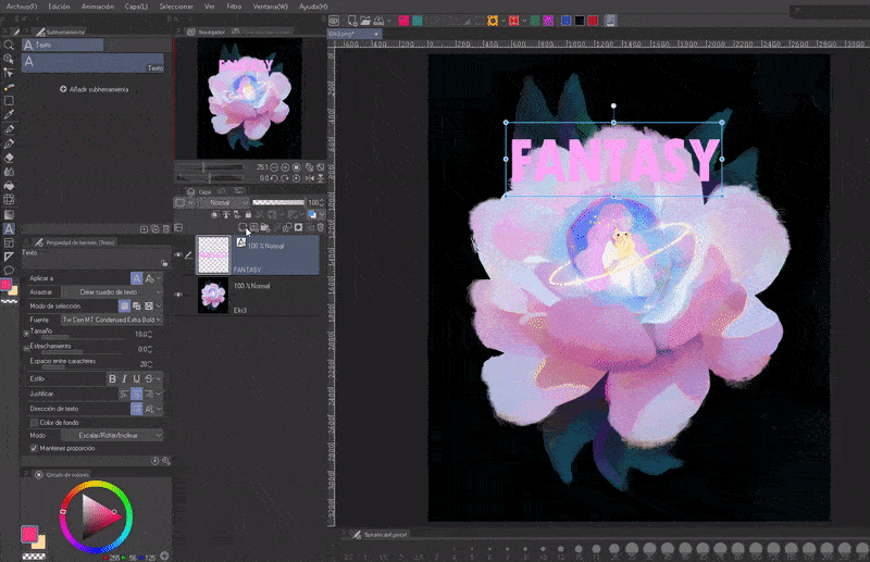
When we start the text experience we usually use it in the following way: To start writing we click on the section of the canvas where we want the text. A new text layer will be created (NOTE: You cannot draw on this layer).
To finish editing we will click on the check mark icon found in the floating bar. While the pencil icon takes you to “Sub tool details”. And the “X” button to cancel (clicking outside the box also ends the editing).
To edit again, once again we will choose the text tool and click on the letters or characters. What is special about this way of writing is that it does not limit the available space. With the ENTER key a line break is created.
Additionally, the text box can be moved by clicking on the edge of the line, rotated using the control point at the top and finally using the box handles we will change the text size. This can compress the letters, but if we have the “Maintain proportion” option checked or by holding down the SHIFT key the transformations will remain constant. Although these transformations are ideal for giving dramatic effects.
IMPORTANT: The cursor will change shape for each action; curved arrow to rotate, directional arrow to move and straight arrow to resize.
- SUB TOOL DETAILS
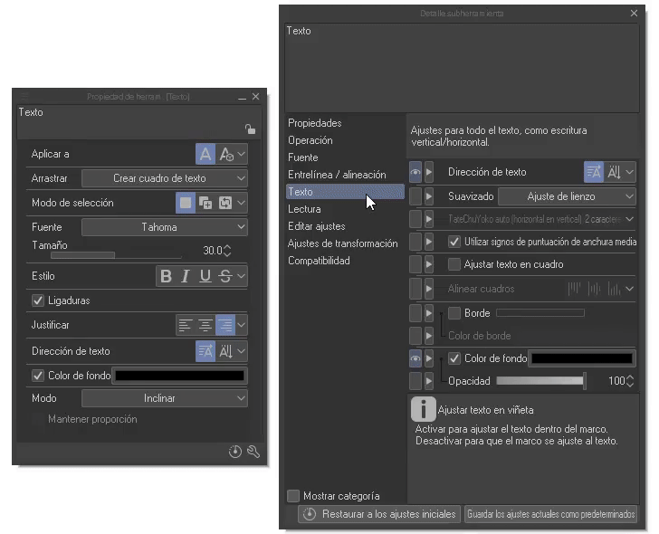
The first important point to keep in mind is that you can change the settings before entering the text in “Sub tool detail”, which will be visible by clicking on the wrench at the bottom right. Remember it well, because we will mention it a lot from now on!
Within this window there are other options that do not appear in the tool properties; we can make them visible by clicking on the icon on the side (an eye will appear to confirm its visibility).
By changing the settings, for example, the font size, the boxes created from that moment on will default to the given settings. Some of the things we can do is add a background color, turn ligature, leading, spacing, etc. on and off. I will address some of them later.
If you want to know in depth about the text tools, I recommend reading the official tutorial series where they show more settings that are good for manga and webtoon. Below, I leave the first of four:
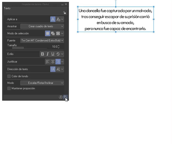
- TEXT BOX
Now, we have another way; text boxes, this way, on the contrary, creates a box where, unlike the previous method, it limits the space available for writing. One of the great advantages that I see is that it is no longer necessary to use the Enter key for the line break; once the limit is reached, a jump is automatically made.
NOTE: From version 2.0 onwards you will be selecting by default “Wrap text in frame”. Option that prevents text from extending beyond the frame. Instead, a new line will be created. To disable it go to: Sub Tool Detail > Text.
Unlike the previous method, when we use the handles to transform the box, the letters are not compressed (we can notice this when we see that the maintain proportions option is disabled). If the box is too small, some of the text will be hidden until it is resized to a format where all of the text can be visible.
NOTE: Even if you have this option active, you can still write text the simple way, by clicking on a space, without the need to draw the box. This way you can vary between both methods quickly.
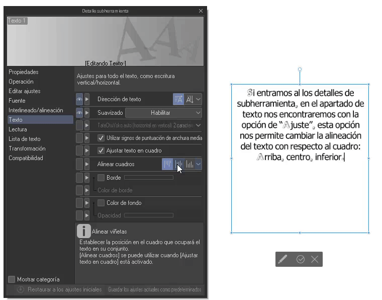
If we enter the sub tool details, in the text section we will find the option to “Align boxes”, this option allows us to change the alignment of the text with respect to the box: Top, center, bottom.
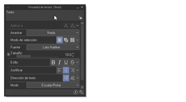
In the “Tool Properties” palette we can make the following modifications:
- Multiple text layers: If we have several text layers they can be grouped into one with the “Merge with lower layer” icon, this layer can contain many text boxes that can be modified independently.
NOTE: If one of the combined layers is not of type text, the result of the combination will be a raster layer.
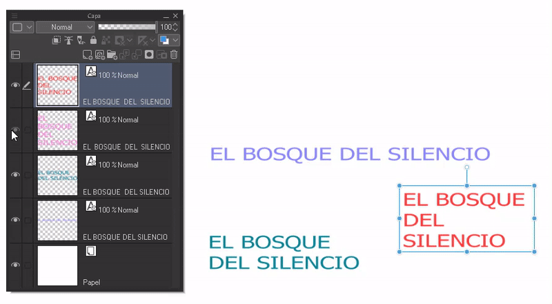
If we want to select several texts at the same time we must activate the option: “Select text”, this function is found in the “Drag” section in the tool properties. This works for both separate and joined layers.
IMPORTANT: Disable this option, once finished, create text box again to avoid dragging.
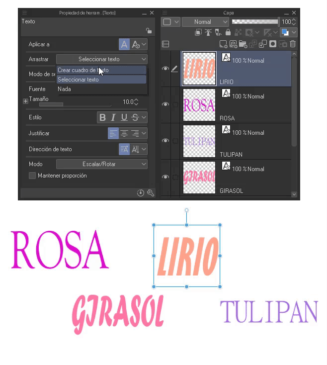
- Modify multiple layers at once: When we want to modify several text layers at the same time to save time, we should change the “Apply to” setting in the tool properties palette to: “ New only” to “Selected text”.
NOTE: Selected text is a new function that was added in version 2.0 of the program.
Now, selecting all the boxes that we want to modify, we will edit from the properties palette. The changes will be reflected in each selected box. This form of editing is an improvement that was implemented in version 2.0.
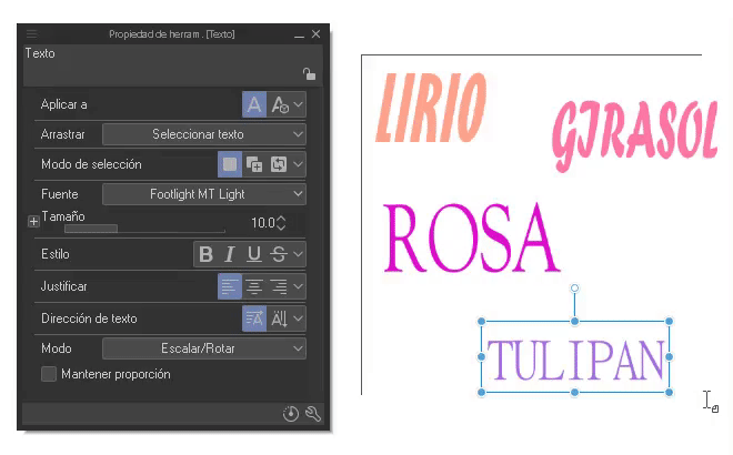
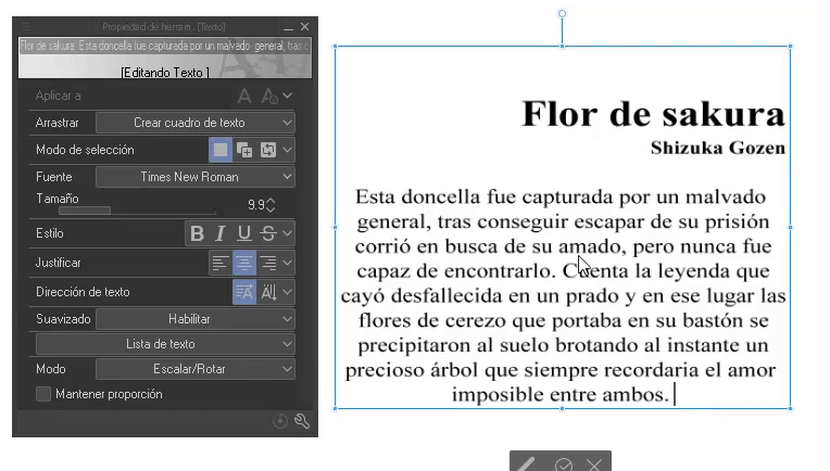
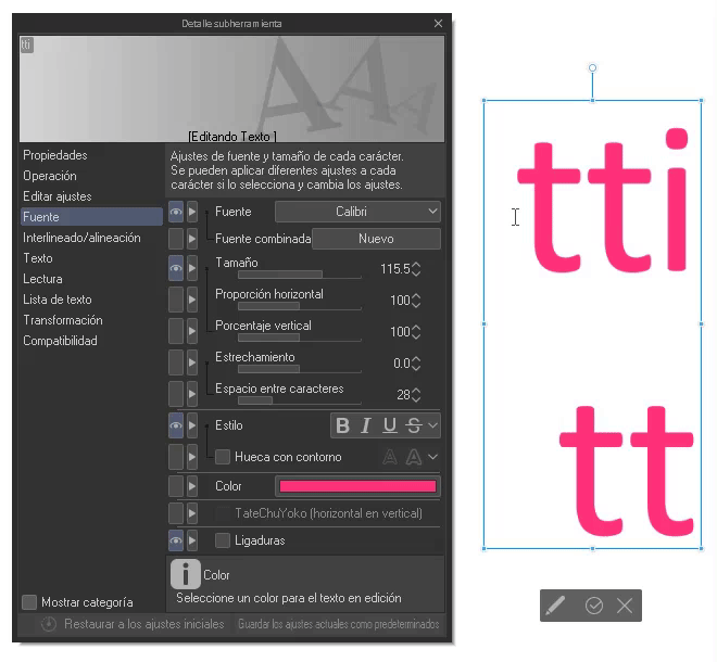
- Font and size: In this section the different fonts will appear and we can modulate their size. For the size and fonts we can select a word, letter or the entire phrase, therefore, you can have different size and font configurations within the same text box.
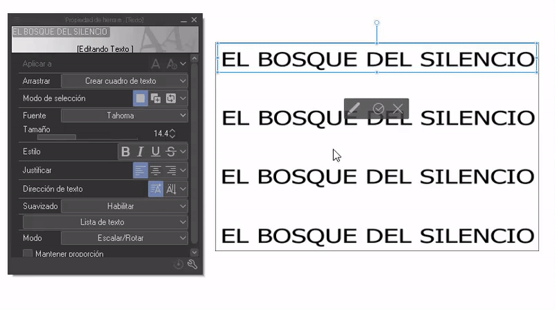
Within the drop-down menu, apart from the fonts, we find three interesting sections.
1. PREVIEW: At the bottom left we find three options that allow you to change the appearance of the font preview.
1. Show source name.
2. Show font in specific font.
3. Show text in specific font.
2. ADD SOURCES: Here, as its name indicates, new fonts are added, to do this we click on the option, the file search window will open where we will choose the ZIP/ RAR/ TTF/ OTF package that contains our font, we accept.
A message will appear where it will allow us to save it in the cloud, if it seems convenient, accept it, if not, just click close. And voila, we have a new font.
3. LIST OF SOURCES: It happens very often that we have a couple of favorite sources, but it is a hassle to have to search for them all every time. To solve this difficulty we have the option of creating one or more lists where we can group only the sources we like.
To generate them, we will click on the gear located at the bottom right of the “Source” drop-down menu. A window will appear; On the left side of this we can create, edit, duplicate and delete with the buttons at the bottom.
Well, we will click on the first “Create” icon at the bottom. A text field will open where you can type the name of the list. On the right you can search and choose the fonts, with the second icon in this section the names of the fonts will be displayed. Now all that remains is to select the sources (they will be marked with the check sign) and accept.
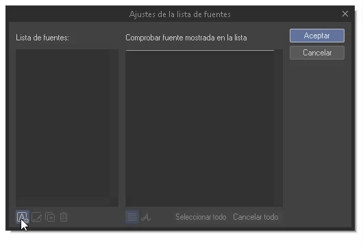
Returning to the “Source” drop-down menu, at the bottom there is another drop-down menu: “All sources”, if we open it the lists will appear.
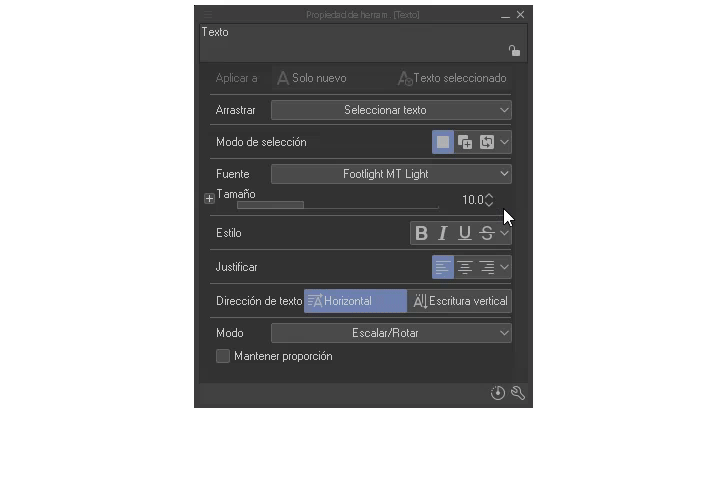
+ **Style:**As for the styles we have: Bold, italic, underline and strikethrough. By selecting a word or the entire text we can apply the effect.
- Justify and text direction: Regarding justified, the text can be aligned to the right, center and left. For the structure, we can change the direction between horizontal and vertical (vertical direction works better for Japanese characters, for example).
- Mode: Here we find scale/rotate/tilt.
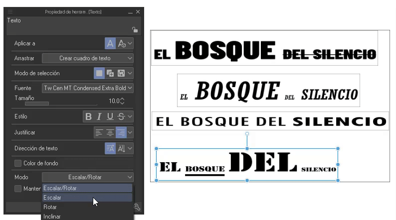
Ideal for placing text in perspective.
2. Types of fonts
Typography is the style or appearance of text. We work with her all the time when we do documents, for school, etc. Knowing about typography will make the difference between a simple project and an extraordinary one.
► Types of sources
The language of typography will help to correctly transmit the desired messages, for example, if we want to emphasize the danger we will not put a sign in cursive font with pastel colors, we will put large letters, in capital letters and with solid colors, contrasted like the typical red and white that warns of danger. This is why it is important to think about what you want to transmit, in order to capture the message with the correct source.
Let's see below some types of fonts, their characteristics and mainly what they are used for.
- Serif: Let's start with the Serif type fonts, these are characterized by having small strokes stuck in the initial part of the letter called serifs. Common in magazines and newspapers.
- Sans serif: On the other hand, fonts of this type do not have this stroke. It is a style that alludes to cleanliness and modernity. Commonly used in digital environments because it is easy to read on screens.
- Display: This type of typography has many styles in which bold, italic or decorated are found. They are usually used for small texts such as titles and subtitles due to their extravagance.
►What fonts to use?
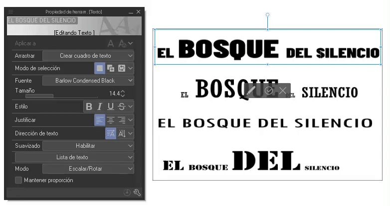
When working on a project it is advisable to use one to two sources maximum. If greater contrast is needed, the fonts already used can be repeated but with a larger size, underlined or in bold. In the example below, the title has a serif font, while the rest are sans serif font.
When combining different types of sources we must keep in mind that they must complement each other. For example, decorative with simple or short with tall, etc.
► Hierarchy
It is used to direct the reader's gaze, the journey goes from the most striking to the least striking, it shows the reader where to start and where to go; In what is striking we can find large and decorated letters, bold or underlined. In the rest, a flat and continuous style, not so large, taking the background when observing the text.
► Line spacing and spacing
Line spacing is the space between lines of text. This space allows us to modulate the reader's comfort when reading, for example, if the space is small or very separated it can tire the reader's eyes, an intermediate space is best.
On the other hand, spacing corresponds to the separation between letters or characters. Letters that are too close together or separated make reading impossible. But if they are used in dialogue they give the impression of someone who speaks quickly or slowly.
To modify the leading and spacing in CLIP STUDIO PAIN we will go to the “Tool Properties” palette, we will click on the wrench icon at the bottom. There, in the font section, we can change the line spacing to our liking, moving the percentage bar.
► Ligatures
As a last point we will find the ligatures. Ligatures are the union of letters that match structurally, so that they look better when they are together. This feature was recently added in version 2.0 of CLIP STUDIO PAINT. By default it is active, but we can deactivate it from the “Sub tool detail” window.
NOTE: Not all fonts are supported, and are treated as a single character if this option is enabled.
If you want to remove the ligature from a specific part, you just have to mask that section and deactivate the ligature icon.
3. Style text
In this section I will explain how to create textures for the letters in CLIP STUDIO PAINT. Different fonts are beautiful on their own, but sometimes they don't fit together well when they share space with an illustration, which is why they are usually textured so that they match the theme of the illustration, or simply stand out.
NOTE: All effects and modifications of the letters will be made with the text layer rasterized. Remember that layers cannot be edited or drawn on.
► Textures
In this section we will learn how to add textures with brushes and patterns.
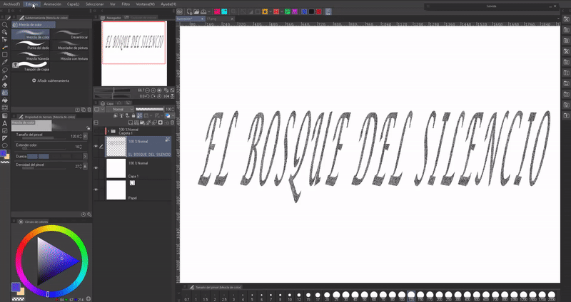
- BRUSHES
To begin adding any texture or color beyond the default, we'll convert the text layer to raster. To do this you have to right click on the layer, in the drop-down options you will find the option “Rasterize”.
Now with the rasterized layer we will click on the “Block transparent pixels” icon, this allows us to paint without leaving the border of the letters.
Now, we will select the text with the selection tool that we like the most, in my case I will use “Lasso”.
In the color wheel we will choose white, then we will click on the fill can icon found in the floating menu of the selection tool. This will paint the letters white. To get rid of the lasso selection as the default shortcut you can use CTRL + D.
With the help of any textured brush we will paint over the letters, the different textures will give the letters the same quality. You can use any color you want. Ready, we now have our first texture.
- Patterns
The process is practically the same. First the transparent pixels are blocked, then we will paint the letters white as we saw previously.
The next thing will be to go to the materials and drag the pattern that we like the most to the canvas, the patterns can be monochromatic or figurative. We will place the patterns layer above the text and adjust it to the bottom layer.
► Color/Gradient
There are two types of coloring that we can add to the letters, one using brushes and the color wheel, while the other is with the use of gradients.
- COLOR
If we already have the texture, we will go to the following route: Edit > Change luminosity to opacity (B), this option allows us to paint without losing the texture. Once this option is activated, we will paint over the letters with the color and brush that we want. Remember to have the Block transparent pixels option active.
With the “Color Mixing” tools we can mix colors if we use two or more.
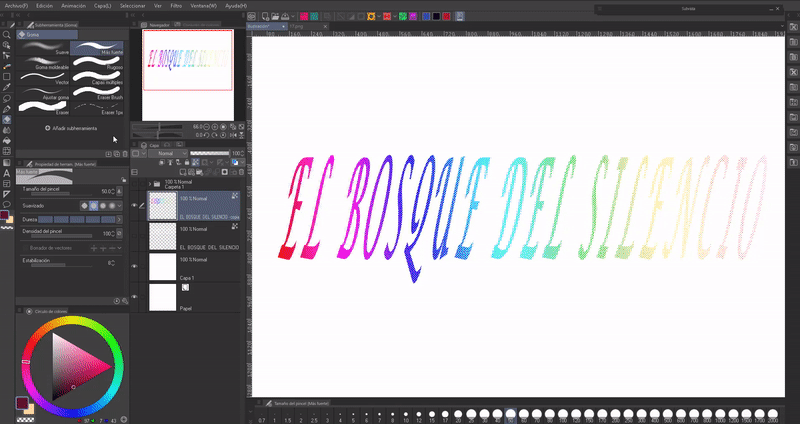
- DEGRADED
For the gradients we will follow the previous process, but with the difference that when we apply the color a gradient will be chosen and it will be applied in the direction we want. Regarding gradients, we have two options:
1. SIMPLE GRADIENTS: These are the ones found in the toolbar. They are easy to edit, you can apply them in any direction and they don't need a base color.
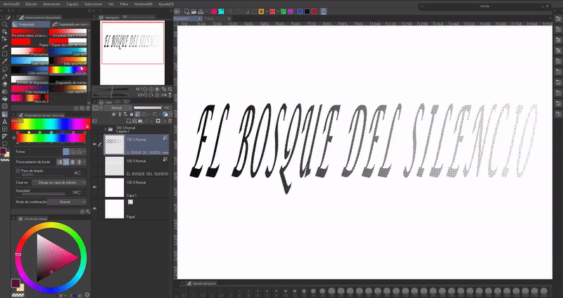
2. GRADIENT MAPS: These can be found in the following path: Layer (L) > New correction layer (J) > Gradient map.
They are more complete, we can download more combinations from ASSETS, invert the colors, etc. The peculiarity they have is that they need a base of several colors, this is because the gradient maps replace the existing colors with those of the gradient. This is why we need to have the letters painted with two or more shades to appreciate their effect.
If you want to know more about how gradient maps work, here is a tutorial I made where I talk in depth:
► Hollow
To empty the filling of the letters we will go to the following path: Layer (L) > Convert layer. Another method is to right-click on the layer and choose the “Convert layer (H)” option that appears in the floating menu.
When you click on this option, a window will appear where you can choose to convert the layer to a vector type. Type (K): Vector layer.
When we change the layer type to vector, the settings option is enabled. Clicking on it will open a new window where we can make several modifications, but the most important is “Max line width.” this setting modulates the thickness of the line.
Below we see an example with 5 and 10 px in the parameter value.
If you want to know more about vector layers, I leave the entry to a tutorial where I talk about this type of layers:
Now, vector layers have an advanced level of editing for the lines created in them. In our case we want the lines to have a texture, to achieve this we will go to “Object”. In the properties of the tool we will find a section called “Brush shape” when we click, a drop-down menu will appear where a textured brush will be chosen. This will give the texture to the edge.
Furthermore, if we are not convinced of the thickness of the lines, we can modify it in the “Brush size” option.
When we have the texture, we will rasterize the layer as shown previously, now we can follow the aforementioned processes to give them color.
Example of an advertising flyer:
► Glows
- BRIGHTNESS
Creating a glow that surrounds letters or characters is simple. First, we will generate a new layer above which we will set with the blend mode “Dodge (color)”.
With the airbrush, you will paint over it with a more expensive color than the typography. I recommend having the hardness and density values at a minimum for a better result.
To add more effects, you can use the spray airbrush to give small sparkles using two layers with the combination modes: “Overlay” and “Dodge (brightness)”.
- TRANSPARENCY
We achieve the transparency of the typography by changing the combination mode of the text layer to “Dodge (brightness)” and lowering the opacity of the layer.
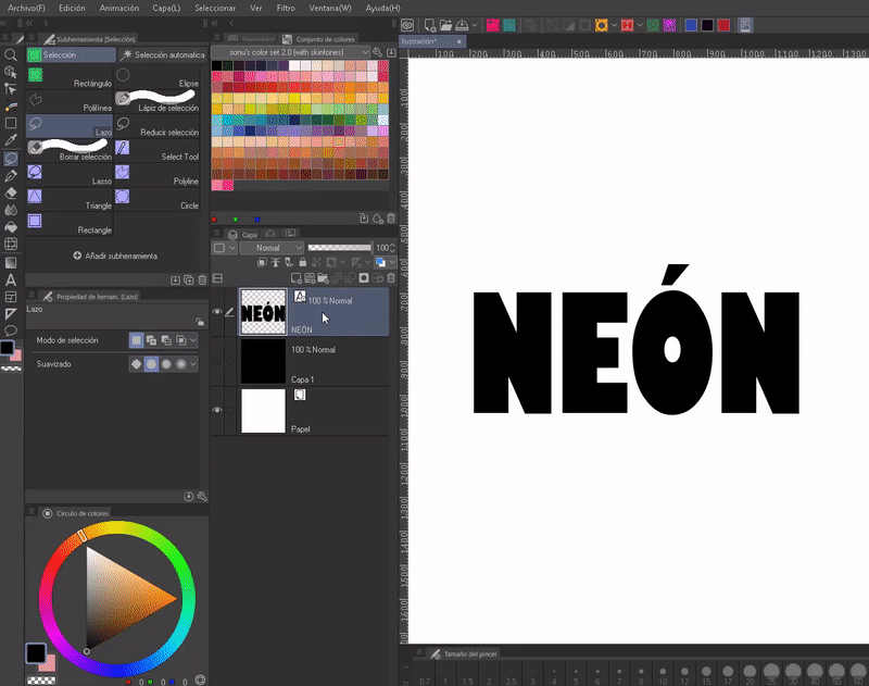
- NEON
To make it noticeable I will use a black background. After rasterizing the text layer you have to duplicate it, this layer must be below the original. In the layer thumbnail of this copy we will press “CTRL + CLICK”, this will select the outline of the letters.
We will hide the original layer. Selected the duplicate layer. Now we will go to the following route: Selection > Contour Selection (G). A window will open where you can expand the selected area. A value between 5 and 15 is good, in my case I used 10 px. At this point we must already have the color that we will use selected on the color wheel.
Now we duplicate the second layer (to which the color was applied). We will place this third copy below the others and apply a “Gaussian Blur” found in the following path: Filter > Blur > Gaussian Blur. Finally, once again we will see the original layer.
TIP: For a better effect, I recommend grouping the three layers into one and then duplicating it. It will improve the vision of colors.
To make hollow letters with the neon style, the same steps will be followed to hollow out the typography explained above and then the neon process, only in this case two layers will be used, one where we will apply the increased border and another to apply the blur.
► 3D typography
We will duplicate the text layer with the keyboard shortcuts “CTRL + C” and “CTRL + V” or by right clicking on the layer, in the options that appear we choose “Duplicate layer”. Then, we will move it below the original; We will change the color of the letter to the duplicate layer. Then, we'll move the layer a little, offsetting it from the original.
Following this same process you can create a shadow effect behind the letters. The additional step will be to apply a blur filter to the layer behind it. I advise using “Gaussian Blur” found in the following path: Filter > Blur > Gaussian Blur. In addition to being able to lower the opacity so that it is not such a deep shadow.
NOTE: You need to disable the “Block transparent pixels” option to be able to use the blur.
To improve the traditional effect, it is advisable to manually draw the union between the two words.
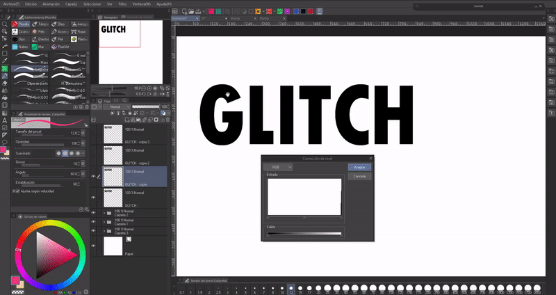
► Glitch
We will create three copies of the raster layer of the text, to each one we will apply the following procedure:
Selecting one of the duplicate layers by going to the following path: Layer (L) > New correction layer (J) > Level correction.
Within this window we will choose the “Red” mode from the drop-down menu at the top left. Now, we will move the arrow that is in the monochrome bar at the bottom left completely to the right and click OK.
We will dock it to the layer below and then we will merge the level correction layer that was created with one of the copies of the text. This will turn it red.
We will repeat this same process with the other two layers, only in one the green mode will be chosen and in the other the blue one.
When we have the three layers we will move each one a little, moving them out of phase with the original (the three layers must be below the original).
Not only can you create this effect with this set of colors, you can any other. The sky is the limit.
NOTE: Modify the color using a gradient map as explained above.
TIP: So that it does not become tedious to always have to follow this procedure, we can create an automatic action; If you want to know more, I leave below the entry to a tutorial where I talk about this wonderful tool that saves a lot of time.
► Borders
The text tool itself has an option to set a border, but I find it easier to use this other method:
After writing the text, we will go to the “Layer Properties” palette, there we will click on the circle-shaped icon. By default a white border will appear. In “Border Color” we click to change the color and by moving the “Border Thickness” bar we change the width.
Another thing we can do to the text is add decorations by drawing them directly on it.
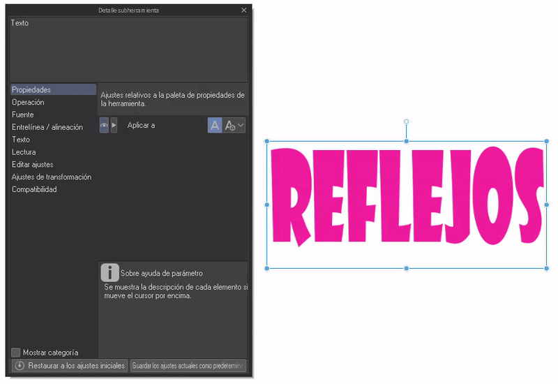
► Biased
Within sub-tool details, in the “Transformation” section you will find other transformation options apart from those already seen at the beginning. With these we can invert the text horizontally or vertically.
- REFLECTION: To create a reflection we will duplicate the layer, we will lower the opacity of this duplication and we will tilt it to the side that we like best with the aforementioned tools. Then we will align this second layer so that the top of the letters touch the bottom of the letters on the first layer. Ready, a reflection.
4. Transformations
IMPORTANT: All letter modifications will be made with the text layer rasterized.
- MESH TRANSFORMATION
Curving text or placing it in an odd position is easy. Having the layer selected we will go to: Edit > Transform > Mesh Transformation.
A mesh will appear with a series of nodes; We can move these nodes to the desired potion.
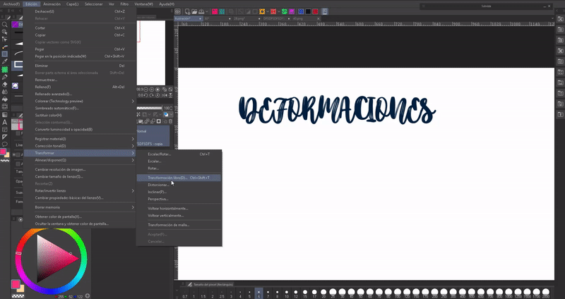
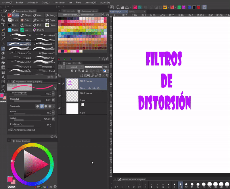
- DISTORTION FILTERS
Another method to create deformations in our characters is to use distortion filters on them. The filters are in the following path: Filter > Distort.
We will find a series of filters: panoramic, polar, geometric, shrink, fisheye lens, waves, circular waves, swirl, curved surface, zigzag.
We will choose the filter that we like, a window will open where we can configure the values, I recommend that you read and experiment until you obtain the desired effect. Here are some examples of distortion:
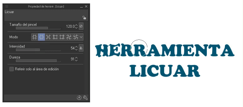
- BLEND
The liquefy tool allows you to make corrections, that means it modifies the shape of the area where we use it. We find it in the toolbar.
In the properties of the tool we can find five sections that will be used to choose: size, mode, intensity, hardness and reference to the editing area. If you still don't know this tool, here is the official tutorial where its use is explained in depth:
By experimenting we can obtain good results.
Farewell
I hope that what you see in this tutorial is to your liking and that it is helpful to you. Well, without anything to say, thank you for coming this far! ପ(๑•̀ुᴗ•̀ु) ॣ৳৸ᵃᵑᵏ Ꮍ৹੫ᵎ ॣ
Vibrate high!!!
We won't see you another time ( •⌄• ू ) ✧
Users who liked this post


Comment