Profile Icons with Mockups and 5 Design Principles
Introduction
Hello Everyone, today we are going to see how to create and use a mockup/template to visualize your profile icon/picture in different sizes. Following principles or guides to optimize the profile during the design process. And finally, how to export the images so we can use them in various platforms such as: social media, forums, chats, messenger apps and more. So, let’s begin.
...
NOTE: The images used in this tutorial were design, created or produced by the author of the tutorial. The logos of Clip Studio Paint, Clip Studio and CELSYS belong to their owners.
1. Exploring Platforms & Sizes
The first step is to explore the different platforms or the platforms where you are going to upload the profile image. These can be social media, chats, messenger apps or whatever you are planning to use.
Take a screenshot from the device you are using. You can use shortcuts or other methods to capture the layout of the different platforms.
WINDOWS.
Press Windows+Shift+S or Print-Screen (key)
MAC.
Press Shift+Command+3 or Shift+Command+4 (for capture areas)
iPAD.
Press the Top button + volume or home button. You can also swipe up from the bottom left corner with the apple pencil.
SAMSUNG TABLET.
Press Power + volume down or home button (simultaneously). You can also use Palm Swipe across the screen. Or Air Command Menu with the S pen.
Open your screenshots in Clip Studio Paint and use the Rectangle Selection Tool and the Information Palette to review the sizes used for the profiles. If you don’t see the information palette go to Window > Information. You can check the width and height represented by a H for horizontal and V for vertical.
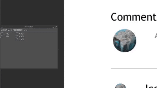
Take note of all the sizes where the profile is used, comments, login-logout, username, and so on. We can review the size numbers later to create a mockup/template to visualize the profile picture/icon.
Here is my list with the size numbers:
Sign in / Login 32x32 px
Large Profile 220x220 px
Username 120x120 px
Comments 50x50 px
Icon 24x24 px
For this tutorial I am going to use custom sizes based on screenshots taken in a Windows PC. These are close or in between the most common profile sizes used in different platforms like Twitter, Instagram, YouTube, Facebook, and more. However, keep in mind that these sizes are not absolutes and can change to adapt to the screen of the device you are using.
2. Types of Profiles
You can find different types of profile images such as: logos or symbols, personal or business names, photos from landscapes to pets, digital and traditional illustrations, pixel-art and more.
Later in this tutorial we are going to see 3 examples and explain the decisions taken during the design process. We are going to see (a) one for pixel-art, another with photos (b) but you can use the same tips with flattened or scanned illustrations. And one for (c) name logos.
NOTE: Keep in mind that with these examples we are going to focus in the process and not dive into details of the tools, or explain step by step how to create the profile images but instead in how to optimize them to look better in small circles and squares following 5 principles or guides.
3. The 5 Design Principles or Guides for Profile Pictures/icons
I try to use 5 principles or guides through my process when I am designing a Profile picture or icon. These are: Simplicity, Contrast, Recognizable, Scalability and Crop Shape. Let’s have a quick review of them.
SIMPLICITY
Avoid too much detail. Details could look great in large sizes but these could be hard to see and understand at smaller sizes.
CONTRAST
It makes easier to perceive the profile image. You can use light versus dark values or complementary/opposite colors. You can also use the background of the platform to your advantage.
SCALABILITY
Check if the profile image can adapt to different sizes. The simplicity and contrast of the image will make this process a lot easier.
RECOGNIZABLE
You can use shapes or silhouettes to make you image recognizable at different scales. You can also use colors or asociatte a color with your profile picture/icon.
CROP SHAPE
Make your composition and align the image knowing that is going to be cropped by the shape (circle, square) of the platform layout. Avoid unintentional crops. You can also use or incorporate the shape of the crop in your design.
NEXT: In the next chapters we are going to see how to make and use a mockup/template to easily check these 5 principles while designing profiles. After that we are going to review the design process that I try to follow and then will check some examples.
4. Profile Mockup/Template (Step by step + Free download)
In this chapter we are going to see the basic steps to create a mockup using File Objects in Clip Studio Paint.
However, you can download the mockups ready to use from the links below along with a PDF of how to use them and things you can and can't do. In summary you can use them but please don't license, distribute or sell them as your own. Then you can continue or jump to the next chapter: Updating File Objects in Multiple Windows Setup.
NOTE: Even if I call these mockups/templates. These are .clip file documents and not the Templates that appear when you create a new document in Clip Studio Paint.
LINKS TO DOWNLOAD FREE MOCKUPS/TEMPLATES:
Download Mockup/Template for Profiles using a 1000x1000px canvas.
Download Mockup/Template for Pixel Art Profiles using a 56x56 px canvas.
4.1 Creating a 1:1 profile document
Whether you are making a new Profile from scratch or adapting one. We are going to work with a 1 by 1 aspect ratio which is the standard across all the platforms.
1. For Profiles using Illustrations, Photos or Name Logos. Create a New Document and from Preset select ‘Square (1000 x 1000px)’. Name your Profile document and save it as a Clip Studio Paint .clip file. This will allow us to use it as File Object. But if you prefer you can also use .psd files to create files objects.
2. For Pixel Art Profiles you can use small canvas sizes to make the squares visible. I am going to create a medium size of 56x56px. But you can also try smaller sizes such 16x16, 24x24 for bigger pixels. Or larger canvas from 64x64px and above to add more details. Then Save the file as a Clip Studio Paint file (.clip) so we can use it as a File Object later.
4.2 Mockup/Template with File Objects
CREATE AND SAVE A DOCUMENT
We are going to Create a New document of 720x1080 px to visualize the profile pictures/icons in different sizes in a similar way that when we use social media, chats, messenger apps, or other platforms. To simulate a dark theme you can change the color of the Paper to a dark gray or black.
Then Save the Document in the same location with the Profile Picture/Icon file we created before.
IMPORT PROFILE AS FILE OBJECT
Now let’s import the .clip file of the Profile Picture/icon or Pixel Art into the document we just created .
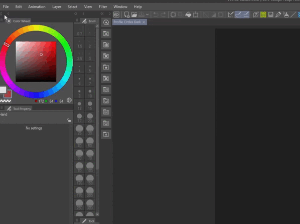
(1) From File > Import > Create file object… Select the file you are going to use as File Object and click Open (2).
You will see a message (3) about the file object we just created. And the file object will appear in the Layer palette with an icon of a linked file next to it (4).
RESIZE USING THE GRID
Check the sizes used for the profiles from the screenshots of the platforms and sites you are going to use or review the list of the custom sizes used for this tutorial.
Sign in / Login 32x32 px
Large Profile 220x220 px
Username 120x120 px
Comments 50x50 px
Icon 24x24 px
Then go to View > Grid/Ruler Bar Settings and change the Number of divisions to 1 and match the Gap with one of the sizes used for the Profile, for example 100px. And make the grid visible from View > Grid.
Now with the Object Tool (shortcut O) resize the file object dragging from the corners (1) and align it with one of the squares from the grid (2).
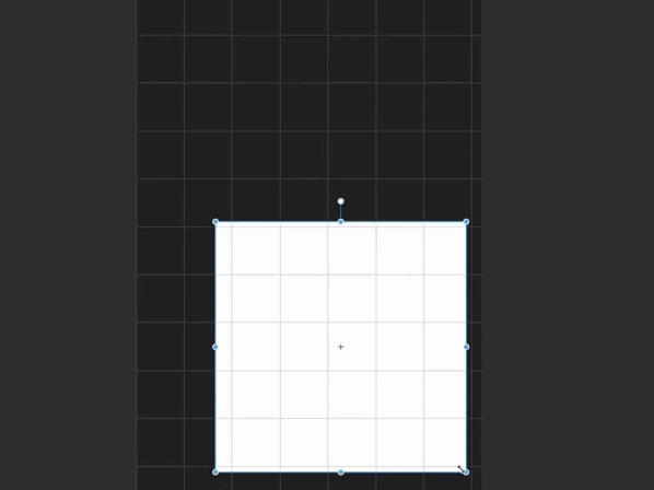
You can double check the size in the (3) Information palette. Click on the thumbnail (4) holding CTRL in the Layer palette or right click > Selection from Layer > Create Selection.
IMPORTANT:
Change the [Interpolation method] to High Accuracy (average colors) in the (1) Tool property palette. This method will work with 1000x1000px profiles and with pixel-art. If you don’t see the option click on the wrench icon and make the option visible from the Sub Tool Detail palette by clicking in the eye (2) next to it.
CROP SHAPE
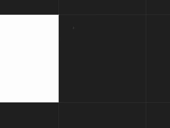
Now in an empty layer below and with Snap to Grid active (CTRL+3). Draw a 1 by 1 circle with the Ellipse tool.
Align the File Object above the circle (1) and on the Layer palette, select the File Object and click the [Clip to layer below] icon (2). This will emulate the elliptical crop used on different platforms.
Then change the size of the Grid again to match it with the other profile sizes. Repeat the process with each one until you complete all the sizes used for sign in (1), large profile (2), username (3), comments (4 )and icons (5).
You can create light and dark themes. And make elliptical and rounded rectangle crops to preview how your profile would look at different sites and platforms.
5. Updating File Objects in Multiple Windows Setup
OPEN AND RE-ARRANGE WINDOW DOCUMENTS
If you downloaded the mockups above. Open or drag the Profile Picture (or Profile Pixel Art) file and one of the mokcups/templates, (Profile - Circles or Profile - Squares) to Clip Studio Paint.
Or open the files you have created and saved in the same location folder.
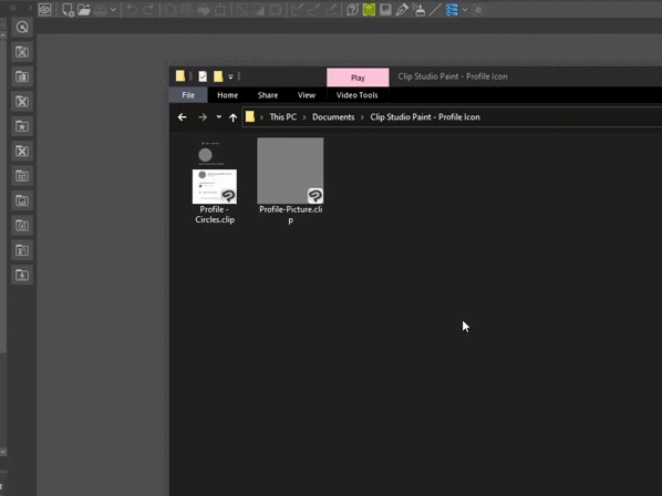
Then click (1) and drag the Tab of one of the canvas and dock it to the left or to the right, release it when you see the red overlay (2) appears.
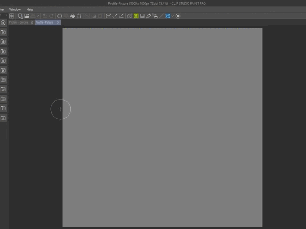
Now we can see both documents at the same time. You can use Fit to Navigator for the 1 by 1 Profile canvas, in the Navigator palette. This feature can be really helpful specially with pixel-art.
SAVING AND UPDATING FILE OBJECTS
Now draw, paint or write anything on the Profile file and save your work. It should update automatically in the mockup file.
If you are in the Mockup/Template canvas. You can also go to Layer > File objetcs > Update all file objects.
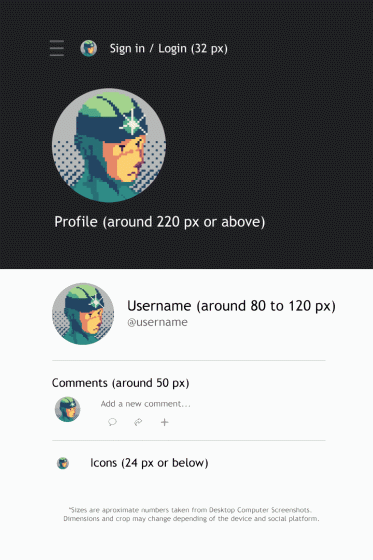
With this setup we can work on the profiles pictures/icons and check ‘The 5 design principles or guides for profiles’ in the process. You can save multiple steps visualizing the different sizes at the same time, in a similar layout to the platforms where you are going to use your profile image.
6. Design Process (Profile Icon/Picture)
In this chapter we are going to use 'The 5 principles or guides' for profiles to explain the decisions taken during the design process. Just a quick reminder these are: Simplicity, Contrast, Scalability, Recognizable, Crop Shape.
6.1 Steps of the process
The steps of the design process that we are going to follow are Focus, Identify, Improve, Double-Check and Repeat.
1. Focus in one principle (from the 5 mentioned above).
2. Identify issues or problems in the profile image.
3. Improve, try different approaches and solutions. Review and keep improving if need it.
4. Double-Check the Scalability of the image using the mockup and export, or...
5. Repeat. Focus in another principle and repeat the process.
6.2 Profile Examples
Now we are going to look at three different examples following the steps mentioned above. We are going to focus in the process without diving into the tools details as we did in previous chapters. If you want tutorials or tips with more details about the tools and techniques used for each example, let me know in the comments.
a) Pixel Art Example
To start I made a Silhouette without antialiasing based on a 3D model. And check if the shape was (1) Recognizable as a head. Then painted without antialiasing using a reduce gray palette of six values for (2) Simplicity.
After that, I added color with Gradient Maps using opposite colors in the chromatic circle to improve and get more (3) Contrast in the subject face. In the smaller profiles sizes, the head looked too big and a bit out of proportion. So, I added a dithering gradient at the back to avoid or decrease that visual perception and improve the (4) Scalability.
NOTE: You can improve the Simplicity in pixel art using smaller canvas and less colors or values. But decreasing details and stylizing more the image. Then you can Double-Check and explore different solutions to improve the image if need it and export it.
b) Photo/Illustration Example
At first glance I noticed that the image needed more (1) Contrast to be used as a profile. So, I made a selection and cut the subject (hawk) from the background. Paste it in the 1000x1000px Profile canvas and placed in the center to avoid (2) cropping the head of the subject (bird).
Then I added a gradient layer at the background to create more (3) contrast. To improve the (4) contrast I used Adjustment layers, Brightness/Contrast, Tone Curve and Gradient Map. Trying to use opposite or complementary colors between the subject (hawk) and the background.
After that, I decided to add a circle (5) to incorporate the shape of the most used crop across the platforms. This also helped to create different planes and sense of depth. To separate the subject (hawk) from the circle and background, trying to preserve the silhouette (6) Recognizable. I added a subtle shadow in between. Finally, I double-check the smaller sizes of the profile (7) Scalability.
NOTE: You can adapt these tips and use them with Photos of people, pets, objects, etc. You can also adapt these to flattened or scanned illustrations. Just make sure to create a copy first and don't work directly over the original or source file.
c) Name Logo Example
In this fictional personal logo name. We can noticed that the name seems a bit long to be read at small sizes (1) Scalability. So, in this case I decided to use just the ‘a’ for (2) Simplicity.
Then I noticed that the ‘a’ looked a bit small for comments and icons sizes. So, I made the ‘a’ larger to improve its adaptation to smaller sizes (3) Scalability. Finally, I choose a green color to be associated with the logo in both versions the icon and the complete name logo to make it (4) Recognizable.
NOTE: You don’t always need to use just one letter or one flat color. You can try different approaches or solutions and see what works best for you and the profile. Just check if the image can be recognizable at small sizes. For example if you font is too light or thin you can try a bold option from the same family font or add a Border effect of the same color.
...
7. Exporting Profiles for Platforms
Before exporting the profile picture/icon, let's talk about when you need to resize the image and the formats supported by the platforms.
RESIZE IMAGE
The image size of 1000x1000px should be enough for any social media, messenger app or forum. But every platform may recommend you minimum or maximum sizes for profile images. If your image is bigger like 2048 pixels when only 400 pixels are needed. Or smaller in the case of pixel art. Try to always resize the image first by your own and don’t relay on the platform method to resize the image.
IMPORTANT NOTE: In both cases always make a copy first and resize the copy not the original or source file.
For large images above 2048, I would recommend you to go to Edit > Change Image Resolution. And select the High accuracy (average colors) as Interpolation method. Then you can enter the exact size in pixels and press OK.
For pixel-art images I would recommend you to go to Edit > Change Image resolution. And select the Hard edges (nearest neighbor) method. You can change the Scale number until you get a size close to the recommend. Or enter the exact size and check if the squares look the same in the original and the copy.
FORMATS
The most common formats for profiles images are PNG (Portable Network Graphics) and JPEG or JPG (Joint Photographic Experts Group).
PNG files are mostly used with logos, pixel art, icons, graphic illustrations and flat or plain colors and graphics. Or if you need an image with transparency. PNG files tends to have better quality but can produce larger file sizes.
JPEG files are widely used with photographs and can compress a lot the size of the file. However, too much compression could decrease the quality of the image. You can use this format with pictures, illustrations, and other graphics. But is not recommend to use it with pixel-art, clean logos and icons. Also, JPG files don’t support transparency.
I would recommend you to use PNG every time you can or a JPEG with quality above 80%. Keep in mind that some platforms like Facebook can compress the quality of the images even more once you upload them.
EXPORT (SINGLE LAYER)
To export your image go to File > Export (Single Layer) and select the format that you want.
Now, for Expression color select RGB color (1). And keep the (2) Scale ratio to 100%. Leave the rest to default and press OK. Check the (3) preview and click OK again.
For JPEG files try to keep the quality above 80 and Embed ICC profile. Then press OK.
If you change the size of the profile remember to save a copy before resizing the image. And don't change the size on the original or source document. You can also add the dimensions to the name of the file to easy recognize the size of the document.
ADDITIONAL INFO: Some platforms like Facebook or Telegram, may support animated gif files or MP4 movie files when they are uploaded from a mobile device in Android or iOS. Even if we didn't see an example for this type of files, you can always adapt the tips, process and principles we saw to design an animated profile.
Summary
To recap we saw how to create and use a mockup/template to visualize the profile picture or icon in different sizes at the same time. We also saw principles or guides that can help you to make and optimize the profile during the design process. And finally, when and how to resize images, to export the profiles for social platforms, messenger apps, chats forums and more.
So, I hope you have found something useful that you can use in your own workflow. Thanks everyone for reading the article. This is Ed saying “See you".




Comentario