
Do you like using bright colors in your drawings, but don’t know where to start? Got a good idea but don’t know what colors you should pick? Thankfully, there are a lot of tools that digital art provides to help simplify this process.
I’ll be going through my coloring process in this tutorial to hopefully demystify it as much as I can.
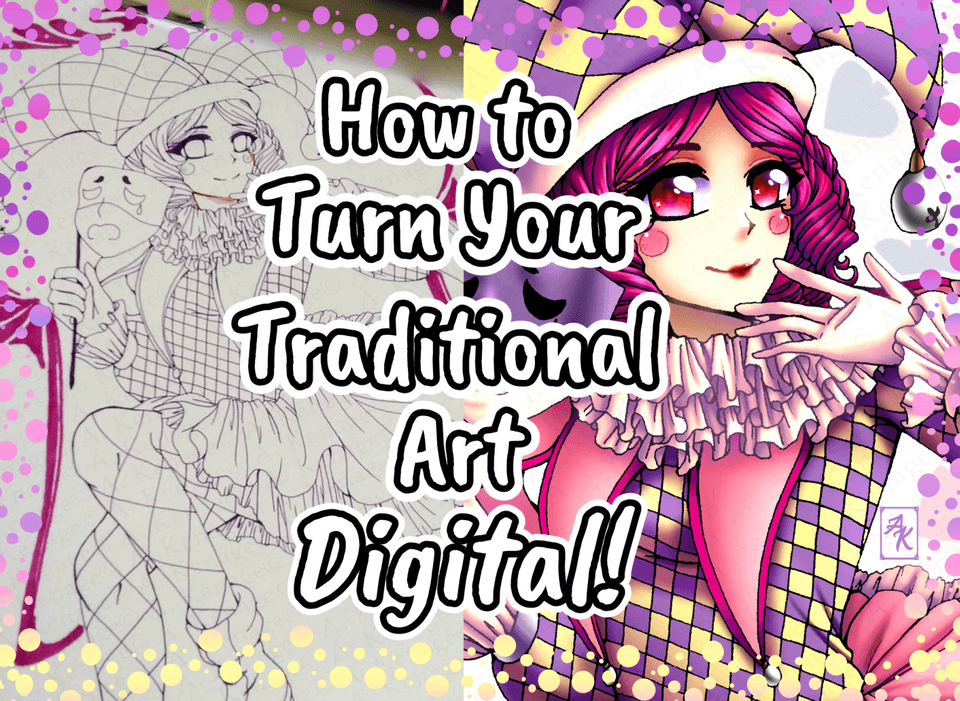
This will be the illustration I’m using to demonstrate! The characters belong to @kabatsu_ on Instagram~
1 | General Tips
When coloring, I try to keep in mind two things: visual cohesion and contrast. You want your characters to look like they belong in the environment they’re in while being able to draw the viewer’s eyes. Here are a few things that help me achieve this:
Consistent Lighting
The most important thing to make your characters look like they belong in the background is to have consistent lighting and shadows. The direction of lighting should be the same for all characters, and the intensity should correspond to how far away they are to the light source. Remember that this applies to background elements as well, if your characters are lit up from the left side, your background elements should be lit up from the same direction too.
To determine the position of the light source, you want to consider something that is realistic for the setting the illustration is in. For example, if your characters are outside in the middle of the day, they should be lit from above because of the sun. You also want to put it in a position that would light up your focal point to draw attention.
As you can see, changing the lighting direction from the right to the left puts one character mostly into shadow, putting the focus on her hair and tail instead of her head.
Bounce Light
Shadows are caused by the absence of light, and therefore they do not have a color. So, when you’re observing the real world, why do they appear to take on colors? The answer is that it comes from a secondary light source, usually bounce light from the environment that casts a colored light on the object.
As you can see, the shadows on the seagull appear blue since the bounce light of the sky is reflected onto it.
(Credit for image: rzierik)
When light hits a colored surface, the pigments in the surface absorbs all other colored light except for the one it appears to be. This is then reflected off the surface onto other objects, casting a ‘bounce light’ onto them.
This effect allows you to make it believable that the character is in an environment, as the objects in it will interact with the character in the form of bounce light. I like to greatly exaggerate this in order to add a bunch of color while maintaining visual cohesion.
2 | Coloring Process
And now let’s go into my coloring process! I try to make this as simple as possible by letting layer modes do most of the heavy lifting for me. This way, there’s not a lot of manual color picking that needs to be done.
Step 1: Flat Colors
For the flat colors, I like to airbrush the skin tone into darker colors to give them a softer look. This fill tool I use is usually very good for putting down flat colors quickly, but the lasso fill is a good alternative when I’m working from a sketch instead of cleaned lineart or if I’m using a textured brush for lines.
Step 2: Rough Background
Like I mentioned before, the environment the character is in will influence the way they should be shaded, so it’s a good idea to put down a rough background first to help you with color picking.
Since this is just to give you a rough idea for what colors you’re going to use, this doesn’t have to be anything fancy. In my case, just blocking in the sky and grass would be good enough, though I like to add more details to help figure out the composition.
If you’re struggling to come up with what colors to use for the background, I recommend using references, they’re super helpful regardless of whether or not you know what you’re doing~
Step 3: Rough Shading
I like to roughly shade my characters before going into details and rendering. This way, I can get a good sense of how the final artwork will turn out to be like without putting in too much time, and if I don’t like how it looks at this stage, I can always redo it without having wasted too much effort. This part usually takes me 10-20 minutes maximum and it’s pretty simple once you get the hang of it.
For this step, you should ignore the details and just focus on the bigger shapes, and don’t worry too much about keeping things tidy!
For the shadows, I like to eyedrop the main color of the background and fill a multiply layer with it. This does most of the heavy lifting for your bounce light and helps with keeping the lighting consistent.
This layer should be clipped on top of your flat colors, which will allow you to shade the whole character quickly instead of needing to go through all the layers individually. I then erase all the parts where the light would hit the characters.
After this, I apply inner glow on an overlay layer where the light and shadows meet (the terminator line). I usually use an orange/red color to do this as it gives my illustration a warmer look.
I then add the bounce light as well as highlights on a hard light or normal layer. For the bounce light, colors are picked from the background and airbrushed in. There aren’t any rules I stick with for picking colors for the highlights, though I find putting in a gradient is a good way to add more colors to your illustration.
You can try different layer modes to get different kinds of effects! For example, I used color burn instead of multiply for the illustration below which gave me very vivid and bright colors, though a lot more manual adjustments were required.
Character belongs to @Hollow_mimikyu on Instagram~
Step 4: Rendering
This is where you clean up everything and add details to make it look pretty! I like to merge the rough shading layers with my flat colors to make them easy to edit, but you can also create a new layer on top of everything and just draw on top.
For the colors, I mostly color pick from the existing ones, though if you need to manually pick them, a good general rule to use is to increase the saturation and shift the hue slightly when going for a darker shade to avoid them looking muddy.
I also use the color correction tools under Edit > Tonal Correction a lot in this step especially when I’m stuck or not happy with something. How you go about this step will vary a lot with your style, so experiment around find something you’re comfortable with!
Here are some considerations I had when rendering, remember that you want a good balance of visual cohesion and contrast in your illustration! This is also where you want to finish up your background. Remember, you can use the same technique as coloring your character!
3| Post Processing
You can call it done at this point! But since you’ve come so far, why not do a few things to give your illustration a bit more pizzazz? Here’s a few things I like to do to further enhance my colors!
Color Adjustments
You can easily adjust your colors using correction layers by going to Layer > New Correction Layer. These allow you to adjust the colors of the whole illustration quickly and are pretty fun to play with. My favorite one to use is the tone curve, which could give you some pretty cool effects if you mess around with it. There isn’t really a right way to go about doing this, I just like playing around with the different settings and sliders until it looks alright to me.
It wasn’t used for this illustration, but gradient maps can give your illustration a nice filter like effect. To use them, I create a gradient map and set it to low opacity, and then go through each gradient I have until I settle on something I like. I can’t find the exact set I use, but you can find plenty of different ones to download on the asset store.
Coloring your Lines
Coloring your lineart can give your illustration a softer impression, and it’s a good method to add even more colors in. Clip Studio has a very nifty function called auto actions, which can help you quickly and effortlessly color your lines.
To use this, import the asset into CSP, and then merge all your color layers. You can then select ‘Auto Line Color’ under auto actions and press enter for all the prompts. This will create a colored clipping layer you can clip on top of your lineart.
To keep your color layers unmerged, you can copy the clipping layer and undo everything, then paste the layer on top of your lines. Adjustments are typically needed but you can just leave it if you’re lazy.
Chromatic Aberration
Speaking of auto actions, you can create the chromatic aberration effect (or RGB shift) using it as well. This can be used in place of blur and can add a bit more color to your drawing!
4 | Afterword
And that’s it for the tutorial! I tried going a bit more in depth into how I usually color so I’m sorry if it ended up a bit too long ;;
If you found this helpful, I’d really appreciate it if you like and shared this! Thank you so much for reading <3
Usuarios a los que les gustó esta publicación


Comentario