Two point perspective news-stand
Introduction
Until a few years ago, I wouldn't believe that I'd become such a big fan of perspective drawing on a computer! I hadn't known how to figure it out. And it was much easier on paper. Everything changed when I started using CSP. All the built-in Rulers were such a game-changer to me!
I'll show you how I use Perspective Ruler to create a simple (and damaged a bit) news-stand.
Rough sketch
When I draw anything using perspective, I usually start with a loose sketch. I use a lot of lines, so my drawings sometimes look a bit chaotic.
I chose a simple shot using the two-point perspective. I arranged some reference photos (that I found on google or took by myself) on the second screen.
I don't care about the perspective that much during the sketching phase. I just was sketching what I had in my mind.
That wavy line at the bottom was put there by accident, heh.
Setting the Perspective Ruler
On that prepared sketch, I can finally set the Perspective Rulers.
I work on vector layers because it's so convenient to me. By using Vector Eraser, I can easily erase no longer needed lines.
I set the sketch color to blue and reduce the opacity. It's not necessary. I just like keeping my sketches in blue.
I create a new layer, click the "Ruler" tool, and chose Perspective Ruler.
If I wanted to stick my sketchy lines in 100%, the horizon line would tilt. In this particular case, this line should be horizontal.
After setting the first vanishing point (two lines on the left), I make the second one, relying on the CSP. The fourth line is merging automatically to the third one.
Snapping lines close-up:
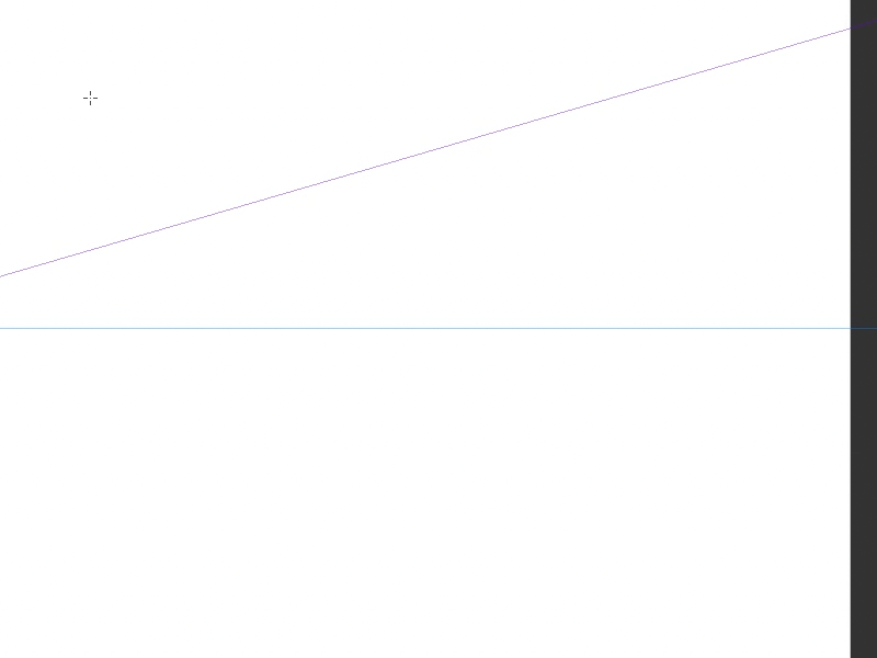
As I mentioned above, I had prepared the sketch roughly. So it's completely normal that during setting the Perspective Ruler, some things change a bit (esp. vanishing points). But, well, my "mistake" was pretty small. I like to think that it's because of my experience, not luck, haha.
You can also use Perspective Ruler by going to Layer > Ruler/Frame > Create Perspective Ruler. Then you have to choose the Two-point Perspective (i this particular case) and set the rulers. But I prefer the way I described earlier.
Rough perspective sketch
Now I can start drawing the lines on the layer with the Perspective Ruler.
Remember to turn on the "Snap To Special Ruler" option to make it works.
You can see the three different ways to turn it on.
By the way, I recommend you to remember the shortcut Ctrl+2 because it's pretty useful!
If I want to place an object drawn from a different angle (new vanishing points), I create a new layer. I copy the Ruler by holding the Alt key and dragging the Ruler icon to the new layer. When the layer you want to copy the Ruler to is highlighted in red, release the mouse button and the Alt key.
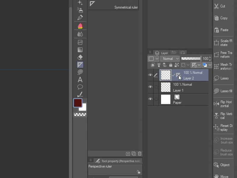
Notice that the entire horizon is tilting when you change the angle of the Vanishing Point guideline. To prevent this (in cases when you want to keep the same horizon line with different vanishing points), check the "Fix eye level" option in the "Tool properties" window. If you do not see this option, click on the wrench icon below and then on the "eye" to make this option always visible.
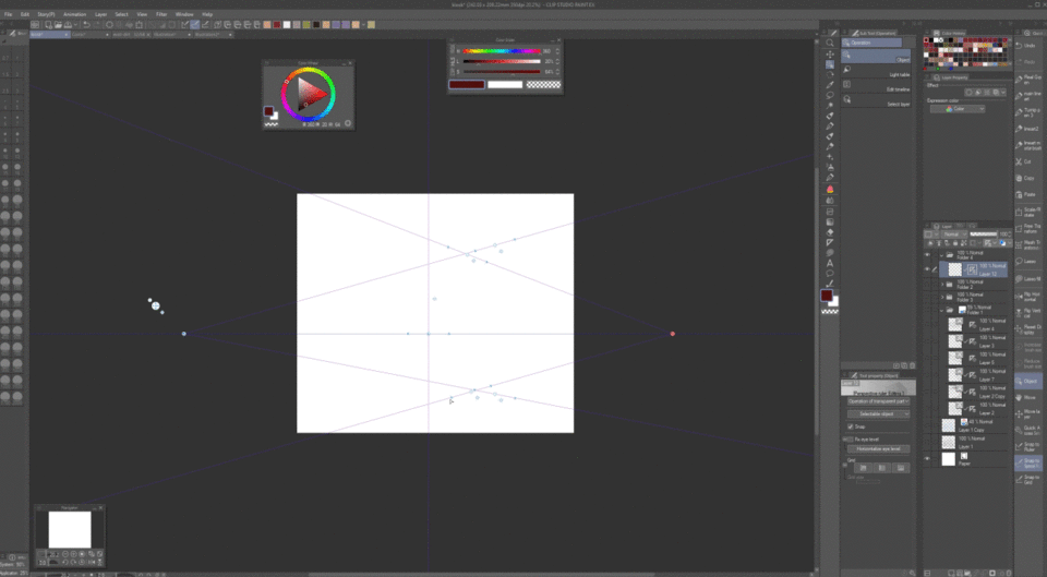
If I want to scale the object, the whole Ruler (the position of the horizon line) also changes. To prevent this, you need to uncheck the tick in the Layers panel.
The next wonderful feature in CSP is the Grid option. We can turn on this on XYZ planes. You can reduce the size of the Grid and move its starting point. I mainly use this tool while drawing windows or tiles.
To draw the broken tabletop, I had to add a new vanishing point. I also turned off the "Fix eye level" option because the object has a different horizon line. At the end of the drawing, I realized that something was wrong with it. So I adjusted some lines.
My main rule when I'm drawing is that unless I create, for example, a technical drawing for a news-stand manufacturer, I do things more or less accurately without carefully designing each element. It has to look good, and that's enough for me.
I have a rough sketch ready, full of boring and simple lines. Let's have some fun now!
Drawing the news-stand
I group all the layers (apart from the first chaotic sketch). Then reduce the opacity and set the color of the whole group to blue.
I set the Perspective Ruler to "Show in All Layers (the menu appears after right-clicking on the Ruler icon). Thanks to this, I do not have to copy the Ruler because it works on all the layers. It's important to remember to turn it off if you want to use a different ruler (you can turn off the layer visibility or click "Show Only When Editing Target").
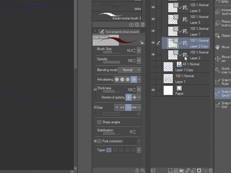
And what can I say here... I draw some parts by hand, the other parts with a ruler, undo, redo, undo, all over again, undo, one more time... I add dust, cracks, correct the basic sketch a bit, draw.
To avoid the raw and mechanic look, I draw a lot of the lines by hand (I turn off "Snap to Special Ruler" from time to time).
I also use the "Special Ruler - Parallel curve" tool to create the cables.
I use a grid again to make it easier to draw stickers and leaflets on the windows.
Piece by piece, I created this beautiful news-stand!
I decided to add some screentones at the end.
The four stages of drawing gif:
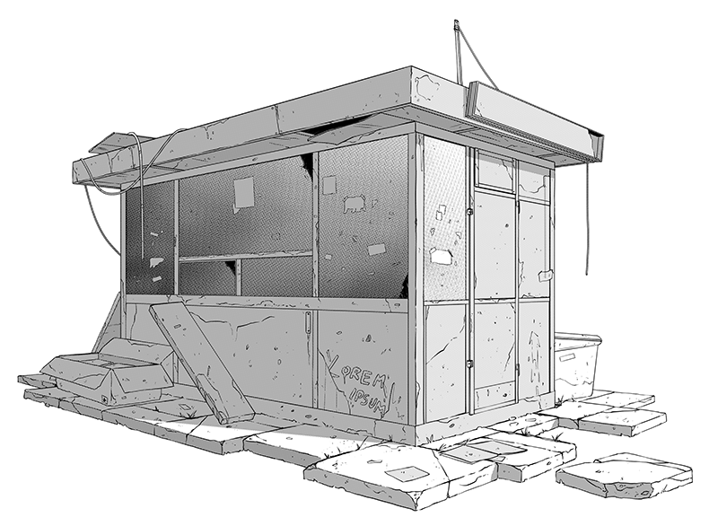
Thanks for reading! I hope you'll find some of the tips useful <3
If you want to find me on social media, you can find me both on Twitter and Instagram: @kapitanzboj


![[GaChiDa]](https://s3-ap-northeast-1.amazonaws.com/celclipcommonprod/accounts/profile-image/42/9b28e4ced95a4b0308e33f149bcc804ba90f652f1e93c334f6c4a7aea611093e.png)


댓글