Illustrations Made Easy with Curve Tools
Introduction
Hello! Today I'm going to show you how I make food illustrations easier and faster with the figure subtools of Clip Studio Paint.
I'll be using mostly [Bezier curve] and [Ellipse]. Remember that every layer where I'll use these tools will be vector layers, that way I can easily edit them. The [Ellipse] subtool is pretty straightforward, but to use the [Bezier curve] you'll have to familiarize yourself with the control points, and I found a way you can do that with a game!
Tools
Beziers use handles and anchors. The anchors determine where the path goes, while the anchors describe the curvature of the line. I found a game online that teaches you how to use bezier tools. It's not meant for CSP, but it has the same keys, so it should be the same:
Please, practice with this resource! There's a bit of a learning curve, but it's well worth mastering such an essential tool of graphic design.
I'll explain you the keys to use tools with bezier curves. It'll just be an overview to make the tutorial more cohesive, all of this has been explained better in a tutorial by ClipStudioPaint, go check it out:
You can use Bezier curves with the [Bezier curve] subtool in the [Figure] tool, the [Curve ruler] in the [Ruler] tool, and the [Polyline] subtool in the [Selection] tool. To use it on [Polyline] selection, you'll have to activate it on the [Sub Tool Detail] menu. I like to make it visible to switch as I see fit.
To make straight lines, simply click on the canvas without dragging:

Beziers are done when you click while drawing. The handle will get set on whatever direction you drag towards:

If you click [Shift] while dragging, the handle will be moved on increments of 45°:

You can change the increments by going on the [Sub Tool Detail] menu:
[1] Makes it visible on the [Tool Property] palette.
[2] Snaps the line/handle on the angle when it approaches it.
[3] Set the angle by dragging slider or changing the unit number.
REMEMBER: These are angles, not percentages. If you want the angle to be set on the four cardinal directions, you should set it to 90, not 50.
To restart the last anchor point you made, click [Delete/Backspace] in your keyboard:

Click on an anchor point to delete it:
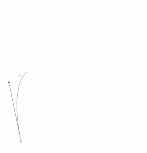
Click on the line to add a new anchor point:

To move either an anchor or a handle while drawing, press [Ctrl] in your keyboard and move them around.
To both delete and add anchors, you have to make sure you have the [Add/delete control points while drawing] on the [Sub Tool Detail] palette set on.
If while you're drawing, you want to make a curve a corner, click on the anchor while holding [Alt] on your keyboard:

If it's a corner you want to make into a curve, dragging the anchor while holding [Alt] will give it handles:
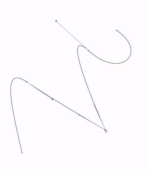
So if you click on the canvas, it becomes a corner, and if you drag, it becomes a curve...

... but what if you want both on the same anchor? Two curves merging on a corner, or one side being a straight line and then a curve? If you drag the corner last drawn, it gives you a handle, so it can become a curve. And if you click on the curve last drawn, it becomes a corner. Furthermore, if you want to close a curve, clicking the first point while pressing [Alt] will let you remain in control of the last handle, rather than fusing it with the first.
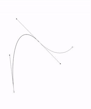
These are all behaviors done while drawing a curve, and they become second nature after a while. But what if you finalized the curve already? Enter the [Correct line] tool. The [Control point] sub tool gives many options to modify the anchors and handles of the drawn curve.
If you chose to use bezier curves to make lineart, you can use the the [Adjust line width] subtool to give the curves different widths, as if drawing with different pressures using the [Pen] tool.
Alright then, all set. Let my show you my steps when making an illustration:
Thumbnails
We start the same way every illustration starts, with thumbnails!
It's probably that you already have something in mind, but if you start right away, you risk starting a drawing to realize midway that the composition is not of your liking. Inside some small boxes, draw small versions of what you have in mind. Do variations and try different things. Maybe another angle? What if you add other elements? Make them quickly, no more than 2 minutes per thumbnail. Don't get too engaged in one. These are disposable sketches, so it's best if you aim for quantity.
I'll show you some of the one's I made for the ramen illustration I'll be doing.
Those are all variations of the same concept. I just keep moving the bowl around. I ended up settling for the one in the bottom.
Once you have the one you like, enlarge it so it fills the entire canvas.
Usually, the next step would be sketching, but since I use curve tools on vector layers to make the illustrations, that allows me to change things if I'm unhappy with them, I'm confident enough on moving straight to the line art. I usually only sketch if the element is too complicated. That's how much of a game changer curve tools can be.
Line Art
I tried to record myself to better illustrate this part, but my computer is old and outdated, so I had to give up on it. I'll explain myself as well as I can, but if you have any questions, please don't hesitate to make them in the comments.
I use different vector layers for each element of the drawing, I prefer merging them if I want to join something later on, than having to select, cut, and paste in another layer if I want them separate. I use a very thin brush size (1.5) because I will fill it with color later on. If only I could fill in vector layers! I'm sure the CSP team is working hard for future updates ;)
I started with the bowl, using three ellipses to make the shape.
Then I made the chopsticks. I used the bezier tool, but kept the sides straight, only curving it a little in the tips.
Moving on to the eggs, I used a circle and added bezier curves for the top, oval part of the egg. A curve also helps to create deepness.
Next, the noodles, an important part of this illustration. These are all Bezier curves with a brush size of 15. I had 4 layers.
Now, the meat. These are each a different layer to make it easy for coloring, all made with beziers.
Next, the soup. I wanted it to look like it was spilling, as if the bowl had fallen from a higher position. I made sure to consider how the noodles are moving in the bowl.
It's looking well, but there's something missing. I wanted my ramen with corn and green onion, but drawing each one would have been a hassle, so I made custom brushes instead. Depending on what you want, you can find different solutions.
These are all the elements of the illustration. Now, on to coloring.
Coloring
Coloring these layers will be fairly simple. Orderly, layer by layer, I select each area and paint it on a raster layer. If necessary, I use the [Erase selection] tool to deselect any undesired areas.

I did that for each element (except the noodles, of course), coloring with solid colors or with gradients, and adding details as I saw fit. I kept the linework in this section for illustrative purposes, but turn off the layers as you go through them.
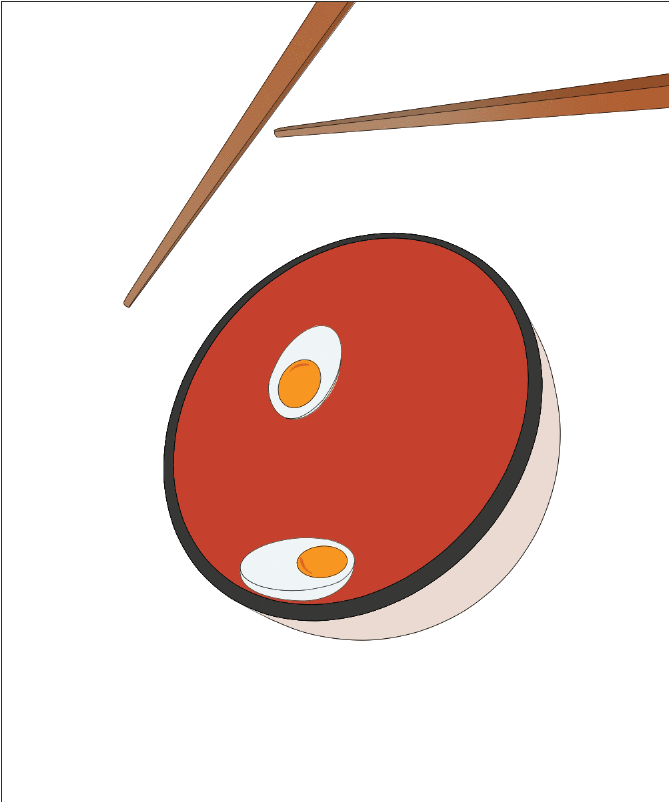
The inside of the pork chops was made with an Ellipse gradient set to Repeat. I also gave them deepness with a gradient on a separate layer set to multiply.
The noodles got some special treatment. I used a clip layer for each and added shadow to make it seem as if they were together in the same space.
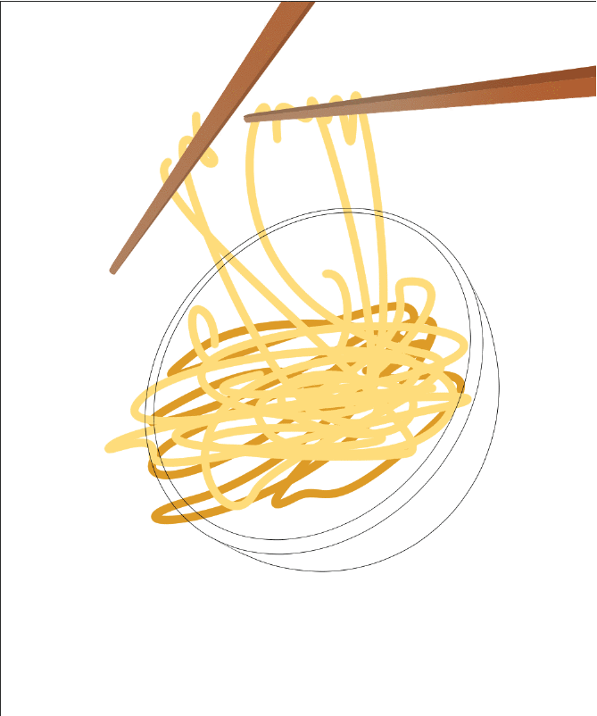
On to the soup. I used a gradient and setted the blending mode to Multiply.
Then, on a mask, I erase spaces of the color to make it seem like the contents broke the surface tension.
I didn't want to see the background through the soup, so I made a solid layer below it.
Depending on your design, you'll probably need to mask certain elements to make the interactions between the contents more believable. I made it, for example, on the noodles and the chopsticks.
Before moving on, I added gradients in some places I hadn't to create shadows and deepness.
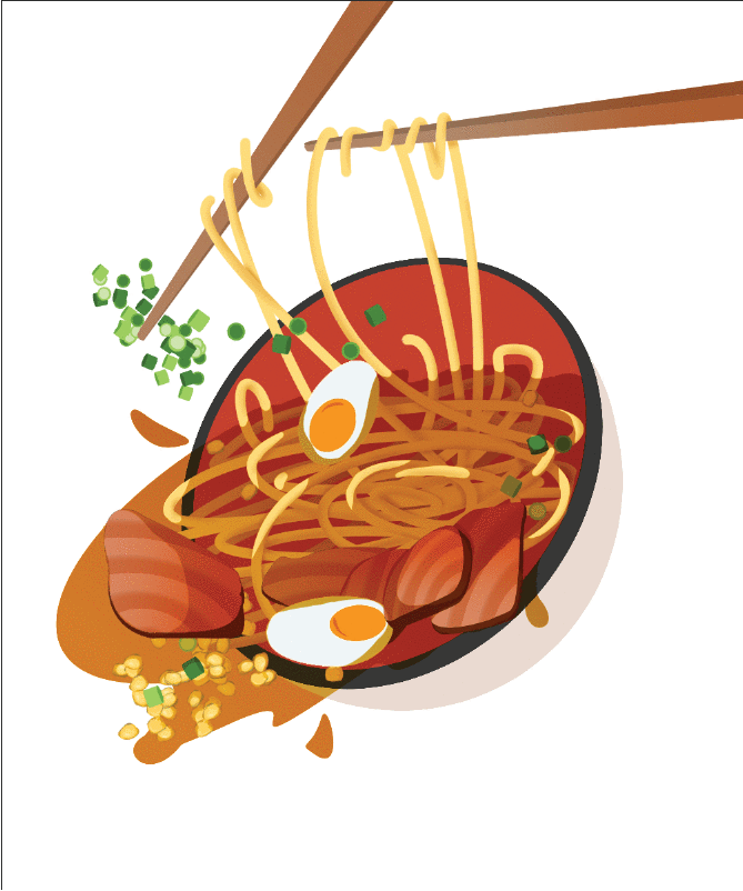
To finish, I added Highlights to the soup.
[1] On a raster layer on top of everything, use the [Bezier curve] tool to create shapes that simulate reflections.
[2] Next, select one of the shapes.
[3] Using the [Erase gradient] on the [Gradient] tool, delete the borders of the shape you selected. Repeat [2] and [3] until you're done with every shape.
[4] Lower the opacity of the layer.
This is how it looked after adding noise, a drop shadow, some extra gradients, and coloring the background.
Extra examples
I'll include some extra examples of some food illustrations I've done using figure tools, to give you an idea of what you can do.
I did even the strawberries and the blueberries in this one with the bezier tool, it's a very dynamic tool:
You don't have to make every meal look like it's falling. I like doing flat illustrations too! Here's a version of the waffles seen above...:
... and the ramen done in this tutorial:
Another tool you can use is the [Curve ruler], a subtool of the [Ruler] tool. It works just as the [Bezier curve] does. I used it in this illustration together with the [Symmetrical ruler], because I wanted the bottles to look symmetrical:
Bezier curves aren't only good for food illustrations. They work great for all kind of stuff! Here's a pattern I made with floral and animal motives. Everything was made using the [Bezier curve] tool.
Closing thoughts
Bezier curves are an essential tool in graphic design. They allow you to create beautiful illustrations with minimum effort. I know for certain I would have lost my keyboard's Ctrl and Z keys if it weren't for them! Since my Wacom is old and often fails me, I use them for illustrations, line art, everything!
I hope this tutorial inspired you to try using them in your illustrations. If you have any questions, I would love to help! You can leave a comment at the bottom of this page, I check it often.
If you'd like to see more of my work, you can check my Instagram...:
... Or my twitter:
Oh, and sorry for any grammatical mistakes, English isn't my mother tongue :)
(Edit 27/05/20) I made a mayor addition to the Tool section, edited the title and thumbnail, added another example, and changed some grammar mistakes through the text. I only made a showcase of the Introduction manual's "Drawing Continuous curves & Bezier curves" entry, rather than linking it for you to try as it was originally. Check the manual here:
I did so because the tutorial seemed more illustrative than pedagogical to me after I posted it. I showed you how I used bezier tools, but didn't tell you how to use them. I left it be, but the more time passed the more bothered I was by it. From now on, I will keep the tutorials as a draft for a couple of days, to prevent situations like this.
I checked the other tutorials on the #CurveTool search results to make sure I wasn't inconveniencing anyone, and none of the tutorials posted had this information, though I did find a tutorial by the CSP team that covers the same topic and credited them accordingly.


留言