THE BEST WAY to POSE Chibi Characters
Welcome to this tutorial!
My name is Maria and I'll be guiding you on how to execute chibi poses in an efficient and eye-catching way.
This is not an ultimate set of rules, and the best thing about art is that rules are meant to be broken. Keep drawing until you find what illustrating methods you're most comfortable with.
I'll be using one of my friends' OC, and the Youtube channel Beyond the Bot's mascot, Bot, as my character for this tutorial. With that being said,
Let's begin!
CHIBI-FYING MODELS
【CHIBI PROPORTIONS】
According to idealized figure drawing, the human body is 7~8 heads tall.
Chibi figures, on the other hand, can range anywhere from 1~4 heads tall, like a child.
(▼ refer to the below image for visual aid)
As you can see from these silhouettes, chibi characters would be undoubtedly terrifying if they were real! Luckily, we're working outside the realms of realistic figure drawing.
Although chibi characters are known for their large heads and eyes, there's more to chibis than that! There are other body parts that can be exaggerated (both ↑ increased; and ↓ decreased) in order to maximize cuteness.
↑ INCREASE ↑
‣ Hands ‣ Feet ‣ Forehead ‣ Mouth (?)
↓ DECREASE ↓
‣ Neck ‣ Wrists ‣ Noses ‣ Mouth (?)
...among others.
(▲ refer to the above image for visual aid)
【CREATING YOUR OWN CHIBI MODEL】
• WHERE ARE THE 3D MODELS?
You can find the default 3D Models in [Window] > [Materials] > [3D] > [Body Type]
• HOW DO YOU EDIT A 3D MODEL?
Once you click on a model, a toolbar will appear (upper left of Fig. 3). Click on [Display Object List].
The [Sub Tool Detail] will open. Here, you a variety of different aspects you can edit. For the purposes of this tutorial, we will focus on what's necessary to create your own chibi model.
Under [Sub Tool Detail] > [Body Shape], these tools can be found:
① [Initial Body Shape] - to reset your model
② [Register Material] - to save your models for future use
③ [Height] - height is contextual to your background elements. Please consider the size of your 3D space to choose the height you want
④ [Head to Body Ratio] - remember that chibis tend to be 1-4 heads tall
⑤ [Adjust Head to Body Ration with Height] -
When you click this, the [Height] and [Head to Body Ratio] will adjust to complement one another
⑥ [Select Parts] - You can select specific parts of your model to adjust (using 2D sliders). Please refer to the previous section about parts to ↑ INCREASE ↑ and ↓ DECREASE ↓ to help guide you
• HOW DO YOU USE THE 2D SLIDERS?
⇅ Vertical = (Up) Pronounced Musculature; (Down) Lean Body Lines ⇅
⇄ Horizontal = (Left) Minimal Thickness; (Right) Maximum Thickness ⇄
Remember that chibis are meant to be cute! Thus, chubbiness and soft figures are preferable when illustrating. Being towards the「bottom right of the central axis」 is ideal.
...Alternately, you're welcome to find pre-made assets, purchasable and free! Here are some recommendations:
POSING CHIBIS
If I can impart any nugget of information to you, it's 「use silhouettes」 !
• HOW TO TURN YOUR MODELS INTO SILHOUETTES
This can be done in two ways:
① [Layer Property] > [Effect] > [Layer Color]
② Put a solid color layer above your model, and under [Layer], select [Clip Layer Below]
(▲ refer to the above image for visual aid)
You can see that the poses on the left are what unreadable. What I mean by that is that the pose isn't easily recognized; the position of their arms, legs, and/or body isn't clearly communicated.
Chibi figures have very small bodies! We know this! Therefore, there's less length to limbs which leads to poses looking crowded and "balled up".
It's in your best interest to use more dramatic, theatrical poses. Exaggerated bodies deserve exaggerated poses. When you're in the lineart phase, clear gestures make rendering easier, as awkward gaps are avoided.
(▼ refer to the below image for visual aid)
You'll also see that [3D Pose Material] must be edited after the fact. This is because usual material is intended for default body proportions.
• HOW DO YOU USE POSE MATERIAL?
Pre-made pose material can be downloaded in the Clip Studio Paint Asset Store. Once you've downloaded it, it is accessible under [Display Object List] > [Sub Tool Detail] > [Pose] > [Pose] subheader > [Use 3D Pose Material]
I like to use the following material for chibi poses:
RENDERING YOUR CHIBI CHARACTERS
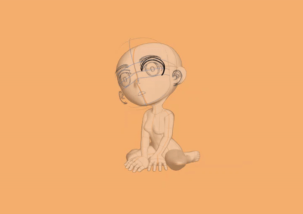
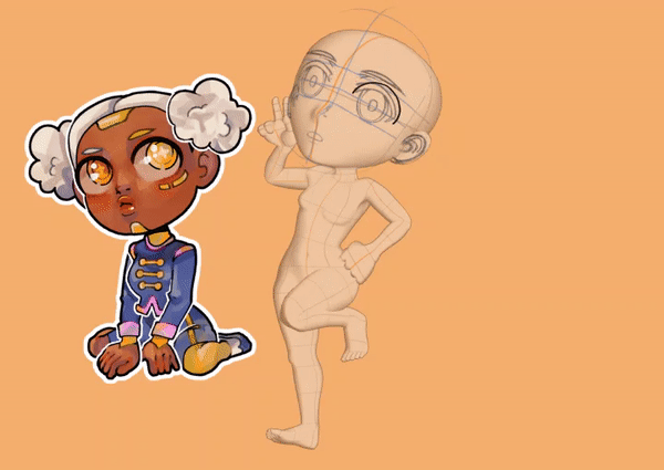
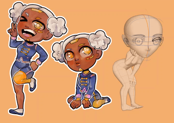
Here are the poses I've chosen to use for this project (as well as their silhouettes).
Again, chibis are exaggerated bodies. In real life, certain poses are impossible (leading to clipping; 3D elements overlapping one another), but you're free to go buck wild in the medium of illustration.
These are the tools that I am using for this project:

The last asset is a Sketch Head that I use to guide my face proportions. I loosely overlap the center lines to that of the head in order to get a vague idea of where the eyes, nose, and mouth should be.
If you'll notice, I ignored the nose and mouth guide. Like I said in the beginning, the best thing about rules is breaking them.

If you're drawing multiple poses, it's a good idea to keep your models near each other (either on the canvas or in the adjacent window).
There's no shame in taking shortcuts! If anything, they ensure quality. You can take the head of your previous chibi, and overlap it to your next pose to help guide you.

I'm a comic artist, so I love using black and white outlines. I use 5pt BLACK STROKE on the bottom ALL-WHITE layer. Afterwards, I put them in a group and then use 10pt WHITE STROKE. In a new layer above, I use thin white lines around overlapping body parts to define gestures even more.
• HOW DO YOU USE DOUBLE STROKES?
Make sure you have an all-white layer underneath your work.
By using [Auto Select (W)], with the [Sub Tool] in [Refer to Editing Layer Only].
Make sure that [Tool Property] is set to your preferred [Area Scaling].
Now you can click outside your lineart, and then invert your selection through [Select] > [Invert Selected Area].
Once you have your all-white layer, go to your [Layer Property] > [Effect], and click on the [Border Effect]. Edit your slider to your taste. [Edge Color] must be black.
Afterwards, place your all-white layer into a group. Repeat your [Border Effect] on the group. [Edge Color] must be white.
...and you're done!
Thank you for reading! I really appreciate it!
Follow me @mariamediahere on Twitter, Instagram, and Facebook if you'd like to see more!


留言