Gui Guimaraes_Concept Art with CLIP STUDIO PAINT
Painting Process Video
[1] Introduction and Sketching a Pose
My name is Gui, also known as moonlight orange. I’m here today to show you guys the process of one of my Cyber Candy Girls. I’m using CLIP STUDIO PAINT version EX.
I’ve been using CLIP STUDIO for quite some time now. Especially for the idealization process I find it very useful. I always get some very nice and clean lines.
And it’s super-fast, in this case I am running it from a Cintiq Companion.
It’s a Wacom device and it’s not extremely powerful but still the lines are so smooth, they flow pretty nicely.
I am just painting and I can lock the pose pretty well. The options I have for adjustments and how I can configure my brush are really amazing. For people who are used to other painting software, when we start using a software like CLIP STUDIO that’s really focused on the drawing part, for illustrators and concept artists, it really makes a difference.
They have a lot of built-in tools that are often plug-ins in other software, like you can configure the correction of every brush you make. It’s basically a muting of your lines, so if you need to make a precise curve or circular shape, it helps you and you can turn it off if you don’t feel like using it.
Overall I feel that my tablet works really well with CLIP STUDIO. Apart from that, all the other configurations and the layer system that you would expect are all there, but I feel that the speed is quite amazing when you’re really just drawing. You probably know if you do some recordings too that when you’re recording the screen, especially if your computer is not super powerful, then you get a bit of slow-down, but my painting was not compromised at all.
So I’m going to talk a bit about the process I’m doing here, and when it’s relevant I’m going to being some aspect of the software that for me were a surprise when I first started to use it.
If you watch some of my process, you can see here that I’m translating everything I am doing in other software to CLIP STUDIO. I start with a rough sketch just to try to define the design of the character.
I decided to draw one of my Cyber Candy Girls, because I really like drawing them. I can focus on the design, I know that the process is nailed and I know that I’m going to get to a nice result, but I need to define the design.
I spend most of my time just focusing on getting the design to work, so in this first sketch I’m trying to give the viewer some hints of what this character is, what’s her personality. I can do that through the pose, through the face and through her clothes.
You can see I added some duct tape on her legs. Every time I draw the Cyber Candy Girls I feel that they are too clean, so I start to add some damage like they are patching themselves up, just to make them look a bit more alive and not brand-new.
[2] Blocking in Colors, Creating Clipping Masks
As soon as I’m happy with the design, I start blocking the colors.
I’m making a mask of the silhouette of the character. You saw I used the magic wand, to make a selection at first.
One good thing about CLIP STUDIO is, that you can choose the magic wand to fill gaps. So even if your line is not all consistent, the software can close those gaps. You can choose the size of the gap, so even if your line is messy like mine was.
I just had to paint the selection for the hair. For the rest, the software took care of making the selection.
I create this base, the orange one, and all the other layers are cut into the shape of this base layer. It is just a button click for you to do that in CLIP STUDIO.
As a tip for you to do that efficiently, is that, when you create that first layer that is clipping on the layer below, instead of creating a new layer on top of this layer, you create a new layer under it, so it will already be clipping to the base layer so you don’t need to change the layer type all the time.
The orange bar next to the layer thumbnail shows that it’s clipping, using the layer below as the transparency channel. I can just paint with very broad brush strokes and it is not going to go out of my silhouette.
I created all these colors separately, because I want to have the freedom to adjust the color, if I’m not sure about it. I can change all of them independently.
I am making everything a bit darker, because when I’m drawing my cyber candy girls series, I think the glow is a very important part of it. The way to make the glow pop more is to make everything darker.
In this case I’m using this very saturated dark blue to make the whole character a bit more blue.
[3] Cleaning up the Line Art
I was happy with the colors, so now I’m starting to clean up the lines.
I have the shapes of the parts, I have the volumes, I have the expression, but I need a bit more definition to make it easier when I’m doing the final painting.
I’m re-drawing and fixing stuff where I see fit. I’m trying to finish the design and cleaning up the piece at the same time.
A lot of people don’t do this process but it’s pretty useful for me because when I’m designing I can focus on designing, but when I’m cleaning up I focus on cleaning up. I don’t mix those steps so I can focus on one thing at a time.
I am still doing some small design changes, but I try not to change my mind at the basic level. I only move to clean up the lines when I’m pretty happy with the design, or else I just keep changing the base. You can see I just added a small detail on the neck piece.
Those kind of changes are okay to do when I’m doing the final lines, but I would rather do bigger changes on the sketch. That said, I wouldn’t limit myself, if I really feel that I have a better idea, I’ll just go ahead. I would advise everyone to do that. You can change the base to bring your piece to the next level.
I’m using the same brush that I used for sketching but I’m using it at a smaller size, and I’m not changing its size. This is a brush that has the pencil as a base, and I only have variation to opacity, not the thickness. If I want a thicker line, I just paint it twice.
Even on the legs here, I fixed some parts, as the shoe design was really not there. Just playing around with the shapes and perspective until I find something that I’m quite happy with. At this point I was really not focusing on the shoes for this drawing so I feel that the foot was a bit too small. When I start refining, I fix those things.
▲[Edit]menu→[Transform]→[Scale up/Scale down/Rotate]
For me it’s easier to pick one battle at a time.
Since I am going to bring some contrast to the neck area and the head, just to not leave the leg all empty, I did those details for her knee caps. They have a bit of tech so I just moved a bit of tech that was on her upper body to the legs, so you can see that her legs are also robotic and not just her arms. I’m trying to tell a bit of a story.
The way that I’m trying to design the character is in the way that I’m going to show a bit of information about what this character could be both design-wise and story-wise.
You can see that the designs are coming out pretty well. I copied the arm, from one side to the other and transformed it a lot. This really helps to establish the design faster, since the arms are the same.
I tried not to keep things super symmetrical, just changed it a bit when I copied the arm to make sure I have enough variety.
I’m erasing part of the original sketch. You can see that on the right I have two layers, the first one and this clean-up, but I’m leaving a bit of the original sketch.
[4] Adjusting Clipping Layers
Here I went back to the orange part and I’m cleaning up again the silhouette, because when I did the final lines, I made them thinner, so now I need to adjust it again.
I added a strand of hair. I thought it was missing something on the silhouette on this side.
I changed the hand pose a bit. So, I am basically reworking this whole part, just to make sure that when I paint I use this as a base, because I don’t want the paint going outside the lines.
You can see that on the shoes, I have a bit more changes because they were rougher and I changed the design a bit, but overall the other parts are not that changed.
I know it sounds like a bit of re-work, but it’s pretty useful. I’m going to do that to all of the layers. I’m going to see if they go out of the zone they should be in, and clean up the borders a bit, and extend the borders as needed.
One thing I really like about CLIP STUDIO, when I started to use it, is that you can basically put shortcuts for everything. Every brush you create, every action, everything you can attach a shortcut to it.
You can also attach the same shortcut for two things. For example, I hold [b] for my main brush and I also have [b] for my soft brush. If I press [b] once it goes to my hard brush, if I press [b] again it cycles to my soft brush. So, when you get used to that process, you get so fast at sketching and painting. It’s really amazing. There are a lot of options for brushes. You can customize them completely.
I really like to stay with the standard brushes. I have the soft round brush and hard round brush and those are the brushes I use. I don’t use blending for painting, I usually just try to control the pressure on my brush, and CLIP STUDIO allows for that really nicely. You can just precisely control the pressure. With this I can do very neat shading.
[5] Refining Colors, Lights and Shadows
After I put the colors and adjust the layers, I’m going back and adding a bit of skylight and local colors like on the nose.
The way that I go for the skylight is basically, I try to imagine what are the parts on this drawing that are facing up and I paint them blue in this case.
I’m using the layer in [screen] mode, so it’s just the light part of the paint that stays on the canvas. I’m trying to think about how the anatomy and the materials work. I’m adding wrinkles and I’m trying to follow the bone structure.
It’s really strong right now, but I reduce it now to make it barely visible, but still enough to give the volume.
After that I’m just adding a bit of occlusion. This is just like some shadows. Since I like to paint more with lights I’m just adding some core shadows. I’m not thinking too much about projected shadows.
I’m just painting darker here and there. The hair and the inner thighs. Just to make sure I have a decent enough contrast.
And this is still not my final painting step. I am just preparing the whole painting, so I can start the final painting process. I’m painting this layer a bit, and you can see that I locked the transparency of the layer.
I make the background a bit darker so that the character can pop a bit more.
▲[Edit]menu→[Tonal Correction]→[Hue/Saturation/Luminosity]
[6] Refining the Overall Painting
What I did, I just created a selection with lines, so if you Ctrl-click the layer you get a selection. I did this for the line and for the orange base. And now my highlights are limited by that. I didn’t use only the orange base, because the orange base is not exactly the size of the line art. So, if I Ctrl-click the orange layer and Ctrl-Shift-Click on the lines, I get the selection from both.
Now my rim lights, these white lights, goes right on top of my line art, so I don’t have any line art escaping.
I went back and added a bit of dark on her legs, and this helps me bring the focus to the top part of the character.
I also added a bit of purple tint to the background. It’s really black right now but it was real black and since the whole character has a bit of blue shade, the true black was reading a bit reddish. Adding a bit of purple to the background make it read like black more than the actual black.
I am starting the final refinement painting. I named this layer group “refine” and I start painting.
I start with the face of the character, because that’s the part that’s gonna determine most of how the character is perceived. And it’s one of the parts that change most when you paint. With this anime style that I’m using, the face is really simplified. When you paint, you add volume and all this volume changes a lot of the base you had. Because the base is basically just lines and since it’s so stylized it’s hard to translate this volume. I know the face is going to change, so I start with it and try to keep it closest to what I had in my head. I try to get the mental image that I had of the character and try to translate it on the render.
Usually what helps me is to think of my character as an action figure. It’s easier to imagine the face in 3D. If you imagine it as a flat illustration then it’s hard to see the volume, but it’s easier if you see it as an action figure. If you have an action figure of an anime character you can look at it or photos on the internet. It really helps to see how the stylization is done. Don’t be afraid of going from this kind of reference.
Here I am just using the same brush I used for the lines, but I’m using it to blend. You can see how easy it is to use this brush to blend. You can sample the colors and since the software makes it so fast, you can just sample and paint, sample and paint. With the colors that are laid as a base, I can sample color from my whole drawing.
I’m blending them is by using the pen pressure. So, if I press it more, it’s more opaque, if I press it less, it’s less opaque. I’m using this and a bit of my soft brushes to get the blend I want. Keep in mind that I’m not shooting for this really smooth blending, I want to have some brush strokes. I really like to have those brush strokes showing. The blending looks beautiful here, the colors don’t get dulled down when blending.
You can configure the blending mode. I don’t have it on my brush but you can have the brush to blend a little bit of the colors underneath it when you’re painting. If you want a bit more of an oil paint effect, you can get it super fast, and it really gives more color to your character. It’s a bit more realistic because when the colors blend with each other, they absorb a bit of the other color and become a third color. Just using a lighter color of the color you’re painting doesn’t cut.
There are some software that don’t blend colors very well when you use opacity, but CLIP STUDIO really does a great job blending colors when using just the opacity to do it. For example when you have a green plane and you paint in blue on top of it, even if you paint the blue in 20% opacity, the part where you paint the blue and see the green underneath, it looks super nice. It looks vivid. In some other software, you get this color dulled down and it doesn’t look realistic at all. You need to go and paint it by yourself with color correct. You can see how just with a couple of strokes I get the blending of the duct tape pretty nicely. I just changed a bit of color for each one of them as a bit of a different tone, to make it a bit less bland.
The reflections for the plastic mini dress that she’s wearing, were basically white with lowered opacity. And it gives me this nice effect. It’s pretty rough, but it gives a nice effect.
For the legs, I’m using a bit of the blue that I used for the skylight earlier. You can see on the purple socks it really shows.
[7] Working on Contrasts
I’m just sampling the darker part and painting a bit of the folds, same thing for the shorts. I’m just adding a bit more dark to bring the contrast back to her face. I’m trying to focus on the top of the character.
I’m adding a few more wrinkles to the legs, but I’m doing it a bit more rough than I did on the upper part, and that’s something that allows you to control the interest of the picture if you have more sharp lines, more contrast, more vivid colors.
It can be a contrast by value, by hue, by saturation. Every time you bring in more contrast, you draw more attention. I have some contrast here on the shoes, but the sharp lines and the high contrast is also on the neck and head, especially her arms that have complex mechanic things, so they have a lot of small parts that are contrasting.
I’m going go back to the face now, because I felt the face was missing a bit of contrast, so I’m adding a bit of shadows for the reason I was explaining earlier. If we have a lot of contrast in other parts, the attention goes to those parts.
I’m adding a bit of tint to the eyelashes using a lighter color.
[8] Adding Glow and Finalization
Now I’m pretty happy with the result. I think the render is working nicely. And I’m going start adding some glow to the glowing parts.
They are saturated, but they are not really glowing. I copied the glowing layer and added a screen mode and saturated it. You can see that all the color is pretty bright.
▲[Filter]menu→[Blur]→[Gaussian blur]
I did the same thing; I copied the rim light and blurred it a bit so I can have a bit of glow on the rim light.
I’m just finishing up the background, making sure she is not standing on a flat background and then basically just the final touches to bring the image to completion.
Another thing that I really like: the selection tool. The CLIP STUDIO one works with the shortcut Shift-T, and you get this mesh to transform and you can make last minute corrections. After I finished the drawing, I thought the head was a bit too big, so I went ahead and changed it.
▲[Edit]menu→[Transform]→[Mesh Transformation]
This is the result of some final touches post-production.
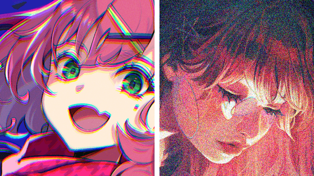
I really enjoyed drawing this in CLIP STUDIO. I’ve been using it a lot for sketching and concept drawing, not as much for painting. This was the second time I painted a whole illustration on CLIP STUDIO. I’m really pleased and it went much faster than I thought. I managed to replicate my brushes exactly the same and even the finishing process, where I add a bit of noise, and then sharpen up the drawing, I managed to do exactly the same thing in CLIP STUDIO.
I would say for the painting, I was really impressed for how smooth it was, how I managed to get the shapes, to get the volume and everything right.
I hope you enjoyed it.
That’s the final piece. I had a lot of fun drawing it and I hope you guys learned a bit about how my process works and how I used Clip Studio to make this illustration. Thanks for watching.


Comment