Numeric setting to make use of the tone effect of monochrome documents for the Internet
You may already be familiar with it, and there may be other good settings, but in the case of black-and-white cartoons published on the net, I think that there are more gray settings that do not provide a tone effect.
I also had a lot of settings, but I actually uploaded it to Twitter and Facebook, and found that there is an export that does not bother too much moiré even with the effect of the tone.
I think many people can reproduce it.
I think it is better to try it.
The manuscript itself may be made at 600 dpi for commercial magazines.
When exporting, set as shown in the screenshot below.
・ Gray scale width 600px × Nayuki
At this point, leave the check in Apply tone effect in advanced settings.
That's all there is to it, but I think that even if you upload the monochrome manga that you wrote out to Twitter etc., there is no particularly noticeable moiré.
Here, about 600 pixels in width are safe. What was written out in 1441 is moiré on Facebook.
Twitter is uploaded so as not to bother so much, but I think whether 600px is good for safety measures.
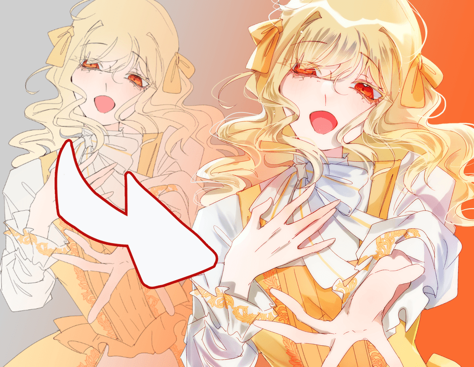
I will attach what I exported for trial. Do not worry if you look at it on your smartphone.
I think that it is better to try with the tone effect in grayscale, rather than the numerical value itself.
If this is exported in black and white, it will result in poorly looking data.


Comment