
In this tutorial, we are going to take a look my favourite and most frequently used tool in Clip Studio Paint - the Lasso Fill tool. You may already use this in your workflow for colouring, but here we shall see how I use it as a drawing tool and create most of my image using it. We'll look at how we can design illustrations using only shadows, highlights, and mid-tones, and set up a canvas so that we can create interesting and highly-stylised images very quickly.
What is the Lasso Fill tool and where can I find it?
The Lasso Fill tool can be found under Figure > Direct Draw (Default shortcut key 'U'). Its icon looks a little bit like a speech bubble.
Once the tool is selected, you can draw a shape. When you lift your stylus, the shape that you have created will automatically be filled with your currently selected colour.

When you lift your stylus, Clip Studio Paint will close the shape by drawing a straight line to the point where you began - even if that is on the other side of your canvas. Furthermore, if you overlap yourself whilst drawing the shape, that selection will be removed from the fill. This can be used to your advantage, particularly when drawing hair, as you can create complex-looking shapes simply by drawing a 'scribbly line' and letting the program fill in the parts automatically.

What our three-toned canvas will contain
Before you start your drawing, you need to set up your file. This doesn't take long and once you have it set up, I recommend saving it as a template you can open next time you want to create a drawing using this technique.
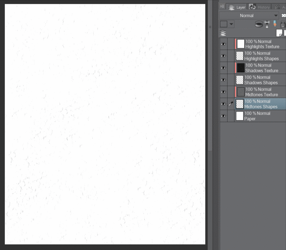
Here is a quick look at the setup you'll be creating. The figure has been created by drawing shapes using the Lasso Fill tool. Three layers contain these shapes. They are from the bottom to the top: mid-tones, shadows and highlights. Each of these layers is acting as a clipping mask for the layer directly above it. This means you do not need to change colour once whilst using the Lasso Fill! The layers with the red marks beside them contain textures that become your tonal values.
Setting up a canvas for our three-toned drawings
Let's set up a canvas now. Go to File > New, select 'Illustration' and use any size and dpi that you like.
For this example, you'll use one of the textures from Clip Studio Paint's material library. Open your 'Materials' pane and under 'Monochromatic Pattern', drag 'Drawing Paper' onto your canvas. I prefer the textures to be very rough and visible, so resize the texture by dragging one of the green corner resizing handles out until the texture is the size you like.
This texture has opacity information in it that you won't be using, so select the layer underneath it called 'Layer 1', make sure 100% white is your currently selected colour and fill this layer (shortcut keys: Alt+Delete). Now right click on your texture layer above and select 'Merge with Layer Below'. This will also rasterise your texture.
Right-click on this layer and select 'Duplicate Layer'. Do this one more time so that you have three copies of this texture.
To make things neater and easier to manage, rename these layers now. Double click on the title of the lowest texture layer - call this 'Midtones Texture', the one above it 'Shadows Texture', and the top layer 'Highlights Texture'.
You’re going to tweak these layers individually so that they can act as your values when you draw later on.
Setting up the Three Tones
Make sure that your 'Highlights Texture' layer is selected, then go to Edit > Tonal Correction > Levels. We want this layer to be bright, so lower the white input point and raise the black output level. You can copy my settings if you like.
Click the eye icon beside this layer so that it is no longer visible. You are going to do the same thing with the Shadows Texture, only this time you will use the levels to make it very dark. Again, you may copy my settings if you wish.
Use the eye button to hide this layer, then do the a levels alteration to your 'Midtones Texture'. You're trying to create a layer that will represent roughly a 50% grey value.
Unhide the other texture layers. You're now going to add the layers that you'll draw your shapes onto. Select the lowest layer called 'Paper' and click the 'Add New Raster Layer ' button to create a new empty layer above it. Rename this 'Midtones Shapes'. Select the layer called 'Midtones Texture' and create a new layer above it called ‘Shadows Shapes’. Then create a final layer above 'Shadow Texture', and call it 'Highlights Shapes'.
You’re almost finished setting up your canvas. The last thing you need to do is select each texture layer individually and click on the 'Clip at Layer Below' button (circled yellow). This will hide all your textures until you draw on the shape layers.
Your canvas is now ready to draw on. If you save the file at this point you can use it in the future to create similar works.
TIP: I like to duplicate the highlight texture and lighten it even more. I then free transform this layer so that the texture pattern is slightly different from the highlights. Then I merge this with my lowermost paper layer. That way I am never working on a blank canvas!
A quick sketch
Let's try out your canvas now you have it all set up, by drawing a simple pebble casting a shadow.
Make sure the opacity setting of the Lasso Fill is set to 100%. I'm using quite a high stabilization setting so the shapes will look smoother.
On the layer called 'Midtones Shapes', use the Lasso Fill tool to draw a round shape on top of an ellipse, like this.
On the layer called 'Shadow Shapes', draw a crescent shape with a smaller one underneath.
Then on the 'Highlights Shape' layer, draw a round shape.
You can see that it doesn't matter what colour you are using on the shape layers as only your textures appear.
You’re now going to soften some edges to create a more realistic look. On the edges marked in yellow, use the 'Blend' tool (default shortcut 'J') making sure that you leave the edges, indicated in red, sharp and crisp.
Your pebble should now look like this and you'll notice your textures have been unaffected by the blend tool.
Now you can see the tones all working together in context, I'm going to make some adjustments. I used the Free Transform tool on the 'Midtones Texture' layer to stretch and enlarge the pattern as I felt it was too busy. I also used the Levels tool to slightly increase the black output point, so the dark lines are not as distracting.
Finally, I went to Layer > New Correction Layer > Color Balance and adjusted the Halftone and Shadow colours to something more appealing than plain black and white. This color balance layer is on top of everything else.
Drawing a male portrait with lasso fill
I'm going to demonstrate how I would use this technique to draw a man's portrait. I created this image in a 3D rendering program for demonstration purposes. My drawing style is very loose, so in this demonstration, I'm more interested in creating pleasing shapes than a strong likeness. I also don't like to draw light construction lines - I just go for it, as you'll see in a moment.
We can make it much simpler to understand which shapes are highlights, mid-tones and shadows with this little trick...
Simplifying our reference image
First, remove all colour information by going to Edit > Tonal Correction > Hue/Saturation/Luminosity. Then change the 'saturation' value to -100. You now have a black and white image.
Next go to Layer > New Correction Layer > Level Correction. Leave the settings as they are for now and just click 'OK'. On top of this correction layer, add another one. With the Level Correction Layer selected, go to Layer > New Correction Layer > Posterization. Change the 'Number of Gradients' to 3.
The reference image is now split up into three tones. These are shadows, mid-tones and highlights. But the look of this can be improved by double-clicking on the graph icon on the Level Correction layer and changing the black and white input to something more appealing. I wanted more darks in my image and doing it this way round means that I can see exactly how that will change the shapes of my three tones.
Drawing a Portrait
Now the really fun part - creating your artwork! You can keep your reference image open in another tab and continue looking at it as you start to draw. Open the three-toned canvas setup that you made earlier. You can quickly remove the pebble by selecting each Shape layer and pressing the 'Delete' key.
I began by drawing a big shape on the 'Midtones Shape' layer. My lasso fill-opacity is 100% and my stabilization is 15.
I typically draw this shape in one go. I'm interested in pleasing curves and, ultimately, the way all the shapes will relate to each other when it is finished.
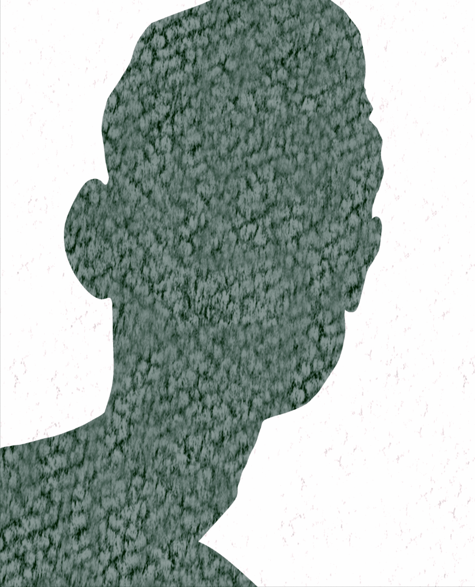
Select the 'Shadows Shape' layer next and start sculpting the darkest parts of your reference image. After working my shadow shapes, my image looks like this.
I wanted to cut out a few window shapes on this layer to reveal the mid-tones underneath. I did this quickly, without changing tools, by changing my painting colour to transparent (default shortcut 'C'). I then drew some shapes where his left eye is and broke up his hair a little more.
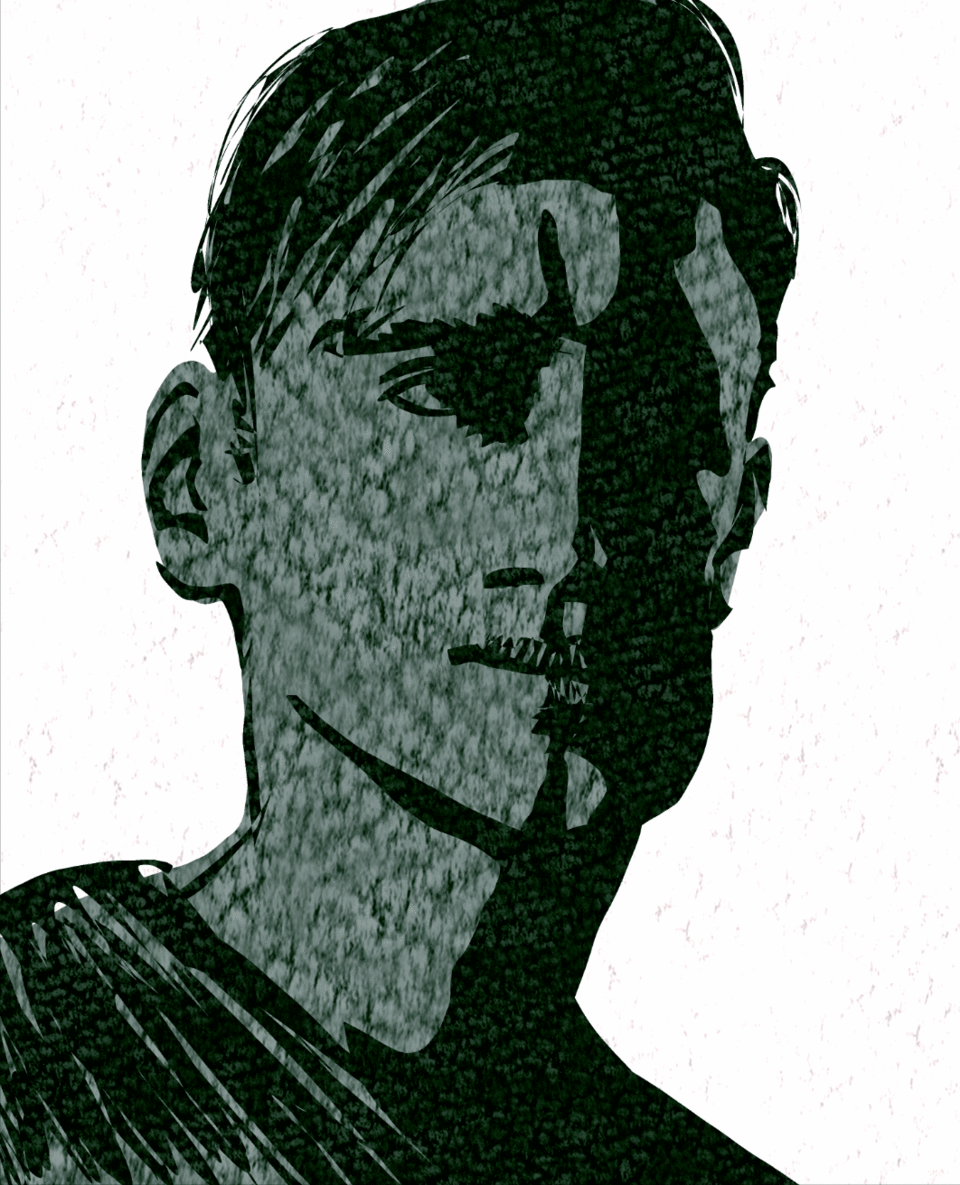
Finally, I use the Lasso Fill on the 'Highlights Shapes' layer, so the image now looks like this.
As with the pebble drawing earlier, I wanted to soften up some edges but keep some hard. I used the blend tool on each of the shape layers to achieve this.
You can finish your image here if you like. This setup allows you to have a little more fun, though...
Creating your own original textures
You can very easily change the texture layers to something else. For example, here is the same portrait, but the texture layers have all been changed to images of acrylic paint that I scanned. I also adjusted the 'Color Balance' layer to achieve a more sepia look.
To make the textures use an ink roller (also called a brayer).
Put a small amount of paint onto the paper and use roller to spread it out.
You can very quickly fill up many sheets of paper using this method. The thin layer of paint dries very quickly, so it is possible to add more paint over the top.
Keep a sheet of paper to clean off the excess paint. This sheet will also be useful for lighter tones.
When the paint is fully dry, scan these sheets into your computer and select one that is quite dense with paint.
To make this texture represent your mid-tones, go to Edit > Tonal Correction > Hue/Saturation/Luminosity. Change the ‘Saturation’ value to -100. This will make it black and white.
To check that your black and white image represents a good mid-tone, select the Eyedropper tool (default shortcut I) and select a few different areas at random. As you do this look at the ‘Color Wheel’ (if yours is not visible you can make it visible by going to Window > Color Wheel) each time you select an area of your black and white image the white circle will jump to the selected colour. You want most of these selections to be halfway down the straight edge of the triangle (or halfway down the left edge of the square if you are using HSV mode). This will let you know for certain that your texture can represent a 50% grey tone.
If you want it darker or lighter, go to Edit > Tonal Correction > Level Correction and use the sliders to adjust it accordingly.
To create your shadow tones, open your selected tone and like previously, make it black and white by going to Edit > Tonal Correction > Hue/Saturation/Luminosity. Change the ‘Saturation’ value to -100. Make it darker by going to Edit > Tonal Correction >Level Correction. Slide the black input to the right and the white output a little to the left.
If you use the eyedropper trick again, this time the white circle should mostly stay in the bottom quarter of the left hand side of the square or triangle.
To create your highlights texture, select one of your scans that has slightly less paint on it. Make it black and white as you previously did and adjust the levels so that when you use the eyedropper tool, the white circle is mostly near the top of the left hand side of the triangle or square.
You can now use these three textures as clipping layers in place of the original textures in your image.
This version of the image uses graph paper for the ‘Highlights Texture’ layer, as well as the very text that you are reading in this tutorial to create the other tones.
Use the Text tool (default shortcut T) and fill your canvas with text. If the text is quite small it can make a good mid-tone. You can copy and paste sections and rotate them to break up the lines a little bit also if you like.
To create the shadows, with your text layer selected, under ‘Layer Property’ click ‘Border Effect’, change the edge colour to black and change ‘Thickness of Edges’ until you are happy with how the text looks.
Do a level correction so that the text isn’t against such a light background, then copy, paste and rotate some sections so the lines don’t all run the same direction.
This last version was made from photos of banana skins! You really can use this technique with almost anything - let your imagination run wild.
Users who liked this post


Comment