
[A] Introduction
Hello, this is shoe! In this tutorial I will show you the basics or what you must know to make a webtoon. All of the tools/assets I've used in this tutorial are free and can be found at the CLIP STUDIO ASSETS store.
Since what makes webtoons fun is its individual uniqueness and styles of different creators, I will not be explaining in detail my artistic process and only the technical details like what tools to use, how to blend 3D models with 2D illustrations, and the likes.
Please note that I am not a professional and I only make webtoons as a hobby, everything I will say in this tutorial is based on what I have learned on my own. With that being said, I hope you enjoy and learn a few tips from this tutorial! :D
[B] Creating a Canvas
[NOTE] Webtoons are digital comics that are often read on mobile phones. It’s better to work on a longer canvas to help you not get confused or lost when working on certain scenes. It will also help in building up the atmosphere or mood of the story.
1) Creating a Canvas
First, create a new canvas by clicking [New] on the upper left command bar:
You can also create a new canvas by going to [File] and selecting [New], or simply press [CTRL + N] on your keyboard.
Once the window opens, go to [Width] and [Height] to change the size of your canvas. The standard size of a webtoon is 800x1280px but I prefer to work on a longer canvas. The canvas I use is 800x7680px, that’s 6 pages of an 800x1280px canvas.
*[Cropping] will be discussed once we're done with the page!
2) Creating a Preset
Click on the icon beside the trash icon. This will save your canvas into a preset so you don’t have to manually type the canvas size next time. Creating a webtoon requires a lot of pages, doing this will lessen your workload.
Once the window opens, change the preset name to [WEBTOON] then click [OK].
Now we have a canvas ready!
[C] Paneling / Creating Panels
[NOTE] It is important that you have a script for the dialogue or scene otherwise the flow of the webtoon will look odd and unnatural. Sketching the scenes on paper beforehand will also help with planning the panels.
1) How to Make Panels
First, go to [View] and select [Grid] or simply press [CTRL + E] on your keyboard.
Make sure that [Snap to Grid] is on. It can be located on the command bar.
Having this on will make your panels look balanced and neater but if you feel like you want your panels to be asymmetric for your own artistic style then feel free to skip this step. The fun of webtoons is its own unique styles after all!
There are 2 ways to create panels:
One is by using the [Frame Border] tool and the other is by using the [Figure] tool.
I use the [Frame Border] tool more often because it will automatically create a mask for your panels. This way, lines will not pass through the panel.
Though in some cases you can use the [Figure] tool as well for panels that transition to a different mood or scene. Try to experiment for what you would prefer!
Panel using the [Frame Border] tool.
Panel using the [Figure] tool.
2) Planning the Panels
This is where having a script ready becomes important.
I sketch the panels using the script I have prepared beforehand. This page is only one sentence from my script. The script is [“Main character finds a letter and cries after reading it.]
[NOTE] Having a [Navigator] open will help with placing the panels. Webtoons require “white space” or gaps after every panel or else it will cluttered and messy. White space helps set the tone of a story, build up the mood, and make reading flow easier.
If the panels are too close to each other, it'll be hard for the readers to read.
3) Adjusting the Panels
Open the [Grid] again. Since the panels are too close to each other and don’t have enough space in-between, I’ve decided to split the scene into two pages.
*Because the canvas is too long, I will only show the finished product of one page instead. It's okay to not show the other page since this isn't the full story of the webtoon anyway!
Using the [Selection Area] tool, select [Rectangle].
Adjust the panels with at least 3-4 boxes apart based on the grid. I’ve also added a new panel where the character is contemplating to read the letter so I can set the mood of the character after.
4) Finalizing the Panels
Now that the panels have been planned and the sketch is revised, we can now line the panels. Make sure that [Fill inside the frame] is checked in the [Frame Border] settings and the Opacity of your sketch layer is lowered.
[NOTE] Remember [Snap to Grid] should be activated in the command bar if you want to make your panels balanced.
Follow the grid and create the panels. The [Frame Border] tool will automatically create a mask and set layer for your new panel. Hide the [Frame Background] layer by clicking on the eye icon so you can see the sketch.
*Do not delete the [Frame Background] layer it will be needed for creating backgrounds!
If you select the [Frame Border] set layer, the panel will turn white that means that’s the only part you can draw on.
[D] Lineart and Adding 3D Models
Using a 3D model for items that appear frequently will help you save time and it will be easier to fix the angle for different scenes!
I used a free 3D model from CLIP STUDIO ASSETS for the table. Simply drag the 3D model onto the set layer of the panel you’re working on. A lot of webtoon artists download assets from the assets store but there are others who use 3D programs and create their own 3D models.
If you wish to learn more about how to optimize the use of 3D models in CLIP STUDIO PAINT there are many tutorials at CLIP STUDIO TIPS!
For the vase, I used the [Symmetrical ruler] in the [Ruler] tool. Set the number of lines to 2.
The 3D model I used can be downloaded here:
It’s okay to use whatever Pen you’re comfortable with as long as it can be used with a fill bucket. You can select the [Paper] layer so you can quickly see the whole canvas without the mask.
Now the line work is complete!
[E] Adding the Base Color
1) Making a Color Set
In making webtoons, we have to use the same colors repeatedly for many characters so it’s advisable to have a [Color Set] made so your colors will stay consistent. Click the spanner icon to create a new color set.
Click [Add new settings] and name your new color set whatever you want, in this case I named it “WEBTOON COLOR SET”, then click OK.
Go to the [Color Wheel] to select a color and then click the icon beside the trash can to add a new color.
*Remember if you click on the checkered box, that’ll make your color transparent so make sure that the color you want is highlighted with a light blue before you click [Add new color].
2) Using the Fill Bucket Tool / Adding Base Colors
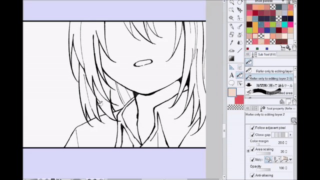
There are 2 methods to fill in colors quickly. You can use the [Refer only to editing layer] tool this bucket tool can fill in colors according to the line work.
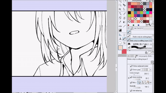
There’s also another way using a Lasso-style bucket tool. With this tool you will draw the area you wish to color, this is a better bucket tool to use if you don’t use too many lines or the area you are coloring is big.
I used [Refer only to editing layer] bucket tool with a checkered color box selected to erase some parts of the hair that got filled in as well.
The Lasso-Bucket tool I used can be downloaded here:
I use both of these bucket tools interchangeably but feel free to try out what works best for you!
Now we have our whole page colored. It’s finally looking like a webtoon!
[F] Adding the Background
After adding the base colors maybe you'd think we'd start shading, but I prefer to add the backgrounds first. This way I can determine the shading based on the lighting we will use for the scene.
I differentiate backgrounds into 2 types:
One is Location Backgrounds or actual places. It could be a room, a park, a classroom, etc. And the other is Mood Backgrounds, this kind of background is usually a solid color, a gradient, or even something that shows the current state of the character in the panel!
1) Location Backgrounds
First I lined some parts to separate the wall and the floor. Hold [Shift] on your keyboard if you wish to create a straight line or simply create a ruler. I then added the base colors.
For the floor I used another 3D model from the ASSETS page. Simply drag the model the layer above the [floor] base layer.
And then select [Clip to layer below]. The 3D model will automatically follow the perspective of a 3D model you've used in the same set layer. That's why any 3D model of items should be added as soon as when you're doing the line work.
Now repeat the same process for the [Frame background] layer, this time I've filled the layer using a Bucket tool to color it a light peach and then selected [Clip to layer below]. Now we have the wall colored as well!
The 3D model for the floor can be downloaded here:
For this panel where I used a [Figure] tool. Since the panel is open and I can't use a Bucket tool, I used an airbrush instead so the color of the wall will fade in from the last panel.
This background coloring is often used as a transition to tell that the location changed, the character's mood or emotion changed, or even just emphasizing a certain scene.
There are a lot of ways to use this kind of background coloring!
2) Mood Backgrounds
Since there is no dialogue yet it's hard to tell what the letter is about, right?
It could be that the main character is expecting a love letter by using a pink gradient with sparkle effects.
Or it could be that the letter contains something threatening that's why the main character is hesitant to read it.
[NOTE] Going back to the script, determine the tone of your characters. Are they fighting in anger? Are they shouting in frustration? Remember to match the colors and lighting you will use depending on the script (the scenes and conversations that will happen).
There are "Silent Webtoons" where there are no dialogues at all but the readers can still tell what the story is conveying through the use of colors.
Using bright and dark colors can convey a lot of emotions. Simply through the use of colors we can tell a story!
[TIP] Reading about Color Theory can help with learning about the different emotions colors can represent. Some common color representations are:
Red for Love
Yellow for Happiness
Blue for Sadness
Pink for Sentimental Feelings
Violet for Gloom
The Effect Brushes I've used can be downloaded here:
Leaving the background white could mean that you want the reader to focus on a certain action or object. In this case, the main character decided to pick up the letter!
[G] Shading and Lighting
Using a grayish-pink color, I made a new layer in [Multiply] mode and used an Airbrush to blend the colors of the floor and 3D model.
Add shading according to your own preferred style.
[TIP] I use the same procedure as the step above for shading. I choose a grayish color, set the layer to [Multiply], and then color all of the objects with that! It's time-consuming to have different shading colors for every object in a webtoon. Unless it's a beauty scene or an important shot I usually use the same color for shading with just the layer set on [Multiply].
With this the 3D model is slowly blending with the 2D illustrations!
The same goes for lighting, I use one light color and set it to either [Screen] or [Soft Light]. Using an Airbrush, I shade the parts where I think light will be coming from.
And now I add another [Multiply] layer above all the layers in this panel set layer.
[NOTE] If you plan to do this step it's important that you use the same colors in all the other panels or else the colors will look inconsistent. Of course, it's okay if there's an artistic or symbolic meaning behind using different colors but for the sake of general consistency, use the same colors!
After coloring the rest of the panels the same way as above, here's what the page looks like (crop may look uneven because the image size is limited here and not suitable for webtoons):
[H] Adding Final Details / Dialogue
You may have noticed that there are certain details that have disappeared in some panels. That's right! The vase and the letter itself is missing. I usually add small details like that last because it takes too much time to draw every small object in every panel.
Of course, this is also my own preference. If you would like to add details early on it's up to you!
1) Adding small objects + Fixing the lineart
Some parts of the 3D model still looks too "stiff" or unnatural so I will be fixing it's lineart plus add some other details.
[NOTE] This step is optional because it consumes time and adds more work, but I change the color of the lineart as well. This can be done by creating a new layer above the lineart layer and select [Clip to layer below].
I've added some leaves to the vase, changed the color of the lineart, and added lineart to the 3D model. Now look at the before and after:
2) Adding Effects
Some popular effects to use is adding [Blur] or Effect Lines to give emphasis or focus to a certain object.
Example of using [Blur] to give emphasis to the letter.
Example of using Effect Lines to give emphasis to the letter.
It also shows the scene's point of interest. This time the main character is clear while the background (the table and the letter) is blurred.
3) Using Effects Brushes
With the use of the Effects Brush I linked earlier, I added more sparkle effects to make the panel look "dreamy or melancholic".
4) Adding the Dialogue
Again, I have a script made beforehand. By following the script I place the speech balloons accordingly.
You can make speech balloons by using the balloons in the [Balloons] tool or you can draw it using a pen and fill it in!
[TIP] The common use of different speech balloons:
Regular speech balloon: used to show conversations/someone talking.
This was made using the [Ellipse Balloon] tool and the [Balloon Tail] tool.
Inner Monologue speech balloon: used to show the character's inner voice or narration. This was made using [Dense flash] which can be found if you click the icon of the [Flash] tool beside the [Balloon] tool. Make sure the [Fill center] is checked and [Toning] is off.
Thought/Thinking speech balloon: used for thoughts or when the character is thinking about something. It's almost the same as the speech balloon above but I tend to use this one more often and use the other for when the character is narrating the scene.
[TIP] Using fonts to tell the tone of the character's voice. There are a lot of free fonts you can download to help you show what your character is feeling through their words. Take this for example:
I used a hand-written font to show that the character's voice is shaking due to nervousness. I've also added and "after-thought" by adding text outside of the speech balloon.
I gave the after-thought text a white border by going to [Layer Property] and selecting [Border effect].
5) Adding Sound Effects
Just like in manga, webtoons use sounds effects as well to give hints as to what the current scene is about. For example, when a character is running there would be a 'THUD, THUD, THUD' sound effect.
Here, I added a 'THROB' sound effect to show that the main character's heart is beating fast. I used the same effect as the after-thought text, I used [Border effect] which can be found at [Layer Property].
Now repeat the same process for the rest of your dialogues and the webtoon page is finally complete!
[I] Cropping
The platform I use to post my webtoon has a maximum size of 800x1080px so us webtoon creators have to crop our pages before posting.
There's an online cropping tool for webtoon creators called "Croppy" even professionals use it, it's totally safe and easy to use! Simply upload your pages there and Croppy will automatically crop your pages and download it into a .ZIP file.
[NOTE] Now that everything is done, it's important to proofread your work or check for final edits like spelling errors or a detail you forgot to add.
CONCLUSION / FINAL RESULT
Remember that webtoons take a lot of time and patience to make! I think it's good to have general knowledge of human anatomy, how to create landscapes, how to use 3D models, and even taking a few play or movie directing classes for storytelling.
Personally, the school I went to had a mandatory drama class. I was able to learn about how to frame scenes and how to make complete scripts with the dialogue and actions taking place.
The TIPS I shared here are just things I wished someone taught me when I first started making webtoons so I hope if an aspiring webtoon creator sees this and learns something from it, I'd be very happy! :D
With all that said, here's the final page! (Crop may look uneven because this site was not made for webtoons)
Thank you for reading until the end! This is my first time making a tutorial and English is not my first language. Apologies if there are any grammatical mistakes!
If you're curious about my webtoon or want to see more of my art follow me on Twitter! :D
*EDIT (08/24/21)
Hello, because I was asked a lot. This is my webtoon! IN YOUR ORBIT:
Users who liked this post


Comment