
- All photos, art, and diagrams in this guide were created by me.
Introduction
Welcome to another Helpful Guide! Today we’ll be learning about lighting and shading a variety of objects, textures, and forms. Let’s get started!
The Basics
First thing’s first; we need to understand the very basics. Lighting and shadows can be difficult to study and understand because they’re constantly changing depending on your location, source(s), time of day, and subject and lighting position. Let’s go over some fundamentals so that we can get a better idea of how it all works.
- Ambient Lighting :: This is the light that’s preventing your scene from being totally dark. Take a look at our little town here; It’s a bit dark without introducing a dominant light source, but we can still see everything which means it’s lit.
- Light Source :: As our “sun” comes up on the right of our town, we introduce a dominant light source. The shadows become more prominent and a direction to the lighting is made apparent.
- Highlights :: Notice how as our “sun” moves across our town in an arc from right to left, the brightest points on our buildings move along with it. These are our highlights; the lightest spot and often the highest and closest points to the light source.
- Cast Shadows :: The dark points being cast by our objects, often times on the ground, are what we refer to as cast shadows. It’s darker closer to our buildings and gets lighter the further the shadow stretches away. Notice how the length of the cast shadow changes based on where the light source is situated, and how close it is to our subject.
Reflective Light
- Reflective Light :: Occurs when your light source bounces off of objects and hits your subject. It adapts the hue of the surrounding objects that it’s bouncing off of, rather than the hue of your light source.
To show what I mentioned earlier of this reflective light taking on the color of its surroundings, we’ll review a white sphere set against a green backdrop. Despite our light source flashlight being a cool blue hue, the lower shadows adapt the surrounding color of green as light reflects back onto the sphere from the ground.
When it comes to reflective surfaces and lighting, it may be surprising to realize the algorithms that go into their creation in real life. Yes, there’s mathematics behind realistic art, and that’s because there’s mathematics behind life in general. Let’s take a quick look at the basics of some of these principles.
- Law of Reflection :: Merriam Webster describes this as “a statement in optics: when light falls upon a plane surface it is so reflected that the angle of reflection is equal to the angle of incidence and that the incident ray, reflected ray, and normal ray all lie in the plane of incidence”
Now that’s a bit confusing, so let’s break things down so it’s easier to understand.
- Incident Ray :: What we call the Incident Ray (or “i” in our following diagrams) is our light source that comes down and hits our mirror or reflective surface.
- Reflective Ray :: Our Reflective Ray (or “r” in our following diagrams) is the light that’s being reflected back from our Incident Ray.
- Normal Ray :: (or “n” in our following diagrams) This is the line perpendicular to our reflective surface (Found at 90 degrees).
So what’s the Law of Reflection for dummies? In essence, it means that when our incident ray hits our surface, the reflective ray will have an equal angle to the incident ray. In other words, i = r in plane angle.
This law doesn’t just apply to a horizontal mirror and a uniform angle incident ray, though. It can take effect with a mirror at any position, and with an incident ray coming in at any angle. Θ i = Θ r always.
So we know what the Law of Reflection is. Cool. Now let’s explore that further with two kinds of reflection using the same principles.
- Specular Reflection :: Seen when light is applied to smooth surfaces, such as mirrors and calm bodies of water.
It results in a more uniform reflection that's easier to calculate the trajectory of. (Such as seen in the above Law of Reflection diagram) This exact trajectory for the light rays creates an image on the totally smooth surface that the light is bouncing off of.
- Diffuse Reflection :: Seen when light is applied to uneven surfaces, such as asphalt and canvas.
If you’re a photographer, you may recognize the term “diffuser” with the panels you put in front of your lights to provide more widespread lighting of your scene. This works because that layer of film, canvas, plastic, etc. provides a method for the incident rays to bounce off and scatter irregularly. Since your rays are going in all directions, you get a scene that’s wider lit, and a light source that’s larger.
In this same sense, clouds act as diffusers for the sun. Without clouds in the sky, the sun will provide hard lighting due to its distance from your subject and small point. With clouds, the light gets thrown around and diffused, giving a larger and closer light source, forming softer shadows.
Even the Earth’s atmosphere and water molecules in the air can aid in diffusing light to some degree.
Soft Light can be achieved by having a large light source or bringing your lighting closer to your subject
Hard Light can be achieved by having a small light source or bringing your lighting farther from your subject.
Hue Shifts
When it comes to coloring and shading, it’s important to use hue shifting to get a diversity of colors in your subject. This is done by occasionally shifting your color wheel’s hue as you paint and shade.
In the above example of a sphere, we have on the left an image of hue shifting having been applied, while on the right I used only a singular shade of red for the entirety of the sphere. The alternation of colors on the left sphere adds vibrancy and interest to the object while the right sphere with its singular shade appears dull and boring.
Notice that on the left sphere, I also added reflective green lighting to better incorporate it into the green backdrop.
Grey Scale Values to Color
Using the greyscale method of shading, in which you establish your scene’s lighting and shadows in monochrome before later adding color on top with blending modes, is a great way to ensure your artwork has contrast and visual interest. Before using this type of shading, however, it’s important to understand how colors translate into greyscale values.
Above is a chart of what percentage of grey corresponds to specific color shades. Notice how different colors also behave in different ways according to the grey values. While a 75% grey value equates to a bright cherry red, that same percentage of grey results in a dirty yellow. This is important to keep in mind while you employ monochrome painting, to prevent the difficulty of getting proper colors later on.
I suggest having a pre-established color pallet in advance before utilizing the monochrome painting method, so that you can pre-check the shades correlation to grey values.
Let’s do an exercise to demonstrate monochrome painting by drawing a photo of a metallic sphere set against a bright green backdrop. Here’s the brushes we’ll be using to create our artwork;
I use a different brush for the speckled effect in the tutorial which unfortunately is no longer available in the Assets store. However, 雪ブラシ is a close alternative;
- Step One :: Create a new layer. Then, make a black circle using the Figure (U) tool with the Elipse setting on Line/Fill “Create Fill”. Next, drag the circle on your canvas while holding the shift key to obtain a perfect circle. This will be the base for our sphere.
- Step Two :: While observing our photo in monochrome, we mark in the general placement of the lights, darks, and midtones. Notice how these are comprised of circular and rounded shapes as the curvature of the sphere wraps the light around it.
- Step Three :: Using a bright shade a grey, the light source and rim light on the top and reflective light on the bottom are added in.
TIP :: I use the Figure (U) Curve tool for adding the reflective light and rim light while locking my sphere layer, to achieve that perfect curve.
- Step Four :: Using Clip Studio’s built in Blur tool found under Blend (J), I lock my sphere layer and smooth everything out.
- Step Five :: To add extra emphasis to the rim light and correct any erasing that occurred during the blurring, I go in and add my rim light again before smoothing it out very carefully. I also add additional lighting reflections on the right of the sphere.
- Step Six :: Form a highlight using white or near white for the brightest reflection of light. Some more shadows are also created in the sphere to darken it in replication of the source photo. I then emphasized the bottom reflective light compared to the photo, to give our subject more contrast from its cast shadows that are also added.
TIP ::The cast shadows are added in their own layer, below the sphere. Notice how the cast shadows also feature blurring as a result of a light source that’s close to the subject and or larger.
Step Seven :: Time for coloring! On a new layer filled with a teal hue, set the blending mode to (color). This will turn our entire scene that color.
- Step Eight :: Select only your sphere layer by CTRL + Clicking the layer. With a soft eraser, gently erase the top portion of the (color) blending mode layer from the sphere. This is a result of the main light source being a different color from the reflective light bouncing off the green floor, resulting in reflective green lighting appearing on the bottom of the sphere and main white/gold lighting appearing on the top.
- Step Nine :: With your sphere still selected, add in some warm golden hues to the top of your sphere on your (color) blending mode layer. Additionally, dab some different blue hues to the lower reflective lit portion of the sphere for a more dynamic work.
- Step Ten :: Grab the 雪ブラシ (Snow Brush) and on a new layer make speckles on the sphere’s surface, just like our photo has. This is great for texturing our work. If your speckles are too small or tough to see go to (Layer Property) -> (Effect) -> (Border Effect) -> (Watercolor Edge) to make them stand out.
- Step Eleven :: Almost done! As the last step, let’s make this artwork pop by applying a Tone Curve.
Plutchik Wheel of Emotions
This topic could be its own tutorial entirely, so we'll just touch on it briefly today.
If you’re stumped as to how to improve your scene further, consider using the Plutchik Wheel of Emotions to aid you in your color theory. Different colors evoke different emotions. By mastering what each color means, you can influence the mood of your work and allow more in depth symbolism.
Want to craft a dark and moody scene of a character who has lost a loved one? Use shades of dark blue to convey grief. Or maybe you wish for a violent artwork of a character whose lashing out in anger, if so, go for red shading and lighting to get the point across.
Painting Realistic Fur
Shading textures can be tricky due to their complex forms and larger degree of detail needed to convey realism. We’ll be covering how to shade and paint fur as it’s a great way to improve one’s understanding of lighting on intricate surfaces.
First, we’ll start by studying some reference photos I took. Fur ranges greatly in length, consistency and color depending on what species the fur belongs to. The above references are of raccoon fur, which has a unique blend of coarse long fur and soft shorter fur.
Here’s the brushes we will use to paint the following two fur tutorials;
The brush 主線も水彩も厚塗りも (Main line, watercolor, thick coating) is what is used for the majority of these fur tutorials. I adjust the settings of it to alter the Amount of Paint , Density of Paint , Hardness, and Brush Density for different thickness and softness of strokes.
The brush Ri★ Ink Splats adds a great final touch of speckled lighting at the end of the painting process.
Notice how just adjusting the brush Hardness and size can create drastically different fur strokes. We’ll be employing this method to create a variety of fur in our painting.
- Step One :: Begin by painting a rough base for your fur. No need to make it too detailed at this stage, something loose and quick works fine.
- Step Two :: With a lighter color, block in the general positioning of highlights by using vertical strokes with a large brush size.
- Step Three :: Blend the two shades subtly.
- Step Four :: Lower the brightness of your fur to allow for easier highlighting later by going to (Edit) -> (Tonal Correction) -> (Brightness/Contrast). This will make the fur we’ll be adding in later steps appear more vibrant.
- Step Five :: Perform additional blending of the fur and begin layering in the individual fur strands starting from the bottom of the subject and working your way up. The ends of your fur strands will be lighter, while the bases will be darker as shadows fall upon them.
TIP :: Starting at the bottom and working your way up prevents you from coloring over your strokes as you go.
- Step Six :: I continue adding fur details and strands, gradually increasing the hardness of my brush to make strands that are closer to the viewer appear more crisp. This alternation of hardness gives an effect similar to adjusting the aperture on a camera and helps form a shallow depth of field.
- Step Seven :: More highlighting strands are added delicately to areas of the fur which are too dark and need more diversity. Take care to not place your fur randomly, and to instead give it a structured appearance as seen in our photo example.
- Step Eight :: With a hardness set to maximum or near maximum, I add in the final thin strands in a new layer for pronounced texture. These are placed most commonly in highlighted regions.
- Step Nine :: Blend in the bases of the newly added crisp fur strands.
- Step Ten :: If your fur is lacking contrast, consider making a new layer set to Multiply and darkening a few shadows.
- Step Eleven :: In a new layer set to Overlay, grab a warm bright hue for the portion facing the main light source and a cool blue hue for the portion facing the reflective lighting to form a glowing effect on the fur.
- Step Twelve :: Grab the Ri★ Ink Splats brush and speckle in some lighting effects in a new layer set to Glow Dodge. Then, make them stand out even more by going to (Layer Property) -> (Effect) -> (Border Effect) -> (Watercolor Edge).
- Step Thirteen :: With your Gradient (G) tool on a new layer set to Glow Dodge, pick a warm hue for the top and a cool hue for the bottom to then sweep across your canvas.
- Step Fourteen :: As our final step, we’ll wrap things up by using a Tonal Correction by going to (Layer) -> (New Correction Layer) -> (Tonal Correction). This will brighten up our image and amplify the contrast and coloration. Now we're all done!
Long fur is great, but having experience drawing short fur lengths is also useful. For our next step by step tutorial, we’ll be drawing standard rabbit fur. To start things off, let’s take a look at our reference images to help us visualize how the fur moves and lays.
- Step One :: Start with a rough base for your fur in a dark shade. No need to get too detailed, just block in the general shape.
- Step Two :: Slap on some basic highlights in the regions that are most lit by your main light source.
- Step Three :: Blend in the shades while taking care to still give room for textured strokes.
- Step Four :: In a darker shade of brown, form shadows in the areas that the fur is ruffled. Broad strokes for this step works just fine as we’ll be getting into more extensive detailing next.
- Step Five :: Starting from the bottom and working your way up the shape, use a small brush size to form horizontal rows of fur with downward strokes, alternating between light and dark rows. This will give the appearance of depth. It’s important to not just randomly place fur texture as that can result in a disorderly image that’s visually unappealing.
- Step Six :: After the entirety of the base texturing has been applied, now we can go in and darken or brighten any sections of fur that is especially ruffled.
- Step Seven :: If your fur is getting too dark or lacking contrast, apply a tone curve by going to (Edit) -> (Tonal Correction) -> (Tone Curve) to brighten things up.
- Step Eight :: With a small brush size and Hardness setting of 3 bars, add glossy highlights to the fur regions closest to the main light source.
- Step Nine :: On a new layer set to Multiply, a gentle coat of shadow is added to the side of the fur facing away from the main light source.
- Step Ten :: On a new layer set to Soft Light, we add a subtle amount of lighting to the sections of the fur with high gloss content, most notably closest to our light source.
- Step Eleven :: Use a warm color for the portion of the image closest to your light source and a cool hue for the part facing away from your light source on a new layer set to Overlay to add lighting effects.
- Step Twelve :: As the final touches, we’ll go in with our Ri★ Ink Splats brush and speckle in some lighting effects in a new layer set to Glow Dodge. Then, make them stand out even more by going to (Layer Property) -> (Effect) -> (Border Effect) -> (Watercolor Edge). We’re done!
Shading a Character
Putting everything we’ve learned from the prior segments into application, we’ll be shading an anime character in a cell shading style! Let’s jump right into this!
- Step One :: Start off with your anime character colored. Then, select the base color layer via CTRL + Clicking the layer, to select the character itself. OR, you can use layer clipping so that the shading color goes only on the character.
- Step Two :: I decided to use the #5 Front Facing Short Hair photo reference to aid me as I shade, so the lighting will be coming from the bottom left corner of my scene. Make a new layer on the Multiply blending mode, then shade where the light falls in the reference photo. Exaggerating the lights and darks can help you achieve a more stylistic and anime appearance.
- Step Three :: Grab a new layer set to Overlay and place your highlights that are a result of your main light source in a warm color.
- Step Four :: Make a new layer, then, form a ring in the hair to give it gloss. Blur that ring and set the layer on Glow Dodge.
TIP:: I have only the hair selected for this step to prevent the color from going outside of this region.
- Step Five :: On a new layer set to Multiply, make a ring below your highlight ring to provide depth to the hair.
- Step Six :: With only the character selected, I give a downwards sweep from the top of the head with the Gradient (G) tool on a multiply layer. This is part of the overall hair shading, as my light source is coming from the opposite direction.
- Step Seven :: Form strokes of gloss on the hair and eyes to make them pop!
- Step Eight :: Make a new layer set to Add (Glow) and with the Gradient (G) tool sweep upwards from the bottom left corner to create an apparent light source in your scene.
- Step Nine :: On a new layer with the Overlay setting, use your Gradient (G) tool again with only your character selected and add lighting effect by angling the gradient down over the top right corner.
- Step Ten :: To make the shading on our character more interesting, lock the layer and select only the neck shading. Then, in a darker color and different hue, use your Gradient (G) tool downwards so that the space closest to the chin is darker.
- Step Eleven :: Make a new layer with the Glow Dodge blending mode below your character layer. With the 雪ブラシ (Snow) brush, dot in some lighting effects to better visualize your light source.
- Step Twelve :: For our final step, we’ll make our artwork more appealing by implementing a Gradient Map via (Layer) -> (New Correction Layer) -> (Gradient Map) with this newly formed layer on Soft Light mode. Now we’re done!
Gradient maps are a great way for making your art more interesting and applying ambiance to your work. When used in combination with blending modes, you can achieve incredible effects.
There’s tons of free to download options in Clip Studio Assets for Gradient Mapping! Here’s a few of my favorites;
Light References for Humans
Finding the right reference photos or taking your own can be important to helping you grasp how light works in a real world setting. Let’s take a look at some references I’ve created for the sake of this tutorial with my mannequin model, Joeja. I’ve prepared three different hairstyles for her also to give some diversity and to cover how lighting direction impacts hair as well.
Notice how the light and shadows wrap around her facial structure creating curves and shapes rather than perfect lines. The face’s anatomy influences the shadows and lighting.
:: FRONT FACING MANNEQUIN ::
:: QUARTER VIEW FACING MANNEQUIN ::
:: PROFILE FACING MANNEQUIN ::
But let’s say you don’t want our mannequin, Joeja, as a reference. You want someone that’s real and has ears. Don’t worry, I’ve got that covered too. It’s time to bring out our next model and do some lighting studies with her as well.
:: FRONT FACING HUMAN ::
:: QUARTER VIEW FACING HUMAN
:: PROFILE FACING HUMAN ::
:: BACK FACING HUMAN ::
Hair Light References for Humans
Now that we've covered a variety of angles and lighting with models that have short or no hair, let's review two additional commonly seen hair styles also and study how different lighting appears on them.
:: SHORT HAIR FRONT FACING ::
:: SHORT HAIR SIDE FACING ::
:: SHORT HAIR BACK FACING ::
:: CURLED BOB FRONT FACING ::
:: CURLED BOB SIDE FACING ::
CURLED BOB BACK FACING ::
3D Models for Lighting Reference
But let's say you don't have a little town, or a Joeja to help you with your lighting studies. Don't worry, Clip Studio has your back. A massive variety of 3D models are provided for free! Can't find one you like in the pre-installed options? Check out Clip Studio Assets for 3D buildings, scenes, castles, different body types, and so much more.
The 3D models have a built in lighting function to adjust the light source direction and cast shadow.
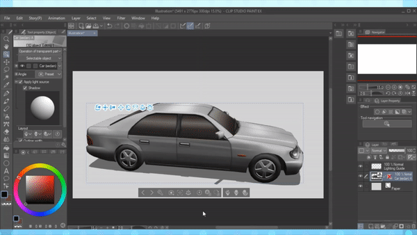
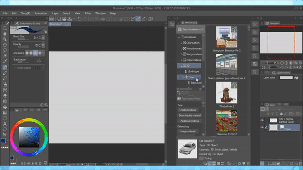
Here's a few fun 3D model Assets seen in the above example;
End Note
Thank you so much for reading and I hope you learned something new today! Be sure to leave a like, comment, and subscribe for more tutorials. See you next time! ^v ^
Users who liked this post


Comment