
INTRO
Hello! I'm Weiwei, and I've been drawing digitally for a few years now and I'd like to share some tips and fundamental theory about lighting and shadows. I hope you learn something ~
This tutorial is designed for people who already are familiar with basic CSP tools such as layer blending modes (MULTIPLY, GLOW DODGE, etc.), locking transparent pixels, and clipping layers to other layers. ClipStudio has official guides explaining these functions, so check those out if you need. Nevertheless, I hope there's something useful here for artists of all experience levels!
1. Setup
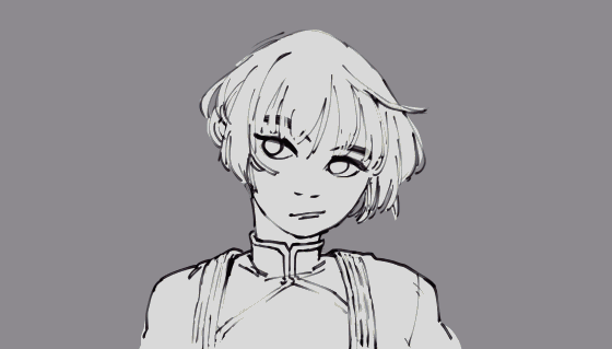
I'll be using this sketch of my original character, Yan, as an example. It's a fairly simple drawing so I have only 3 layers right now - the lineart, all the base colours on one layer, and the grey background. I like working on grey rather than white because it's more neutral and lets me choose colours better later on. It's also easier on my eyes.
Don't worry about colouring exactly in the lines right now, having a few (not too many) imperfections gives the art a more natural and spontaneous look. I personally like putting base colours down roughly with the BIT HUSKY India Ink brush, to get some natural texture. You'll be hearing a LOT about the BIT HUSKY brush... it's my fave :)
^Witness my favourite CSP default brush. It can do everything and anything!!
Now, let's make the drawing more interesting by adding shadows and lighting!
It helps to think of lights and shadows using game engine logic. Realistic-style 3D game engines like Unity use fundamental physics principles and 3D shaders to generate shadows and change the objects' colours accurately. Unfortunately I'm not a robot/computer program (and hopefully, neither are you!) so I can't replicate those effects exactly, but understanding the logic behind it, and about how light actually affects colour in real life, is a super valuable skill. Generally, this means:
>> Think of your subjects as a 3D form, not just a flat 2D image. >> Setting light sources first, this determines where the shadows should be. >> Adding other light interactions like ambient light, subsurface scattering, diffuse and specular lighting, etc. It can get as complicated and realistic as you'd like! >> Finally some finishing touches like environmental filters, object material, and details.
Let's go!
2. Establish light source
To figure out the best light source placement, I make lots of quick thumbnails of basic shadow placement. Ultimately I'm trying to express a certain mood or atmosphere, and the right shading/lighting will help me express that. Witness these lighting tests below:
Some notes on the thumbnails above:
Yellow arrows = light direction
If the light source is the SUN, all the light can be considered to come from the same direction even if the sun radiates light in all directions, because it's far away. In thumbnail 4, the light would be coming from a smaller source, like a flashlight or glowing object, to create those more rounded shadows.
1. LIGHT FROM ABOVE - works great for outdoors settings under a high noon sun, or sitting inside under a strong light bulb, etc.
2. FRONT LIGHTING - usually generic/neutral and simple, puts more focus on the facial features and less on dramatic lighting. If you don't want shading to be a highlight of the drawing, you can't go wrong with front lighting!
3. SIDE LIGHTING - having half her face in shadow can be cool and dramatic, especially with very dark shadows
4. LIGHT FROM BELOW - scary/dangerous vibe, usually during nighttime, maybe she's holding something glowing like a candle?
5. BACK LIGHTING - it can have an "epic" kind of feeling. If this was a picture of Yan in action/fighting pose, back lighting would be great.
6. ANGLED LIGHTING - a diagonal light source is natural and neutral, has lots of possibilities for mood
These aren't all the lighting options possible, I just picked some common ones. For example, I haven't fully explored having multiple light sources, light source distance and size, or playing with light exposure in these tests... I'll save those for another tutorial in the future!
For this tutorial, we'll continue with ANGLED LIGHTING (6). But regardless of the light source, the following lighting principles should always apply anyway!
Quick note about method:
At this stage I shade with a neutral grey using the BIT HUSKY pen with a giant brushtip - it provides some texture and lets some colour of layers underneath show through, but it's subtle! The shadows are added on a new separate layer on MULTIPLY setting and clipped to a folder containing both the flat colours and lineart layers. Left image above is before changing the layer's blending mode/clipping, right image is after. By locking the transparent pixels of this shade layer, I can add colour and more texture later.
3. Light interactions - colour, cast shadows & ambient light
So far, it looks quite plain and flat with only basic shadows. Light interacts in many other ways to create visual effects that can add interest to the drawing. This is where we make the shadows more realistic.
SHADOW COLOUR.
A general rule you may have heard before is Warm lights = cool shadows, and vice versa. This isn't entirely accurate, a better way to think of it is - warm light = areas lit by the light will be warmer, therefore the shadows will be cooLER than the lit areas. so, cool light = lit areas will be cooler than usual, therefore shadows will be warmER compared to the lit areas.
For this drawing, I want a warm yellow sunlight on a sunny day (the blueness of the sky will have negligible cooling effect on the light colour), so my shadows should be cool tone compared to the base colour. So, I lock the MULTIPLY-mode shadow layer and colour over the grey with a neutral/de-saturated blue. Now the shadow has a cool tone.
V
CAST SHADOWS.
Any 3-D object will be in shadow where less light hits it, and it will also cast a shadow onto things behind it as it blocks light from reaching there. I've already put some cast shadows at the beginning, show in red here - mainly the shadow cast by the hair onto her face, and her head onto her shoulder. I actually think of these cast shadows together with shading the object itself, since they are similar enough.
V
CAST SHADOWS, contd.
However, you can add other elements into the drawing indirectly, by having those elements cast a visible shadow. I add a large purple-ish cast shadow over her face to suggest she's under a shelter/roof, creating a more melancholy/mysterious mood. And even if I'm not adding a proper background, I can add a shadow cast by Yan's body and the roof that's casting the shadow onto her face, to push the grey background back in space.
V
^ Note:
To quickly make a body shadow:
>> duplicate and flatten the line art and base colour layers into a single layer >> lock transparency >> fill with a neutral colour, I used a greyish blue >> apply a Gaussian blur >> voila!
AMBIENT LIGHT and LIGHT OCCLUSIONS.
Ambient light is light that comes from other objects in the environment. For example, if Yan had a red apple on her shadowed shoulder, the apple would throw some redness into the shadows around it. Here, the major source of ambient light would be from the sky. The sky is huge, so it would cast ambient light from pretty much every direction.
Note - Ambient light theoretically hits the lit areas too, not just shadows, but it's much less noticeable under direct light so I just don't consider or add them in light areas of the drawing.
LIGHT OCCLUSIONS
The shadows cast by Yan's hair onto her face would be shielded/occluded from ambient light.
Part of Yan's shoulder in the shadow cast by her shoulder is blocked from the sunlight and ambient light so it would receive no light at all - that's a full occlusion of light and will be the darkest part of the drawing.
There are 2 ways I add ambient light, I'll show you both methods below, 1 with the core shadows and 1 with the large cast shadow.
V
^ 2 ways to add ambient light
1. New layer on top of the shadow layer
>> set to low opacity, normal blending >> draw blue ambient light in the shadows. I use the BIT HUSKY brush to draw the shadows again, then SOFT airbrush to erase some parts away, so the shading is soft and gradual.
2. Same layer as the cast shadow (which should be on MULTIPLY blending mode)
>> pick a blueish colour >> airbrush that colour on ambient light areas. (Left = normal blending mode, Right = multiply)
Both methods are fine, just depends on how prominent you want your ambient light to be!
4. Light interactions - subsurface scattering & direct light
SUBSURFACE SCATTERING/LIGHT BLEED.
This my favourite part! :)
When a light source is particularly strong, some light will bleed into the midtones and shadow areas to create a super saturated-colour edge where the shadow meets light. This would be light that penetrates through translucent materials like skin, so that it glows. Since the main light source here is a yellowish sunlight, it might glow orange-red on her skin, and make a saturated brown edge on the shadows of her clothes and hair. I use the BIT HUSKY brush to add some hard bleed edges, and the SOFT airbrush with a large brush tip on low opacity to add broader, soft light bleeds. I draw the soft glows directly on the transparency-locked shadow layers, and the hard edges on a separate layer in NORMAL blending mode. Since it's sort of hard to see them on top of the flat colours, witness here the edges on a colourless base as well.
NOTE:
This edge only really shows up in DIRECT light, so don't use it on all your shadows or else the drawing will lose focus. One common mistake I've noticed is, people over-use these light glows. I'm guilty of this too, because I love adding glows and shiny parts to my art! But if you limit the glow to a small focus area (here, the most saturated light bleeds are only on Yan's face), the overall look you get is more effective.
DIRECT LIGHT.
Do I want a very strong light source? If so, some parts could be fully lit up to become white. Otherwise, a weaker light source may just make directly-lit areas only a little lighter than the base colour. Left is the lights layer on GLOW DODGE mode, and right is the same layer on SCREEN mode and a lower opacity. GLOW DODGE and SCREEN are my go-to layer modes for super-bright light and subtle/matte light, but feel free to play around with others!
I tend to also add some light glow on a character's eyes too, even if it physically doesn't really make sense, because I want to have her eyes pop and be part of the drawing's focal point.
V
5. Finishing touches/bonus
These are some extra things to consider, on top of everything else!
PLAYING WITH LIGHT COLOURS
I am going with a warm yellow light for this drawing, but it's always fun (and useful!) to test out alternatives! Using surreal glow colours like blues and greens could give a "magical" vibe! Colours are a huge way to story-tell through your illustration.
You can also play with all the other shadow aspects in the drawing. Since they're all on separate layers, it's easy to change individual parts - for example, if you find that a certain shadow or light effect is too prominent, you can always adjust the colour and opacity without affecting the other shadows.
V
DEPTH.
Further objects aren't just smaller, they also fade in saturation, detail, and sharpness. In outdoors scenes, the sky's ambience will also have more effect on distant objects, so they appear more blue/greyed out. So, I make her background have a blue tint, and I fade out some of her hair in the back.
FOCAL POINT DETAILS.
The focal point of this drawing are the parts of Yan's face that are under sunlight. I only put more details around the focal area to reinforce its importance - so I keep the shadowed portions of her rather plain and flat, and put some single strands of hair and fabric textures in the lit areas.
I also locked transparency on the line-art layer and coloured the lines red where the lines were under direct light. This made it a lot less harsh than the original black lines!
V
OTHER THINGS TO CONSIDER.
Should the shadows have hard or soft edges? How dark or light should my shadows be? That depends on distance of light source among other things - harder edges and darker shadows can imply a closer and smaller light source. Shadows softness can also give information about the material of the object. I want Yan's jacket to be a thicker material so I give it softer shading/less sharp shadows.than, for example, the shadow cast onto her shoulder.
Also, you can of course choose to go super stylistic with JUST hard edges or JUST soft edges! It's free real estate. Below is the piece with a list of all the layers it's made of, on the right!
Thank you! :)
Congrats for making it to the end! Here's a GIF animation of the whole process, and the finished drawing. There's definitely a lot more cool effects light can create, but I want this tutorial to cover just enough that you can think more logically about how you design your shadows in your future art!
If you have any questions, comment below and I'll be happy to answer them ~
Stay hydrated and stay classy. See you next time :)
If you'd like to follow me on social media, I'm incredibly online all the time on twitter as @peevishpants!
Users who liked this post


Comment