
Hello!
This is Mana1057 and we're gonna talk about some basic to intermediate uses of Blending Modes. From Basic of the basics to Effects even to Correction Layers and Component Blending Modes.
This topic has been divided into five (5) parts; Normal, Darken, Lighten & Contrast, Effects, Component - Blending Modes.
This FOURTH part is about my favourite effects that I use on my drawings.
You can check out this video right here for the fourth part:
◊ EFFECTS - Intro
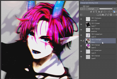
Other uses of Blending Modes are special effects. We’ll be using most of the Contrast Blending Modes for this and one inversion tool which is Subtract.
I usually do this for the final editing of my drawing but feel free to do this at whatever sequence you want.
We’ll tackle the basics of Brightening, Texture, and Glitch
→ Brightening
Brightening Effect is good for anime style drawings or if you just want something that is bright and somewhat saturated. Yes you can use just a Tone Curve or even Brightness and Contrast to make this but if you’re having a hard time controlling those Adjustments, this effect is the easy mode of those.
To make a brightening effect, make sure you have your image ready; you have finished drawing and merged everything on a separate layer. You could merge them separately if you want; Character and Background.
With your merged drawing on a separate layer> Duplicate that > Go to FILTER > GAUSSIAN BLUR > Blur it to at least 60-80% > Change the Blending Mode to Soft Light or Hard Light

Their difference is quite subtle but
Soft light is a very light Contrast Blending Mode. Meaning this gives a brighter/lighter effect.
Hard light gives a strong Contrast Blending Mode and it preserves those Blur that we got from the Gaussian Blur Filter.
For this example, we’re going Hard light because I want those Blurry effects to remain.
And we’re done! We started dull, now it’s bright!
→ Noise Texture
Putting textures on your drawing helps to provide extra details, even if you didn’t make the texture, the attention to details and placement of texture helps to add more attention on the drawing. My most used textures is Noise and this gives a lot of Anime feel to the finished drawing.
Noise Texture is, well, Noise. I do this effect if I feel like the image is too smooth and/or the atmosphere is dark and heavy.
Make a New Layer (CTRL + Shift + N) > Go to Filter > Render > Perlin Noise
Set the settings: Scale (1.00) | Amplitude: (0.70 – 1.15) | Attenuation: (0.60 – 1.00)
*You don't have to follow this settings. Please explore and try!
Lower the Opacity to at least 20-35% > Change the Blending Mode to either Overlay or Soft Light
Overlay provides strong contrast; and so it will show more noise.
Soft Light is a softer version of Overlay; it will show less noise.
You can CLIP it to the character alone if you want. I personally love Noisy textures, so I add a lot, but you can make it less, it depends on your preference.
→ Glitch
THIS PART IS QUITE LONG. I RECOMMEND WATCHING THE VIDEO OF THIS PART. Reading it might get overwhelming.
Glitch is a cool effect for sci-fi, heck, even at horror or even action. Let’s use it anywhere.
This effect is ideal for FINAL RENDERING, means that this is the last step (or depending, if you don’t want the BG to be attached with this.) For this example, let’s only Glitch the character and leave the Background as is, but this steps will work the same even if you include the BGs.
Duplicate the element/thing/character that you want to glitch, TWICE; *renamed one Green and the other RED > On the RED, Go to Hue, Saturation and Luminosity (CTRL + U) > Change the HUE to something RED. > Do the same to the GREEN but, of course, please choose GREEN as you Hue.
Get you Move Tool > Make sure you're on the Move layer sub tool.
Move the RED a little bit to the left. Now with the GREEN, move it a little bit to the right
This next step is OPTIONAL, you don't have to do this.
On the RED Duplicate, Go to Filter > Blur > Motion Blur
*Blur it for just 25-30%
Then on GREEN Duplicate, Go to Filter > Blur > Gaussian Blur
*Just Blur it for a little bit, around 12% is enough
Now change the Blending mode of the two duplicates into Hard Light at 70% Opacity and merge them together (Choose both and CTRL + E)
Possible Blending Modes for the Glitch are:
Overlay – doesn’t preserve the blur effect but adds a good amount of contrast
Hard light – preserves the blur effect and adds a lot of contrast
Vivid Light – preserves the blur effect and adds a lot of contrast and brightness
Linear Light – preserves the a lot of blur effect and provides a lot of contrast and a lot of brightness
Now let’s erase some areas of the Glitch, because some areas are too bright and too drark.
Make a mask on the Glitch Layer > Get your Soft Eraser; Lower down the Opacity > Erase softly on some parts of the face, clothes, just enough to see his features.
If you want to add like a TV trippy effect;
Make sure you're on your GLITCH layer, get your Selection Tool > Make long and thin horizontal lines and with your move tool drag them to the side. CTRL + D to deselect and Continue adding that.

→ TV Noise
We’re not done with the last topic, let’s make a TV noise texture.
Make a New Layer (CTRL + Shift + N) above your GLITCH layer > Get your Bucket tool > Get a light Grey Color, somewhere around 5-10% grey is fine. > Fill that new Layer with Grey
Then access your Layer Property, if you can't find it, Go to Window > Layer Property
Now activate TONE > Scroll down to Dot Settings > Choose Line > Lower down the Angle to Zero > Scroll Up Again and change the Frequency to 12.5 (or whatever works best for you)
Now change the Blending Mode of that to Subtract
▪ Why Subtract, Subtract is an Inversion Blending Mode. Also called as a cancellation tool. Literally the word itself, it will subtract the values of the tones. Basically we subtract the values of the RGB of the Blending Layer to the Layer Below. We subtract, literally. This darkens the colors while subtracting the brightness.
Okay, Now Go back to your Layer Property > Activate Layer Color > Make your Layer color Blue and Add a Sub Color of Red
Let's Lower down the Opacity of this Layer to around 20% > right Click that Layer > Rasterize > Then Duplicate that rasterized layer > Then Invert the Colors (CTRL + I) of the top one
Going back on the tutorial, while you're still on the Duplicated Rasterized layer (Top layer), get your Move Tool and Move it a little bit upwards
So now you can see the Blue and Red Lines
When you're satisfied, merge the two together > Change the Opacity if it's too strong, I lowered it down to around 26%
You can erase a few areas of the effect, the same way we did with the Glitch.
Just apply a MASK > make sure you're on the MASK ICON > Get your soft Eraser > and erase some parts just to randomize the effect
Okay! We're done.
We started plain, now were our texture!
◊ NEXT TOPIC
Next Topic, let’s talk about COMPONENT Blending Modes; what they are and their basic uses.
Please remember that this is a 5 part series, this is the fourth one – now let’s go to the next and last one!
Users who liked this post


Comment