
I'm PenultimateSaint and I'm here to talk about the power of messiness. Knowing when to be messy and how to turn sloppiness into a strength is a fundamental skill that can be applied to many different mediums.
That said, I can't just explain a fundamental concept without an example, and what better medium to showcase turning rough drafts into shiny finalized drawings than pixel art? To be precise (heh), I'm going to show you how I got from here...
to here:
(and here's actual size, if you were curious)
Starting way bigger than the final drawing ends up being is step one. As small as it may be, that final image benefits from the big, sweeping lines and little details present in the rough draft. Because I drew them the same way I would draw a rough draft for a larger drawing, those details are organic.
If I had started this drawing as a pixel drawing, it might have been tempting to draw everything at right angles or in straight lines. Starting with a loose sketch helped me create subtler, more interesting shapes.
More on that later!
Now that we've established the usefulness of a rough draft, let's take a closer look at creating one.
Simple, simple, simple!
We've got a circle + oblong pointy bit for the head, a jellybean body, and blobby limbs. The arm I knew I wasn't going to draw barely has a hand. Which is totally fine. We're at the planning stage, after all. What we're looking for here is an effective pose and convincing gesture.
Gesture is worth its own tutorial--and I encourage you to read some on the subject if you haven't!--but to put it simply, gesture is the main line of action that a pose creates. You can envision it as a literal line drawn through the body. In our sketch, the gesture could be drawn through the spine and curved forward toward the belly:
Now that I've got a basic pose and proportions that I'm happy with, it's time to move on to the building blocks of the design. In this case, her clothes. I knew I wanted a big, baggy sweater, so the rest of the design was going to have to accommodate it--which meant, that had to be the first thing I drew.
Note how the bandaid creates visual interest in an otherwise empty area of the composition.
It did take some fiddling to get the skirt to a length I thought worked best with the bulky sleeves, though. That's why we begin with rough drafts. Imagine getting all the pixel work nice and perfect and shaded and realizing only then that the skirt and sleeves ending at the same horizontal line looked wonky and didn't work.
I don't have to imagine, I've been there.
Now that we're about to get into drawing the pixel lineart, let's take a moment to talk about organic shapes (I did say we'd come back to this)!
I should start with a caveat. Geometric shapes are not bad and sometimes they're the right choice for a project. The point is that you should know the difference--so that you're choosing the shapes that work best for you, not defaulting to one or the other by accident.
With that out of the way, what do these terms mean?
I think an example should make it pretty clear. On the left, we have a geometric head--the lines are straight or perfect diagonals, and there are a lot of rectangles and triangles. On the right, we have a version that uses curvier, more irregular lines in order to convey an organic feeling.
(You can think of it as the straight lines of something manufactured vs. the soft lines of a human or animal).
Geometric shapes tend to work well for images that need to convey a stiff, regular feeling. A minimalistic cityscape would be a good fit, for example.
Organic shapes are often useful for conveying the softness and natural curvature of an organic (aha!) object--a person, plant, animal, etc.
But of course, rules are made to be broken. Some games use a purposefully blocky artstyle. Some cartoons use loose, organic shapes even for buildings. These unusual artistic choices can create a distinctive, iconic look. Beyond aesthetics, these choices can lend themselves well to the atmosphere that the works are trying to create.
But for this drawing, I think a conventional choice will work just fine. The feeling I want to convey is the soft volume of a baggy sweater and the cute roundness of a chibi girl. Organic shapes are more suited to conveying that feeling. So, those are the kind of lines I'm going to try to emphasize as I begin tracing the sketch:
Looking, uh...
Well, this is the first pass. I did it quickly (messily!) on purpose. Let me explain...
By tracing the image quickly, I accomplished a couple different goals:
1. Save Time
Drawing one pixel at a time takes forever. At this early stage, I can't even be sure that this is exactly where I'm going to want those lines to be. Far more time-efficient to get the lines down quickly, look for areas that need adjustment, make those corrections, and then refine the lines.
2. Accurately Capture the Sketch
Besides that, drawing one pixel at a time makes it more likely that I'll lose the feeling of the sketch. If I'm hyperfocused on making the knee look good, for example, I'm zoomed in and adding or deleting pixels one at a time, paying no attention at all to the rest of the image. Which...is bad for the composition.
After all, I'm not drawing The Single Most Perfect Knee in the Universe, I'm drawing an entire girl. Every artistic choice I make should therefore be in service to the big picture--to conveying the overall feeling that I'm trying to evoke. The shapes, the colors, the placement of each element...everything has to work together.
Once I'm confident that the proportions and silhouette of the lines are working for my composition, I can start worrying about refining the lines and adding details.
So...after moving the bun down, adjusting the shoe tongues, improving some of the shapes in the hair, adding some clothing folds...now it's time to clean up the lines:
It's starting to look like something!
One big thing that helps this version look more clean is the removal of extra pixels at what we'll call 'corners' (the areas where the pixels change direction):
Notice how the clumpy corners in the version of the left give the drawing a rigid, geometric feeling despite the organic shape of the lines. Because of the extra pixels, every movement of the line reads as a right-angle turn. They also make the lines look much thicker, which isn't conducive to the soft, organic feeling that we're going for. Get out of here, clumps!
Now that we've got our lines where we want them, we can start coloring!
Let's slap down some flats:
Why these colors?
Color theory is a whole can of worms I'd love to get into, but we'll have to settle for a quick and dirty summary in the interest of staying on topic. Here we go!
Color schemes usually have a neutral color or two, another main color, and then a popping accent color.
Once again, we're making choices that are in line with the big picture. I'm after a soft, gentle look--but one that's not too cute, either.
I selected cream and brown as my neutral colors. This base creates a warm, low-contrast feeling. Using several different shades of the neutral colors (e.g. dark shoes vs orangey hair) provides visual interest without adding too much contrast.
I used teal as both my main and accent colors (again, to minimize contrast). The skirt is a dark, muted version of the color, while the eyes are bright and saturated. This actually helps with the balance of the composition, too.
Because the skirt is dark, it sets off the pale sweater, balances the dark shoes, and balances the relatively bright, eye-catching eyes and hair (when we add the plaid pattern to the skirt, it'll become even more visually interesting and therefore even more effective as a balancing element).
Colors are a huge and fascinating subject, but it's time to move on to shading.
At this stage, we're not worried about the color of the shadows. I've got a clipping layer set to the multiply blending mode so I can see what I'm doing and I'm just going to town trying to find the right places to put those shadows:
Looks pretty good!
I'd like to take another brief tangent to talk about relative value. The idea here is to look at the subject as a whole and to select large areas of light and shadow. In the areas of deepest shadow, the lightest value should not be present. Likewise, in the areas of brightest light, the darkest value should not be present. Basically, if you were making a grayscale painting, you would not use black and white for every surface. Some of the image would be white-to-gray and some of it would be gray-to-black. That helps give the entire image a sense of cohesion, and a much better sense of light direction.
In this drawing, relative value is the reason for the big shadow above her ear:
Now that the shadows are in the right places, we can turn our attention to choosing effective colors. I selected fairly pale shadows, again in service to my low-contrast vision, with warmer tones on the hair and skin to give them a lively feeling:
Next up is highlights! This is going to look weird because I used bright white as my placeholder highlight color (usually I wouldn't, but the sweater was so pale that nothing else would have been universally visible). Without further ado...
Holy moly, she sure is shiny!
Let's tone it down...
Notice here too that there are areas with highlights and minimal shadows. For example, the torso of her sweater and the chibi expanse of her cheeks. Relative value strikes again!
But, gosh, the skirt looks kind of boring and lonely without a pattern, doesn't it? Perhaps overwhelmed by the baggy sweater and the girl's giant head? Let's add some visual interest.
Step one: brown vertical stripes set to a low opacity on the multiply blending mode:
Step two: off-white horizontal stripes set to an even lower opacity on the glow dodge blending mode:
Put them together, and what do you get (bibbidi-bobbidi-boo)?
Visual interest!
Now that all the colors are in place--the flats, the shadows, the highlights--it's time to color our lines. This will help define different elements of the drawing and give the image a softer overall appearance. My first change was to make all of the lines a dark brown. Then I edited the line color section-by-section, staying as close to that brown as I reasonably could. This helped keep the lineart color cohesive:
At long last--we're done!
Well...we would be, anyway, if I were a perfect artist and got everything perfect on the first try. But I'm not! And that means there are lots of little tweaks and improvements we can make to this nearly-completed version.
That's right.
It's finally time to hyperfocus on details (aka 'polish'). What's working and should be emphasized? What's not working and should be corrected?
I felt that some of the shadowed areas needed more oomph, and that the eyes looked a little dead--so I spruced them up. I also added pixels the same color as the shadows to some of the outline edges, in order to soften the transition. I decided the big shadow under the sweater wasn't working and eliminated it. Some of the interior lineart was lightened in order to put more emphasis on the edges of each element...
Or to put it more concisely, a bunch of fiddly stuff! I could focus on this advanced junk without worrying that I might be wasting my time on something I'd just change later. With frequent zooming out to make sure I wasn't hurting the overall image, I was free to adjust and tinker until I came up with a final version that felt right.
And here it is:
To make the differences even more obvious, here's an animated comparison (.gif):
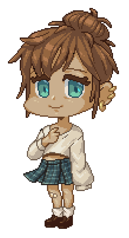
Is she perfect? Eh, nothing's perfect. But she matches my vision to the best of my abilities.
Being messy with the sketch and the initial pixel tracing over it allowed me to capture and keep a sense of liveliness and softness in the lineart. Working on placement before bothering with color let me focus on getting the shapes right without having to constantly change what color I was drawing with. Saving my finicky little edits for the very end helped me make sure those edits wouldn't be a waste of time and helped ensure they were in service to the overall composition.
So, even though we're working with a medium so precise that the placement of every individual pixel matters--
Don't be afraid to get messy!
P.S. Thank you so much for spending some time with me. Wishing you the best in your art journey!
--PenultimateSaint
Users who liked this post


Comment