
Preface
Hello! We are i-BOOM Creative House.
It’s Christmas again, and I wish you all a Merry Christmas! In order to send blessings to everyone, early December is definitely a good time to make Christmas cards, so this time i-BOOM decided to start with drawing Christmas cards and explain the basic application methods of CSP layers and materials.
But before, do you know how the cover image of this teaching was made? The answer will be announced at the end of this tutorial!
Now I will send a detailed instructional video. If it is not convenient to watch the video, you can continue to read this teaching article, some parts will be more detailed than the video.
*This TIPS contains two themes: "Explain the layer function for beginners" and "Holiday card illustration".
Christmas cards are generally the size of postcards. And if you want to facilitate printing, then A6 will be a more suitable size, so when drawing, you can also directly use A6 canvas for drawing.
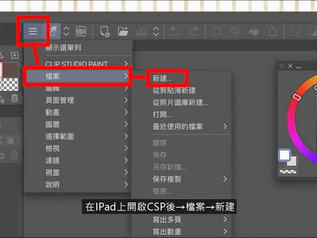
After opening CSP on the iPad → File → New, then select A6, confirm the direction, and finally press OK.
You can also choose the paper color if necessary.
When a canvas appears in the window, and there is an empty layer in the layer part and a background image, we can start painting.
What I want to complete this time is this Christmas card. I will start with the draft part.
Part 1 draft
|In order to check the skeleton, first understand "left and right inversion"
I personally think that in CSP, the most commonly used functions in the draft stage are "left-right inversion" and "draft layer".
"Left and Right Reverse" can quickly reverse the entire canvas to the left and right, which is very suitable for checking the skeleton.
But it should be noted that the temporary "left-right reversal" used in the painting is different from the "left-right reversal" of the entire work.
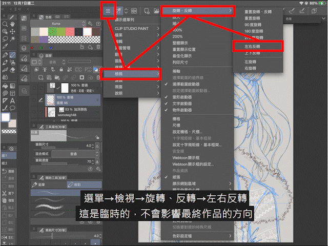
Menu→View→Rotate, Reverse→Reverse Left and Right
This is a temporary "left-right reversal" function and will not affect the direction of the final work.
Menu→Edit→Rotate, Reverse Canvas→Reverse Left and Right
This is long-term and will affect the direction of the final work. Frequent use will also consume iPad’s temporary memory and cause file distortion, so don’t press the wrong button.
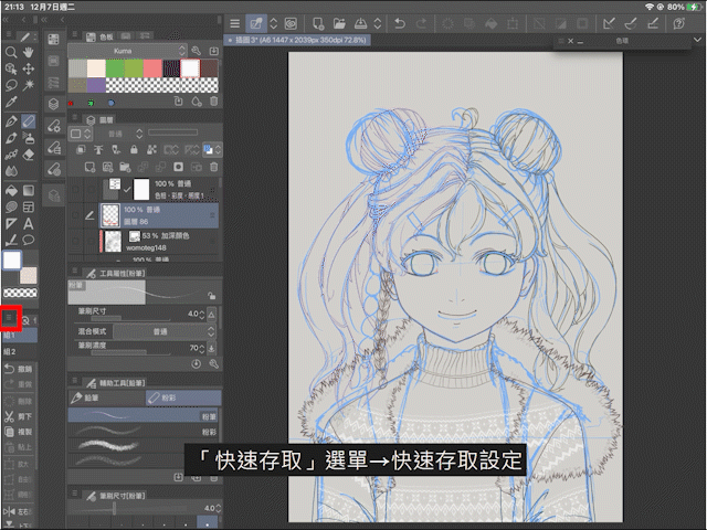
If you want to use "Left and Right Reverse" quickly, just use the quick access function.
Go to the "Quick Access" menu → Quick Access Settings → View → Rotate, Reverse → Reverse Left and Right → Add
|In order to facilitate the organization, add layers and layer folders
Proper use of layers can not only facilitate modification, but also help speed up painting.
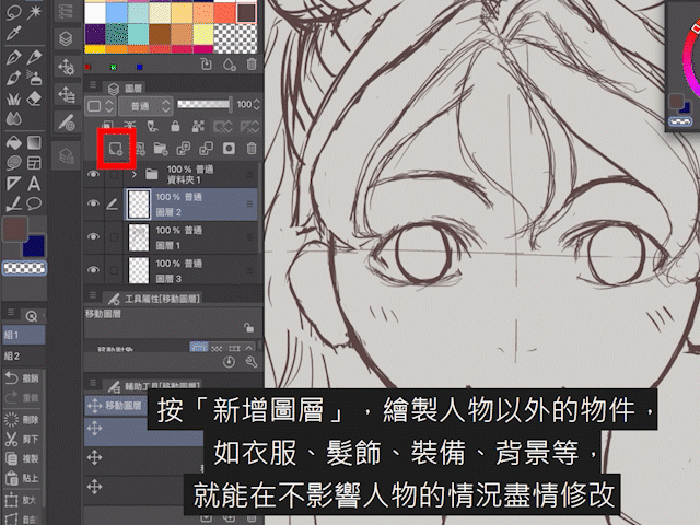
Click "Add Layer".
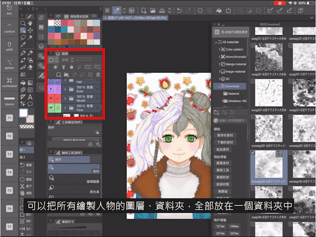
Drawing objects other than characters, such as clothes, hair accessories, equipment, backgrounds, etc., can be modified without affecting the characters. At the same time, after drawing many layers, if you want to organize them well, you can select all relevant layers and add them to the folder.
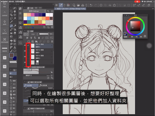
On the selected layer → iPencil or long press with your fingertip → create a folder and insert the layer
The selected layers will be added to the new folder for easy organization.
Another way to add a folder is to click the "Add Folder" button.
Click Add Layer in the new folder, and the layer will be automatically included in the relevant folder.
|When outputting, please don't see the draft! Introduction to "Manuscript Layer"
Next is the introduction of "script layer".
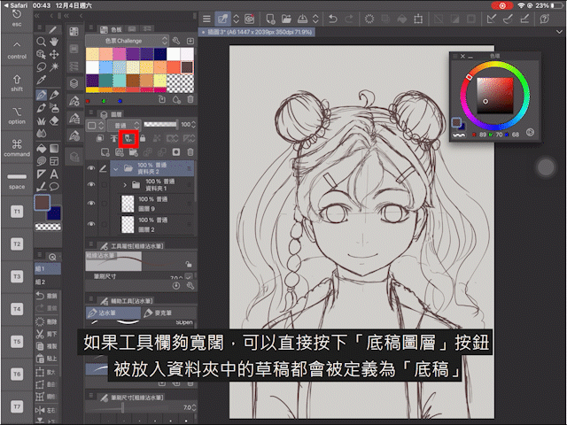
If the toolbar is wide enough, you can directly press the "draft layer" button, and all drafts placed in the folder will be defined as "scripts". After selecting the manuscript, the color of the manuscript will not change, but when outputting the file, you can choose whether to output the "manuscript" or not.
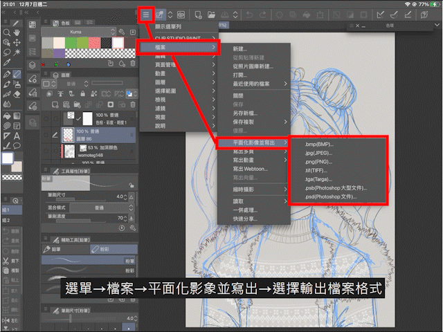
Menu→File→Planarize the image and write out→Select the output file format
Choose whether you want to export the "script", and then click OK to export the file.
In the above example, the image on the left is the output script (blue line), and there is no output script on the right.
It is worth mentioning that if the toolbar is not wide enough, the shortcut key of "draft layer" may be hidden. At this time, you can go to "Menu→Layer→Set Layer→Set as Script Layer".
|Convert the color and transparency of the entire layer!
So, how to quickly convert all the manuscripts in the folder?
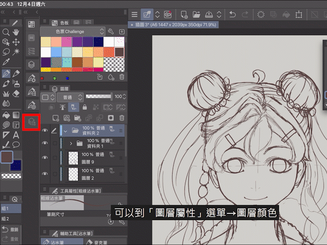
Go to the "Layer Properties" menu → Layer color
Here you can turn the lines of the entire layer into a specific color.
In addition, if the toolbar is wide enough, you can also find a shortcut to quickly "Layer Color".
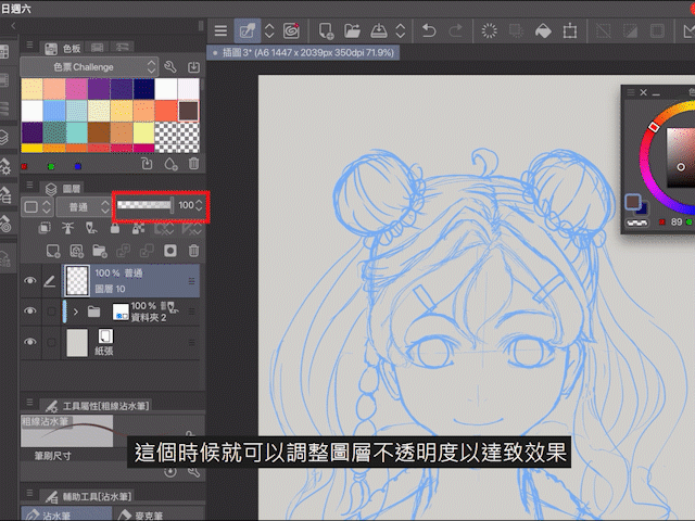
After the manuscript is converted to color, it may not be able to make the line draft clearly cover the top. At this time, you can adjust the opacity of the layer to achieve the effect. An opacity of 40-60% would be a good choice, please do as needed Adjust it.
Part 2 line draft
|"Raster Layer" and "Vector Layer"
Without calculating the draft layer, CSP layers are generally divided into two types:
1. Lattice layer
The most common layer. If you keep zooming in on the image file, the image will become mosaic or blurred.
2. Vector layer
Need to use special software to open, the characteristic is that no matter how you zoom in, the edge lines, colors, etc. will not change, and the image will not be blurred. In the vector layer, all the lines drawn can be fine-tuned using "points".
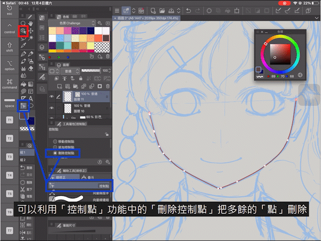
Select the "Object" (red) or "Control Point" (in the blue position) function and click on the line to control the "Point".
The fewer the "points", the smoother the line will be, so if you want to draw a smooth line, you can use the "Delete Control Point" in the "Control Point" function to delete the extra "points".
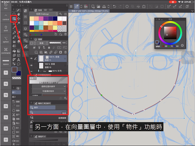
On the other hand, in a vector layer, when using the "Object" function, you can also adjust the thickness and color of all lines in the layer. And if you use the "eraser" function in the vector layer, there will be surprises.
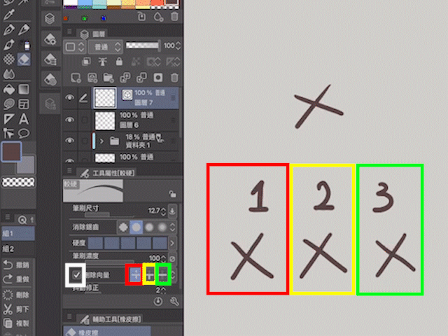
After checking "Delete Vector" and choosing different modes, you can easily adjust the intertwined lines. This is a function that is not available in the "Point Layer".
However, because the vector layer sometimes automatically fine-tunes the direction of the line, sometimes it feels more free to use the "dot matrix layer" to draw the line.
|Change layer name
After drawing a part of the line, we can rename the layer to facilitate the sorting and searching of the layer.
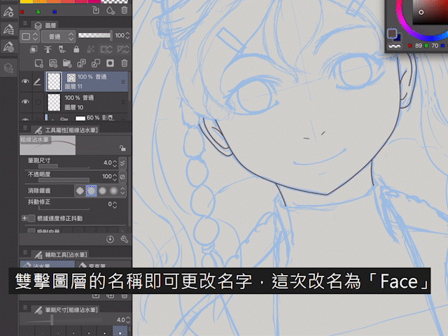
Double-click the name of the layer to change the name, for example, change the name to "Face" this time.
Folders can also be renamed in the same way.
|Draw quickly! The basic method of downloading and adding materials
When drawing some complicated parts of the picture, we can choose to use materials, such as the braids around the ears of the characters drawn this time.
At this time, we can go to CLIP STUDIO ASSETS to search.
The materials in CLIP STUDIO ASSETS are divided into two types: free and paid
Although there are many paid materials that attract attention, many of the free materials are very practical and have many types. You only need to enter keywords, and a variety of related materials will appear. For example, it’s almost Christmas, why not try to enter "Christmas" and see what Christmas materials can be used.
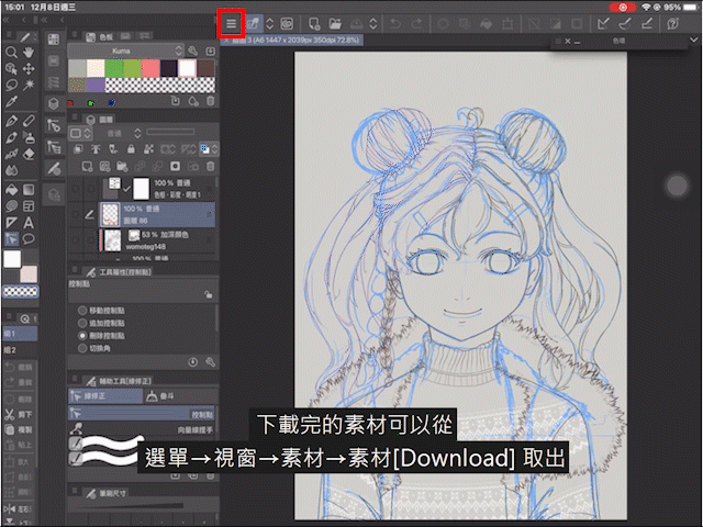
The downloaded material can be downloaded from
Menu→Window→Material→Material [Download] Remove
The materials are divided into different types: images, brushes, 3D, etc., all of which can be found here.
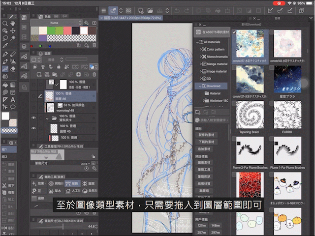
Image-type materials are most often used for backgrounds or textures. For example, if you want to add a full watercolor texture after coloring, you can use the relevant materials. When using, you only need to drag it to the layer range, and all image type materials will be marked with the icon of "image material layer";
As for the brush material, you can put it in the corresponding place according to the type of brush:
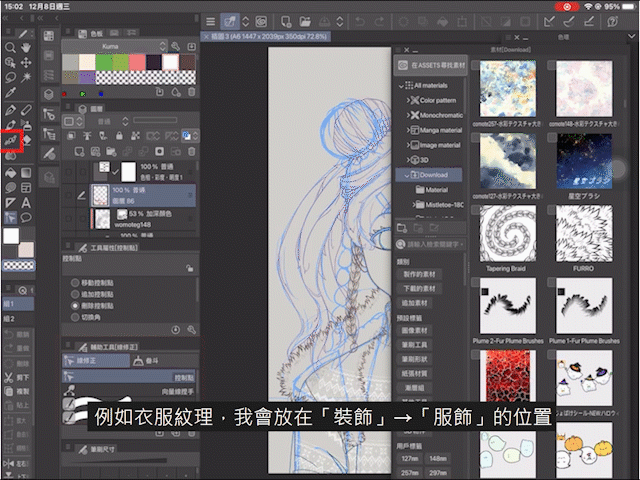
For example, the texture of clothes can be placed in the position of "Decoration" → "Apparel", and drag and drop directly into the window where you want to place it.
Brush materials sometimes display a small icon on the left side of the preview image for easy identification.
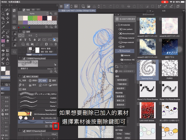
If you want to delete the added material, you can select the material and press the delete key.
If you forget what the downloaded material is, you can click the mark in the upper right corner as shown in the figure above, and you will be directed to the download page of the material.
|The most basic way to use materials
Selecting suitable materials according to the image to be drawn can not only make the work beautiful, but also speed up the work.
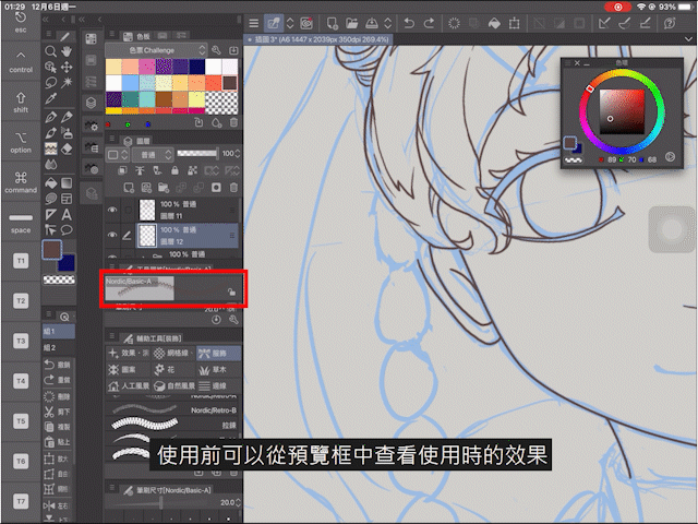
Before using the material, you can view the effect during use from the preview box. Some materials support pen pressure, while others do not. You also need to pay attention to the color when setting. Some materials support dual-color, so you can create the best effect by yourself. However, if you want to make the opaque material transparent, it is recommended to mark the "part to be transparent" in white.
After determining the materials to be used, you can proceed with processing, such as erasing unnecessary parts, or adding parts you need.
The part that needs to be transparent can be processed by using the built-in function of CSP in addition to processing with an eraser:
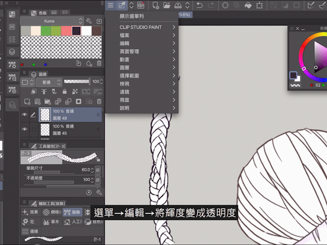
Menu→Edit→Turn the brightness into transparency, one-click processing, and it's done quickly.
The following are the materials that have tried to be used to make braids, and finally used cone braids to paint.
|Use materials and "create mask" to make clothes patterns!
Because the pattern will be divided according to the cut and shape of the clothes, to quickly process the division, you can use various "selection" tools and "mask" processing.
The simple method is to first choose the pattern to be used, and this part can be drawn with materials or by yourself. Below are the texture materials that have been used in this painting, and they are all patterns full of winter feeling.
It is recommended that the texture of different parts of the clothes be painted on different layers, and in accordance with the direction of the material brush, draw a pattern that develops in the direction of the cloth.
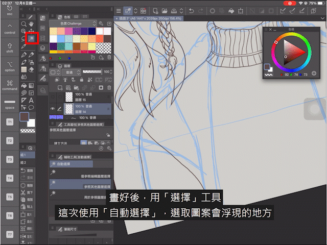
After drawing the pattern → use the `select'' tool → automatic selection'' → select the place where the pattern will appear → click on the layer where the sleeve pattern is drawn → `create mask''
The layer will only show the selected part, and the other parts will be masked. In this way, the texture distribution of the clothes is basically processed. It should be noted that when using the "Select" tool, you can select "Select only by reference to edit layer" or "Select by reference to other layers" according to the situation.
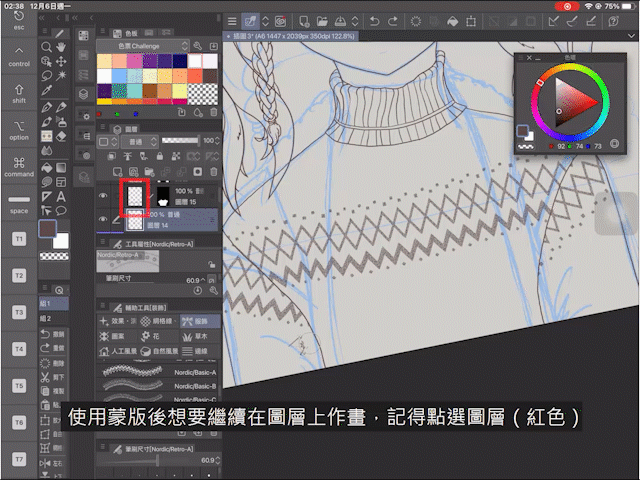
If you want to continue painting on the layer after using the mask, remember to click on the layer, otherwise the painting will be painted on the mask, which will affect the masking range or have no effect.
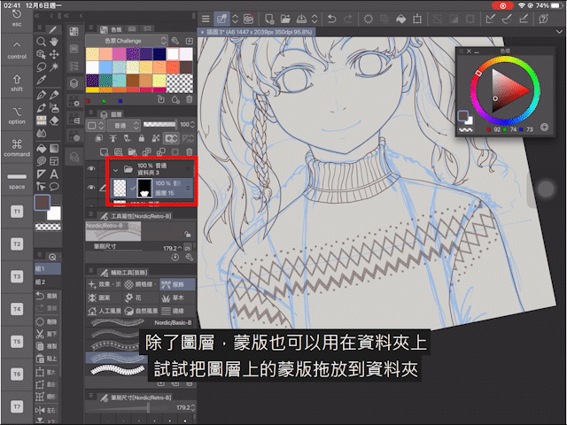
In addition to layers, masks can also be used on folders. Try dragging and dropping the mask on the layer to the folder, so that you can perform various types of pattern tests in the desired range.
Part 3 color
Regarding the use of layers when coloring, I personally draw different parts of the line drafts on different layers, and then classify the different parts, add background colors, shadows, etc., for example, see the figure below.
In order to facilitate the organization, each folder will be distinguished by the color display. The setting method can be found in the upper left corner of the layer window.
|Introduction of coloring tools
The tools for coloring are respectively "Fill" and "Lasso Smear" in "Graphics".
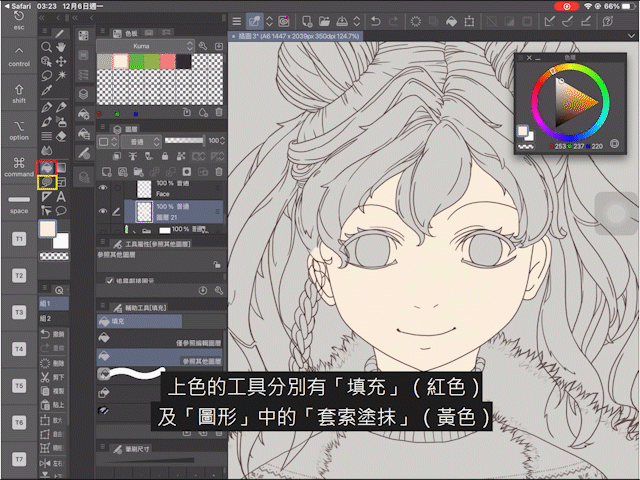
"Filling" can quickly complete a wide range of coloring, but some small corners will not be perfectly filled, or there will be a problem of color overflow when there are gaps in the artwork. This problem can be used to help fill in with "lasso smear" .
At the same time, the filling function in CSP can be fine-tuned, such as adjusting the "color error" to fill in all the parts defined as gray; the "zoom area" can determine the outer size of the filled range, etc.
|Super easy to use "cut with the next layer", easy to complete the shadow color
After the background color is complete, start drawing the shadow.
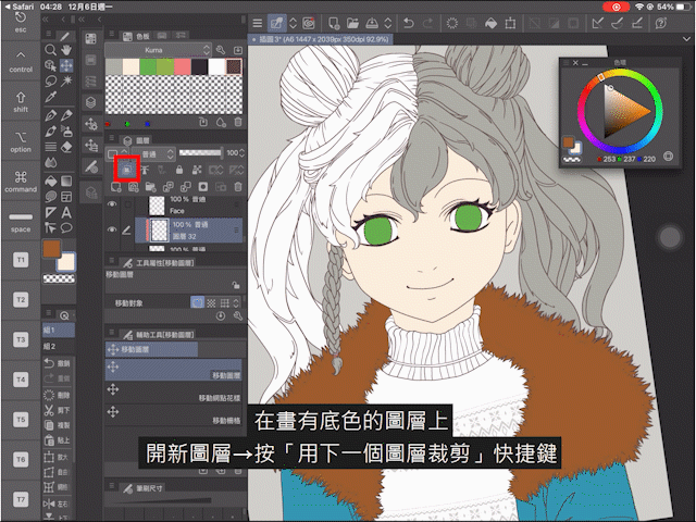
On the layer with the background color,
Open a new layer → press the "Crop with the next layer" shortcut
There will be a red mark next to the layer after it is turned on.
Next, when drawing on this layer, the layer containing the background color block will be used as the surface, so the color will not overflow outside the color block. If you don’t find the shortcut key, you can also use iPencil or your fingertip to press and hold on the corresponding layer → Set layer → "Crop with the next layer" to set it.
When the shadow of the first layer is completed, you can add layers to draw the shadow of the second layer.
Unless there is a break in the middle, add another layer on top of the layer that has been set to "Crop with the next layer", and they will still use the color blocks in the bottom layer as the basis for coloring. To put it simply, as long as there is no disconnection in the middle, there is no need to worry about the color overflow, making the state look like a "mask".
In the picture above,
Red box: Normal state, no layer is disconnected, and all shadows are colored without overflow;
Blue box: the upper right corner is in the disconnected state, and some layers are not displayed because of the disconnected blank layer (green box) as the base;
Yellow box: The bottom layer is not displayed, and all the layers above that are set to "Cut with the next layer" will not be displayed;
Purple frame: The layer of "Crop with the next layer" that has not been successfully set will be marked in gray, and the color will overflow, which is no different from ordinary layers.
|Another option for color selection: adjust "hue, saturation, lightness..."
In addition to color selection in the color circle, the color of shadows can also be selected by adjusting "hue, saturation, lightness...".
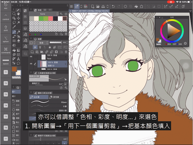
1. Open a new layer → "Cut with the next layer" → fill in the basic color
2. Menu→Edit→Hue Compensation→"Hue, Saturation, Lightness..."
3. Adjust the data→OK→iPencil or hold your fingertips to absorb the color
Next is the time for the most skillful painting. Since the colors will not overflow the range of the background color, please paint as much as you like.
|The importance of gray mold! Introduction of "New Tone Compensation Layer"
Gray model prototype: The model will be sprayed with a layer of gray before coloring. One of the purposes of this is to check whether the skeleton of the model is wrong, because the luminosity, saturation, and color of the color itself will affect a person's perception of the shape and three-dimensional appearance.
Therefore, the use of "grayscale" to check the work when painting can help confirm whether the contrast of colors is enough to attract the eye, or whether the hidden colors are successfully collected, so as to increase the color richness of the picture.
In CSP, "New Tone Compensation Layer" is a method to quickly convert the entire screen into grayscale.
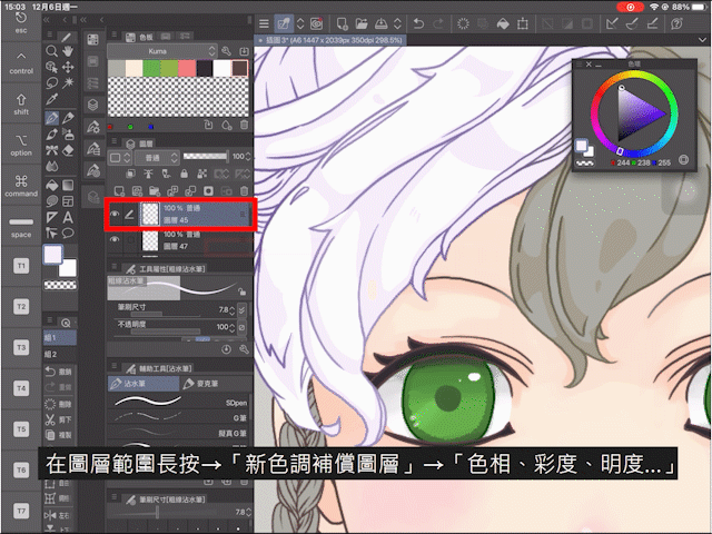
Long press in the layer range → "New Tone Compensation Layer" → "Hue, Saturation, Lightness..." → Set Saturation to "-100" → OK
"New Tone Compensation Layer" has appeared! Put it on top of all the layers.
Now you can check whether the contrast and saturation of the color of each layer are sufficient, and make adjustments.
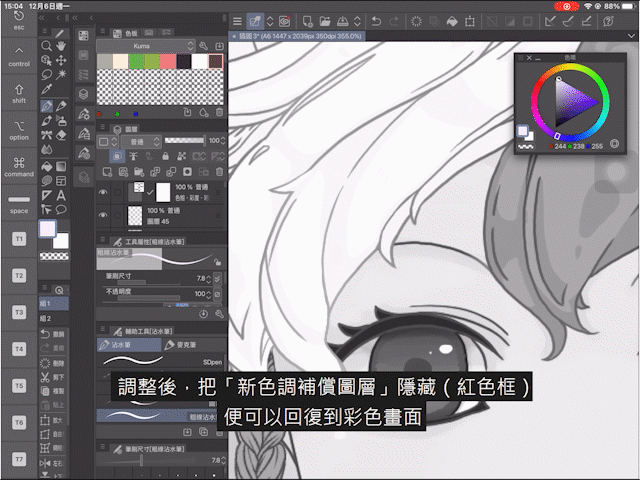
After adjustment, hide the "New Tone Compensation Layer" to return to the color screen.
|Incorporate the lines into the painting and change the color of the line draft! Introduction to "Locking Transparent Entity"
Coordinating the thickness of the line, the gradient, and the line color that matches the color block, not only can prevent the line from becoming abrupt in the work, but also increase the richness of the picture, so use all the elements on the picture as much as possible to make the work Be complete.
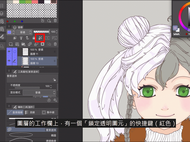
On the work bar of the layer, there is a shortcut key to "lock transparent primitives". After use, the same icon will remain on the layer, so that all transparent parts on this layer will be locked, only the colored ones Parts can be modified, so you can greatly use "lasso smear" or other brushes to color the lines as much as you like.
If you don’t find the shortcut key, you can
Long press the relevant layer → set layer → lock transparent primitives
Part 4 final adjustment and material application
|Use materials to add cute hair accessories to the characters!
Sometimes, the material looks like a seal, and the drawing is a different pattern. This type of material is very suitable to embellish the work and become the decoration of the characters, so it is very recommended to try it out before using it. Know all types of materials.
The following are the decoration and background materials used this time:
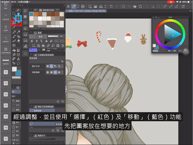
After adding the material, after adjusting, and using the "select" and "move" functions, first place the pattern where you want it.
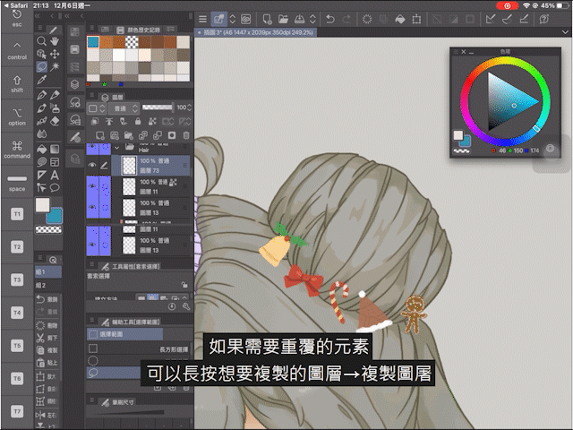
If you need to repeat the element, you can press and hold the layer you want to copy → copy the image.
In addition, you can also change the direction or size of the layer. For example, if you want to reverse horizontally, you can go to Menu→Edit→Transform→Reverse Left and Right.
|Add a frame to the material to unify the style of the work
After placing the material, in order to match the overall feel of the work, you need to stroke the material.
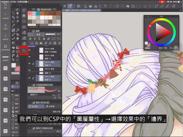
We can go to "Layer Properties" in CSP → select "Border" in the effect.
Here you can add a frame to all the color blocks in the layer. The line can be selected as "Edge" and "Watercolor Border", and you can also select the thickness and color of the line.
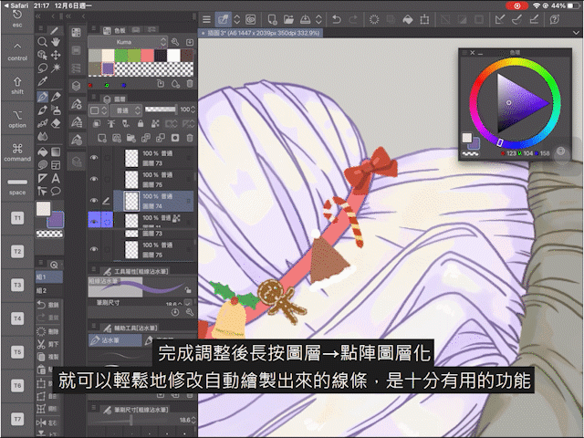
After the adjustment is complete, long press the layer → bitmap layering
You can easily modify the automatically drawn lines, which is a very useful function.
|Use materials to complete the background and add watercolor texture!
First drag and drop the desired pattern and watercolor texture into the layer toolbar.
If you want the character to have a watercolor texture, put the watercolor material on top of all the layers where the character is drawn.
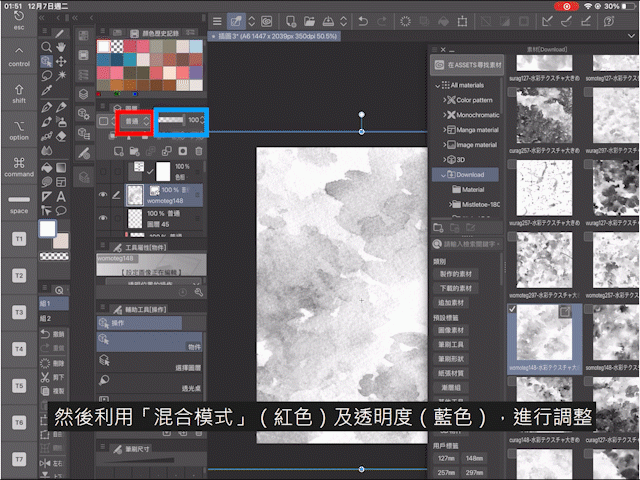
Then use the "blending mode" (red) and transparency (blue) to adjust.
At the same time, if you don’t want the watercolor material to affect the background, you can put all the layers and folders for drawing characters in one folder, and set the watercolor material to the state of "cutting with the next layer", so the watercolor material It won't affect the cute pattern of the background.
In order not to make the background more conspicuous than the characters, the background should also be slightly adjusted, lest the background color is brighter than the characters and steal the protagonist status of the characters.
|Use the built-in brush: "Art characters" to write blessings!
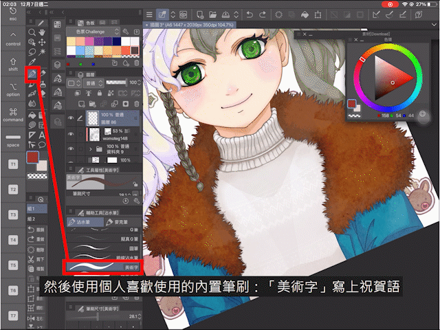
In CSP, I quite like to write with the built-in brush: "fine art". You can find it from "Dip pen→Art characters".
Finally, use "Layer Attributes" and white borders to make the congratulations more conspicuous, and the work is done!
end
Wish you all a Merry Christmas! At the same time, I hope you will enjoy this teaching.
If you like our teaching videos and articles, please give us a "like"!
Finally, the materials used in the cover map of this teaching are sent below. Simple coordination and modification can make a beautiful and lovely cover image. Don’t you need such a useful material? !
See you next time! Thank you for reading here!
Users who liked this post


Comment