
In this tutorial, I’m going to teach you the all of the ways to pick colors for your paintings with Clip Studio’s color palettes and other features. I’ll first be teaching some quick color theory to get you started, especially if you’re a beginner, then I’ll head straight to teaching the different ways you could pick colors in CSP.
A Bit of Color Theory to Get You Started
Let’s start with a bit of color theory terms and concepts that we will encounter along the way.
I know that color theory could be daunting at first if you’re a beginner so I’ll try to keep it as simple and short as possible. Trust me that knowing this is as important as knowing the software because this will serve as the foundation on which we’ll pick our colors afterwards.
Hue refers to the dominant family of colors that can be discerned as the colors of the rainbow while Saturation refers to the intensity of color and Value refers to the brightness or darkness of a color. Together, they make the HSV colorspace.
A colorspace is a range of colors on a spectrum represented mathematically. In digital painting, it can be described as the style how your colors will be represented in the software.
Another example of a color space is the HLS color space where the ‘value’ is replaced by ‘luminance.’
The main difference between HSV and HLS colorspaces is that maxing the lightness in HLS, regardless of saturation, produces pure white while maxing the value in HSV will only result to pure white when the saturation is 0.
Hence, when we place 2 colors of each colorspace side by side, give it the same saturation, value, and luminance, then set it to grayscale, we will end up with the same grays in HLS but not in HSV.
Personally, I use the HSV colorspace but there are also a lot of great artists out there who uses the HLS colorspace. Don’t think too hard about it, just try it out and see what’s best for you.
To be able to take full advantage of colorspaces, it’s also important to know the theory behind the relationships of color and color harmony.
Color harmony is the term for aesthetically pleasing color combinations used in art.
Pairs of colors opposite each other in the wheel are called complementary.
split complementary is like complementary except that two colors adjacent to the color’s complement are used with the main color instead, thereby forming an isosceles triangle.
If it forms an equilateral triangle, then it will be triadic.
If a rectangle, then tetradic
Three hues beside each other are analogous.
While using only one hue, is monochromatic
The execution of these proper color harmonies is what separates beginners to professional painters.
It is also one of the best explanations why using a high number of colors randomly spread apart in the wheel turns out worse than using a LIMITED color palette.
But iI you really need to have a lot of random colors, then you can still compensate for the visual coherence by lowering the saturation or adjusting the HSV values in such a way that they seem consistent.
There’s a very easy way of choosing consistent colors automatically in CSP but I’ll talk about this in the very end of the tutorial.
While we’re at it, I also want to introduce the concept of warm and cool colors. Ideally, the color wheel is split with red, orange, and yellow being the warm colors & with green, blue, and magenta being the cool colors. If warm colors remind us of heat and sunlight, cool colors tend to remind us of the sky and other cold places. But warmer colors also tend to be more relaxing to the eye. These symbolisms will help you establish the mood of a painting.
To further improve the mood though, you can also use mood boards which are a collection of reference pictures you can use as inspiration for your color palette, character design, poses, etc.
Here is an example of a work I made using the complementary color scheme with a combination of warm and cool colors. And Because I used a vibrant palette, the painting looks more energetic.
And here’s an example where I used a split complementary color scheme with lighter cool colors.
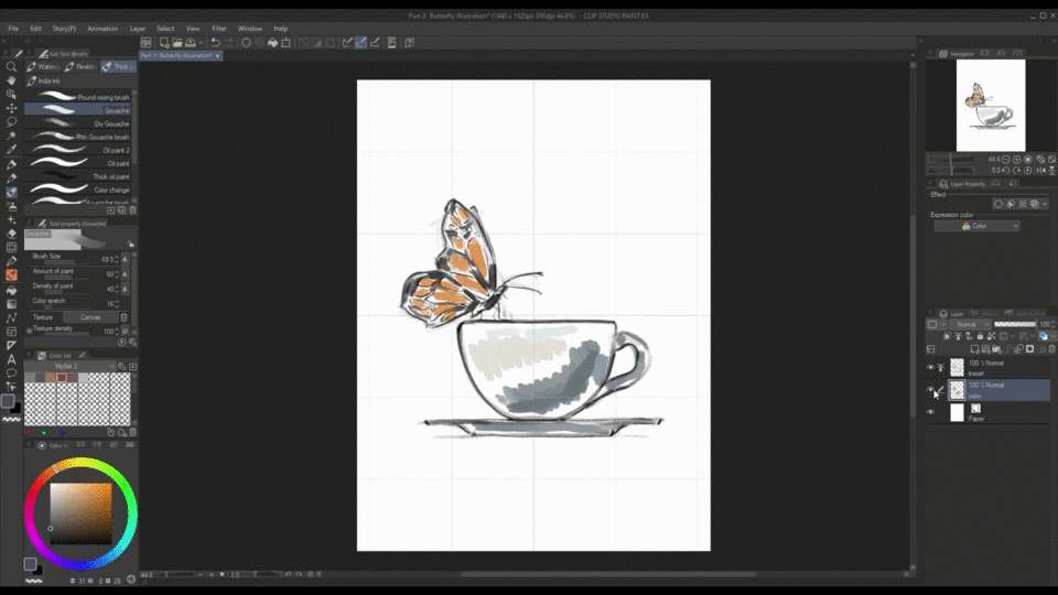
For this tutorial, I’ll be painting a simple comic with warm analogous colors and a little touch of complementary colors. I’ll be dividing it into 3 paintings to demonstrate CSP’s color palettes and other color picking features.
But what exactly are palettes and color palettes in CSP?
Contrary to the traditional idea of what a ‘palette’ is, the different tools enclosed in boxes at the corners of the screen are all called palettes in CSP. And as you could guess, all color-related palettes are called color palettes. Subsequently, the arrangement of these palettes makes up the interface, more commonly known as the workspace.
Not all of Clip Studio’s palettes are shown by default so to access the hidden palettes, you need to click the tabs at the top of each palette. Alternatively, you can also go to Window> and choose whichever palette you want to see.
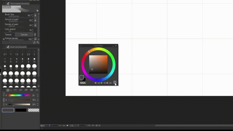
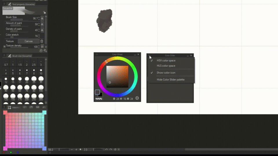
Color Wheel
Let’s now begin with the color wheel.
Since it’s already in here, we don’t need to add it from the window. I’ll move it by click and dragging with my mouse.
After that, I’ll try to pick my starting color for the walls.
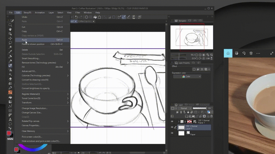
We can see our currently selected [1] main and sub color in the bottom left boxes. We can toggle between the two by either clicking it or by pressing X on the keyboard. Double clicking on it will bring us to its settings where we can further edit the color. [2] Below that is the option to paint transparent pixels aka erasing. This can be toggled by pressing C.
[3] While on the bottom right, we have the HSV values of our color which are especially important when copying our current color to other applications; you can also toggle this to show the RGB values by clicking on it. [4] On the right, we have the toggle for the HSV and HSL color space. Another way to toggle is through clicking the three-line icon on the top and picking between the two.
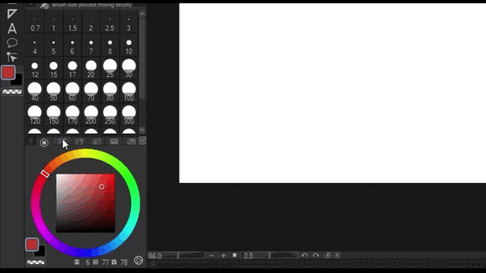
Color Slider
It is very similar to the color wheel except that it has finer controls for individual hsv, rgb, and cmyk values.
I’ll lay the color to the canvas for now. Then let’s say that I want a more saturated and redder color without changing its values. It will be hard to do so with the color wheel so this is where the color slider comes in.
Just like before, we can also change the color spaces by clicking the three line icon. The color space we use in each color palette are linked together so you’ll also notice that by changing the color space here, we are also changing the color space on the color wheel.
To get my desired color, I can drag the sliders but a simpler and more precise way would just be to type it.
Intermediate and Approximate Color
Now I’ll place this color beside our first color. And I’m kind of running out for specific colors to choose so why don’t we use the intermediate and approximate color palette to help us.
The intermediate palette allows you to pick four colors and see how they blend together. You can adjust the size of the tiles by clicking the menu icon and picking one of the options. If you don’t like the grid, there’s also an option to hide it.
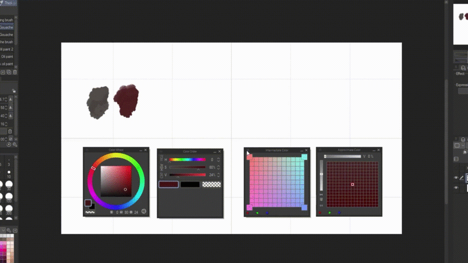
Let’s test it out by picking a color and clicking the corner boxes. Then with these generated colors I’ll pick the ones that I like.
Similar to intermediate color is the approximate color which references on only one color. This tool has its own individual sliders for controlling the parameters you want the color to be modified with.
By default it is set to saturation and value, but we can change it by clicking on the characters beside the bar. I’ll set it to R(red) and G(green) for this example. I highly recommend that you also experiment with these to understand it better.
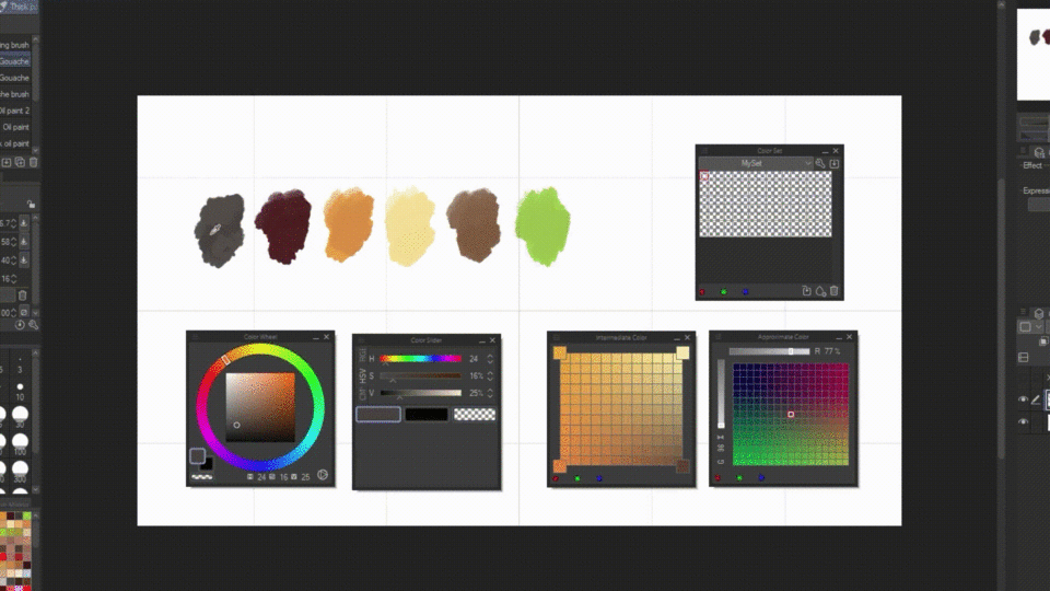
Color Set and Color History
And with that, all of our colors are done! But using the canvas to store these colors while painting are not only tedious but also inefficient. Thankfully, CSP has color set and color history palettes. You wouldn’t believe how much this saved me.
To put it simply, the color history shows you the list of colors you used in the program while the Color set is where you store your colors while painting.
You can use default colors, download from clip studio assets, or even make your own. You can access these sets by clicking the drop-down icon.
In our case, let’s make our own by clicking the wrench icon>create new set> then let’s rename it {My Set}> and click OK.
If you want to edit it later, for example, duplicate or rearrange it, you can click the wrench icon again to do so.
I’ll start adding the colors now by:
1. using the eyedropper tool with alt to select the color
2. selecting an empty tile.
3. and clicking the raindrop icon.
Another way is through the three-line icon>add color. But the simplest way would be to hold down alt and click the empty tile you want to register your active color to.
However, To make this a lot faster I’ll select the Auto-register color in eyedropper.
I advise that you turn this off after using it if you don’t want to accidentally add unwanted colors to your color set. If you accidentally added one though, you can always delete it with the trash icon, or replace it with another color with the arrow icon.
You can also rearrange the colors by ctrl+dragging it. -But you can change this control by clicking the menu>change order>drag. You can also resize the tiles by going to >View(S)>whatever size you want.
Now that I’m satisfied, let’s go ahead and save it for later use. Go to the menu icon>export color-set> and browse to whichever folder you want to keep it. Saving this allows us not only to import it to our own device but also to share it to other creators in clip studio assets.
And now that we’re all set, I’ll begin filling up the painting.
‘Eyedropper method’
Previously, we picked our base color, and laid down the flat colors so now we have to add shading and stuff. I won’t include the whole shading process but I want to give you another tip to picking colors with what I call ‘eyedropper and smudging’ technique.
Through using whatever subtool that allows you to overlap or blend colors, you can eyedrop the intersection where the two colors blend together. You can save the new color to your set or you can also color with it and repeat the process to smoothen the shading.
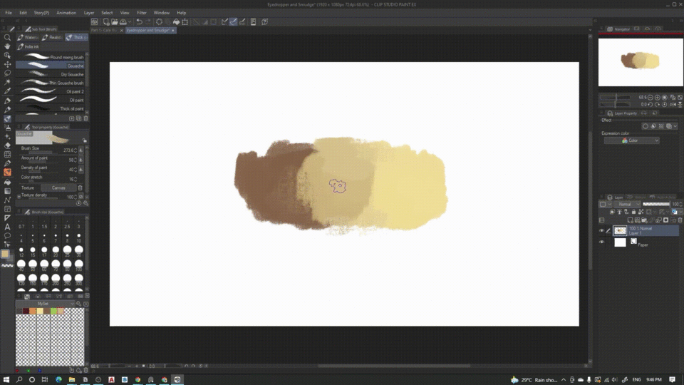
Be careful of overdoing it though. because Overdoing will cause the colors to be ‘duller.’
(Color) Blendmode
And Our first painting is done. Just one thing though, I don’t really like the ‘greenness’ of the leaves. But manually painting over it will take too much time, so instead:
I’ll use the Color Blendmode. Let’s add another layer then hit normal>color. With this, we can change the hue and saturation of the layers beneath it without affecting its values.
Pick Screen Color
Now let’s move on to the second painting and another set of methods.
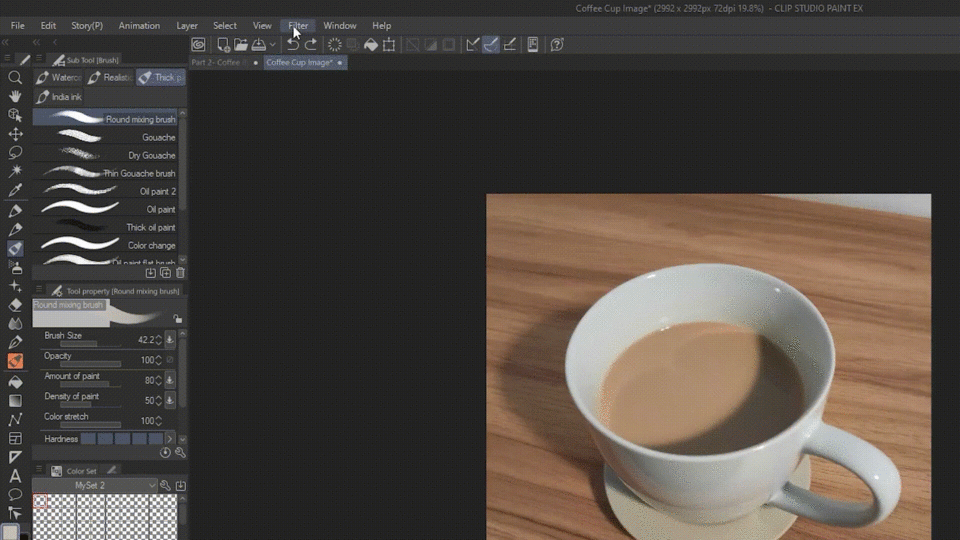
Right now, I have a reference picture as inspiration for colors opened on another window but I won’t be able to access it with the normal eyedropper. Instead, I need to go to edit>pick screen color.
Now I’ll hopefully use the color I eyedropped for my illustration—no—Using the colors from pictures are not ideal because the colors are ALREADY blended together. What we want instead is a the starting colors which we’ll blend afterwards.
Yes, you could still use this, but if you really want to train your eye, what you can do instead is use the colors as reference or inspiration to estimate the starting colors you need.
Mosaic Filter
To make things a lot easier, you can simplify the colors from images by importing the picture to the program and going to filter—>effect—>mosaic. You can use the slider that appears to adjust the tiles.
BUT did you know that there’s an even easier way of getting colors from images?
For this tip, we need to go to companion mode.
[Setting up Companion Mode]
If this is your first time with companion mode, you first need to have CSP installed in your phone. (It will work regardless if you have a license or not so don’t worry if you’re using the free version.) Next, You need to click the connect to phone icon in your computer. This will generate a QR code which you can scan by clicking the same icon in your phone.
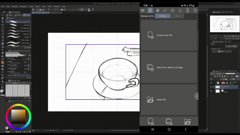
That’s it. You’ve successfully activated companion mode. You can now use your phone as a controller for your computer. At first, I thought that using the phone for companion mode would be slow and laggy but surprisingly, it’s works very smooth. There are a lot of features in companion mode but I’ll only focus with the the sub view and color mixing palette today.
Subview [Companion Mode]
Coming back to the tip, you can actually use the subview in your phone to automatically generate a color scheme from an image! Let’s test it out by clicking the folder and picking an image. Immediately, you can see the new color palette in the bottom of the picture. Sadly, this feature doesn’t work in the PC version.
Color Mixing Palette [Companion Mode]
With this new palette in companion mode, let’s try to experiment with the colors in the newly added color mixing palette.
The color mixing palette mimics the traditional way of using palettes.
By clicking the colors generated in the subview, we can go to the color mixing palette tab and paint it with the brush selected.
I also have the option to save these colors to the tab’s color set by swiping to the left and clicking the plus icon. Reversely, I can also delete by long-pressing the tile.
I’ll now select the smudge and blend the colors to see if I’ll find something I like.
But right now, we can’t really see the lighter colors very well so let’s go to the menu and change the background color to a darker one.
Better. Then, by clicking the eyedropper tool or by long pressing, I can select specific colors. This color will automatically appear in the PC which I can then save in the color set palette.
Color Mixing Palette in PC
There is another feature in the color palette that I guarantee you’ll find useful. That’s the option to use your current subtool as your mixing palette brush.
Unfortunately this doesn’t work in the phone as of the time of making this tutorial so I’ll close the companion mode for now by clicking the connect to phone icon again in the pc.
Now click this new icon that doesn’t appear in the phone. This will let us use the same subtool as the one we’re using in the canvas. In this case, it’s the round mixing brush.
Additionally, I can also register it as a brush in the color mixing palette by heading to the menu>register current subtool>replace brush 1.
If you want to revert it to default later on, you can go back to the menu>register current subtool>and reset to default.
I guess I’m done with preparing the initial color scheme so I’ll begin painting.
Blendmode for finding extra colors
*A quick tip, just like how we used the color blendmode before, we can use other blendmodes to help us pick colors. For example, I can add a new layer, change normal>to multiply, pick a lighter color, and add shadows like a piece of cake.
I won’t attempt to explain the other blendmodes but you get the idea. Just beware of accidentally colorpicking the wrong colors because the colors in the blendmode layers won’t appear the same as the initial colors you picked. Likewise, the affected colors of the layers below it will appear different from its original form when overlapped.
Editing colors with Correction Layers
The painting is done. Placing it side by side, with our first painting, the colors are kind of inconsistent. We can still use the color blendmode but that would be too tedious. Instead, we can use tonal corrections.
It can be accessed in edit->tonal corrections>hue and saturation but an even better and NON-DESTRUCTIVE way is by right clicking the layer -and going to new correction layer>hue saturation. By adding this we can edit the colors of the entire or certain parts of the painting while still allowing us to change it later.
There are a lot of types of correction layers. Just go ahead and experiment with it to see which will help you.
Colorize Tech
Lastly, For the cramming and rushing artists out there. I’ll introduce you to Colorize (technology preview).
This will allow you to let the software decide the colors and color the painting for you.
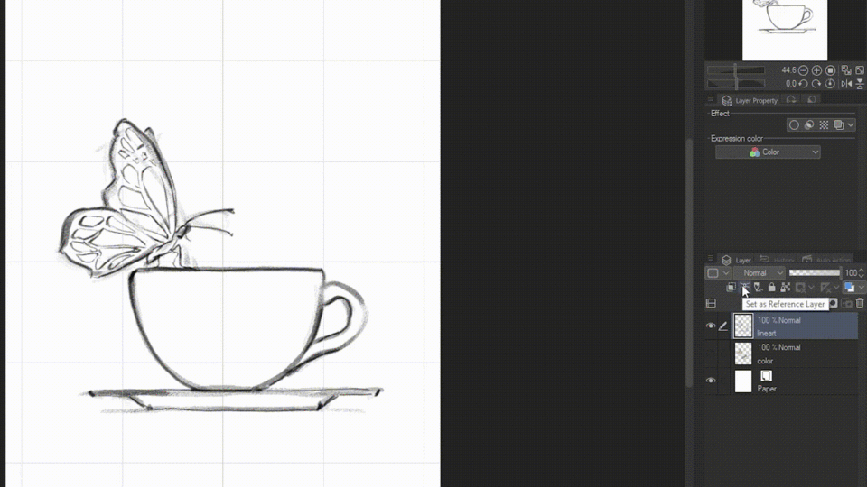
To use it, first set your lineart layer to a reference layer by clickingthe lighthouse icon, then go to edit>colorize(technology preview)>colorize all. The data will be sent to CSP but no personal information is included so don’t worry.
When it’s done, you can see your whole painting automatically get colored within seconds.
And if you already have a color scheme, then you can tell the program to use it for coloring. This time add colors below the lineart layer, then go to edit>colorize(technology preview)>Use hint image and colorize.
The result will not look like a final painting but it is definitely a great place to start.
I'll just refine it with manual shading.
We’re done with the paintings!
Sub Color
But before we end, I told you before that I will show you the easy way of choosing consistent colors automatically in CSP no matter what your color scheme is. For that we need to go to the brush settings by clicking the wrench icon, go to color jitter, check the ‘change brush tip color’, and increase the blend with sub color to 30. I’ll also hit the eye icon to show it in the tool property bar.
With this, I can select a certain color for the subtool, and all of the succeeding colors I’ll choose as the main color will have a set portion of the subtool color mixed within them. This in turn will always make the colors belong together.
Conclusion
I’m sorry if this was a long tutorial because I’ve included all of the ways of picking colors in clip studio paint that I use. The methods I showed you can be used individually or with one another. Some of them are simpler and some are more customizable. But in the end, what matters above all is which among them suits you.
Users who liked this post


Comment