
-Hello everyone!!
I hope you are very well, today I come to tell you a little about my process to follow when making the "Flat illustration". We will have a complete follow-up of the process, from making our sketch with geometric shapes, how to select our colors and different ways of placing the color, adding the necessary lines and ending with a couple of plots that help visually. All this with some extra tips that will help you with your illustration, as in other areas. Now, how about we start at once?
What are Flat Illustrations?
Before starting with the drawing itself we have to keep in mind, what are the "Flat illustration"? The "Flat illustration" or flat illustrations are characterized by being "flat" drawings where the detail is little present, it seeks to simplify the structures, taking into account the same geometric shapes and flat colors with very few shadows, enough to distinguish the elements, but up to a certain point.
initial sketch
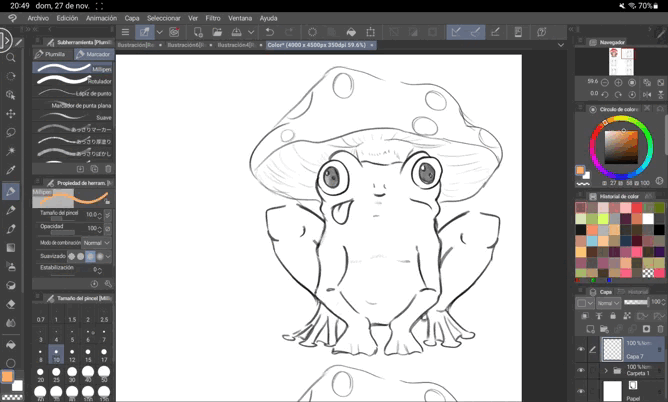
Having a little clearer what these types of illustrations are, you have to know how to start. Clearly the most optimal is always to start with the sketch itself. But before this we must know how to simplify the shapes, objects, people or animals that we want to incorporate into our drawing.
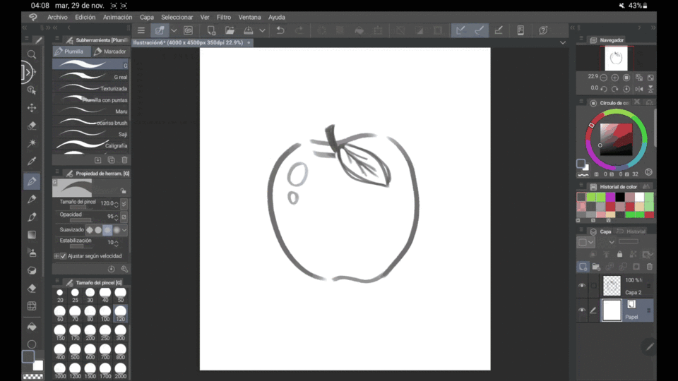
Here we can see a kitten, this kitten despite everything maintains semi-realistic proportions, both in its texture and in its fur (despite being simple sketches).
geometric disfigurement
"Geometric disfigurement" is a name I have just given to this process. It is mainly based on deconstructing the model that we are making in our illustration with the three basic geometric shapes. See "Circles", "Squares" and "Triangles", everything or almost everything can be broken down in one way or another, sometimes the three basic shapes can be deformed and appear more rectangular or oval. However, the principle is the same. Here, we had previously seen a kitten as an example of "Realism", of course this in quotes, we knowing the principle of decomposition and using the layers that digital drawing gives us. We create a new layer and in this we make the corresponding shapes that are suitable for the kitten. This to have a clearer vision of how to make a more simplified sketch, so that when it comes to "passing" it cleanly we can have everything well defined.
Already having the defined shapes we have to put our own "touch" to the drawing, making the sketch fit our personality. This, clearly limiting many details, since the purpose of these illustrations is to be as simple as possible. In addition to reminding you that this will later be accompanied by a flat color, so we must have everything very neat to facilitate this process.
A small Tip that I can give you is to take into account the "Language of forms". See here what each one represents:
Circle
The "Circle" which, due to being completely curved, gives us a feeling of softness or conformity, is the kindest shape and is visually more "adorable".
Square
The next one is the "Square", the square is used for firm characters, on many occasions it is used for the nobility and helps to transmit some "strength".
Triangle
In the middle is the "Triangle" which is the most ambiguous, having three points denotes something of "fierce" and even danger, but this changes a bit when the points are more rounded. In addition to the fact that this one actually shows a lot of charisma and intrigue.
inverted triangle
The Fierce “Inverted Triangle”. This is pure evil, being an inverted triangle it denotes more the aforementioned ferocity and the points are more threatening and sinister, this is the form of villainy.
Now knowing all this, they are ready to be able to make a good neat sketch to be able to add color without much complexity.
Tips
A small tip to know if our drawing is "anatomically correct", is to flip the canvas horizontally, we can do that in the Navigator sub-tools and click on these two little arrows here.
With this, we see the areas where we failed to be able to correct things now and not later when everything is more advanced. With this, I still recommend using the liquefied tool, with this tool we can drag areas of our drawing into themselves so that it "disfigures" a bit, but with this we can fix the damage to our work.
help tools
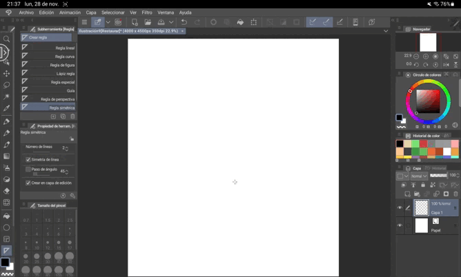
-Rule: When making our sketch there may be elements that are symmetrical to each other, a plausible way for the elements to be symmetrical to each other is with the "Symmetrical Rule". With these we make a line in the direction where we want so once we start drawing (either on the left or right side) the same lines will be made in the other direction. This tool can help us especially with the scenarios, since they are flat illustrations, the sketch tends to have a lot of symmetry in certain areas to a greater extent.
-Gradient: Despite being mostly flat illustrations with "Plastas" of color, a gradient can help us to give more "life" to the drawing, many times the illustration by itself is beautiful but it lacks "something", with the tool gradient we can use tones that are similar to each other to give a different touch to our stage. In any case, this is not 100% usable in all cases, you have to know where to place it and this, despite everything, remains in the knowledge of yourselves, they are flat illustrations, remember that.
Color
Now yes, with all our drawing ready, it is time to choose the colors that we are going to use. For this, we can use a pre-made palette that we can find on different internet platforms or use our eye to select the colors from our own palette.
For all this, we have to have the prior knowledge that each color has its own name or attributed feeling. This can help us when we want to express something specific, in addition to taking into account a "sub Division" where our chromatic circle is split in two, having cold tones on one side and warm tones on the other, named after what each one expresses and remembers, colors like yellow, orange and red are reminiscent of summer, while Blue, light blue and purple can lead us to a cold winter.
Once this is learned, we need to know how to combine our colors since for these we have several options to create our own color palette.
monochromatic
See the "Monochromatic" where the tone is always the same and we vary in terms of brightness and color saturation to paint our works.
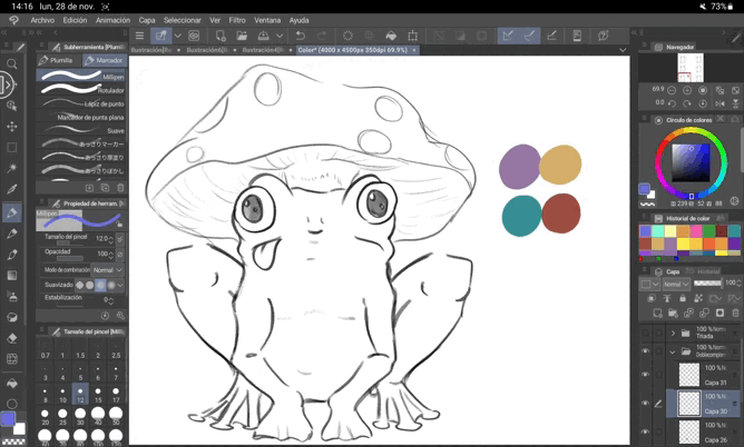
complementary
"Complementary": Each color has its complementary tone, we can see this by making a straight line from our tone to the one in front of it on the chromatic circle, with these two tones we paint our work
complementary division
To explain this selection in a simple way, it is to make a Y in our color circle, this gives us 3 tones which we use to select our tones and see how to integrate them with each other.
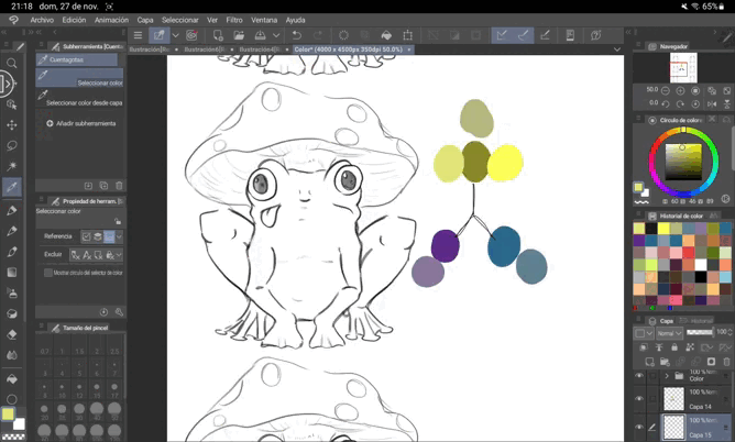
Triad
The triad is a triangle in the middle of the chromatic circle which indicates the three colors adjacent to each other, with these we maintain tones and change saturation and lightness
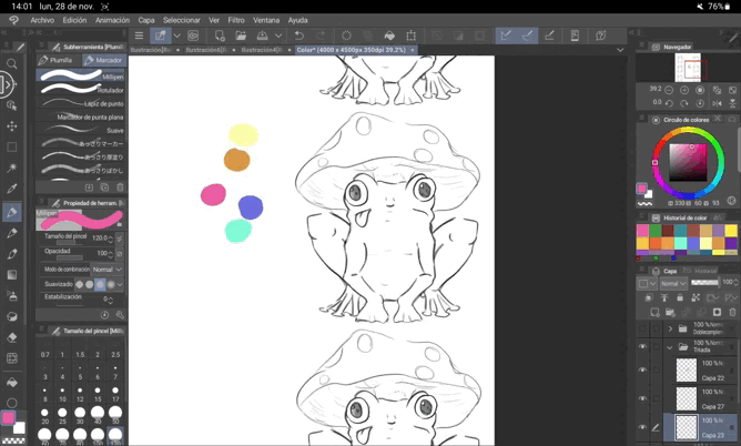
Double complementary
We choose two key colors for the work and we look for the complementary ones of both tones, with this we have 4 tones to use for our work
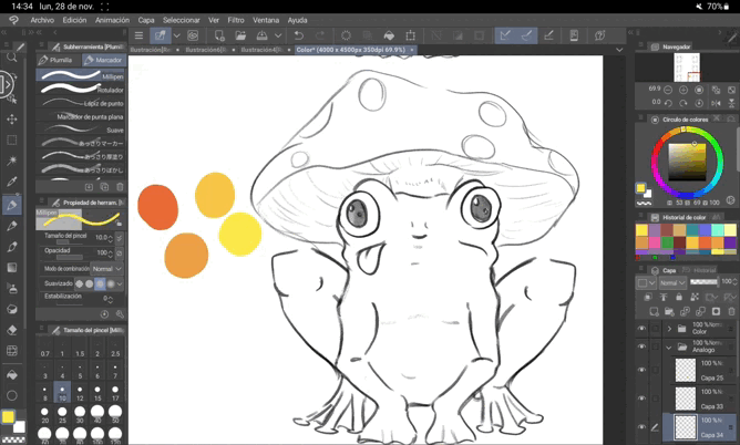
analogues
With the analog palette we take 4 tones that are together, they are the closest to each other and are closer together.
How to put the color
Now, to place the colors we have many ways, I will present you four options and you can see which one suits you best ^^.
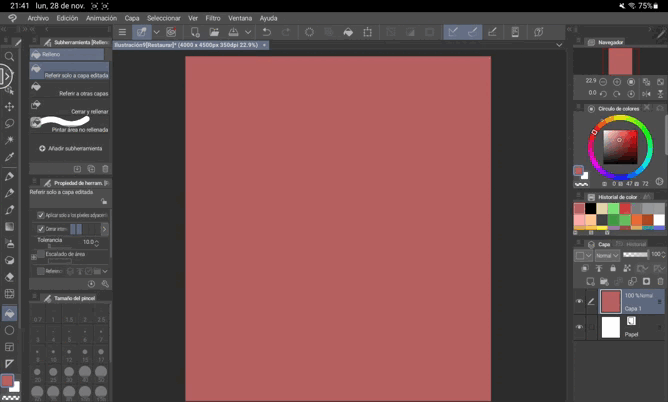
The first option is to make a "Lineart" of our sketch with all the colors that we are going to use and later use the paint bucket tool and with it color everything, be careful with the edges of the drawing that are not completely painted.
The second option is directly with a large brush and paint the area of our sketch, without leaving our sketch
The third option is to use the lasso tool, here we find multiple sub tools, where I will highlight the "Rectangular" Lasso that is used to make squares or rectangles, as well as the "Circle" with which circles and ovals are made, the " Lasso" with which we select things with our pencil, "Polygonal Lasso" that works by clicking and selecting the areas always with straight lines, "Selection pencil" with which we can go "painting" and with this we select the area that we want and "Delete selection" with which we will "paint" and deselect the area we want.
The last option is “Draw”, we go to the Figure Sub tool and in it we find different selection formats, with each one of them as “Eclipse”, “Rectangle”, “Curve”, etc. Here we have some shapes already defined with a "Lineart", which we can fill with the paint can and immediately leave the colored area, we can also create a fill to the figures and do it more quickly
TIP +
A simple tip is to use the "Transformations", if we go to Edition and later to Transform we will find many options with which to change the shape of our fillings a bit, with them we can increase the size (Scale) or rotate them so that they fit to our own liking (rotate), or we can distort them (Distortion), the most common to use is "Free transformation" and it includes several of these functions but only in one, with which we can change the size of our object painted, go distorting or rotating to fit better in our composition
Another small but great Tip that I can give you is to use different layers for each color zone, here to organize ourselves we should use the folders that appear in the layer sub tool, once clicked we have to select the layers of each thing in the space that remains between the eye and the layer, having everything selected we mobilize the layers to the folders and with this we can have everything more organized and we lose less
(Another optional thing is to change the name of the layer, for them we have to double click where "Layer x" appears and name it as we want).
Line Art
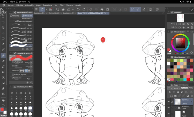
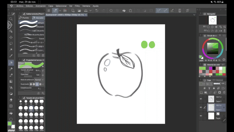
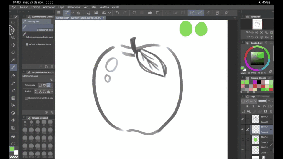
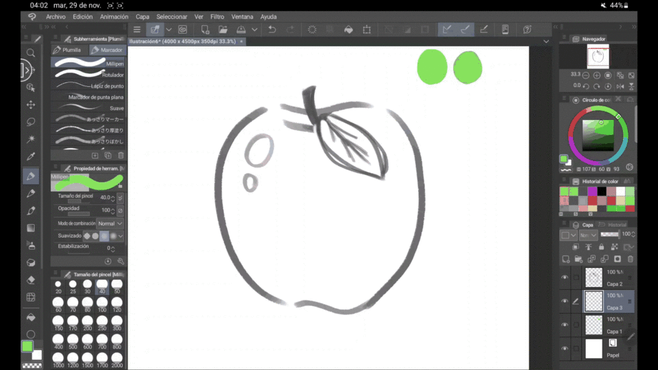
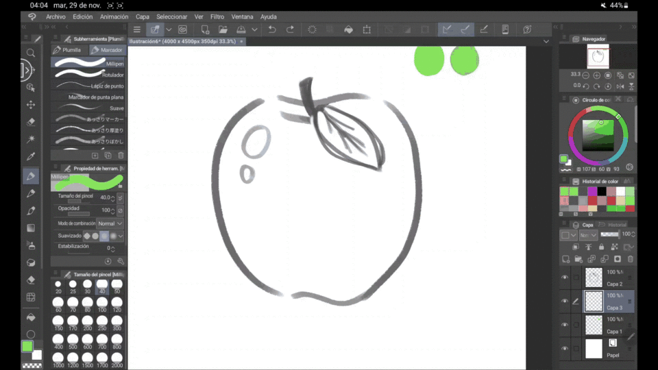
When we have everything ready for candy, something very useful to distinguish the shapes is to add a line to our drawing, in the case of this type of illustration it is much better to use the "Milipen" tool, which we will find in the same area of "Plumilla" but next to where it says "Markers", with this we avoid the "value" of the line, everything being much more uniform and being more in line with the "Flat illustration".
Another little tip is to use a line that is more "Coffee" than "Black" as such, with this we avoid the line standing out too much and clashing with the illustration.
With this, I still want you to know that it is not necessary to make a "lineart" as such, it is only to place lines in the areas that the drawing needs it most, this in order to keep it as simple as possible.
Textured/Weaves
Finally, something that can help us a lot to make our illustration look “Flat” is to add patterns as textures. The simplest way to do this is by creating a new layer and going to the "layer properties" area, here we select the "pattern" icon and "color selection", we choose the color we want, what shape we want that the plot has in dot settings and we modify the frequency so that they are not infinite dots (If you want to do it, go ahead, but personally I prefer that there are not many dots), with all this ready we select any brush and go "coloring the area where we want to add the texture, here another fact to take into account is that the closer the color is to black, the more space there will be between each point, while if it is closer to white, the fewer spaces there will be between each point.
Now with the area selected, we will have to include the layer where we want the plot to be seen, in addition to that we lower the opacity a bit with the intention that everything is more integrated.
BONUS EXERCISE
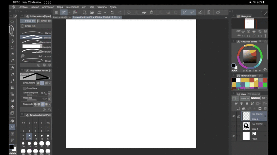
What I am going to tell you about is an exercise I did to improve my own vision and to get more used to defining shapes. With the canvas completely blank, we take a reference photograph and try to make it as it is but without a sketch, we start to do it with the Polyline tool, we activate the line fill and we make the shape only with this tool until we are left with something visibly attractive.
This helps us to improve our dimensionality of the drawings by making them without a sketch and having to make the proportion ourselves as we create the work, this is another type of "Flat illustration" but only with black and white tones, not here we only have depth in the negative spaces, doing it a couple of times is useful to get used to using the tools and better understand the concept of "negative spaces", this can also be done with all the tools that the "Figure" area has in “Drawing”, I recommend doing a couple of these quickly.
Final + Video
First I will show you the final result of my own illustration "Flat" taking into account all the elements mentioned in this Blog, I hope you like it
And everything is ready, but my tutorial has been useful to you, if you manage to make a drawing following my tutorial, tag me on Instagram or Twitter, my links will be on my profile, I hope to see your results.
Have a nice day and keep drawing.
Bye Bye.
Users who liked this post


Comment