
A. Introducing
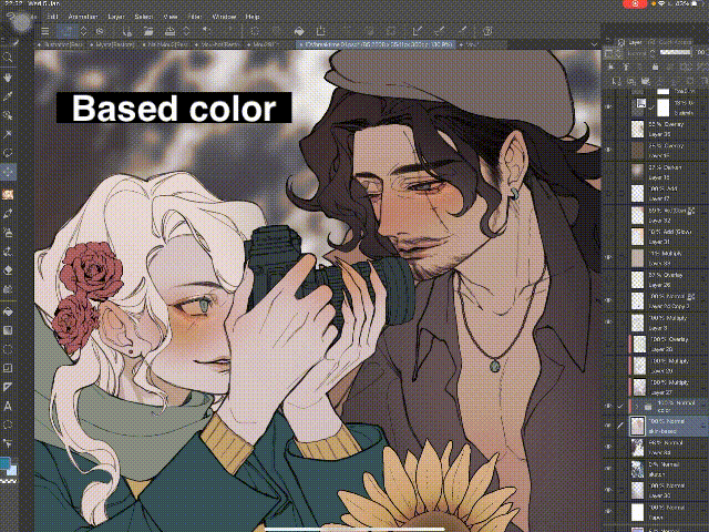
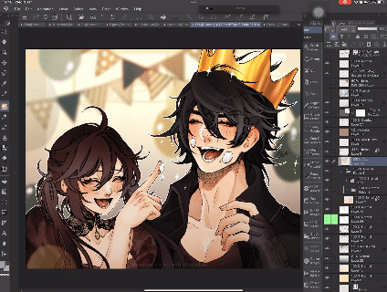
Firstly, please take a look with some layer organization of mine.
Hi guys, welcome to another tips of mine, how is it going?
Oh this have been a long time since my last tutorial was posted on last year, but I hope you are doing well. And talking about this month’s theme, finishing with blending mode, was something really familiar to me, I can’t wait to show you some technical ideas to finish your artwork with them, from the simplest to advanced way to use blending mode.
I’ll try to explain it easily as much as I can! So, let’s jump into it now! (❁´♡`❁)
B. Where to fine Layer Mode?
As you can see, I use a lot type of Layer. I once talked about it in my previous tips that you can find it here:
Do you see the pattern? I always have some [Effect Layers] with different layer mode like [Multiply], [Overlay], or [Add Glow], etc…
This is the points of this TIPs!
Now is Blending Modes and Where to find them!
Go to your [Layer], look at the box to the left of Opacity, you will see it is showing the current mode of the layer - here is[Normal].
When you click on it, the drop box will show down with the list of [Blending Modes].
This is where you find them. But how to understand them clearly and use it in your drawing, since it has a long long long list?
Don’t worry, let’s move to the next part!
C. Divide the using of Layer Blending Mode
When I started to drawing digitally, I just tried everything I see on the screen, so does the layer mode.
I read the name, translated it into my mother-language to know what it means and tried each modes of them. I tried and tried until I find out which one is the most suitable to creating the effects I want. So that way is so natural to learn something new.
The Tutorials Library of CSP has one tutorial that explains how each layer mode affects the layer below. You can read it here for more explaining:
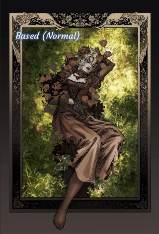
I have made a preview of each Blending Mode Layer affects to the layer below. And as you can see, although there are many modes, they still have similarities to divide into small groups, serving different needs.
Based on its effects (like the photo above) and how I apply it to my paintings, I have classified them into the following subgroups:
When using blending mode, I will choose each mode based on the purpose. Now we can move to some application of blending mode.
For example, if I want to add dark color (like shading) to the painting, I will choose the darker modes (like darker, multiply or liner burn is some modes I usually use). Else, when I wanna add light to it, I will choose the modes in the lighter group. And then I can try to switch between them until I can choose the most suitable one.
D. Using of Blending mode
In this tips, I will show you some using of Blending Modes, affects to subjects and then the whole background.
In short, I have write down some ways I used regularly:
D.1. Creating Depth for subjects
To creating depth for the subjects, I use [Multiply] mode the most.
In the [Multiply] Layer, I choose the light grey color (you can choose to add hot or cold shades to show the color of the environment and make the picture more vivid) to adding shade. And then adding some sun light color at the edge.
After that, you can add [Overlay] color to make it more vivid.
You can also add an [Add] layer to create a sharp light.
D.2. Shading Subjects (Character for Example)
This has the same method as above, but I will go deeper in shading character here:
After creating an [Multiply] layer above the base color, we have to think about the environment and atmosphere of our artwork to choose the shading color.
In this example, I wanna create an warm and comfortable atmosphere so the main tone is warm color. Let’s take a closer look to see the result on painting!
I also have other examples, using [Multiply] and also [Overlay], [Add] for the final picture.
It’s easy to see the differences, right!
Now let’s move to the whole picture! (❁´♡`❁)
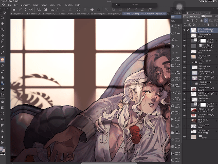
D.3. The Depth of Background.
In the example here, I hope you can see clearly the affects of each Blending Layer to the based color one.
The shadow of the frames create a bit feeling of space, while the grass background shading make the character pop up, separate from the canvas below.
I also add a pinch of light to the top to emphasize the face of the character.
In this one, I want people to focus into the center of picture, so I create 2 dark border and blur it into the center.
D.4. Sparkling light
I do really like adding some ✨✨✨ sparkling light in to my art to make it Blink blink~
It’s really easy. Just start with an [Add] or [Add (Glow)], [Glow Dodge],.. and a sparkling brush and make your art blink ✨✨✨
I also use it to apply the light to my picture, here is the example (❁´♡`❁) /~
Do you see how it shine bright after adding light?
I love it so much.
D.5. Color Adjustment
You can use the Blending Mode in Color Adjustment group to change color of the subjects. For example i got here, I wanna change the hair to Blue.
This image shows you how I apply the new color (which I want to change to) to the Blending Layer, and how it affects to the original color.
For the [Saturation] Mode, you can see it change the saturation of the original color to the saturation of the new color on the blending layer.
The more vivid the new color is, it changed the original color to that saturation.
D.6. Creating over tone for the whole picture
Sometimes you wonder if the colors you've chosen will go well together, right? Me too.
To be sure, I will coat the whole picture with an [Overlay] layer to match all the things together.
As you see, the picture before has a quite green tone. But I want it to have a little more warmth so I added an 50% opacity [Overlay] layer to it.
You can also use both light and dark color in [Overlay] Layer to emphasize the main subjects of your picture in this way. (❁´♡`❁)
D.7. Background adjustment, Background drawing
There is so much way to use Blending mode to the Background drawing. You can freely to use it with your creative. Here I show you some of my methods to create background for character art:
You can see I use a lot of different layers with different blending mode to create it. The tips here is try to change its opacity so you can see it become match to the others.
I got another example:
When the pattern you added to the background too shine, it will confuse your eye and take the spotlight of the main subject (here is the character), so try to low it’s opacity a little.
What about make the main character separated from the background. I like to use a light shadow of the silhouette, put it in a [Screen] Layer.
Now you have the main character glow and separated from the BG. This allow you to focus on the character, not the background behind.
You can also duplicate the character layer, lower the opacity and try some Blending mode like [Screen] or [Overlay], etc.
This turn out to basic BG trick for Character Art, which you can zoom to character’s face details but not take so much spotlight of the full body design.
E. Conclusion & Thank you
There is so many ways to use Blending Mode, you can freely try and try, then you will find out which one is your favorite, which one is suitable to your art style.
I hope that I have explained everything well and easy to understand. And if you find anything that can help you in my TIPs, it would be the happiness to me.
Hope my tips work for you ! And if it does, please give me a heart !!!
You can also follow me on @tokyolondon (IG, dA, weibo) or visit my FB Page @TokyoLondon.Artwork
Thank youuuu <3
Users who liked this post


Comment