
Introduction
How color mixes digitally is different from how colors interact in real life. Or at least that was the case until Clip Studio Paint version 2.0 came along.
Now we can combine colors digitally to achieve the color combinations we would normally get by mixing paints by hand.
In this tutorial, we will look into the color mixing essentials, the new perceptual color mixing, and how to use its brightness correction settings to get customized mixing results.
1. The Reason Why Digital Colors Do Not Mix Like Real-Life Paints
The reason colors behave differently on the screen than on paper is because both operate on different color models and have different primary colors. Our screens use light emissions to illuminate the display area and the primary colors here are red, green, and blue (RGB).
On the other hand, our physical surfaces are colored using pigments that absorb certain wavelengths from the light cast on them while reflecting others. The primary colors here are either cyan, magenta, yellow, and black (CMYK), or red, yellow, and blue (RYB).
In CMYK and RYB, we can combine yellow and blue to make green. But in RGB (used in screen displays) green is already a primary color, so it cannot be recreated by combining colors that don’t already have a significant amount of green in them.
Therefore, when we combine yellow and pure blue digitally, it gives us a dull mix instead of green.
Similarly, there are other color combinations that also give us unexpected results because they work on a model that is different from the one we use for traditional drawing and painting.
Thankfully, as [Perceptual] mixing simulates how color mixes in real life, we no longer need to manually add separate transition colors when color mixing to achieve expected dynamic results.
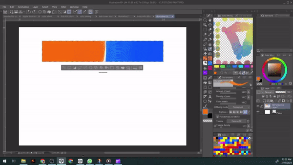
2. Where To Find The Perceptual Mixing Mode
To turn on find Perceptual mixing in ver. 2.0, go to the [Tool property] palette and click the [Sub Tool Detail] wrench icon on the bottom right. Then go to the [Ink] category and then switch the [Mixing mode] to [Perceptual] if it isn’t set already.
Note: If [Mixing mode] is inactive in a brush, turn on [Color mixing] in the [Sub Tool Detail] palette’s [Ink] category first, then you can change it between [Standard] and [Perceptual].
3. Brightness Correction in Perceptual Mixing Mode
Brightness correction options gives us extra control over how gradually color mixes and how it turns out. With low or no brightness correction, mixing results in saturated and strong colors very quickly.
Whereas, with high brightness correction, mixing results in lighter, softer, pastel colors that can be gradually built up to stronger and more saturated results.
Here is a chart to demonstrate the two mixing modes and the brightness control adjustments:
As we can see, the Perceptual mixing can give us soft mixing as well as vibrant depending on the brightness correction level. On the other hand, the Standard mode color wheel gives more muted results in most cases except for purple.
[Brightness correction] control in the Perceptual mixing feature is great for adjustments for simulating different traditional mediums and we will discuss how to do so in Section 5.
Tip: You can achieve even greater color mixing variety by adjusting the amount of paint, density of paint, and the opacity of your brush in the [Tool property] palette.
4. How To Mix Your Own Colors
Knowing how color mixing works is essential to making the most out of Perceptual mixing. First, let’s look at how secondary colors are made from the primary colors red, yellow, and blue.
i. Mixing secondary colors
Red + Yellow = Orange
Yellow + Blue = Green
Blue + Red = Purple
ii. Mixing tertiary colors
Tertiary colors are made by combining primary colors with the secondary color next to them.
Red + Orange = Red-Orange
Yellow + Orange = Yellow-Orange
Yellow + Green = Yellow-Green
Blue + Green = Blue-Green
Blue + Purple = Blue-Purple
Red + Purple = Red-Purple
iii. Mixing brown
We can mix brown in two simple ways and they all result in a slightly different brown. The first is to mix yellow, red, and blue in equal amounts.
The second is to mix a primary color with its complementary color (the color opposite to it on the color wheel).
iv. Mixing grey
If you add yellow and red in equal amounts and add blue in a greater quantity than the two, you will get grey.
v. Warm and cool colors when mixing
All three primary colors (red, yellow, blue) have a cool side and a warm side. Here is how it is:
Yellow leaning towards blue = Cool Yellow
Yellow leaning towards red = Warm Yellow
Red leaning towards blue = Cool Red
Red leaning towards yellow = Warm Red
Blue leaning towards yellow = Cool Blue
Blue leaning towards red = Warm Blue
When mixing for clean and crisp colors, we will choose the two primary colors that do not lean towards the third primary color. Because as we know, combinations of the three lead to browns and greys.
However, if we are mixing for dull colors, we will choose the two primary colors in which either one or both lean toward the third primary color.
Example for mixing crisp colors
If we want a crisp and clean orange, we will get the best results with a warm yellow (leaning towards red) and a warm red (leaning towards yellow). This is because the mixture is purely of red and yellow and both of them have no amount of blue that could muddy the resulting orange.
Example for mixing muted colors
If we want a muted or dull green, we can use three ways.
If we want a very dull green, we can mix a warm yellow (leaning towards red) with a warm blue (leaning towards red). The result will be a very dull green because both the yellow and blue will have a small amount of red in them, resulting in more red in the mixed green.
For a slightly muted green, we could mix a cool yellow (leaning towards blue) and a warm blue (leaning towards red) or we could mix a warm yellow (leaning towards red) with a cool blue (leaning towards yellow).
Note: A clean crisp green, in comparison, could be achieved with a cool yellow (leaning towards blue) and a cool blue (leaning towards yellow).
vi. Mixing tints
By adding white to any color, you can make its tint. For example, pink is a tint of red made by mixing white and red. With more white you add, your tints will become lighter and less saturated.
For example, following are the tints of red:
vii. Mixing shades
By adding black to any color, you can make its shade. With more black you add, your tints will become darker and less saturated.
For example, here are the shades of yellow:
viii. Mixing tones
By adding grey to any color, you can make its tones. With the more grey you add, your tints will become desaturated but not as dark as the shades of the same color.
Following are the tones of orange (another way for mixing browns):
Tip: You can use your tints, shades and tones as color palettes.
ix. Further mixing
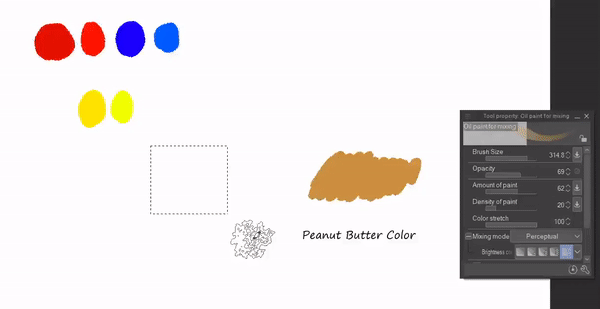
You can further mix all the above color combinations to get to colors you like or need. For example, to get to a color close to peanut butter, you might start by making brown and adding yellow-orange, and white to it. Or you could start from orange and go from there.
There are many possibilities and color mixing is all about exploring the various options and enjoying the process.
5. Simulating Traditional Mediums Using Brightness Correction
Brightness correction proves very useful when simulating traditional mediums. Different traditional mediums give different mixing results depending on their pigments and dilution and need slightly different approaches.
Furthermore, instead of choosing the color to paint with, you can now create those expressive and vivid colors on the go as you paint.
For example, if you want green for a tree, you don't have to start from green and can instead build layers of yellow and blue and get a variety of greens in your tree that are also in harmony.
If the colors in your art style are deep and vibrant, then low brightness correction will help you get more saturated results. Conversely, if you are going for a softly vibrant feel, then a medium brightness correction might be better for you.
Here are three examples for simulating different traditional painting styles with the same brush:
i. Watercolor style tree
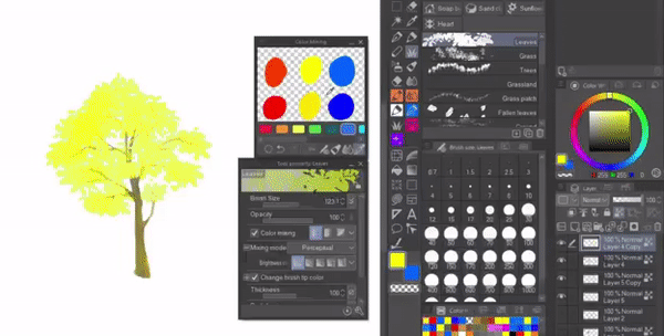
For a watercolor style tree, I used a cool yellow and a cool blue to get clean and bright mixing. By turning on the transparent pixel lock on the layer after making the base, I was able to achieve a flat watercolor effect as the lock kept me from adding further foliage layers.
As the transparent pixel lock minimizes layering, I needed to keep brightness correction off to get the softly vibrant mixing that I would normally get from medium brightness correction (as we'll see in the pastel style tree).
I also lowered brush opacity to ensure more controlled color variety when mixing.
ii. Pastel style tree
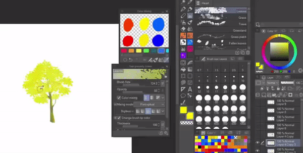
For the pastel style tree, I used medium brightness correction for soft vibrant mixing and let the foliage layers build up by not using transparent pixel lock.
Here again, I used a cool yellow and a cool blue for clean greens and adjusted brush opacity as needed.
iii. Oil paint style tree
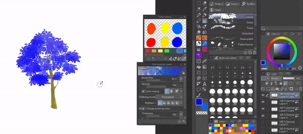
For the oil paint style tree, I kept brightness correction off to get deep and vibrant mixes. I also used more warm yellow and warm blue to get the darker greens.
Here is a comparison of the three mediums:
6. How To Create And Use Harmonious Color Palettes
Another extremely good use of the Perceptual mixing mode is to create custom color palettes. Color palettes are essential for a cohesive illustration, and now we can mix our own palette very realistically.
Compared to [Standard] mode, color palettes using the [Perceptual] mixing mode are richer in colors, and give more realistic mixes.
To make a color palette, we start by creating a gradient between the colors.
Then we can color pick the various hues from the gradient.
Lastly, we can complete our color palette by adding white, black, and grey to the hues in separate rows to achieve the tints, shades and tones.
Using this method, we can also create custom color palettes in the [Color Mixing] palette ([Window] > [Color Mixing]).
When using a color palette, it is better to have a dominant color rather than letting all main colors be in same ratio.
For example, here I have mixed a triadic color scheme using purple, green and orange in the [Color Mixing] palette and used it to paint a flower in Perceptual mixing mode. Here my dominant color is purple, with orange coming second, and green was used least but is enough to enhance the overall piece.
Final Thoughts
Perceptual color mixing gives us the ultimate traditional painting experience while illustrating digitally. The color mixing results are more dynamic and I love the color variety it adds to a piece.
I hope you found this article useful and that it helps you get a fuller experience from this handy new feature!
Users who liked this post


Comment