
Introduction
Multiple tools and techniques come together to give watercolor paintings their characteristic look. Today, we will look into what those characteristics are and how we can easily emulate them on our digital canvas.
1. Attributes of Watercolor Paintings
Knowing the essential attributes of watercolor paintings will make it easier for us to approach our digital watercolor works more intuitively. Here are six such attributes to be familiar with:
i. Painting background to foreground
Similar to several other traditional mediums, we go from background to foreground when working with watercolors.
It’s quite inherent since the backgrounds are usually faded and less detailed. As we add more layers of paint, we come toward the foreground with stronger and darker colors and further detailing.
ii. Going light to dark with constant multiply
Watercolors are light and become even lighter when they dry. So, to get darker colors we need to continue layering until we get the desired color concentration.
The watercolor layers behave similar to the digital [Multiply] blending mode, with the new layers multiplying with the dry layers below to give a darker color.
iii. Accent colors and color variations
Accent colors are prevalent in watercolor illustrations and add richness to the overall color scheme. They are often a complementary and vibrant color that is added in small quantities to create visual interest.
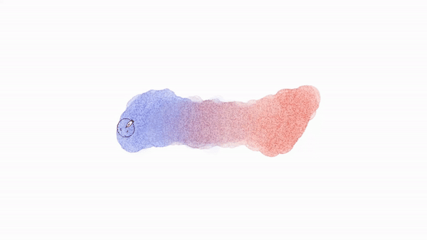
Color variations are easy to add using the wet-on-wet technique, and can also happen inadvertently when one color bleeds into another.
iv. Paper texture and undertone
Watercolor paper often has a texture to it as well as a warm or cool undertone. You can easily emulate this in your digital painting using premade paper textures and enhance the traditional watercolor vibe.
v. Imperfections and effects
Watercolor is a very free and forgiving medium where imperfections create more interest.
Imperfectly filled line art, paint splashes, color bleeding, and salt effects are some elements that you can integrate to create more interest and enhance the overall organic feel of your watercolor-style illustration.
vi. Colored shadows
Since watercolor layering acts similar to the [Multiply] blending mode, we can easily paint the shadows of a complete scene with a single color like when cell shading. This aspect is characteristic of watercolors and makes it simple to experiment with colored shading.
2. Two Essential Techniques
Wet-on-dry and wet-on-wet are the two essential watercolor techniques we'll discuss here. These are often employed alongside each other when painting. Here is what each is better at:
i. Wet-on-dry
For wet-on-dry, we let the previous layer dry completely before applying a new one.
Wet-on-dry is great adding shadows, crisp details, and painting well-defined shapes. It works well for a clean and precise painting style.
ii. Wet-on-wet
For wet-on-wet, we apply a new layer while the previous one is still wet.
Wet-on-wet creates softer edges, gradual color graduations, and more organic effects. It is great for painting fluffy and fuzzy elements and for adding hints of other colors to a dominant color.
3. Perceptual Color Mixing
Clip Studio Paint version 2.0 introduced perceptual color mixing, which makes our digital colors blend as their real-life counterparts do. So, for example, if you now mix yellow and blue you won’t get a muddy in-between but rather a green.
You can make sure your watercolor brushes have perceptual color mixing turned on by clicking the wrench icon in the [Tool property] palette of the brush, and going to the [Ink] section in the pop-up window. Here, switch the [Mixing mode] from [Standard] to [Perceptual] and have colors interact right on canvas as you would in real life.
4. Making a Watercolor-Style Illustration
Now, we will utilize what we’ve learned so far into actually painting a watercolor-style illustration and I’ll show you the way I do it:
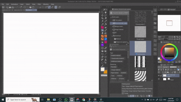
i. Paper texture
First apply a paper texture to the canvas. I’m using a default drawing paper texture. Set the blending mode to [Overlay]. This layer will stay on top.
With an airbrush, add an undertone to the paper. I’m adding a warm undertone for mine.
ii. Pencil sketch
With the pencil tool, create the sketch for your painting. I will hide my sketch later so I’m not going into too much detail with it.
Your sketch could be gray or colored depending on your preferences. Lower the opacity of the sketch as needed.
iii. Base colors
Create a layer above your sketch layer and add the base colors using a watercolor brush. You don’t need to fill in the colors too neatly and can leave some blank gaps and overflows here and there. This will give a more natural watercolor impression.
The brushes I use for my watercolor paintings are from the following watercolor brushes set available in the assets library for free:
iv. Layering
Now, we will keep layering details from background to foreground in both wet-on-wet style and wet-on-dry style until we reach a desired amount of detail, saturation, and depth(often not too much or too precise in watercolor paintings).
Only just saturating and darkening some areas of the painting can also be enough for simpler watercolor painting styles.
For wet-on-wet style, we need to use the watercolor brushes with variant pressure to create a gradient that ensures smooth transitions between the colors.

For wet-on-dry style, such as when adding details or shadows, we can use the same brushes with just more firm pressure.
Oftentimes, I do all the layering in a single layer, but there are times when colors are not blending well or not coming out as clear as I want due to the paint under them. At such times, creating a new layer works better than pressing on in the previous one.
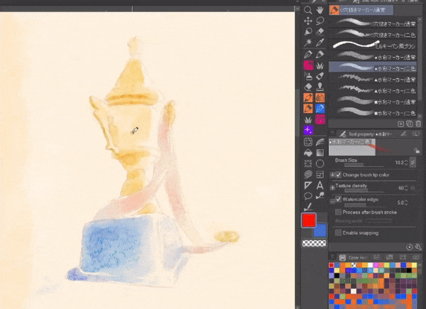
For example, for the reflections on the trophy’s base, I used a new layer to add the red and yellow tints so that they won’t mix with the blue under them.
v. Imperfections and effects
There are a variety of imperfections we can portray in our watercolor-style illustrations to bring them closer to traditional watercolor.
Like we’ve discussed previously, you can add water drops and splatters, create color bleeding between objects of different colors, and add salt effects etc., to achieve a characteristic traditional watercolor look.
Some such watercolor effects brushes available in the Clip Studio Assets library for free are listed below:
vi. Erasing
One last tip I’d like to share is to not use the regular eraser for corrections or for adding blank spaces because its sharp marks don’t go well with the watercolor style.
Instead, the soft airbrush with transparent color would be a better option.
Final Thoughts
Traditional watercolor style paintings are easy to emulate digitally if you know how to approach them. I hope this tutorial helped you in discovering the tools and techniques that make watercolor-style painting simple and convincing.
Thank you for reading!
Users who liked this post


Comment