
Presentation
Hello!! Welcome to this new TIPS. Today I will present different tools to apply color to our illustrations easily and quickly. The methods presented here can be applied to any type of style. I hope these tips are useful to you. Well, without further ado.
Let's get started!!
1. Previous concepts
First of all, the first thing I can advise you is to prepare in advance the colors you want for your illustration; you may change your mind along the way and decide to use others, but you will already have part of the way covered, because if you use color theory to select them, if you want to change them later you can use one of the program's tools without having to start coloring from the beginning.
► Plan colors
The program has several tools that we will call "Color Palettes" which are essential for choosing and saving colors. Let's now see which ones can help us plan them.
Below is a link to a more detailed explanation of its features, as well as covering color theory:
To start, I will recommend using color palettes because they are practical when choosing colors. Each of these tools can be found in the following path: Window > The options will be from Color Wheel to Mix Colors.
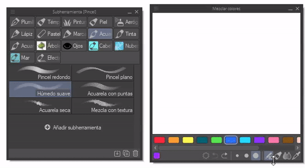
• MIX COLORS
This tool allows you to mix colors using a palette that emulates analog combinations. Its mode of use is quite intuitive. It also allows you to mix colors using the texture of any brush. Useful for using the basics of color in the digital world.
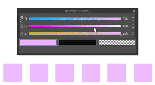
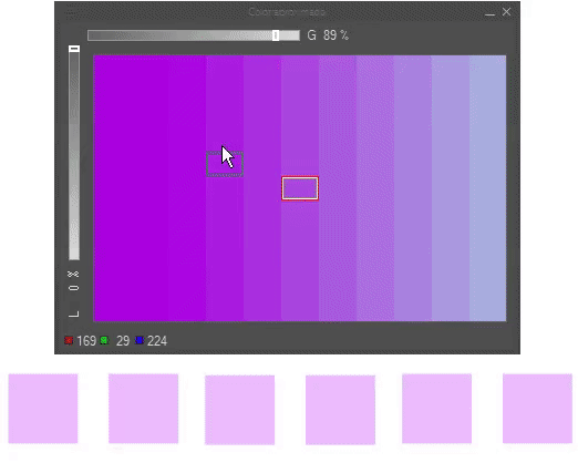
• COLOR SLIDER, NEUTRAL AND APPROXIMATE COLOR
These three tools can help you choose colors. The color slider allows you to alternate between RGB, HLS and CMYK models. This tool can be used to obtain the luminosity, saturation or tones of a color that you have selected from the color wheel.
As for the Neutral Color panel, you can obtain the luminosity and saturation of a color or colors, by placing the colors in the reference boxes we can see how they mix with each other.
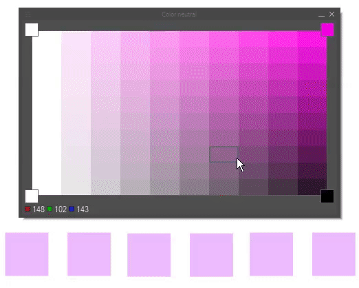
The approximate color is useful for obtaining an approximation of your selected color; this now depends on a single color, while the previous one could depend on up to four different colors. With the bar located in the left and upper left section, you can modify the gray and white level to measure the level of the functions you choose.
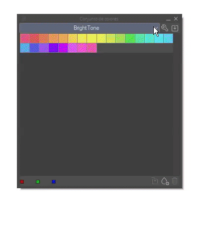
• COLOR SET
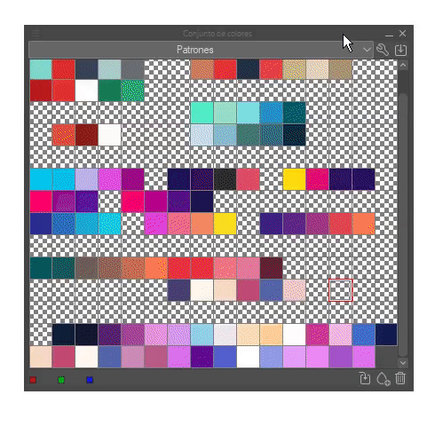
We already have our colors, but what happens if we want to use these same colors on another occasion? How do we save them? Well, that's a very interesting question; we'll see that the program has a palette called "Color Set", which will help us store them.
First, the palette has predetermined color sets that we can access through the drop-down menu, but we can also create our own.
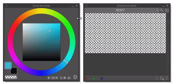
To create a new color set, click on the wrench located at the top right. When you click, the following window will appear where various options will appear to create, modify, duplicate or delete a set.
Once a new set has been created, we can save all the colors we want there, either by right-clicking on an empty space and choosing the "Replace color" option or by clicking on the drop with the plus sign located at the bottom right.
► Tip for planning colors
Beginners often have trouble visualizing their illustrations with the colors they want, which is why I recommend having a semi-clean sketch where we can add the colors. With any brush, quickly apply the colors below the sketch. If we are satisfied with the composition, we will be ready to move on to the next step.
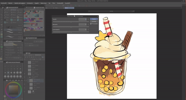
Now, if it turns out that we don't like the color composition, it would be tedious to delete everything and start over; luckily there is a function within the program that will make it easy for us to change the color without deleting anything. CHAN CHAN CHAN... And the tool is it? Hue/contrast/luminosity.
We can find this tool in the following path: Edit > Tonal correction > Hue/contrast/luminosity. As its name suggests, with its controls we can change the hue, contrast and saturation of the colors that are in the currently selected layer. If we place each color in a separate layer we can modify them separately.
I really like this tool, I love it because it allows me to do thousands of color tests without wasting unnecessary time.
2. Tools for the model from scratch
Now, we will begin with the main focus of this tutorial, the different functions of the program that will make it easier to add color to illustrations. This second section will focus on the classic illustration model, that is, starting from the sketch. Section three will address the functions with which you can add color to a grayscale illustration.
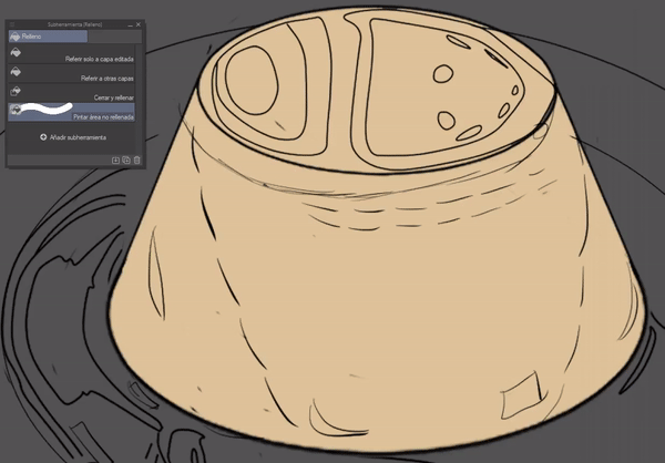
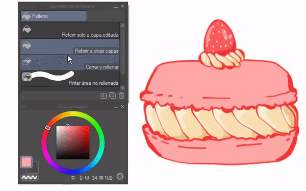
► Filling
Now, first we will locate the fill tool, this is in the toolbar, it is the small cube.
Fill has four functions: Refer to edited layer only, refer to other layers, close and fill, paint unfilled area. Although there are four, I will only address three of them, which are the most useful for me to establish the base colors. The first step to color with this tool is to refer to multiple layers. We will see it below:
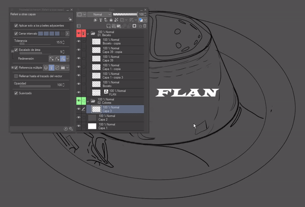
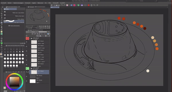
• REFER TO MULTIPLE LAYERS
To start we will mark the reference layer icon in the folder or layer of the sketch, this will allow to apply the colors in separate layers without painting the whole canvas as seen at the beginning of the GIF when the option is not yet marked. We will mark it in both, in the properties of the fill tool (the four functions have this option) and in the layer properties.
As you can see, folder 01 contains layers with the sketch, I will mark it with the reference layer function, once this is done I will move to folder 02 where I will put the colors. In this way, the fill tool, taking the selected layer as a reference, will know what the limits are to fill.
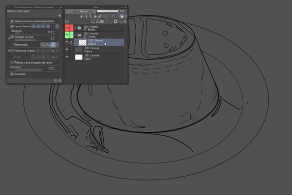
In the fill tool's refer to layer settings we can find different options to exclude features from the reference layers, for example, let's say we have a text inside the folder we are using as a reference and we want it to take all the layers in the folder as a reference, but ignore the text layer. We check the exclude text option in the exclude section.
Among the layers we can exclude we have: Sketch layer, text, Selected layer, paper layer and locked layers.
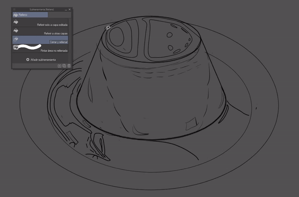
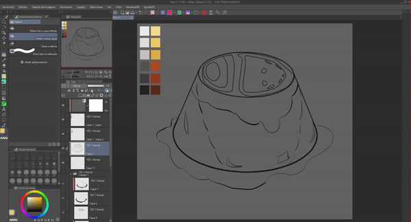
• FILLING
Once we have the layers referred to, now it is the turn of the fill tool. With this function we can fill closed spaces and modify some settings, even fill spaces with slight openings, but we will see that in the next point. For now I will only explain the use of three of the sub tools.
1. REFER TO OTHER LAYERS
This function is the one I use conventionally to fill large spaces. Also, you can hold the click and drag the cursor to fill several spaces without having to click several times.
2. CLOSE AND FILL
This function is the same as the lasso, we select and whatever is inside the selection will be filled with paint. Because it follows the pattern of the lines, it is advisable to use it with areas of the illustration that contain many lines.
3. PAINT UNFILLED AREA
Practically, this tool helps fill in those pixels that the other functions cannot fill along the lines of the lineart. Its use is like that of a paintbrush. It is a tool that knows how to fill inside the lines.
• FILL TOOL SETTINGS
Any of the three previous functions have the following settings that, when controlled, will allow us to modulate the tolerance and the paint overflow limits. In this way, we can, for example, paint a section that does not have a continuous line without the paint spilling outside the part we want.
1. CLOSE INTERVAL
When this function is active, it will detect the line segments that are open and treat them as if they were continuous lines.
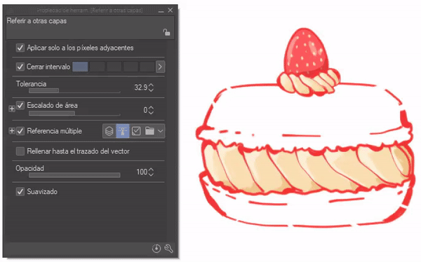
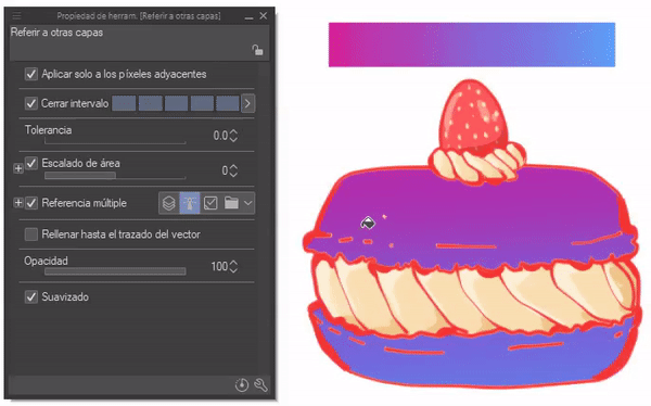
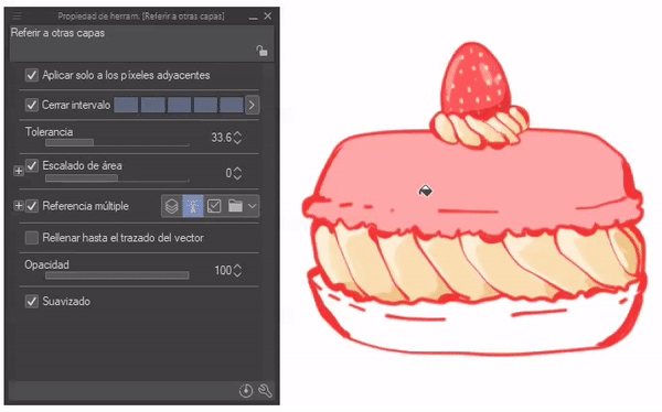
2. TOLERANCE
This option modulates the amount of similar pixels that can fill the cube. Let's see, in a gradient, for example, if the tolerance is low the amount that will be filled will be small, the larger the tolerance, the more pixel intervals it covers and it can even cover everything.
3. AREA SCALING
This option moves a few pixels forward or backward to go over the line or, in other cases, not touch it.
NOTE: In the sub options I recommend having it set to "Up to the darkest pixel" because otherwise the color will go beyond the limits of the line.
With this knowledge we will now know how to use the tool wisely, we will be able to apply solid colors easily, evenly, without going beyond the edges and above all quickly.
Before finishing this section I will present my configuration of the fill tool in case you want to have a reference, but the best thing is to try adapting it to your own style.
• HOW TO USE THE TOOL
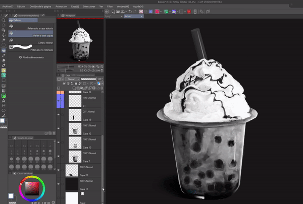
Finally, I will present the process I do with this tool. The following GIF shows the process I did to add the base color, the process is very simple, once I have the sketch in its respective folder, which I point to as a reference as explained in the first step. Later, in a new folder I created different layers where I added the colors separately with the tool "Fill", "Refer to other layers" and "Close and fill".
I changed the area and tolerance settings of the tool to refer to other layers as needed to fill in the spaces that could remain white, and finally I used the close and fill tool to paint the spaces that the previous one could not fill.
PAINTING LINES/LINEART
Another use beyond solid colors is to be able to paint lines without much effort. The process is very simple, first we will create a layer above the lineart, we will adjust it to the layer below and now with the fill tool we will click anywhere on the sheet.
Optionally, we can then join the layers so as not to have so many. The advantage of this method is that we can paint the entire lineart in a single click. Later we will see another method to paint the lineart.
NOTE: To do this you do not have to have the reference option activated on the layer.
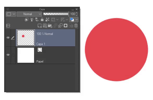
ERASER
In addition to using it as a painting medium, we can also use it to erase; very useful for erasing large segments. This can be done with any fill tool. To do this, click on the transparent color option found on the color wheel.
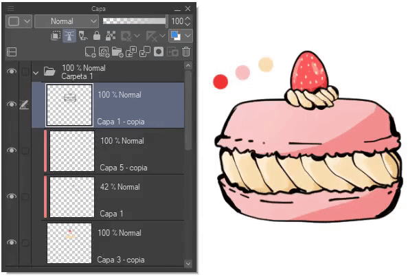
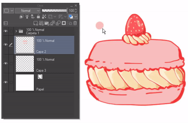
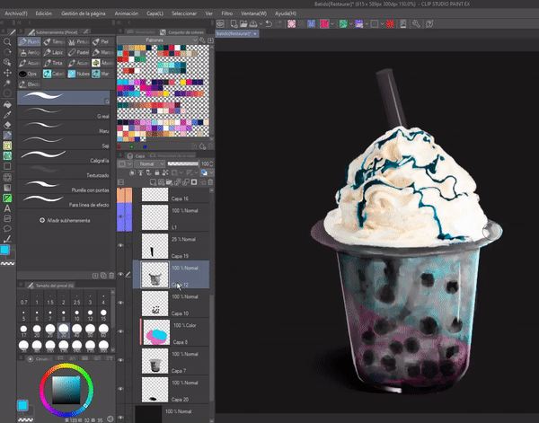
► Layers
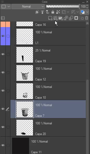
Layers are not exactly tools for applying color, but rather they contain the colors themselves, but by using their functions we can have greater control when applying colors, and for example, opacity can allow us to give a certain effect to the colors such as the transparency effect. So, I consider that the management of layers is essential to give color. Next I will explain some layer functions that will help with color. Previously, we have already seen some of them (reference layer and blending modes) so they will not be discussed here.
• FIT TO LAYER BELOW
This function can be found in the layer options, it is the immediate icon on the far left. This function is extremely useful because it provides a non-destructive method to apply colors, so we can modify specific parts without damaging the rest, but of course, for this you have to have everything separated by layers.
Its function is to create a false clipping, that is, what is drawn in it will only be visible with respect to the limits of what is drawn in the layer to which it refers (the lower layer). If the clipping is removed, everything done will become visible, and several clipping layers can also be applied with respect to the same layer.
• LOCK TRANSPARENT PIXELS
This function can be found in the layer options, it is the square icon with a small padlock.
It is similar to the previous one with the difference that this is a destructive method. With this function, new layers are not created, but when activated in that same layer, only the pixels that have color can be drawn on, the transparent ones are completely ignored.
PAINTING LINES/LINEART
As we saw before, we could paint using the fill tool, but there is another method and that is to use this function. The advantage of this method is that we can paint parts of the lineart with different colors, unlike the other one, where we could only paint everything with one color at a time.
If we lock the layer with "Lock transparent pixels" we only have to paint the parts of the lineart with a brush.
• OPACITY
The last function in this section is opacity, this is found in the layer option, it is the sliding bar.
This function is very easy, using the slider we can make a layer less or more visible. When it is at 100% the objects on that layer are opaque, but when it goes down and becomes 0% it becomes transparent.
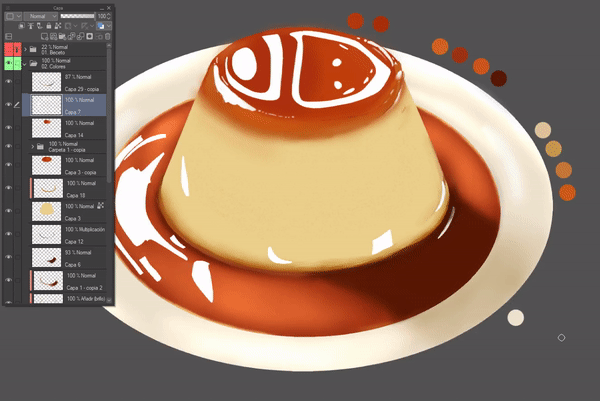
In the flan I used this function to lower the opacity of the layer where I have some highlights to obtain a translucent effect.
• HOW TO USE THE TOOL
I mostly use the layer functions to apply colors without going outside the boundaries of my lineart or to apply colors over other colors without going outside the first one. For example, I have my base colors for the candy and now I want to apply the highlights, but I don't want to go outside that section, so I can create a new layer above the base color and adjust it to the layer below, so I can apply the highlights without going outside my base.
In short, these layer functions help me to have control over the colors, to keep the layers in order.
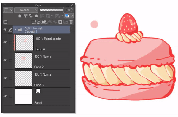
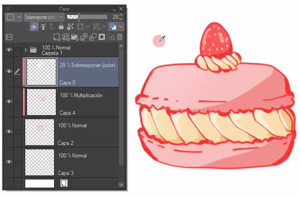
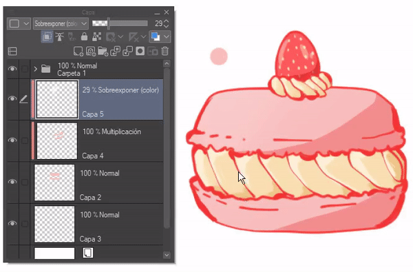
► Blending Modes
Blending modes are functions with a series of mathematical operations through which the program combines a layer with the layers below it, creating an interaction between them that generates various effects. This allows you to subtly adjust the tone of the colors.
There are 28 blending modes, which can be found in the layer options. It is possible to establish a blending mode for each layer and layer folder. The method of applying it is to select the folder or layer, display the blending modes menu and select the one you want.
These options can be grouped by the similarity of their characteristics. Some brushes also have the option of blending modes. Both work the same way.
The groups are divided into darkening effect, brightening effect, contrast effect and color shift effect, the groups are as follows (normal effect is excluded from this division):
1. Darken.
2. Lighten.
3. Contrast.
4. Component.
Below I will present some examples to better clarify the effects of each of these groups. Each effect has its own peculiarity, but I will only present one for each section; therefore I advise you to try each one to see its potential first hand. By starting to use the blending modes on any layer we can use them.
• DARKER
These modes turn the colors applied on those layers into one darker than they are in their normal form. The most used modes of this group are: "Multiply" and "Burn (linear)", frequently used to represent shadows.
• LIGHTEN
These result in the opposite of the previous one. The colors appear lighter than they are in their normal form. The most used modes in this group are: "Screen" and "Dodge (linear)", which are frequently used to represent a luminous effect.
• CONTRAST
Combines the above modes in such a way that it darkens or lightens as needed, thus increasing contrast; in simple terms, bright colors become brighter and dark colors darker. The most commonly used mode in this group is: *"Overlay," which is often used to represent an effect that helps improve the color impression.
• COMPONENT
These blending modes change hue, saturation, and brightness. They are also useful for adding color to a grayscale illustration (we'll cover that in the grayscale to color section).
3. Grayscale to color
There is an illustration technique that consists of making the illustration in grayscale and then adding color to it, and that is precisely what I will explain below. There are methods for adding color to a grayscale illustration. We will see these methods below.
► Tonal correction layers
Using the functions of the "Tonal correction layers" tool, we can add color to our illustrations in a short time. Furthermore, it is an easy-to-use tool. The greatest difficulty will fall on us, on our eyesight when changing the settings. The good thing about this method is that it is not destructive, the adjustments become a new, fully modifiable layer and even the blending modes work on them.
To start with, tonal correction covers several functions of which we will only use for this method: "Level correction", "Tone curve" and "Color balance".
The functions are found in the following path: Layer > New tonal correction layer.
To go from a grayscale to color in this first method we have three tools that make it possible, these are: "Level correction", "Tone curve" and "Color balance". All three are essentially the same.
When we open any of the functions, we will close them immediately afterwards to adjust the layer that was created to the lower one, if we do not do so, what is done in this layer will affect all those that are below it.
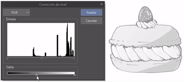
• LEVEL CORRECTION
This feature allows you to edit shadows, midtones and highlights. What this tool provides is basic tone editing.
The interface is as follows. The first thing to note is that the left side is the dark side and the right side is the light side.
As for the input area, the arrows at the bottom are the controls for this area. The left slider controls the shadows, the middle one controls the midtones and the right one controls the highlights.
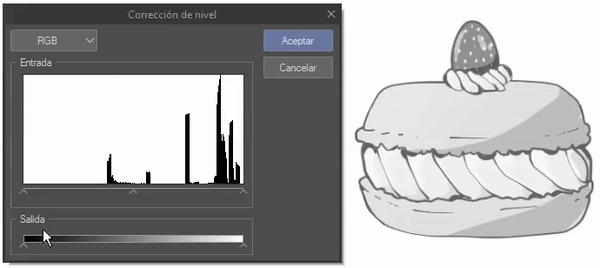
As for the output area, if you drag the left controller to the right, everything will turn white, on the contrary, if you move the right controller to the left, everything will turn black.
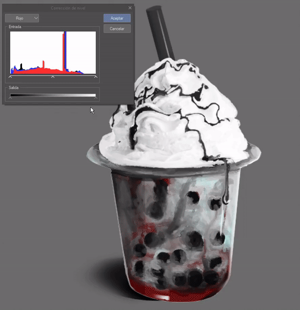
When you open the top menu you will find other options such as: RGB, red, green and blue. When you change the option you have to:
RGB: Controls the white/black tones.
Red: Controls the red/cyan tones.
Green: Controls the green/magenta tones.
Blue: Controls the blue/yellow tones.
With the input and output controls you can modify the values of any of these options.
To use it you will place yourself in one of the layers to which you want to add color, then you will open this window and all that remains is to move the options to your liking. You do the same with all the layers to have a complete color illustration. This is a good tool, but a bit basic, in the next tool you can add colors with more precision.
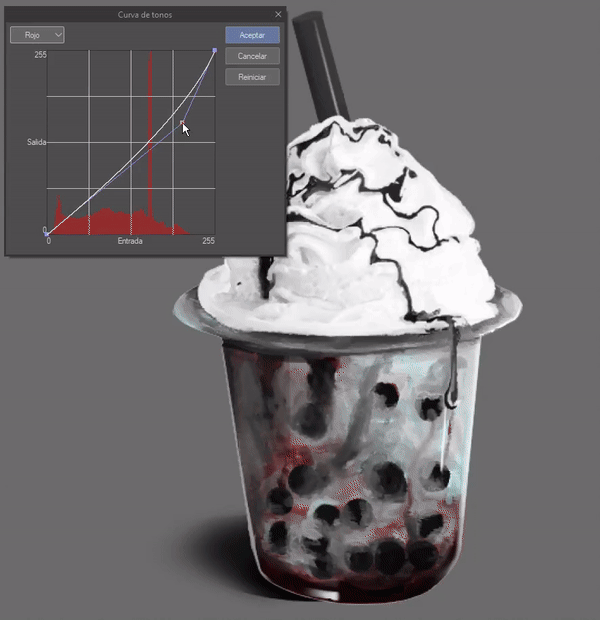
• TONE CURVE
It has the same functions as the previous tool, but in more detail. The constant is repeated, the left side is the light and the right side is the dark.
The interface is as follows. As we can see, the output is on the left side and the input is at the bottom, this means that the curve represents the shadows, midtones and highlights. By creating points on the curve and moving them to the left we will get shadows, and to the right we will get highlights. The center is the midtones.
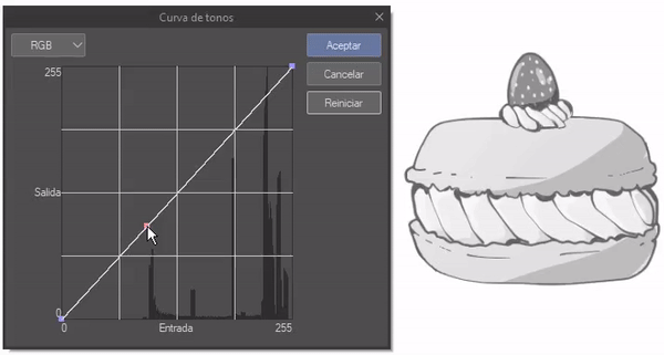
At each end of the curve there are two points, the first point is the brightness (top right), if we drag it down it will start to get darker. The point at the bottom left is the darkness, if we drag it up it will start to get lighter.
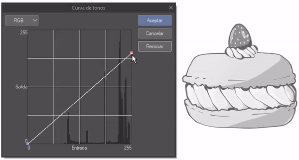
As for the RGB drop-down menu, it works the same as in the previous tool, with the only difference being that the origin of the colors is changed, with red, green and blue at the top; cyan, magenta and yellow at the bottom.
You can add as many points as you need, the more the better, so you have greater control over the tones.
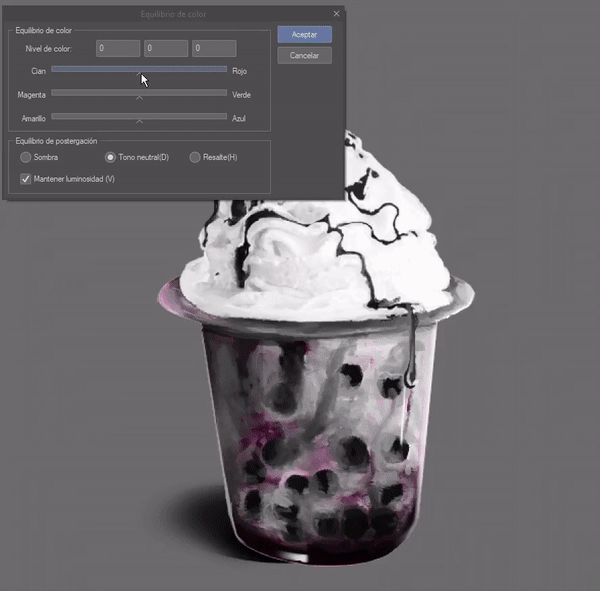
• COLOR BALANCE
The interface is as follows. This tool has the same principles as the previous two; this tool is intuitive and very easy to use. In addition, you can maintain the luminosity, which the previous ones do not.
In color balance, in the sliding bars we find the colors cyan, magenta and yellow with their respective opposites on the other side, red, green and blue.
As for the postponement balance section, we have the option to control the shadows, midtones and highlights. Maintain luminosity, maintains the light of the illustration if left selected.
► Blending Modes
Blending modes have already been discussed in a previous section. As I said in the explanation of the "Component" group, the "Color" mode is useful for coloring a grayscale illustration, and it is extremely easy to use.
The process is very simple, first, we will create a layer above the grayscale layer we want to color, we will adjust it to the layer below, then we will change the blending mode to color.
Using the brush of your choice, you can add the colors you want, just like in a normal coloring process.
The weakness of this method is that light and dark colors cannot be seen well. Medium tones are effective.
• CONCLUSIONS
Each of the methods for coloring a grayscale illustration has its pros and cons, but don't let that limit you, you can also change the tools, combining the best of each tool. Once you have applied the colors, you can create new layers to manually correct details to have our perfect coloring.

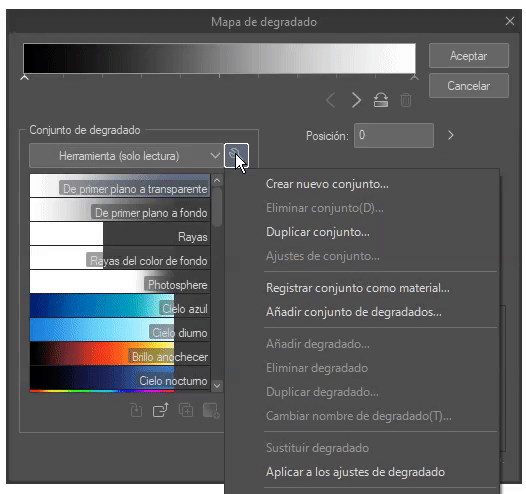
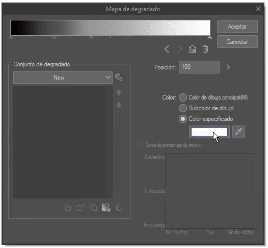
► Degraded maps
Gradient maps are a tool that makes coloring easier, and their use is easy to understand. If we download gradients from CLIP STUDIO PAINT assets we can obtain color palettes, one less step to create our work.
The function is located in the following path: Layer > New tonal correction layer > Gradient map.
When we open it, a new layer will be generated above the active one when opening the map window. We will close the gradient window to be able to adjust this new layer to the one below. If we do not do this, the gradients will affect all the layers below it.
• IMPORT GRADIO SETS
We can download gradients from CLIP STUDIO PAINT assets when we already have them, we can integrate them by clicking on the wrench, a series of options will appear that will allow us to add, delete, duplicate and change a gradient or a set, but in this case we will use "Add gradient set".
Now a window will appear where we will select the gradient sets we want to add, holding down the CTRL key we can select several gradients at the same time. When we finish the selection we will click on "Add" so that the materials are loaded.
In the drop-down bar we can see all the added sets.
• CREATE GRADIENT MAPS
To create our own gradients we will go to the wrench again, choosing the option "Create new set". A box will appear where we can name the set. We will click OK.
Once we have created a new set, at the immediate bottom of the gradient bar there are a series of arrows (nodes) that we can create, move and delete, we can also reverse the order of the general gradient.
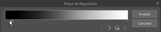
By choosing a node we can change its color with the option "Specified color". A window will appear where we will choose the color, we will accept and then, in add gradient (the square with the cross sign at the bottom), we will name it. Ready, we already have our first gradient, we can do this "n" number of times.
• HOW TO USE THIS TOOL
We will open a new gradient map layer as I explained at the beginning, and we will adjust this layer to the one below. Done.
Although we have already applied a gradient, it may not be enough for a complete image. Sometimes illustrations are so complex that several gradients are needed. How to apply several will be the next thing to see.
1. BY LAYERS
If we have our illustration separated by layers, there will be no major problem. We create a gradient layer and adjust it to the lower layer. In this way, the gradient will affect that section, so we can apply as many gradients as we want.
2. LAYER MASK
Another way is to use the layer mask. The layer mask is the white thumbnail that appears on the right side of the layer.
If we click on the white thumbnail we can erase sections of the gradient; depending on the type of eraser we can obtain hard or soft edges.
• DETAILS
The advantage of this tool is that it makes the colors more vivid, but for example in the case of this flan, the colors are so bright that it can be annoying, which is why we can use previous tools to correct it. We can use the tonal correction tools to dull the colors a little, the blending modes or the opacity of the layer.
To reduce the vividness of the color, I used two tonal correction layers, the "Brightness and contrast" layer together with "Hue/Saturation/Luminosity". In addition, I lowered the opacity of these layers along with the gradient layer of the caramel and the flan.
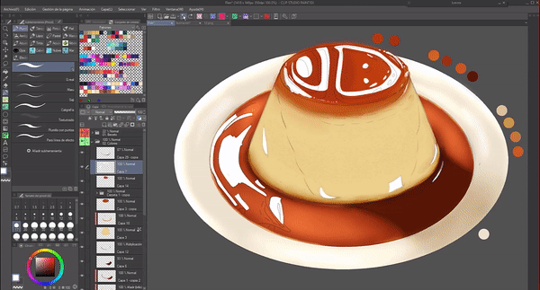
The following comparison is to observe the difference between the gradient alone (left), and the other (right) is a gradient accompanied by other tools mentioned above.
Farewell
Coloring is an important process in an illustration, in most cases it is like its soul, that is why knowing tools that facilitate the process is essential. This TIPS has been full of food, pure sweet, although I am not really a fan of it, but I love flan; I would like to try Japanese-style flan one day, they say it is delicious. Someday.
I hope that what you have seen in this tutorial is to your liking and is helpful. Well, without anything to say, thank you for getting here! ପ(๑•̀ुᴗ•̀ु)* ॣ৳৸ᵃᵑᵏ Ꮍ৹੫ᵎ *ॣ
Users who liked this post


Comment