
Tutorial presentation.
In this tutorial, we will delve into the fascinating world of artistic composition, a crucial element that gives shape and meaning to any visual work.
Composition is the language through which artists tell stories, express emotions and create captivating or simply imaginary visual experiences, inspired by others.
Various fundamental aspects that influenced visual creation were explored. Principles such as balance, harmony and contrast were addressed, highlighting their importance in the structuring of an artistic work.
The talk delved into the application of elements such as lines, shapes, colors and textures to build a visually striking composition.
Emblematic cases of artworks that effectively exemplify these principles were discussed, giving the audience a deeper understanding of how artists consciously apply these techniques.
Additionally, advanced concepts such as visual hierarchy, visual flow and artistic tension, which contribute to the complexity and depth of a composition, were explored.
Practical examples were provided and active audience participation was encouraged to consolidate understanding of these concepts.
What is composition?
Composition refers to the organization and arrangement of visual elements in a work of art. It is the underlying structure that guides the viewer's gaze and communicates the artist's intention. Effective composition transforms a collection of elements into a coherent and powerful visual experience. As well as:
Lines.
Lines are not simply strokes on paper; They are routes to direct attention. Lines can be straight, curved, diagonal or sinuous, and their arrangement affects the energy and visual flow of the work.
Forms.
Shapes, whether geometric or organic, create the basic structure of a work. Shape influences perception and can convey stability, dynamism, or even ambiguity.
Spaces.
Space in a composition not only refers to the physical distance, but also the relationship between objects. Space management can create depth, perspective and balance.
Colors.
The color palette not only adds beauty but also evokes emotions. The choice and arrangement of colors are essential in establishing the tone and atmosphere of the work.
Texture.
Texture adds tactile and visual interest. From rough to smooth surfaces, texture contributes to the overall feel of the work.
Point of view.
The point of view determines the perspective from which the work is presented. It can influence how we perceive the scale, importance, and relationship between items.
Here are some materials that I recommend to start using, understanding the perspective and methods that I will tell you below!
All composition materials!
Rules or methods.
There are a variety of rules to use in your illustrations such as the Rule of Three Tenths, we can use geometric shapes, triangles, circles, squares and many more. And without lack of straight, curved, diagonal or sinuous lines. I'll leave you some examples to give you an idea of what I'm saying.
Rule of Three Tenths.
This rule divides the image into nine equal sections using two horizontal lines and two vertical lines, creating a grid of nine areas.
These lines and points of intersection are used strategically to place key elements of the composition, resulting in a balanced and visually appealing image.
Imagine or draw on your canvas horizontally or vertically (the rule works the same, it depends on the concept), or the photo frame is divided into three equal vertical sections and three equal horizontal sections. This creates a grid of nine areas.
Instead of placing the main subject or important elements in the center of the image, the Rule of Thirds suggests placing them along the lines or at the intersection points of the grid. For example, two people, one further away than the other.
Horizontal
Vertical
The resulting four intersection points of the grid are visually strong points. Placing key elements at these points tends to be most effective in creating a dynamic and attractive balance in the composition.
Geometric forms.
Geometric shapes, such as squares, triangles, and circles, are often used to organize and structure the composition. They can serve as building blocks that define the overall layout of visual elements.
Using geometric shapes of different sizes and proportions can establish a “living visualization” depending on your artistic style. The largest or most prominent shape can stand out as the main element of the composition.
When used in combination with perspective techniques, they can help create an illusion of depth in the composition. Converging lines and shapes can guide the eye to the focal point.
Lines of reference.
The use of lines in composition is a powerful technique that guides the viewer's gaze, creating dynamism and visual structure in a work of art.
They can be used to direct the viewer's gaze to specific areas of the composition. Diagonal lines, for example, tend to guide the eye more dynamically than horizontal or vertical lines.
Diagonal lines can transmit energy and movement. By slanting the lines in a composition, you can add a sense of dynamism and direction, creating a more interesting visual flow.
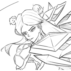
A fight in motion.
ㅤ
Curved lines add softness and fluidity to a composition. They can be used to soften contrasts and guide the gaze in a more gradual way.
A girl with an impressive sword.
Horizontal lines are often associated with tranquility and stability. They can be used to represent horizons, landscapes or elements that suggest calm.
A boy sitting in the distance.
Vertical lines are often associated with stability and height. They can be used to represent elements such as trees, buildings or anything that rises vertically.
A boy with many balloons.
Example Illustration.
Sketch.
In this process, I have started to use the rule of Three Tenths, I use it too much to get used to using it and practicing it. This is a redraw of an illustration from 2021, so I already had the concept and poses in mind.
I have used geometric shapes such as circles and the space of the composition (I have explained it at the beginning of the tutorial).
I marked some of the round bugs to differentiate how far or close it is, this drawing is not finished yet but is just an example.
The tail and leg of the monster are also further away, it could be said that it is “giving shadow to the character” and that it is “walking constantly”, as if it were its pet.
I marked the ruler lines so you know what I want to focus on and what viewers can see first.
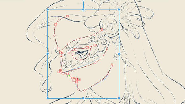
Lineart and brushes that I use.
I make the outlining very simple, before I rendered without doing this. Directly on top of the sketch, he painted and shaded as if it were nothing.
I'm not a big fan of eyeliner but as time went by I started to like it, it's strange for me but I got used to it.
The brushes I use are these.
Coloring.
In this part I am still very moderate, I have not yet practiced or studied much about lighting, coloring is the only thing I know so far.
In this illustration I put very warm and strong colors, I want to go towards the joy side and make brighter illustrations.
Shadows & Ilumination.
For the above (shadows, lighting, etc.) I don't use much strategy, I choose or use the eyedropper to match the color of the background and set it to the “multiply” function.
I use different colors for the environment, in this example I use blue-yellow in the darkest parts. In the lighting I use a yellow similar to white but that gives a sensation to the Sun's rays.
After all that, there is the final result, which is not yet because I am missing many more things. Here I add more lighting or finishing touches to make the image brighter or more alive. Not only am I missing those shadows in the environment, but also in the folds, reflections and many other things.
Result.
This would be the illustration, I recently finished it and edited this post so you can see the final result. I have added more things that I have not said, it was going to be very long that is why I decided not to comment on it.
Conclusion.
Composition is an art in itself, where each line, shape and color contributes to the overall harmony of a work. By understanding these elements and principles, you can strengthen your ability to create impactful and meaningful visual pieces.
We hope this journey through artistic composition has been inspiring and educational. Go ahead, artists, and let your works shine with the magic of a carefully crafted composition!
Time-lapse.
Users who liked this post


Comment