
Intro
Hi! I'm Sweetpea!
Today I will explain my process for drawing a steampunk illustration as well as some Clip Studio paint tips and tricks for your rendering process. Designing a steampunk illustration may seem daunting with all the bolts, nuts, gears, but in my breakdown, I'll show you just how easy and fun It can be! Let's go!
Defining
Before we start let’s define what steampunk is. Steampunk is a style of design and fashion that combines historical elements with anachronistic technological features inspired by science fiction. With steam punk the technology is generally heavily influenced by the industrial revolution with steam powered technology.
Now that we are on the same page let's get to the designing.
Step 1: Ideation
Ideation is the first step that comes in any of my design projects, this is where we will map out the possible courses our designs could take and narrow it down to the one best suited to our liking. You can think of it like the blueprint to our design, more specifically our steampunk design. There are one of two ways I like to start my Ideation process, a mind map or a prompt.
Mind Map
When Using a mind map, I pick a central Idea and place it in the center, and put associated ideas and themes around it. I've used this since my middle school days and then they called it a brain dump, I used it for writing essays. I'm sure a lot of you have done something similar for school. But now I use it for plot planning and art design and all the other creative work/hobbies I do. I guess you really do use some of the things you learned in school… who knew?
I use this even if it isn't for characters, just a design commission for a logo or graphic tee. It is one of my main tools in my arsenal as an artist. I hope it can help you too.
This exercise will help get our creative juice flowing! Don't be afraid to put random things, not every Idea will be chosen or used in this mapping out process. It is just to try and find our starting point. It doesn't even have to be neat; I've been told after someone saw one of mine that I left out by accident, that it looked like the scribbles of a mad man. Lol. Often times I use one-word descriptions and shorthand annotations that only I can understand. So however, you do it, just do it the most comfortable way for you.
Once you have completed your mind map and can no longer add on words, select the most compelling ones to you. That you can see working together to create a compelling illustration. These ideas will help shape your design making decisions moving forward.
Prompt
This is for those of you who want to have a backstory/plot line for this character you wish to design. You can use this even if you don’t have a manga or anything like that. You can use this even if you simply wish to make an OC. This will just give you a starting point for your design process. Making a prompt Is simple, you can think one up, or use a prompt generator to help you make a backstory for your character. This can help you choose defining features for your character, like the clothes they wear, and where they come from, etc. Influencing their overall concept.
When I start a design project, I always like to use one of the two listed above. It gives me a starting point, so I don't feel as stressed faced with countless options in front of me.
Step 2: Reference/Inspiration
Once you have your blueprint mapped out, it's now time for references. References are important part in and character and background design, especially so with steampunk designs as the details can tend to feel overwhelming. I know for those of you who like drawing from imagination, this can feel limiting, but it doesn't have to be. The sky is the limit with your design choices, but we also want the viewers of our art to know what it is we are portraying as soon as they look at it. It will also help you see things/details you wouldn't have been able to recall just from memory. Helping your art take a step up from what it would have been. So, unless you are like Kim Jung Gi who has a superhuman brain, having good references can decide between a good and bad design. So please, DO NOT SKIP!
Setting/Atmosphere
With main ideas and themes in mind we can start choosing our references. Here you will find pictures that show your setting and mood you wish to portray. Here you will also need to find references for your characters clothing style to accurately portray their atmosphere. Are they grunge? Are they preppy? Are they poor? Are they fierce? Are they lazy? These kinds of questions are the things you need to ask yourself.
Color Pallet
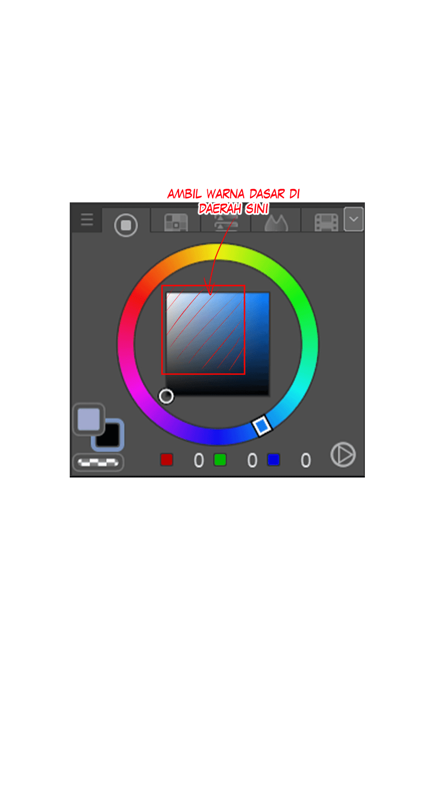
From here you will also determine your color pallet for your illustration, I would recommend not color picking the area, as pictures have many pixels and varying hues, so you may not get the right color, throwing your color off. Light can also affect the colors as well and you may not wish to have the same lighting. Plus, this can help train your eye on recognizing and producing an accurate color as you continue to practice!
Inspiration
Another reference I suggest you gather is, inspiration from other artists.
DISCLAIMER, I DO NOT MEAN TRACING/STEALING AN ARTIST WORK! I REPEAT! DO NOT STEAL!!!!!!! I say this to mean for you to try and implement the things that you like about their art, whether it is their line work, use of texture or shapes, or something about their process that speaks to you. Please, please, please do not trace, or take someone's art and try to pass it off as your own. This whole process is to learn and better your art. Tracing defeats the purpose, as well as it being wrong! Learning from someone you look up to and trying to implement some of their tips and tricks like, layering, blending etc. Is okay. And I encourage you to learn but do it in the right way, and just be your authentic self. :)
Step 3: Decide on Direction
Now that we have gathered all of our references and resources we will use, we can move onto the nitty gritty. THUMBNAILING! YAY!
During the thumbnailing, I really want you to ask yourself, "What if?" What if I changed this? What If I made this darker? Etc. I really want you to push yourself to explore every avenue this design can go down. Here we will do all of our experimenting. Really trying to flesh out this character and background and build it into the design we want. It's really important here to make sure the character and background fit well together. Here we really want to let loose and have fun. Please don’t be afraid of change. When I began drawing, I used to be so afraid of changing the first concept I had in mind, but honestly our best ideas are not often our first. And even if you don’t like the change, you can always go back, so please don’t stress.
Composition
The first thing I try, and nail down is composition. I work while keeping in mind all of the elements and references I have chosen. Drawing smaller thumbnails helps me not worry about details and the little things as I am unable to draw them. Keeping the overall composition in focus and making sure i am making it compelling and readable.
Picking the thumbnail, I like best, I draw different iterations of it. I draw these at a larger scale, to try and flesh it out more. I don’t make them too big as to not get lost in detail. This is still the thumbnailing stage, so I don’t wish to spend too much time here.
Pose
The next thing I thumbnail, is pose. There is only so much we can do to convey personality and mood as well as story into an illustration. Using correct posing, and if done right, can really help with all three of these things. Clip Studio provides help with posing in their asset store where you can download posable and customizable 3D models to reference. They also have premade and downloadable poses available to buy in the asset store to apply to your model. So, for those you struggling to find just the right pose and lighting reference Clip Studio can help you!
Here I usually draw the characters themselves trying to find what I like best, not worrying about details at this point, rather just making a compelling pose. However, since the composition I have made focuses on the blimp, I will skip this step. For those of you where the focus is the character, I highly suggest you not skip this step.
Clothing
As I work on the pose I try and decide on what I want is the clothing/style, I really want to make sure that my clothing's convey the shape and atmosphere I want. Although clothing is my main focus, I also keep in mind body proportion at this stage. Although body proportion plays a big role in shape language ultimately clothes are what covers it all a can play a big role in determining the final overall shape. Do a few thumbnails, while looking at references for your steampunk clothing, keeping in mind the shape. Don’t worry about small details or accessories here, we can add them in when we decide on our final look.
Step 4: Rendering
Now we are getting to everyone's favorite part, Rendering! You can use your own style/process for rendering here, but I'll continue to show my process and how I achieve the results I do. For those of you who are designing for a plot, you can make a character sheet with turnarounds, etc. if that is what you want!
1) Base Sketch
Here we will be taking our final thumbnail and making a base sketch with it. Here I correct and create some of the bigger details that I want to show. Since I’ll be working in my semi realistic style for this illustration, I will work in greyscale as well in this step since in the next step I will be rendering in greyscale. I use this step to find where I want everything, so it will be messy and imperfect at this stage, so don’t worry!
Since my illustration shows a cityscape, I want to make sure to have my perspective right in this step. So, I don’t have to struggle correcting it later down the line. When drawing the background I LOVE clip studio paint's perspective rulers. They help so much with drawing in perspective. If you don’t know how to set one up, Clip studio has a tutorial on their YouTube channel. Clip studio also provides all the 3D assets your heart could desire on the assets store.
Using a Ruler to Draw Gears, Pipes, and More
Since we are working in a steampunk style, it is very industrial based. So, rather than organic shapes we will see more geometric shapes, as man-made objects tend to be geometric and symmetrical in shape. Using a perspective ruler that snaps your lines along will also help as you won’t have to worry about them not looking right and they will naturally take on a man-made look.
You can even use perspective rulers when working with round shapes for gears, and pipes as well as other things you wish to include. All you have to do is draw your basic shapes on a separate layer, and then on your other layer draw in the round or organic shape you want. This will help you keep things in perspective but also allow you to not only use straight lines.
I also make sure to put things on their own layers. I also put the layers in folders categorized by what they are on. So, I am not overwhelmed by the endless layers. It helps me to feel less stressed to close the folders I am not working on. This is important and will help us down the line since Steampunk usually has a lot of details when it comes to machinery. Displaying gears, pipes, bolts, and metal.
2) Rendering
Here I will simply continue to render in greyscale, while keeping in mind the light source. I use my experience as well as my references that I’ve gathered to help me render my illustration. Although you may not have the same style as me making sure to keep a consistent light source is important to any drawing that involves shading, having good references for your lighting (Especially if you’ve never done it before) can help tremendously.
Rendering Metal
Metal can seem difficult to render, but once you understand the steps it is very easy. That being said there is no one right way to render metal as there are many different types of metal, with different textures and reflectiveness. Now, I’m not telling you to go research and do a deep dive into the metal you want to draw. You can if you want but there are 3 main things I think about when drawing metal and have to decide early on in the rendering process.
1) Texture
2) Shape
3) Light source
I first block in the shape I want with my midtone.
I then add, basic shading for my metal based on the light source and shape of the metal. Having a good reference helps a lot as well.
Also, keep in mind that metal is highly reflective and does not have a smooth transition rate between shadows and highlights.
I add in highlights keeping in mind my light source.
Here is where you will add in details. Here I have added decorative carvings. At this stage you can put other details, such as rust, scratches, and any other indication of texture.
There are many ways to add texture and details over your metal, for my detail I simply used a brush I downloaded from the assets store on clip studio. I put mine on the same layer but feel free to use blending masks to clip on top of your layer. Just use whatever technique that best suits your style.
I finally finishing off by deepening my shadows and making my highlights pop. Please keep in mind that, although still there, details become almost invisible in shadows depending on how dark they are.
When I render bigger scale pieces like this, I don’t like to focus on one thing at a time. I try to get my basic values in all at once. This helps me not zone in on one thing trying to perfect it over and over. I bounce around making sure I don’t spend too much time in one spot. I find that I feel less frustrated if I work this way, since this doesn’t allow me to get upset about one particular thing.
I continue to render keeping in mind my light source, as well as utilizing assets from clip studio’s asset store to help quicken my process.
Don’t be afraid to change anything. I find myself having to continually go back and adjust things, it is all a part of the process.
I didn’t put a lot of detail into my characters so I would not draw away from the focus of my illustration which is the blimp. This is important to keep in mind when rendering, it can make the viewer of the art feel overwhelmed when their attention is pulled into many different directions. Having a focal point for the piece, without competing elements is important.
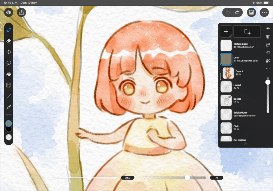
After finishing all the rendering, I would now move onto adding color. However, I wish to leave this piece in grayscale.
But from here I will explain to you how I add on color on top of my grayscale pieces.
I do this by right clicking on my layer and select new correction layer. I then Select color balance.
I adjust the keys until I get the color I want. It may feel overwhelming the first time doing this but after messing with it a bit you can figure it out.
I also use layers with different blending modes to layer the colors I want until I get a result I am happy with. I also use layers to add texture if needed.
Gradient maps are also available on the CSP assets store, there are many kinds of gradient maps available. And if you can’t find one just right you can always make your own. Clip studio has a tutorial on their YouTube if you want to go check it out!
Final Message
And now you should have a finished steampunk illustration!
I really do hope that I’ve helped you, or that you have taken away something useful. This is my first post here on CSP tips, so I hope I’ve explained myself well.
Thank you for checking out my CSP tip!
Users who liked this post


Comment