
Introduction
Water Drops are more fascinating than you might think. They can be illustrated in so many different ways.
In this tutorial I want to show you some simple tricks to draw convincing looking water drops, while using a couple of Clip Studio Paint's convenient tools!
There will be 3 different examples: a water drop sitting on a surface, a falling water drop, and a drop splashing into water, creating some ripples.
In case you want to learn more about them, check out the video right below that I made a while ago! In it I show you even more examples, and explain the fascinating principles of their shapes and how light behaves in them. No worries, I did my best to make the science-y stuff as interesting as possible. After all I believe that if you have a basic understanding of what you draw, you're going to have an easier time. And also it's fun to learn new stuff!
Simple Water Drop sitting on a surface
Alright, let's start drawing!
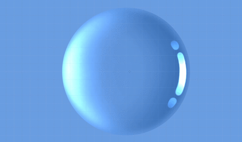
Bring out the Ellipse Tool and set the aspect ratio so that the Width and Height are the same. That way you can easily draw a perfect circle. After all a water drop always wants to be in a circular/spherical shape.
The color I chose is just slightly darker than the background color.
Water is transparent, so the drop would appear in the same color as the background.
Now make a new layer and clip it to the base circle that we just drew.
Use a very soft and large brush, like an airbrush tool, choose a slightly darker color than the background, and add some soft shading along the edge that is FACING the light.
Yes, the darker side is actually facing the light source! That has to do with the optical properties of water drops. I explained that sort of stuff in my video!
For the brighter areas make another layer, clip it to the base circle too, and set it to "Glow Dodge". That layer setting is very useful for making bright and intense lighting and highlights.
Once again softly paint along the edge, this time with white. Make the center of the edge especially bright!
Let's add some highlights. Those are actually on the side facing the light source. Again, the physics behind this are explained in my video.
Create another new layer that is clipped to the base circle, set it to "Glow Dodge" once again, and choose a strong, mostly opaque brush.
Paint whatever shape you want with white. I just went for some simple, thick lines and dots.
To make them less plain looking, you can create a mask layer on the highlight layer, select it, and softly erase a bit off the sides. You could also just directly erase without a mask layer, but using mask layers gives you a bit extra security, in case you erased a bit too much and you want to fix it later.
To make it look a bit less flat, put mask layers on both of those two clipped layers, select them, and softly erase some of the color close to the edge. Just a narrow line, don't make it too wide.
A water drop is also casting a shadow behind it, even though water is transparent.
Make another layer and place it below the water drop's layers. Choose a fairly dark shade of the same color again.
Let's make it easier on us again and use the ellipse tool to draw it. This time turn the "Aspect Type" option off, so that we can freely decide how wide it should be.
In this example "Start from center" is turned on and I start drawing it from the exact center of the water drop. The Grid in Clip Studio Paint can help you a lot finding it.
How long the shadow should be is up to you. Once you are pleased with the result, erase the other half of it.
The shadow looks a bit off still. Let's take a soft airbrush tool again and make the outer edges of the shadow a bit more transparent.
Then use the Blur tool to blur out the edges . The further away from the drop, the blurrier it gets.
Now another interesting thing about water drops:
When the light source's angle is quite low, which means that the cast shadow is very long, you start to see a focused light reflection in the middle of the shadow.
The water drop acts as a lens, and bundles some of the light rays that enter the drop together. Down below you can see a self-made animated photo series of that principle.
It also shows pretty nicely how the shady and bright areas within the drops act. Keep in mind though that these photos have a very strong light-dark contrast, since I only had one small light source pointed on the drops in a dark room.

So wouldn't it be neat to add that kind of reflection within the shadow to the drawing?
Once again make a "Glow Dodge" layer and place it above the drop shadow layer, still below the water drop's layers.
I used a semi-soft, smudgy brush, and utilized the Blend tool quite a lot. Other methods and brushes can work too though.
Draw a straight line along the center of the shadow as a guide, and draw lines curving from the drop toward that line.
The point where the reflection is the thinnest is also the brightest, since the most light is focused there.
Further behind the light spreads out more again.
Also the edges of this light reflection shape are slightly brighter than the center part.
Blur the parts that are further away from the drop, and use a soft airbrush and erase a little from the closest and farthest parts of the reflection.
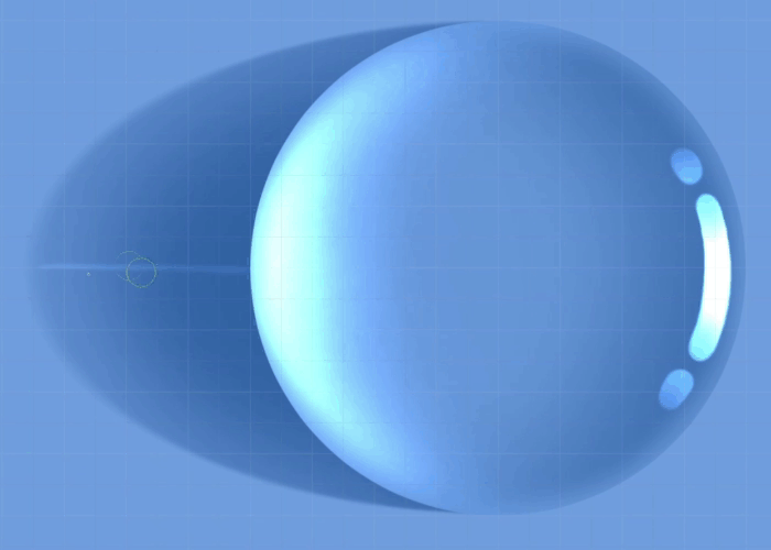
You can keep things a bit more simple though and just use a soft airbrush tool to create a brighter area behind the water drop. (shown on the right side below)
Let's add the last little extra touch.
Create a "Glow Dodge" layer over all the other layers. Choose a soft airbrush with white color and lightly paint over the brighter areas of the drop.
The brush size should be larger than the bright areas themselves.
This create a soft glow effect, which looks quite nice in my opinion. Useful not only in this particular case!
And it is done!
As I said before, this is a very simple example to show you the basics.
Water Drops come in many different forms and shapes, depending on the surface they are on, the background, the light source and so on.
But even as the drawing gets more complex, the basics still remain the same more or less.
We only looked at a water drop from above and therefore only worked with circles. When viewed from the side, the drop shows it's flat underside. However, it can be flatter or rounder, depending on the surface below! It depends on whether the material of the surface is hydrophilic, which means that it attracts water, or hydrophobic, meaning that it repels water.
The texture of the surface below the water drop also can make things more complex.
As I mentioned before, the water drop acts as a lens. You can look through it, since it is transparent, but the image would be distorted.
Down below you can see another photo series I made to illustrate how water drops distort the texture below them, depending on the view angle.
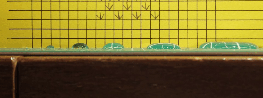
So when looked at from above, there is not really a notable difference, but if you look at water drops from the side, they warp the texture below them, as if it is expanded and swollen.
Down below is a drawing of a water drop that warps the leaf texture beneath it. It gives it a nice bit of extra realism.
Also note the shape of the water drop! Lotus leaves are known for being very hydrophobic, and therefore the water drop has a very round shape.
Clip Studio Paint recently got a new tool, called "Liquify", that makes warping those textures much easier. And as a matter of fact, I am going to utilize it in the next chapter right down below!
Falling Water Drops - They are Lenses!
Next up let's take a look at falling water drops! That means that they are not just sitting on a surface.
Now there is one common misconception that I want to clear up:
Falling water drops do NOT have that "drop shape" with pointy end. 💦🚫
Instead they are just spherical. Even raindrops falling at high speeds are spherical.
Water always wants to retain the shape with the smallest surface area, which is a sphere when they not in contact with any other surface.
The only time when water drops kind of resemble that stereotypical drop shape is when they detach themselves from a hanging surface, as illustrated below.
This process only lasts for a few split seconds, and right after it detached itself the water drop wants to wobble into a sphere.
Ok, I could go on and on about the physics, but I shouldn't overdo it. Again, check out the video if you want to learn more!
So for this drawing example, I prepared a background at first. Just some landscape. Whatever the background is doesn't matter too much.
Once again draw a simple circle with the ellipse tool, with the width and height being the same again. The color does not matter at all. Just make sure that the opacity is at 100%.
I blurred the edges, just so that it fits in this painting a bit more nicely.
Now make a copy of all the background layers, merge them all into one layer, and clip it above the circle layer.
Water drops act as lenses. That means that you can see an image of the background within the water drop itself. And because of it's spherical shape, the image is completely flipped around. Up & down and left & right are flipped.
So use the transform tool and either flip the picture both horizontally and vertically, or just rotate it by 180°.
Then adjust the size so that it nicely fits into the circle.
A sphere is not a very accurate kind of lens. It wouldn't show you the image as you see it normally, but it causes some distortion. You can compare it with a fish-eye lens, just a bit worse.
That means that the image gets expanded at the middle of the circle, and close to the edges it looks squished together.
Originally I used the mesh transformation and tediously adjusted it so that it imitates that kind of warping, but the new "Liquify" tool makes it SO much easier and faster!
Use the "expand" mode and choose a brush size about the size of the water drop circle itself. Don't use too much strength, so that you still have enough fine control. The hardness also shouldn't be too high.
Click right on the center of the circle and hold it only shortly. Don't hold it too long, or it might keep going and going. This tool is unfortunately a bit slow performance-wise, so only use it in short bursts and wait for it to finish processing.
As I said before, it isn't a perfect lens. Use the blur to make the edges of the image blurry.
Make sure that the blur effect gets stronger the closer to the edge you get.
Next up create a "Multiply" layer and clip it on the top. To make things easier, let's use the gradient tool!
Set its shape to circle and have transparent color on the left side, and your primary color on the right.
Move the transparent color on the left side a bit more towards the center on the gradient scale, so that the gradient gets more narrow.
Now choose a light grey and draw the gradient from the exact center of the circle until the edge of it. The drop now has some light shading.
As the last step, create a "Glow Dodge" layer, clip it above all the others, and choose white as a color again.
Draw some glowing highlights as lines, dots and other shapes close to the edge of the drop. What brushes you use it basically up to you. I usually use a combination of smudgy soft brushes, hard brushes and the blend tool.
Additionally use the Gaussian Blur effect on the background to add more depth to the whole picture.
And it is done! These drops can be very pretty looking by themselves, or be used in creative ways to add an interesting composition to your artworks.
Things are still quite simple when you only work with circles. But if you use more complex shapes it will also get more complicated to warp the image correctly. Down below is an example.
Using the liquify tool alone might not be accurate enough in certain cases and you might need to go back to using mesh transformation instead.
But also ask yourself if it is really necessary to put that much effort into making your art realistic. I'm telling you how stuff works, but what you do with that knowledge is completely up to you. You don't need to draw hyper-realistically and physically correct to make your art look better. As a matter of fact, sometimes breaking those rules can make your art even more interesting looking!
Water Splash & Ripples
Alright, on to the last drawing chapter! Something dropped into a pool of water, creating a splash and ripples on the water surface.
This is a bit more complex. Light and shadows play a very important rule here, and the shapes are definitely much more complex than just a simple circle. But don't get intimidated! I will guide you step by step.
Also, water splashes are beautiful to look at and in my opinion quite enjoyable to paint!
Once again we are working with a simple, monochrome background to keep things as simple as possible. I only added a slight gradient, but that is not really important.
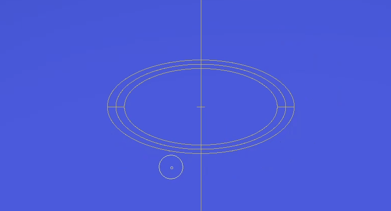
Water ripples are still just circles, and we can use that fact to make things easier for us!
Go to the rulers and choose "Special rulers". Pick the "Concentric circles" and set the aspect ratio so that it is wider than high. By how much depends on the view angle. The flatter the view angle, the higher the difference. In this example I chose a 2:1 ratio.
There are other ways to utilize rulers and make the drawing's perspective more accurate, but this is a very simple and straight-forward way.
Choose the point where the center is supposed to be, and drop the ruler right there. The size of the ellipse that you draw does not matter at all, since all the lines you are going to draw will follow the exact same curvature. That is what "concentric" means. All the circles have the exact same center point, just different scales.
Just leave that ruler on it's own layer and set it to "Show in all layers" when you right-click on the ruler icon on the layer.
We are not going to draw on that layer. But by hiding and showing the layer you can easily turn the ruler off and on.
Next up use a fairly soft brush with its size linked to the pen's pressure sensitivity and not too much hardness. Down below you can see the settings of one of my go-to brushes, but other brushes can work too.
Create a "Multiply" layer and choose a rather dark grey.
We will make this drawing ONLY with shading and highlighting, and that's it. Starting with the shading.
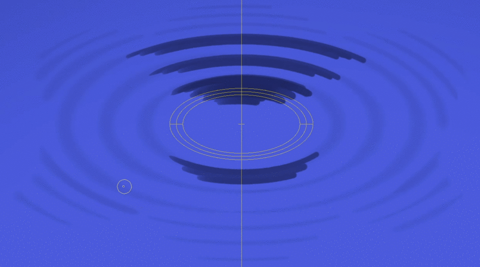
Leave a bit of room in the middle and draw the first couple of circles that are going to be the ripples. Start drawing the lines from the bottom with very little pressure, increase the pressure as you go to the left or right side, and decrease the pressure again as you approach the top or bottom of the circle. That way the line gets thicker at the sides to follow the perspective of the drawing.
Probably confusing in text form, so please look at the GIF below. : )
If your brush does not follow the ruler, check if the brush has "Enable snapping" turned on in its "Correction" settings, and "Snap to Special Ruler" is turned on in the "View" menu.
Almost every drawing tool has an "Enable Snapping" option.
By the way, you don't have to worry about drawing perfectly at this stage at all. Later on we will adjust everything by smudging and blending.
Do that a couple of times, with the circles being about the same distance apart from each other.
Then after a few full circles split the lines into equal parts. Here I did 6 parts, but you can choose a different number. And as the distance increases, those lines get shorter and shorter.
This is visually so much more pleasing than only drawing complete circles all the way. At least in my opinion.
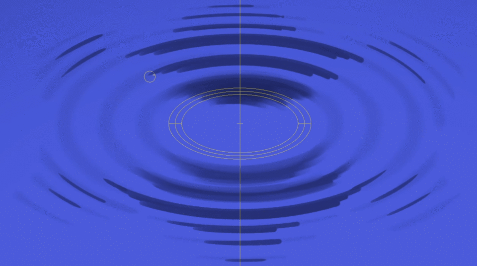
Next up choose a stronger brush and draw lines where the ripples are the darkest. In this example the light simply comes from straight behind, so the shadows are facing the viewer. Different light angles can change the look of the picture quite dramatically, so be mindful of that.
Also, as a general advice: Look up references.
Even the most detailed instructions from me cannot fully replace the power of reference pictures and videos. Look at many different versions, observe them, analyze them, and then make the decision of what you want to draw.
There is absolutely no shame in using references! Just please be mindful of copyrighted materials and how you use them.
Make those dark lines thicker towards the center, similarly to how I showed it in the GIF below.
And again, don't worry about being perfect.
Already resembling ripples I would say!
Next up let's finally smudge those colors. Use a blend tool, with the brush size set up so that it is linked to the pressure sensitivity.
Also for blend tools you can use the "Enable Snapping" option and follow the concentric circles.
Sometimes you want to draw and blend freely however. In that case turn off any of the snapping options that I mentioned before. Or simply turn off the layer with the ruler on it, if you also want the ruler guide lines to be hidden. They can sometimes be in the way.
And now just blend and smudge away! Make those shades softer looking.
Also the smudge strokes kind of give it a paint-like texture. I personally like it. However if you don't like those strokes, feel free to use the blur tool later.
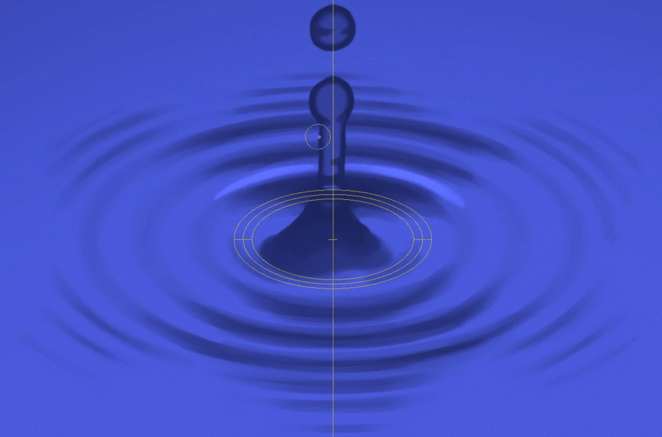
As the next step we draw the water pillar rising from the middle of this splash.
That kind of pillar is just one form of many that a water splash can have. But it is one of the simpler ones.
We stay on the same "Multiply" layer. You could theoretically make a new one, but then you would have to erase parts of the ripples, and I find it just tedious. Just make sure that you are satisfied with the ripples' shading as it is right now.
Start from the center. Use the ruler as a guide, with the snapping turned off so that you can draw freely. And after that just turn off the ruler again.
Use a fairly solid and opaque brush. Draw a pillar straight up. It is wider at the bottom, and at it's peak it has a sphere stuck to it.
And then there can be a small drop in the middle of the air above the pillar.
It looks a bit odd at this stage, but we are not done.
Do a bit of smudging and light painting at the base of the pillar, and softly erase the middle parts of the pillar, except for the base.
Let's give it more texture. Simply paint some random curved lines across the pillar. Short and long ones. This adds so much to the watery look to it!
It's time to finally create a new layer! Make a "Glow Dodge" layer, switch to white, and lightly paint lines above the shadows of the ripples.
You don't need to make full circles. The bottom and top parts of the ripples are enough.
At the center the light reflections look more like spots of various sizes.
Just like in the shading stage, add some solid white lines to the brightest areas along the middle. Narrow lines are sufficient.
And again we smudge and blend everything.
Let's add some brighter spots on the pillar too! We still stay on the same "Glow Dodge" layer. No reason to make a new one.
The light reflections are more focused on the bottom of the spherical shapes. Remember, the brighter spots are actually at the opposite side from where the light hits the water drops.
At first paint softly, and then make the more intense highlights.
Utilize the blend tool again if needed.
Alright! You might think now that we are done, but there is a little detail we still need to add: The reflection of the water pillar itself on the surface!
For that purpose let's make at first a new "Multiply" layer and use the same dark grey as before.
Paint in some rough lines along the brighter parts of the ripples. Leave out the darker areas. Their curvature wouldn't show us the reflection.
Go ahead and make your paint strokes wobbly looking! And slightly displace the individual segments from each other. Don't just paint the same straight pillar as before.
Next up make those lines a bit smudgy and blurry looking, and make the middle parts more transparent.
Also make sure they blend in with the ripples' shady parts.
And lastly make another "Glow Dodge" layer again, choose white color, and lightly paint in some highlights, similar to how they look on the original pillar.
And it is finished!!
All in all it is not that complicated, and can give you really satisfying results!
This example had a monochrome color as background, but like with the first example, things get a bit more difficult when you have an actual texture or image.
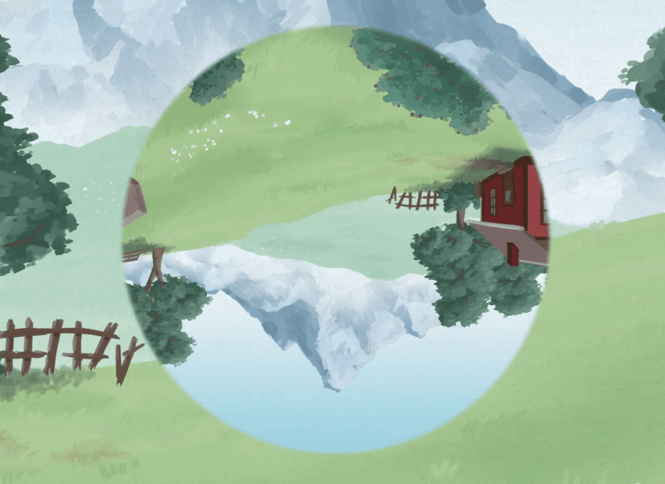
Let's take a look at this picture I drew recently:
It doesn't have a splash, but it has water ripples. And the sky above is reflected off the water surface.
Obviously that reflected image also has to obey to the curvature of the water surface, and it warps along the ripples.
I achieved that look by using the "Liquify" tool, set its mode to "Push" with a lower strength, and simply dragged it along the ripples as shown with the arrows down below.
Additionally I used the blend tool to make the image a bit smudgy and wobbly where it gets warped a lot.
It is not 100% physically correct and realistic, but it looks convincing enough, especially to the untrained eye. And that is what matters. Anything more than that is just waisted time and effort, at least in my opinion. I just want to make pretty pictures.
As I said before, water splashes come in all sorts of shapes. Go and watch a slo-mo video of a water splash to see all of its cool looking stages!
Have another example in the shape of a crown, a very early stage. Definitely more complex than the pillar shape, and describing how to paint this here would be a bit too much for this tutorial. But I explained it at least a little bit in my video.
Conclusion
I hope that I was able to awake some fascination with water drops and splashes within you with this tutorial. I personally find them really cool and beautiful!
They can be wonderful additions to your artworks, even if they aren't the main focus.
Down below is another example of a picture I painted a while ago, utilizing both water splashes and drops to show that it recently rained.
I also have a narrated time-lapse video of its making-of process, in case you are interested:
Alright, that's basically it!
I hope that this tutorial was helpful to you! It was actually the first time that I made one here on Clip Studio Tips in this format. I hope I did at least a decent job.
And again, if you want to learn more about how to draw water drops and how they work, check out the video at the beginning of this tutorial!
Have fun drawing!
(MESSAGE TO CLIP STUDIO: Since the tutorial video at the top is an older one that I didn't make specifically for this month's tutorial contest, I assumed that this tutorial is not eligible for the Video Award, but just the Gold, Silver and Bronze Award. However if I was wrong, please also count this tutorial as a submission for the Video Award.)
All images, animations and videos in this tutorial were made by me, "Mink - the Drawing Researcher".
Users who liked this post


Comment