
Hello everyone, In this tutorial, I will share some techniques and tips to use when creating Greetings cards, I will make a New Years' theme, but I hope you can apply the tips for your own celebrations and events, such as birthdays and special occasions.
I will make a couple of Themes, some elegant and some more playful.
Also since in this era we have social media, We can share Digital greeting cards.
I will try to show you how to use the animation features in clips studio paint ex. to create animated cards we can share on social media with our friends and family.
Ok lets have some fun!
Preparing the file for printing | CMYK vs RGB
When we work on printed media, there is always the debate on which color space we should work.
This is a complex subject, with different standards around the world, and new printing techniques and materials being developed.
As a general rule, we want the colors from the screen to be reproduced as close as possible. To achieve this we need to meet a lot of conditions, even on calibrated monitors with the correct color space and printing test, some times due to Ink limitations and materials, the colors aren't perfect either.
I like to aim for a balance between practical and creative. I want the colors to be reproducible on printed media, but I don't want to limit my color choice and decisions too much.
We use a lot of Digital media nowadays so we can work aiming for digital screens, and adapt the design when we need to print it.
A lot of digital Printers also prefer RGB Color space, So I choose to work on RGB color space, and if needed I can Check a specific CMYK using preview. Just keep in mind as a general rule that really saturated colors Usually don't translate well to CMYK.
If you need help and you are going to send the files for printing to a company, ask them what kind of files they want.
Clip Studio has a couple of tools to help us preview the file for printing.
▼ [1] If you need to check the colors in a specific color profile you can Work in RGB and set up a preview color profile as a reference going to [View] > [Color profile (Q)] > [Preview settings] and choosing the appropriate profile. Then from [View] > [Color profile (Q)] > [Preview] you can toggle between the preview color and the original, this can help you see how the colors are going to look on a specific profile.
■Note: This is only a preview, the colors can change when you print so make a color print test first.
▼ [2] When working in print we need to pay attention to the final Size. Because we can zoom a lot on digital media, we tend to overwork details that would not translate into the final print size. To avoid this we first need to set up the correct Dpi by going to [File > Preferences] >[Canvas] > Display resolution [Settings]. Then using a ruler we trust align the markings so it reflects the real-world size.
Then we can go to [View] > [Print size] To check the real size of the print.
User ED. has a lot of good information on this tutorial, please check it out. ▼
1.For Print: No fold | Playful New year Greeting card
In this example, I will make a Playful themed New year greeting card.
The design will not be folded, but we can add some elements to the backside too.
I will first explain how to prepare the file then I will mix different techniques to create the design.
Some parts will be more specific of the theme but I hope you can apply some of my tips to your own work regardless of the style.
Lets begin!
1.1 File settings
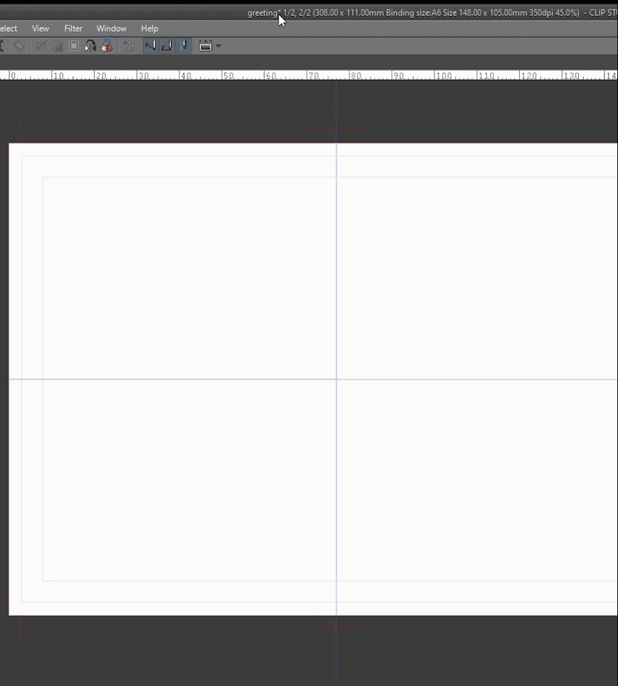
▼ [1] First let's create the file. I decided to make a horizontal card. For the size, I decided to make them A6 size or 148mm x 105mm, The postcard size preset of clip studio is 148x100 its almost the same. I will use the Show all comics settings to create bleed guides, Margins, and crop marks.
■NOTE: When designing front and back cards I like to have both pages side by side, this way we can establish visual lines to keep a consistent flow and balance when we flip the card.
It's just a preference to have them like that, but it's still a good practice to place elements in a way that ties the front and back visually.
To make the spread, i unchecked align crop mark and selected multiple pages with 2 pages and left binding, this way the front is the left and the back the rigth
▼ [2] Here you can see how the settings affect the different parts of the page.
■RED: Bleed. I used a bleed of 3mm but if you print with a printing service please ask them what size of bleed they need, This part will be cut, but to avoid errors extend the design to this part. Remember to avoid putting important things like text close to the bleed area.
■ORANGE: This is the final trimmed size. in this case A6
■YELLOW: I used the Default border setting to create a visual margin, I will make sure important elements are inside this area.
If you want to learn more about file creation please read this article ▼
1.2 Designing the Front of the card | background
First, I search for inspiration on sites such as Pinterest and dribble. then I explore sketch ideas on a piece of paper, quickly without much detail, this way I can decide on a composition and a vision for the design before adding detail. You can sketch directly on the page too with a tablet and a pencil brush.
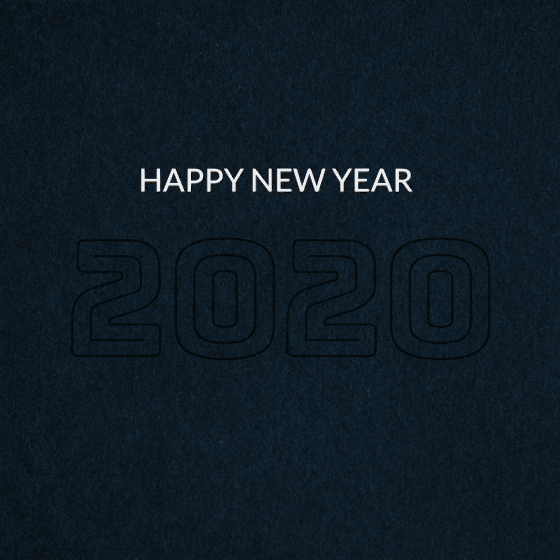
■I will use some typical new year elements such as confetti and fireworks and 2020 as the principal element.
■Note: in this first stage is a good practice to explore color palettes, you can draw inspiration from other designs, or photography.
Have fun and experiment before committing.
▼ [1] First let's make the background.
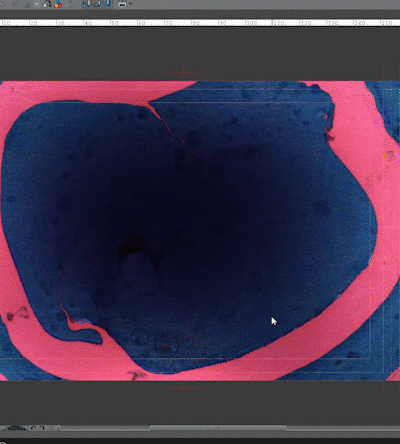
I decided on a dark background with light elements so I added a marbled paper texture to get an interesting pattern, you can search materials on clip studio assets if you need.
To get the final base i experimented with the colors using [Edit] menu > [Tonal Correction] > [Hue/Saturation/Luminosity] and [Edit] menu > [Tonal Correction] >[Tone Curve]
■Note: i created a group folder to have the background elements organized and to apply a mask on the parts i want the white background. [Layer] menu > [Create folder and insert layer]
▼ [2] To have some continuity between the front and back of the card i extended the background texture to the default border on the back page. This give me a border with texture. To make it I applied a mask on the background folder, Then created a selection to mask using the rectangle selection tool and filled the selection with transparent color. This hide any element of the background group that extends beyond the Default border.
▼ [3] Now to add the other border on the back of the card I duplicated the background layer by Right-clicking on the layer > Duplicate layer.
Then I moved the layer to the position i liked and mask the parts i don't need using the same steps as above.
1.3 Front text elements | Adding message
▼ [1] To help me place the elements i created a couple of centering guides. To do it first activate the Ruler by going to [View] > [Ruler] or pressing CTRL + R.
Then simply click & drag from the ruler to the canvas and place the guide were you need it.
If we need to modify the position we can select it with the Object tool (Shortcut O) and modify the coordinates in the [Tool Property] palette.
▼ [2]Let's add the text message to the front of the card!
First, we experiment with different fonts until we find the one we like, Try different styles to suit your design.
■Note: First we lay down the text as a simple base, then we can further add details by applying textures, rasterizing the text and drawing on top or apply a transformation to the letters.
■[2.1] Create New layer by clicking on the layer palette.
■[2.2] Select the Text tool (shortcut T) Choose a font in the [Tool Property] palette. then click on the canvas and Type. in this case I write 2020.
■[2.3] Select the Object tool (Shortcut O) to change the position and transform the text. Using the Guides as a reference I placed the text in the center, changed the scale & rotation and also skew the text a little to make it more dynamic.
■NOTE: to further edit the text we can rasterize it and apply mesh transformation or filters. First make sure to duplicate the original layer before rasterizing to keep the editable text.
▼ [3] Using the same steps I added the rest of the text elements on the front of the card.
With this, we have the base for the front card. i will add details and finishing touches later.
1.4 Fireworks Elements using rulers
Now let's create some graphic fireworks we can add to enhance the design.
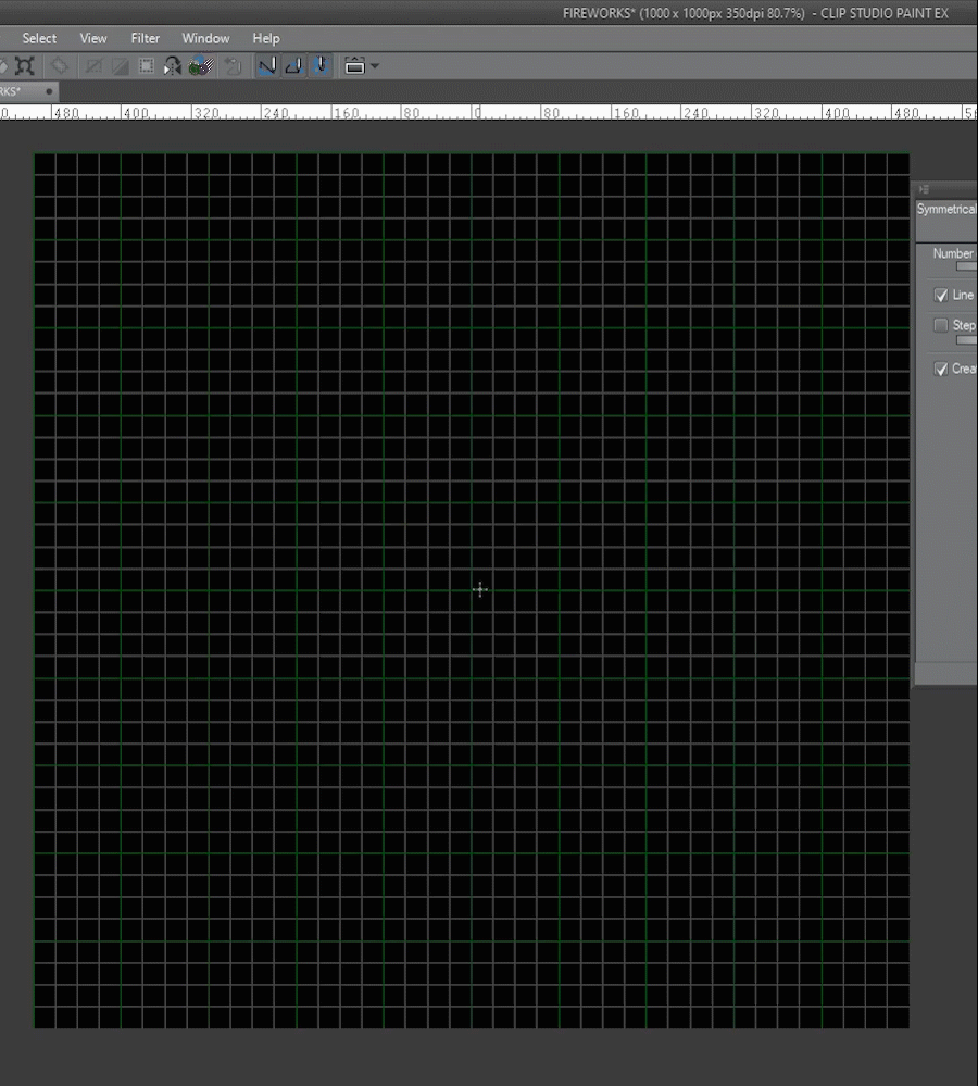
■First I created a new file to keep the workspace clean. I will add light effects later so I created the file with a black background.
▼ [1] To help me set up the rulers and elements I will use the document grid.
■[1.1] to set it up go to [View] > [Grid Settings] it will pop up a window to change the settings
■[1.2] in this panel i choose center for the origin of the grid to design from this point.
■[1.3] activate the grid by going into [View] > [Grid]
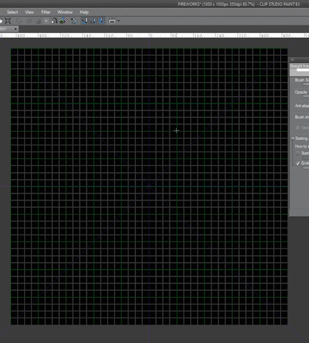
▼ [2] Now I set up the Line tool to get the tapered stroke I want.
■[2.1] Select the figure tool (Shortcut U) and the Direct Draw > Straight Line
■[2.2] i pick a Brush size of 1mm
■[2.3] Here we can change the auto start and ending of the tool. i choose Brush size with a minimun value of 30 and the method to percentage
■[2.4] I pick ending to make the end of the stroke shorter and pick 100 percent
■NOTE: This results in a tapered stroke. the values may vary depending on the size of the canvas (in this case 1000px x 1000px) so please experiment to achive the results you need.
▼ [3] Ok let's create Some rulers to help us create the fireworks
■[3.1] First i created a Group folder [Layer] menu > [Create folder and insert layer] i will create the symmetry ruler on the folder to make it easier to reuse it for different versions and to stack other types of special rulers.
■[3.2] Pick the Ruler tool and choose Symmetrical Ruler
■[3.3] Make sure snap to special ruler (CTRL + 2) and snap to grid are selected.
■[3.4] Play with the settings to achieve different effects, i selected 8 lines of symmetry and line Symmetry
■[3.5] Click and drag from the center of the canvas to create the ruler. We can use the Object tool to move it later.
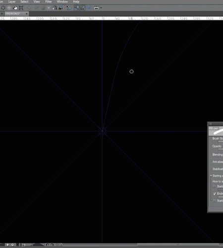
▼ [4] Now I will use the line tool to draw the fireworks
■[4.1] First select the Direct line tool we set up previously.
■[4.2] Make sure to turn on Snap to special ruler (CTRL+ 2)
■[4.3] In the layer inside the folder draw toward the center.
▼ [5] We can stack other special rulers by putting them on the layer inside the folder.
I will use the Radial curve ruler to create a more curved and organic look.
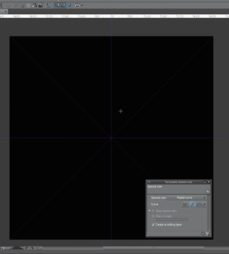
■[5.1] Choose Special ruler
■[5.2] Selec radial curve
■[5.3] Click to create the curve, we can move the origin point with the object tool
■[5.4] I created a marker tool with the same settings as the line tool and then i draw using the rulers to achieve the effect.
▼ I experimented changing the setting of the rulers to achieve different results
To learn more about the different rulers check this tutorial ▼
1.5 Adding simple glow effect
▼ [1]To enhance the elements we can create a simple glow using blending modes and the Gaussian blur filter.
■[1.1]First duplicate the original layer.
■[1.2] Then Change the name of the duplicate to GLOW to keep layers organized, and change the Blending Mode to [ ADD (Glow) ]
To learn more about blending modes read this ▼
▼ [2] To create the glow we need to blur the duplicated layer.
■[2.1] With the Glow layer selected go to [Filter] menu > [Blur] > [Gaussian Blur].
■[2.2] We Play with the settings until we achieve the desired effect. Keep in mind that the settings will vary depending on the shape and canvas size.
■[2.3] Now we Can change the color with [Edit] menu > [Change color of line to drawing].
■Note: experiment with different blending modes and opacity to achieve different results. We can also duplicate the glow layer and applly other filters. Have fun.
The final Result ▼
1.6 TIP | Register Folder as material
Now that we have the elements we want to place them on the Card file. To do this we can simply copy the layers by pressing CTRL + C and then we go to the file we want to paste it and press CTRL + V. But we can also register the elements as image materials, that way we have access to them from the material Library and we can also share them on Clip studio assets.
■Note: To keep the editability of the layers we can register a Folder as material, then when we place it on the canvas it will retain the individual layers, this is really powerful please experiment with it.
I will show a quick setup of the material. To learn more about this function read these tutorials ▼
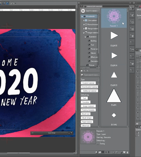
▼ [1] Let's register the firework folder ( Base + GLOW ) as an image material.
■[1.1] With the Firework folder selected go to [Edit] > [Register Material > [Image]
■[1.2] In the material Property panel choose the name of the material
■[1.3] Choose a proper location and Tags for easy searching and then press OK
■[1.4] Now the material shows on our library
▼ [2] Now we can place the material
■[2.1] Drag and drop from the material palette into the canvas
■[2.2] Now we have the folder with the Glow and base layer so we can edit if necessary.
Here you can download the shapes I made ▼
1.7 adding elements to the card
Now let's add the elements to create an interesting design.
▼ [1] First we add the firework elements and place it where we want. We can use (CTRL+t) To position, change the scale & rotation or skew the element.
I will use masks to hide the parts I don't need and to blend the elements together.
■[1.1] create a layer mask on the folder
■[1.2] Using a brush and transparent color hide the parts we don't need
■[1.3] The element is integrated with the text elements
To learn more about masks ▼
▼ Keep adding Fireworks elements to achieve the desired result
I will use decoration brushes to add confetti-like details ▼
▼ [2] I Just painted on a new layer with white.
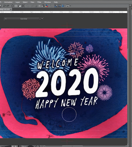
▲ I also added some stars with a brush. and created a balloon with the curve tool
1.8 Finishing details
Now that i have all the elements in place i will mix the techniques above to add glows and change the color of some parts to complete the design.
▼ [1] Added glow to the 2020 text.
▼ [2] Added glow to the Welcome text the confetti and the ballons
▼ [3] I changed the base colors of the Happy new year text and added glow.
The Finished Front ▼
1.9 Adding elements to the Back
To the back of the card, I will add some simple text message and elements to write freehand
I will try to keep it simple. I will use the same techniques from before.
▼[1] First ill add a text message
■[1.1] To keep layers organized I created a folder for the front & back elements
■[1.2] Using the text tool i typed the back message
■[1.3] I created a copy of the text layer and rasterize it, then changed the color and position.
▼[2] Now I will add some simple lines to write freehand after print and the shape for the stamp.
■[2.1] Using the direct line tool I created the lines. i placed some guides to help me.
■[2.2] With the rectangle drawing tool i draw the shape for the stamp.
▼[3] I Added some firework shapes and confetti like i did on the front
The Finished Back ▼
1.10 Exporting the card for print
▼[1] Now that we finished the design we need to export it for print.
■NOTE: if you are sending the files to print ask the printer if they have special settings.
■[1.1] Go to [File > Export multiple pages (Y)] > [ Batch export]
■[1.2] Choose the export folder
■[1.3] Select the file format. I choose Psd to export a PDF from photoshop. its best to choose a format that preserves quality like TIFF or PSD
■[1.4] make sure Export spread separately is checked this way we have one page for the front and one for the back. Then press ok to open the export settings dialogue
■[1.5] if you want you can export the crop marks.
■[1.6] Here you can change what is included on the export, all page, to bleed lines or to the inside of crop marks.
■[1.7] Make sure the scale is correct, in this case 100
If you need more info about printing and page management ▼
Here is the final Card ▼
2.For Print: Folded Elegant New year Greeting card
In this example, I will make a folded card with an elegant theme.
Like in the last example, First I will show you how to set up the file, then I will use different techniques and tools to make the design.
■NOTE: I will use Some of the techniques from the last example, so I will try to refer to them instead of writing repeated detail and keep the tutorial simple. I hope it isn't confusing.
2.1 Folded Card file settings
When creating a folded design we need to keep in mind the fold and the orientation of the elements on the page.
▼[1] For the Front We design on the same page with a fold in the middle, the top part will be inverted so when we fold it the design is on the correct orientation.
Now that we finished the design we need to export it for print.
■[1.1] Front of the card. This part will be on the lower part of the page
■[1.2] Back of the card. This part will be on the upper part of the page with inverted orientation. To achieve this we can design normally and then rotate the design 180°
■[1.3] For the inside of the card i will design Normally on the upper part of the card.
▼[2] Let's create the file, same way as before using the Show all comics settings.
■[2.1] Choose a file name and a location to save
■[2.2] The canvas size i choose is the final binding size plus the bleed
■[2.3] I will use a final page size of A5 or 148mm x 210mm that folds into A6 size or 148mm x 105mm. i picked a bleed of 3mm but remember to ask the printer. The default border is 0.5cm less on all sides as a safe margin.
■[2.4] i check multiple pages and set the number to 2 but this time i unchecked Spread corresponding Page since i don't need the visual guide for this design.
■[2.5] The resulting pages. I added the guide from above so you can visualize the setup.
I also added some more guides to help me place the elements ▼
2.2 Front and back | Background
▼[1] I will create a base for the design. I decided on a dark background and light elements.
■[1.1] To keep the layers organized i created 3 folders, one for the background, one for the front elements and another for the back elements.
■[1.2] First I placed a Black paper texture to make the base for the background.
■[1.3] Then I created lines across the whole page to keep the front and back visual flow when folded using the Figure (shortcut U) Direct line drawing tool
■NOTE: first I will add the elements as plain white to decide the composition. Then I will apply a gold foil effect and details.
2.3 Text elements
▼[1] First I will add the text on the front as I did before on the playful card.
■[1.1] Select the text tool, choose a font, and type. We can edit it later.
■[1.2] I Duplicated the text elements and rasterize them. then i divided the words into individual layers and apply transformations. finally, i added some line elements.
■NOTE: Since I will add a Gold foil effect later I tried to avoid really thin lines that will not translate well when printed.
▼[2] Now let's add text to the back fold.
■[2.1] First create the text normally and place it close to the final position.
■[2.2] Then using the object tool rotate the text 180°to get the correct orientation.
2.4 Gold foil effect
I will use masks to add a nice gold foil effect to the elements of the card. I will use tips I explained in detail in my mask tutorial so if you want more detail please read that. ▼
▼[1] I selected a gold texture from my personal library, if you need one try searching on clip studio assets.
■[1.1] First I place the texture above the layer I want to apply it to. in this case the background lines.
■[1.2] Make a clipping mask using the layer palette icon. This puts the texture only on the lines underneath.
■[1.3] Now we can edit the position and scale of the texture if we need.
■[1.4] We can create a layer above to add some sheen with a brush if we want to. Play with blending modes to achieve the result you want.
▼[2] Using the same steps, apply gold to the text elements
Gold foil final result ▼
2.4 Front and back Final details
▼[1] I will add some Gold confetti overlay elements to finish the card. We can also add other ornaments if we want. Experiment to achieve unique results
The Finished Front and back of the card ▼
2.5 Inside of the card
▼[1]To make the inside of the card I simply repeated the steps above.
Using the text tool and object tool I typed and then modified the text to get the result I wanted. also added some lines and splatters using a special font.
▼[2] then I added some confetti to tie the design together.
The Finished Inside of the card ▼
2.6 Folded card Result
Now we just need to export the files for printing as we did before and the folded card is done.
I hope you can apply some of the tips for your own designs.
Final result ▼
3 Bonus text effect | Colorful lines & Neon
I will show you some text effects experiments i made so you have some variety to use on your own work. A good practice is trying to recreate styles we see on other people's works and take inspiration from them, add our own twist, etc.
I will share some tips to create Colorful line text and neon lights style. For this, I will use decorative Fonts as a base and build the effects with different techniques.
Lets experiment!
▼[1] I prepared the file the same way we did before, added a textured background and Using the text tool I created the base text.
▼[2] Then I duplicated the text layer and rasterize it. This way I can work with the pixels to change the colors.
With the Selection area tool (Shortcut M) > Polyline i select the line i want to change, i pick a color, Then using [Edit] menu > [Change color of line to drawing] the line i selected changes color.
▼[3] Repeat the same step for all the lines using different colors.
▼[4] Now i will add some glow like in the playful card. First i duplicate the layer, then change the blending mode (in this case Color Dodge but experiment), and finally apply a blur [Filter] menu > [Blur] > [Gaussian Blur].
To finish the design I added shapes with the figure tool and make them glow the same way.
Quick and fun! experiment Changing the colors and blur to achieve unique results. ▼
▼[5] To make more of a NEON tube light effect, I choose an outline font, then I followed the same steps but with a stronger blur.
NEON Tube Result▼
Using GOLD AND SILVER▼
4 Bonus text effect | Paper cut
I will show you how to make a paper cut style effect with overlaps
▼[1] Same as before I prepared a simple file, with a background and some text. This time I will rasterize the text and separate each number on their own layer. This way we can overlap the numbers if we want.
▼[2] Now we need to add a shadow. First, I duplicate the original layer and put it underneath. I name the BASE & SHADOW layers to keep it organized.
Change the SHADOW layer color to BLACK, and then apply a Blur ( [Filter] menu > [Blur] > [Gaussian Blur])
Then play with the opacity of the layer to achieve the results we want.
▼[3] Now repeat the same steps for the other numbers
▼[4] To achieve a better result we are going to overlap the numbers
▼[5] We can add other shapes using the same method to get the shadow
▼[6] Here i experimented with shapes & colors.
▼[7] We can apply a texture to the numbers the same way we did the Gold Foil.
5 Bonus text effect | Inverse Cutout reveal
▼[1] Using the same trick to get shadows from the last example I reveal a texture underneath Paper. To achieve this first we need to cut out the text from the Paper texture.
I will Show You the file layer order to make it clear.
On top is the text we need to cut out, Then the Paper layer, and underneath is the Texture layer.
▼[2] Now we CTRL + CLICK the 2020 layer thumbnail on the Layer Palette To load the pixels as a selection.
Then we select the PAPER layer and press Delete to create the cutout revealing the texture behind.
■NOTE: We need to Hide or Delete the Text layer to reveal the texture.
▼[3] Finally Make duplicates of the PAPER layer and change the color to Black, apply Blur and move it until the shadow looks good.
▼[4] To add more dimension I created some shapes to overlap over the paper layer using the same steps.
Final Result ▼
As you can see using similar techniques we can achieve a lot of unique results. JUST GET CREATIVE !
Here I used the technique above to create a paper banner look ▼
6 Quick Animated Cards for social media
I will Quickly Show you how I animate digital cards to share on social media using Keyframes and transformations to get Simple but original Results. Since I made the elements using the same techniques from the examples above I will only show the animation part to keep it simple
NOTE: I will list some of the steps but explaining the animation features goes beyond this tutorial so please Read this first if you need to understand the basics. ▼
6.1 Neon Light Up
Here I will use the Neon text I created earlier to make a light-up reveal effect.
The file is 1080px x 1080px a good size to share on Instagram.
The key to this type of animation is Activating the keyframes for the layer we want to animate and then we work with the OPACITY Value to achieve the effect.
I separated the color and light effect and a Black base. I'm going to animate the colors
■First, I Quickly turn it on and Off To make it flicker and then I made it go from 0 to 100 opacity, Clip Studio calculates the transition and it makes it smooth.
Here is the result▼ Pretty Fun
6.2 Ballon reveal.
The process is the same, just add keyframes to the position of the elements instead of opacity
Closing thoughts
Well, this is the end of the tutorial. I hope it wasn't too complex.
Sadly i couldn't make it before new year due to personal reasons. I hope it still help you guys.
I tried to be thorough with the explanations of all the functions and techniques but maybe i talked too much. sorry if is too complex.
I hope you can apply some of my tips to your own work.
The most important thing is to be creative. Please don't be afraid to try new things.
See you next time. Thank you for watching. Happy New Year!
Users who liked this post


Comment