
Intro
Have you ever dreamt of seeing your world come alive in comics, anime, movies, or games? We've all been there, crafting scripts, characters, and universes in our minds.
But today, let's take a radical step back in time!
This session will guide you through brainstorming your story poster in a wildly vibrant, 80s style. Get ready to tap into that neon-drenched decade of bold colors, electrifying fonts, and unforgettable imagery.
Text
Before diving into the artistic side of poster making, let’s get technical first.
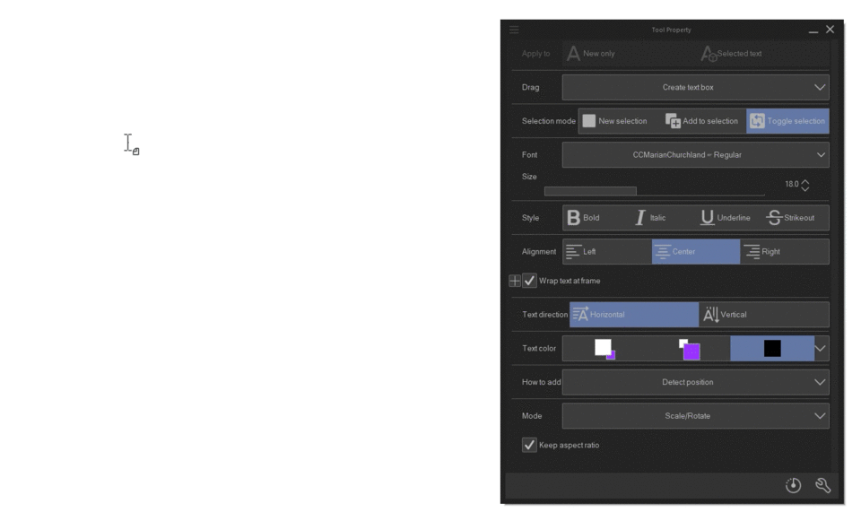
Have you tried using Clip studio text tool before? it can be kinda tricky for beginners, so let’s have a quick look at this feature first.
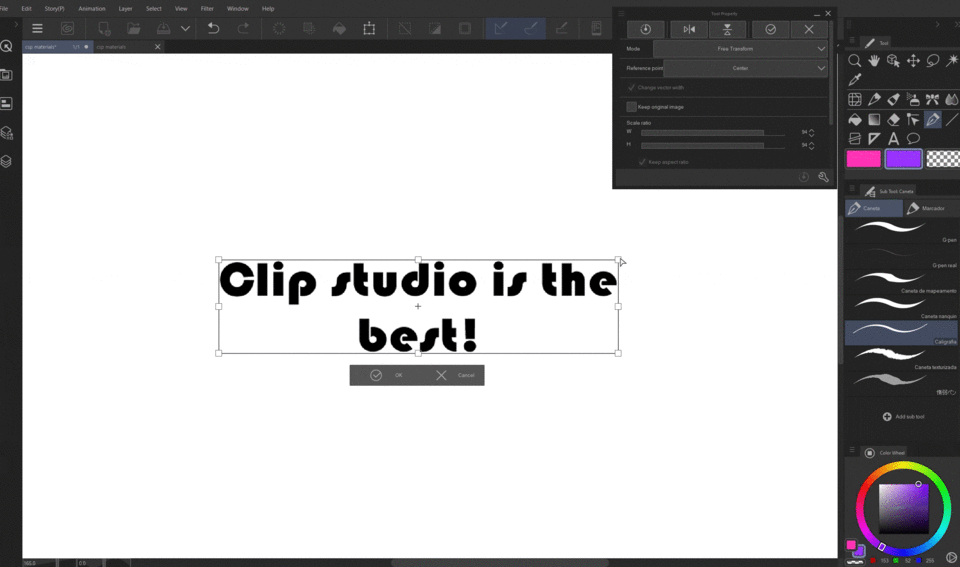
By typing "T" on the keyboard or simply selecting the "A" (text icon) inside the "tool palette” you're gonna open the text feature in "tool property."
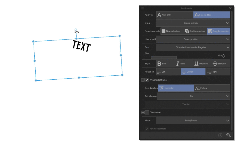
To add text, click and drag your mouse around the canvas to create a "textbox" and type:
You can use the controls to manipulate and edit the size of the "textbox"
You can add new fonts by clicking in the "fonts" option inside the "tool property palette". This will open your document options where you can select the fonts you downloaded. Supported formats are "ZIP/RAR/TTF/OTF".
Typography
Typography is the art and technique of arranging written language in a way that's both readable and visually appealing. It's basically giving your text form and structure.
You choose the fonts (like building blocks), their sizes and spacing (like arranging the blocks), and even colors (like painting the structure) to create a desired effect. And we can achieve this in Clip Studio Paint by using some of the features that the text tool has to offer:
Fonts
Fonts are a great way to start, as they immediately can add some artistic personality to your text pretty easily. There are different fonts for different purposes. Depending on the vibe or genre your story is, it's ideal to choose a font that fits it’s aesthetic.
Editing
The Basics of Text Editing:
Alignment: This sets the position where your text will be located. You can choose left, right, center, or justified alignment.
Style: Here, you can apply different styles to your text. The 4 options for styling are:
Bold: Makes your text thicker and darker.
Italic: Slants your text and makes it appear thinner.
Underline: Adds a line under your text.
Strikethrough: Adds a line through your text.
You can find all of these options inside the Tool property palete of the text feature.
With vertical and circular options you can change the entire position your texts are written, very useful for custom text.
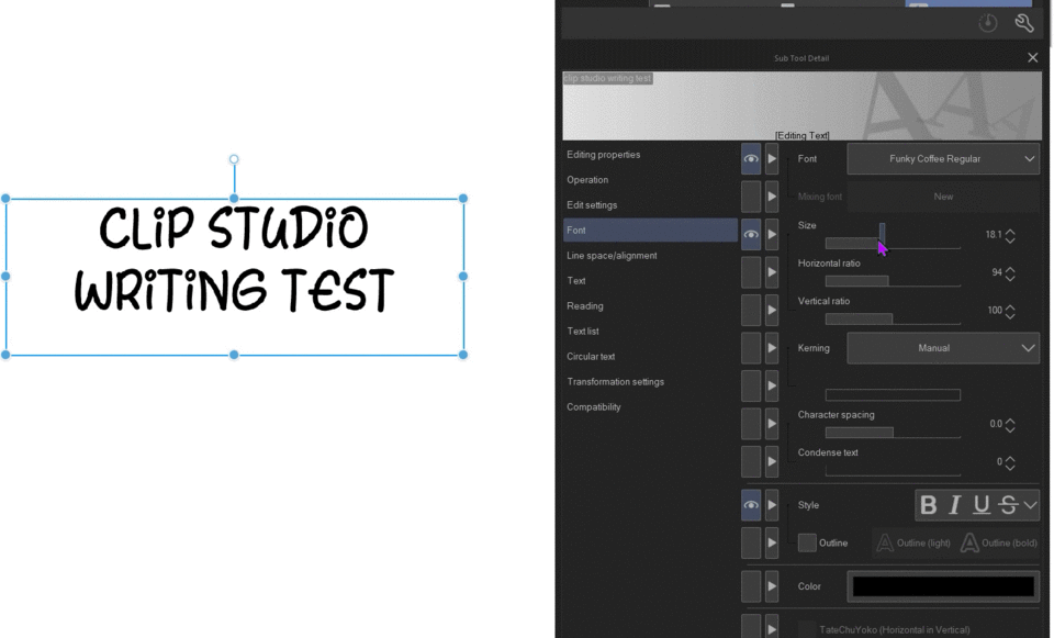
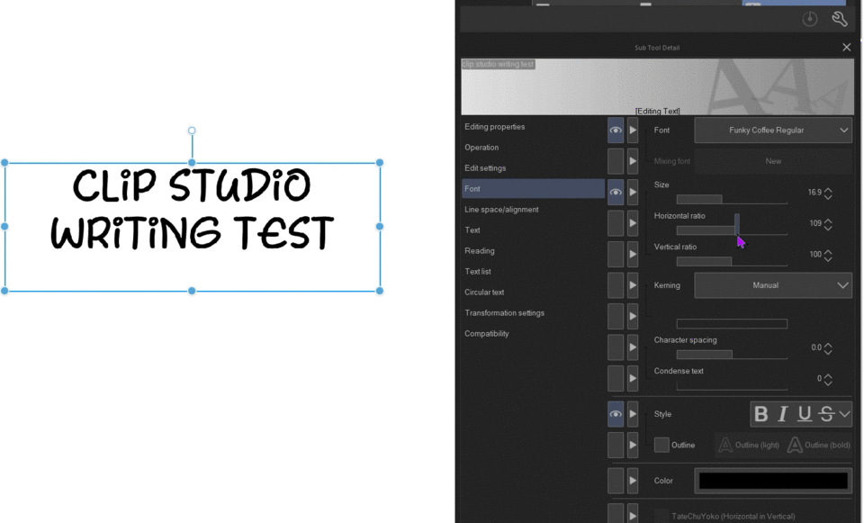
Inside subtool detail palette you will find even more options to edit your text, to access, click in this wrench icon to open the new palette, and lets take a look on that we can find here.
(remember, you can make any sub tool detail options visible in the tool property palette, just select the “eye” icon besides your desired option and it will appear).
A useful custom tool are the “ratio parameters” in the font option, it allows you to change the spacing of the text and some other custom editing.
There’s also an outline option that, well, adds an outline on your text (without you needing to set it directly in the layer options)
Transformation
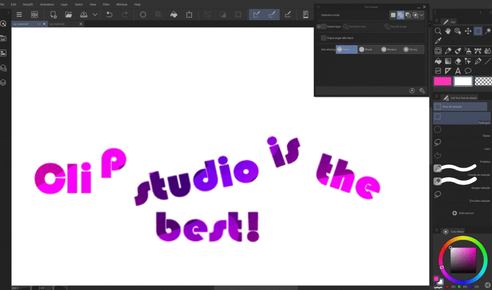
After setting your text, transformative editing is almost always the next step, and to start, you might need to rasterize your text layer whichs will turn it into an image, so make sure to duplicate your text layer before rasterization, because after its done, you will no longer be able to edit it.
Now that we are done rasterizing, the image now is completely available for editing! There’s unlimited options for you to edit it, but i’ll set only a few examples.
With the transformative tool, we can distort the letters however we want, create perspective or change the size.
Locking the layer will give you freedom to add colors, textures and effects to the letters, you can also add a layer on top and clip it, both ways work wonderfully.

You can also clip a layer on top to add effects such as shadows and highlights, easy way to make your letters look really pretty.

Cutting and changing the position of the letters is also an option now, you can be very creative with that.
Composition
Composition in art refers to the way artists arrange the various elements within a piece of art. It's essentially how everything is put together to create a visually appealing and meaningful whole. The elements of art (like lines, shapes, colors, etc.) are like the building blocks, and composition is how you arrange them to create a structure (the artwork).
Brainstorming
When it comes to 80's anime movie posters, composition plays a vital role in grabbing attention and conveying the energy and excitement of the film. Here are some key features to consider:
Diagonals and Angles: Use these to create a sense of movement and excitement. Imagine a hero leaping across the foreground or a spaceship streaking diagonally across the poster.
Rule of Thirds: While not a strict rule, consider placing key elements at the intersections of imaginary lines dividing the poster into thirds horizontally and vertically. This creates a visually pleasing balance.
Asymmetry: Don't be afraid to break from perfect symmetry! Asymmetry can add a sense of dynamism and intrigue.
Eye-Catching Typography:
Large, Bold Fonts: Big, impactful fonts are a hallmark of 80s design. They grab attention and project a powerful vibe.
Neon Colors and Outlines: Embrace the era's love of neon colors! Use them for fonts, explosions, or other eye-catching elements. Outlines around text can add definition and pop.
SFX Lettering: Think "KAPOW!" or "BOOM!" in bold, dynamic fonts to emphasize action scenes.
Emphasis on Characters and Action:
Prominent Hero Placement: The hero, or main character, should be prominently featured, often in a dynamic pose or action shot.
Dramatic Lighting: Use strong contrasts of light and shadow to create drama and highlight key elements. Imagine a glowing city skyline or a hero silhouetted against an explosion.
Explosions and Energy Effects: Don't be shy about using bold, colorful explosions or energy effects to emphasize action sequences.
Retro-Futuristic Elements:
Technological Gadgets: Showcase cool gadgets like robots, spaceships, or advanced weapons to pique curiosity about the film's setting.
Cityscapes of the Future: Depict futuristic cityscapes with towering chrome buildings and neon lights to create an exciting and advanced world.
Geometric Backgrounds: Use geometric shapes and patterns in the background to add a retro-futuristic feel.
Remember: The overall look should be bold, energetic, and eye-catching. Use strong contrasts, vibrant colors, and dynamic layouts to capture the essence of the 80s anime style.
Thumbnails
Thumbnails, also called thumbnail sketches, are quick and simplified sketches used in the planning stages of a larger artwork.
Imagine a blueprint for a house - it shows the overall layout and structure before you start building. Thumbnails function similarly for your artwork, providing a rough roadmap for your final piece.
After choosing your preferred draft, its time to line it, as we’re trying to reach a retro look, these pencils might fit the best for the lineart:
Colors
Retro futurism blends the aesthetics of a bygone era with the imagined technologies and visions of the future. This translates into color palettes that are both bold and nostalgic. So keep that in mind when choosing your color palette for this specific art style, thou some options are:
Vibrant Colors: Embrace the boldness of the past, Think bright, saturated colors like neon pinks, blues, oranges, and greens.
Muted Pastels: Balance the vibrancy with some softer, pastel versions of those same colors. Imagine a washed-out pink or a light, minty green.
Warm Accents: Incorporate warm metallics like gold, copper, or brass to evoke a sense of technology and machinery from a past vision of the future.
Some more palettes that might be useful for you:
Neon Dream: This palette features bright neon pink, teal, and yellow, with a ccents of black and silver.
Colors: #FF00FF, #00FFFF, #FFFF00, #000000, #C0C0C0
Synthwave Sunset: This palette evokes a nostalgic sunset with a retro twist. It features a gradient of orange, pink, and purple, with accents of black and gold.
Colors: #FF9933, #FF6699, #CC00FF, #000000, #DAA520
Tech Noir: This palette combines the grit of film noir with a futuristic edge. It features a dark blue background with accents of neon green and purple.
Colors: #000080, #00FF00, #FF00FF, #FFFFFF
Pastel Future: This palette features softer, pastel versions of classic 80s colors like pink, blue, and green. It's complemented by touches of gold and black.
Colors: #FFC0CB, #ADD8E6, #C2F0F0, #000000, #DAA520
If you still find it difficult to choose a proper color palette for your artwork, try out clip studio assets, by typing: Retro, Palettes in the search bar, it might give you tons of options for you to try:
Now onto my design, I already have a color set for my character, I want it to pop and look eye catching, but still with some pastel hints in purple, blue and red, here’s the image reference i have for her:
Having a solid character design and clear references is crucial for achieving impactful results. Take some time to craft your character's visuals and choose specific color palettes that complement their personality and story.
After coloring my characters utilizing the references, this is the outcome of the base color:
Styling
Styling definitely will be the most fun part of the process, as we have endless options to try out, but first, let’s render the artwork with a simple cell shading technique, usually when it comes to retro anime art, it’s not very detailed, the details looks solid, resembling more of an anime panel than a fully rendered artwork.
Half tone
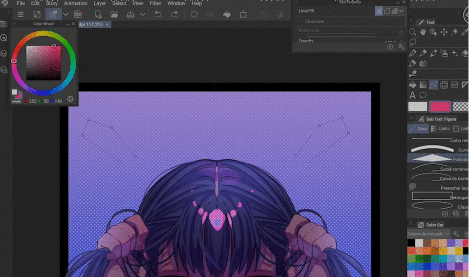
After adding darker edges for the shadows, let’s add tones on top of dark and bright areas, halftones are often used in retro anime and manga art in general, let’s learn how to use it.
Start by creating a new layer and selecting the layer property palette.
Then select the “tone” option and drag the frequency down to around 15-20%
Set the density to “use brightness of image”, then your strokes will be fairy transparent, and now your strokes will look like this:
You can add a layer on top of it and clip it to your half tone layer.
This way you can color your halftones, adding finishing touches.
And this is how my halftones turn out.
Background
Let’s start with a simple solid canvas, then adding a half tone gradient and a black border.
Now let’s add some geometric shapes on top
Add a color layer on top.
Outcome
Effects
Now onto the tittle of this poster, I researched some fonts this style could use, and these ones are my favorites:
However, the font I will be using for my poster will be this one:
Tittle
I’ve choose a regular position for it, basically on top.
Now rasterize it, paint it pink, select the geometric shapes behind, and paint the letters blue:
After shading, let’s add a dark edge effect inside layer property palette:
Then highlights on top (I painted it manually with the fill tool).
Overlayers
Now that we have our tittle, we can finalize it with some overlay effects, these being:
Chromatic aberration
The chromatic aberration filter is an effect applied to images that mimics a lens imperfection where the different colors of light don't quite focus on the same plane. This creates a visible fringing of color around objects, particularly at edges and areas of high contrast, to set go: Filter, Effect, Chromatic aberration option.
Noise
The "retro noise" effect is a visual filter applied to digital images or artwork that emulates the grainy, textured appearance of old photographs, film, or analog media. It adds a vintage aesthetic and a sense of imperfection to your creation, to set. go to: Filter, effect, noise:
To finalize, we add the movie info in white around the poster and voila, your 80’s style cute anime poster is ready:
Conclusion
The road to the big screen might be long, but keep honing your craft, explore new techniques, embrace diverse styles, and never stop creating. Remember, even before reaching that ultimate goal, your art has the power to inspire, spark joy, and beautify the world.
Thank you for joining me on this journey. If this tutorial proved helpful, let me know in the comments! Until next time:
Users who liked this post


Comment