
Hello! I'm Stefani and today I bring you a tutorial to make a landscape, all step by step, perfect for beginners!
Lose your fear of making backgrounds with natural landscapes! Drawing backgrounds may seem like a daunting task, however, if you break it down into simple steps, you can create any background easier and more fun!
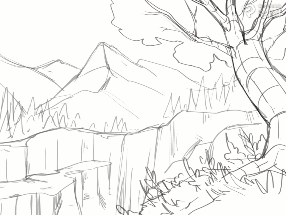
Sketch
Today we will draw a landscape of mountains and a waterfall.
1- We open a new canvas of: 1600x120 px
2- With a brush that we sit comfortably we will begin to draw, first as a reference divide the canvas in half horizontally
3- Below we are going to start drawing a rocky mountain, it is a line that creates a kind of Zigzag.
4- For the mountains, imagine that they are triangles (with a very wide base) the lines that make up the triangles are not straight, they are irregular and have many deformations, the more imperfect the better.
These triangles join together forming mountains.
To add volume to the mountains, draw a line from the top of the mountain to the bottom, in an irregular line that can go with a little Zigzag.
5- We added some elongated triangles to refer to pine trees, these will be at the base of the mountains, more than anything on the left and right edge, to leave the waterfall area without pine trees behind
6-We draw the tree.
To do this, we visualize that the trunk of the tree is made up of a cylinder, a cylinder that is not completely straight, but rather its base is wider.
For the branches and the root it is the same, they are cylinders, which at their birth point are wide and as the end approaches they become thinner, remember to use irregular lines! That is a constant in landscape drawings!
I usually make reference lines after drawing the trunk to keep its volume in mind.
If we want the tree to look more interesting, instead of making the trunk straight, we can make a line that goes in a soft zigzag (or as exaggerated as you want), and arrange the cylinders based on the line.
Then we will add the cylinders of the branches and roots, and then make the lineart
The branches are the same as the trunks, cylinders with a wide base and thin tip, this branches, pardon the redundancy, into smaller and thinner cylinders, to make your twig look more dynamic, apply the idea of making the lines irregularly.
Using that same logic, I drew the tree in the drawing, the base where the tree is located takes up approximately half of the canvas.
Then for the leaves of the tree, it is a fairly simple line, you outline curves with indentations, as if it were a somewhat flattened cloud, and it is good that they are in the areas where the tips of the branches are.
As for the grass, I used strokes that form small points, something quite simple and I made very simple small figures of plants, all this vegetation make it as simple as you want since we are going to redraw this.
This way the sketch is ready! I added a few more details on the rocks on the sides of the waterfall, please ignore that as I will delete it later!
Atmospheric perspective
How exciting, now the good stuff is going to begin! I would like to briefly introduce you to a very important concept for any landscape drawing: Atmospheric perspective
This is based on imitating how the atmosphere affects the appearance of objects as they move away from the observer. Elements further away look paler and with less detail, while those closer look sharper and more contrasty.
To apply atmospheric perspective in our drawing we must:
Divide the landscape into depth planes: foreground, middle plane and background.
1) Foreground: The elements closest to the observer, which usually occupy the bottom or central part of the drawing. They should have more details and contrasts.
2) Medium plane: The elements that are at an intermediate distance. They have less detail and softer colors than the foreground.
3)Background or distant plane: The furthest elements are usually at the top or ends of the drawing. They have less details, duller and more blurred colors, and look smaller.
With this clear, we are going to take a tonal value scale to begin applying it to our drawing, in the foreground we start with the darkest, as we get to the background the values become clearer.
If you need to add more values to your scale feel free to do so!
Note: Create an individual layer for the value you use.
Now comes one of my favorite moments, choosing the color palette! For this we will use the Gradient Map tool!
If you are new to this tool, don't fear, it is very intuitive, the tool replaces the colors of the original image based on the hue or brightness value of each color. Each color in the original image is replaced by a corresponding color in the gradient, based on its position in the gray scale.
The darkest colors of the image become the darkest tones of the gradient, likewise, the lighter ones become the light colors of the gradient.
The light ones are on the right side and the dark ones are on the left
We can create our own gradient, however the advantage of clip studio paint is that it has pre-made gradients and you can even download some in the assets!
In this case we will use one that was already default, its name is “dawn (purple)”, I moved the colors in the gradient to my liking, I invite you to do the same.
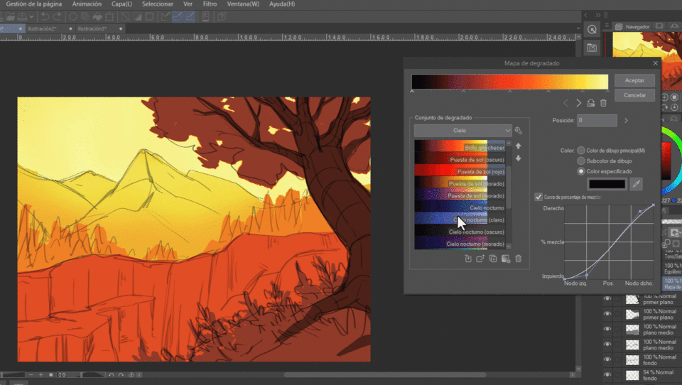
+ the gradient map is going to create a layer, let's duplicate the layer and wash and apply it to each of the layers that we created when we painted our value scale. There should be 6 sketch layers.
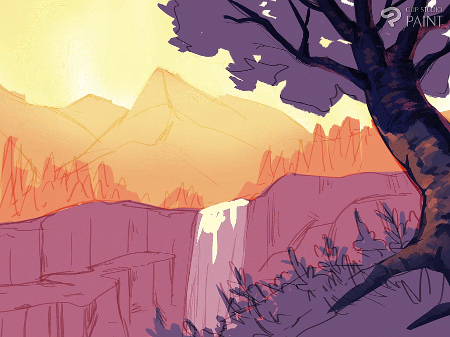
We put the layer where the sketch is in “overlay” blending mode, so that it integrates better with the new colors of the drawing.
To make the waterfall, on a new layer, which we will place at 52% opacity, we paint the waterfall with white, simply a rectangle, on another layer with a light yellow color (HEX: FFFAD7) we are going to make small strokes alluding to that There is the illuminated water.
Foreground
Before continuing, we are going to establish that the sunlight comes from this direction, and based on this we will do all the shading. In this case the light comes from the upper left side of the canvas.
Tree: Trunk
1- We are going to draw the shadow that the leaves generate on the trunk
We create a new layer, in overlay blending mode, with a blue color.
2- Now we are going to apply light, new layer, with a light color, in this case I took an orange, I began to place the strokes on the left side of the trunk, since that is the direction that the light comes from, the strokes follow the volume of the trunk.
3- Shadows, new layer, with a fairly dark blue color we are going to start placing shadows along the trunk, branches, etc. Whatever brush you use, lower the opacity a little, always following the shape of the trunk and on the right side since that is where the shadows are being generated. N
With that dark color we also make details on the left edge to better define the shape of the trunk.
4- We also added a soft, dark gradient at the highest part of the branches and the tips of the roots.
5- Add a somewhat saturated fuchsia color, in areas of the tree where they are darker: the side of the trunk and branches closest to the right, in addition to placing details on the trunk branches with that same color to give it three-dimensionality.
6-Details, check your lights and shadows and add the details that you think are missing, a little more light, or definition in the strokes, whatever you consider correct. In my case I added small strokes to better define the volume of the tree.
7-Branches, add more twigs that are distributed where the leaves are. For them, use the two darkest colors of the trunk, two blues.
Tree: Leaves
To draw leaves on the trees I separate them into two parts: the “front” and the “back”, in the front are the leaves that overlap the branches, and that is where the light generally reaches more strongly, In the back is where I place the shadow.
A super simplified way to make tree leaves is:
1- -Define your “back” side and assign it a color.
2-Define your “forward” side and assign it a color.
3-Now to the layer where the “back” part is, you add light (according to the direction the light is coming from) generally the light reaches the top of the leaves.
Putting it into practice in a drawing:
1- We add color (a dark one) to the “back” part.
2- With a lighter color, we make the leaves that overlap the branches, these follow the direction of the light (this is the “forward” part).
3-We add shadow to the “front” leaves, a slightly darker color that we used for those leaves, but not as dark as the shadow on the “back” part.
4- On a new layer, in overlay mode, with one or two light blue colors, we make several strokes on the “back” part so that it does not look flat, play with the opacity if necessary in this step .
5- We add the light at the top of the tree, so that the light affects both parts of the leaves.
And ready!! I added the shadow on the trunk, and a gradient map to give it a little more autumnal look.
Returning to our drawing, let us keep in mind that in this particular case, since we are seeing the leaves of the tree from a low angle and that the frame does not show the complete tree, we are going in the drawing more than anything for the “ behind” or shadow, and that the leaves that overlap the branches are not going to be many for the same reason.
1- Our shadow space is already defined, so now we are going to define the “forward” leaves, we place them in the upper left part of the leaf area, and only overlap branches on that side. This using a desaturated fuchsia color.
2- With a new layer with the overlay blending mode we are going to make leaf strokes, the colors we will use are the same tone of fuchsia and with a purple. (we lower the opacity to 41%)
3- We are going to arrange the edges of the back leaves, without forgetting to leave small “gaps” between leaves.
4- Again with the same fuchsia that we used previously, on a new layer with the overlay blending mode (opacity: 55%), we are going to make strokes on the edge of the leaves.
5-We are going to place the shadow of the front leaves
6-Finally, we add some lighting on the edges of the leaves, in my case I used a fairly light orange, add the light in a normal one (layer 1: normal 86% opacity) duplicate it, and lower the opacity to 19 % and then put it in Add blending mode.
Lawn and vegetation
How I draw grass and vegetation is quite simple:
1- In the area where we are going to draw the grass we are going to make elongated strokes that overlap each other, use at least 3-4 colors, preferably analogous, play with their luminosity as well as the opacity, so that you have a variety of color.
2- We are going to unify the colored spots with strokes that resemble grass. The strokes are right on the line where the spots meet, the trick is to overlap the spots with these strokes.
3- put loose strokes with different colors than the spot you are painting.
4- if you want to go further, you can make other types of shapes for the vegetation
Don't worry about the details, just the silhouettes. You can do this manually or with a brush!
5- If you want to add flowers, just make the silhouette of the flowers, or even small dots of color (you can also put a dot in the middle).
I usually add several flowers together, never alone, I usually add at least 3.
Back to the drawing
1- I made the spots with different colors, and erased the edges that were there before since I am going to redraw them later.
2- I began to overlap the patches with basic strokes to imitate grass and added some brush details.
3- I started drawing silhouettes of vegetation, with different colors, which overlap a little with each other
4-I continued adding more silhouettes of vegetation, varying the colors as well as their saturation and luminosity.
**NOTE: I turned the lighter colors (oranges, yellows) to the left since the light comes from that direction, the blues and purples are closer to the right.
6-Add a couple of flowers on the lawn
Medium shot
Remember that in this shot, what we see is already beginning to lose some contrast and sharpness, which makes it less detailed than the first shot.
Rocky Mountain
1- We are going to change the original color of the mountain for a slightly darker tone.
2- We are going to draw the light part of the rocks, we will draw irregular figures that do not have pronounced curves, without or have curves better.
We will use a lighter color than the mountain (but not with too much difference in terms of luminosity). Let yourself be carried away by your imagination to make the shapes, tilt them and make indentations, try to avoid completely straight lines.
The shapes should fit together like a puzzle, although don't forget to leave negative spaces, this space will act as a shadow.
Also, when adding the figures in the upper part there will be more because the light reaches better, and they will be closer together, in addition the figures will be touching the upper edge, however in the lower part there should be fewer figures and on the contrary they will be more separated.
3- define the shape of the rocks better, draw lines that cross it, place some soft shadows, and define the edges if necessary.
4- Define the edge of the rocky mountain, create new crevices and reliefs according to what you already have drawn.
5-Now with a somewhat bluish desaturated color, we are going to make a couple of strokes that act as the shadow of the rocks, be careful, just a few strokes and always vertically. We also added with the same color, on a new layer, a soft gradient at the bottom of the rocky mountain.
note: with a clipping mask I removed some of the rock at the bottom left as I had placed too much on that side, I preferred to leave that negative space as it subtly guides the eye towards the waterfall.
6- Finally, with a light orange you can add a little light, using an overlay blending mode or another luminosity mode, I used an opacity of 40% on the layer.
I placed the light near the waterfall to guide the eye to that point, the area where the light is is on the top edge and some rocks around the waterfall where some light reached.
Waterfall
1- This is the waterfall we currently have.
2- On a new layer we are going to make line strokes from bottom to top, make sure that the strokes have a thin tip at the end.
3-Change the strokes we made in the previous step to a color a little darker than the waterfall. Add light yellow to the light of the waterfall at the top of it, and some strokes in the middle.
4-Add on a new layer with the overlay blending mode, a stroke with a soft edge around the waterfall light, using a light orange.
5-With the finger tool we are going to move (a) from bottom to top in the shadow, and (b) from top to bottom in the light.
Ready!
Bottom
Remember that this plane is identified by being less contrasted and having little detail, so what we will draw we will try to do in the simplest way.
Pins
To tell the truth, this is one of the easiest parts, since they are very simplified pines and we will use the help of a brush!
1- We will delete the reference traces that we made before
2- Now with the brush we are going to start placing pine trees, we will use 3 variations of colors, mainly a light orange (the one we had originally), a darker orange and a yellow
The brush will do a lot of the work, the truth is, it is very useful.
Activate the “mix colors” box on the brush and it will give more color variation!
The lighter/yellower colors go to the left.
3-Finally, we add one more purple color on the right side, and they will be ready!
Remember not to make too much contrast in values with the colors you use!
Mountains
When making mountains, keep in mind their volume. I recommend that when drawing them you make a line in the middle (in a zigzag shape) and that is how you divide the mountain. According to that line you can make the volume of both. sides, and according to where your point of light is, create the shadow.
The mountains usually have very marked shadows, and in the light part we add shadow details, since there is relief in the mountains. If it is completely smooth, something strange may appear in the drawing.
1-Identify the light source (upper left) and begin to color the most illuminated part of the mountain. With a soft yellow, without creating too much contrast, remember that we are in the background.
2- We are making strokes with a slight color variation between soft yellows and oranges for the shadow, the strokes follow the relief of the mountain.
3-Add a desaturated orange on the edges of the mountain closest to the right and on the mountain behind, at the top so that it is better distinguished from the mountain in the middle.
For heaven the truth is quite simple
1- unify the sky with a soft and light tone, and at the edges add a soft gradient with a slightly darker tone of yellow.
2- draw a silhouette of clouds, in 2-3 colors, the lighter colors in the center and the darker clouds at the edges, but remember they are still light tones.
And ready! This is how our landscape looks, thanks for following the tutorial <3
Users who liked this post


Comment