From 0 to 100 Learn to make vignettes in clip studio paint!
Do you want to try making a comic or webtoon but are you afraid of the vignette tool? Fear no more, this tutorial is perfect for you!
My name is Stefani and in this tutorial I will be teaching you tricks that you can use for your comics with the clip studio vignette tool~
Basic 101
Introducing the Vignette Tools
The bullet works as a sort of window or frame that restricts visibility to only what is contained within its folder.
Where are they?
Clip studio vignette tools are classified into:
●Creation tools
●Division tools
Another tool that will be our ally is: “Object”
Creation Vignettes
● Rectangular vignette
To create a vignette like this, we are going to make a clip on the canvas where we want the vignette to start and drag, when we release it it will be ready!
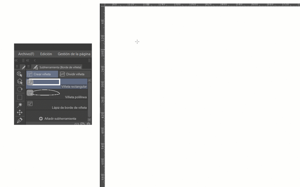
If we open the “sub tool details” window and go to the “figure” tab we will find that we can change the figure of the vignette to an ellipse, polygonal or leave it as a rectangle.
I recommend you activate this box with your eye, and it will appear at once in tool properties.
You can do this with almost any option within the “sub tool details” menu if you consider it more convenient to have it in “tool properties”.
Returning to the Figure tab…
If we have rectangle selected, in that same menu we see that we have the option to modify whether we want rounded corners or not.
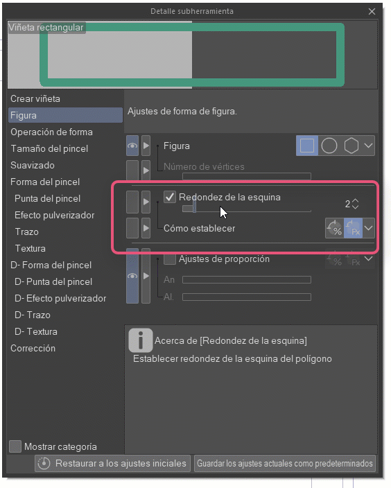
In polygons we can also round the edges.
However, the most interesting option is that we can choose the number of vertices of the polygon.
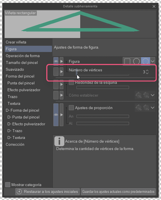
And finally there is the “proportion adjustments” option that is found in all the previous figures.
Note: if you want you can use the “shift” key when making the vignette and this will make the figure proportionate equal width and length.
Also remember that in proportion adjustments you can play with the width and length, they do not have to be the same.
● Polyline vignette
To create a vignette like this we will click where we want to start and after clicking on click we will make the shape of the vignette, to close it we return to the starting point.
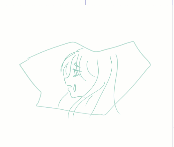
Another way to close the bullet is to press the “enter” key, keep in mind that where the cursor is will create a control point.

Good news! We have more options apart from straight line, we can choose to use continuous curved lines (Spline) or quadratic and cubic Bézier curves, for this we go to “tool properties” and go to “curve” there we can choose the one we want.
Personally, the one I use the most is cubic Bézier, I feel that it has the best of both worlds since it allows me to change from straight lines to curves easily.
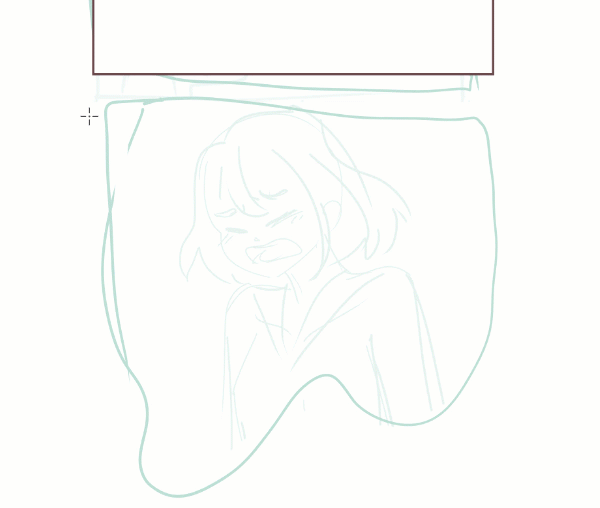
Keep in mind that if we use the “shift” key the lines will be straight and if you use the “Ctrl” key you can modify the curve and position of the control points.
If you want to modify the vignette when it is already closed, all you have to do is click on the vignette line with the “Ctrl” key pressed and we can edit it. This works with any bullet, not just those created with “Polyline Bullet”.
Note: you must leave the “Ctrl” key pressed while editing, and when you finish making the changes, release control and that's it.
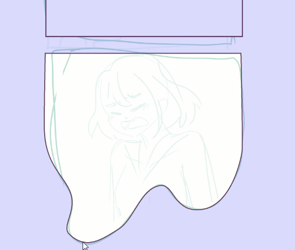
●Vignette border pencil
This tool is ideal for these more creative and irregular vignettes, since it allows us to draw it by hand as if we were using a brush. However, it must be a continuous line, otherwise the vignette is closed.
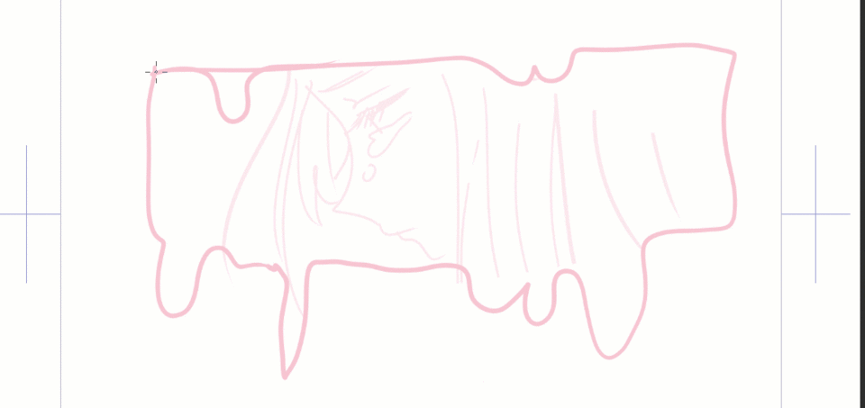
Continuous line:
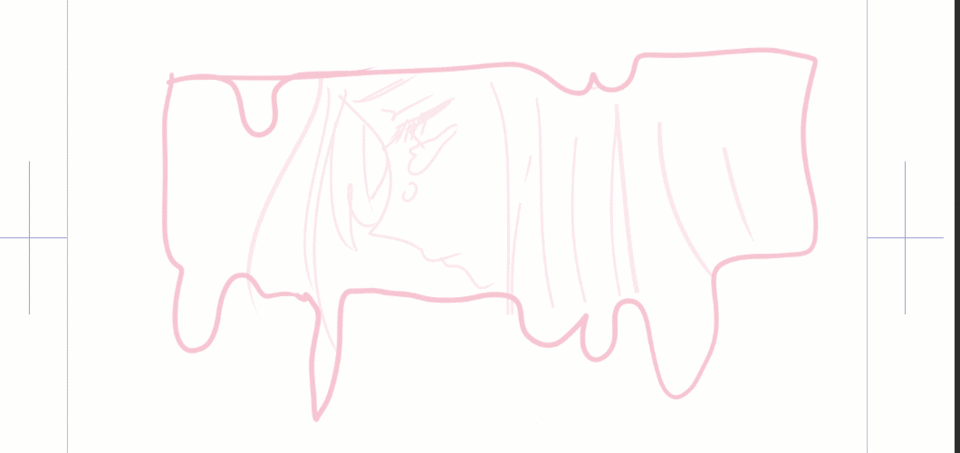
If you want the line cleaner, I recommend adjusting the “post-correction” option and also the “stabilization”. We find them under “tool properties”.
Stabilization does not appear in “tool properties” by default we must activate it, you must open the “sub tool details” menu, there you go to “Correction”, where it indicates “stabilization” activate the little eye.
Basics of vignette creation tools
The vignette creation tools share many attributes/options in common, join me to tell you which ones I consider the most useful.
1. The multiverse of folders
When creating a bullet, by default a folder with a clipping mask (in the shape of the bullet) is generated. Inside this folder, there are two layers: one raster and one background.
Note: we can change the color of the background layer with a double click.
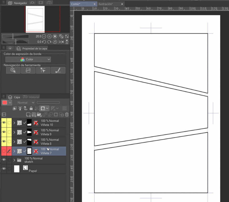
Depending on how you feel most comfortable or what type of interaction the bullets have, you can have a folder for each bullet, so that they would act independently of each other, or you can create several bullets within a single folder.
Example of bullets separated by folder:
Example of bullets in the same folder:
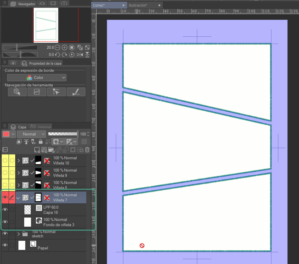
Managing the panels in this way is especially useful if what we are drawing needs continuity across several panels.
As I mentioned before, by default the option to “create new folder” is assigned, this as India the name will create a new folder for each bullet you create, but you can change it to: “add to select folder”, which will allow you in a single folder add more vignettes, you can find that within “tool properties” within any vignette creation tool (rectangular / polyline and pencil border vignette).
Filling the background when you create the vignette is optional. If you have a sketch that you want to draw on, it is more practical to have that option disabled to be able to see the sketch without any problem. You just have to remove the “check” from the “Fill inside” box. bullet” found in “tool properties”.
2. The world of edges
Visibility
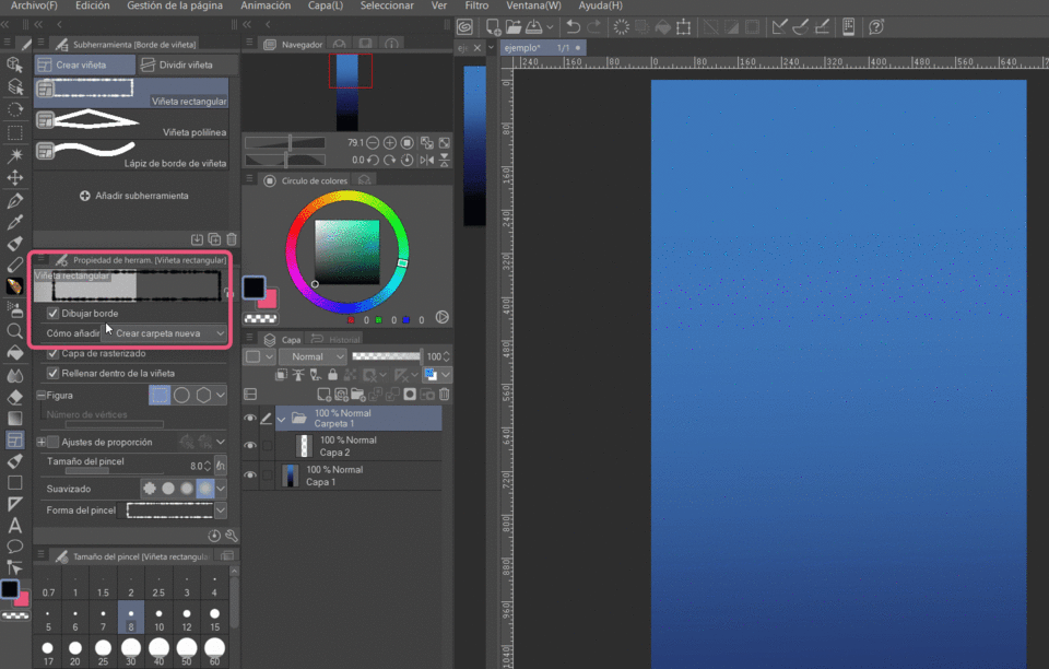
The visibility of the borders can be activated or deactivated when creating a vignette, using the “draw border” box, activate or deactivate it according to your needs, this is located within “tool properties”.
Even if the border of the bullet is not visible it works correctly by restricting the content within the bullet
Border size
You can change the thickness of the borders by modifying the “brush size” bar (within “tool properties”) or the “brush size” window.
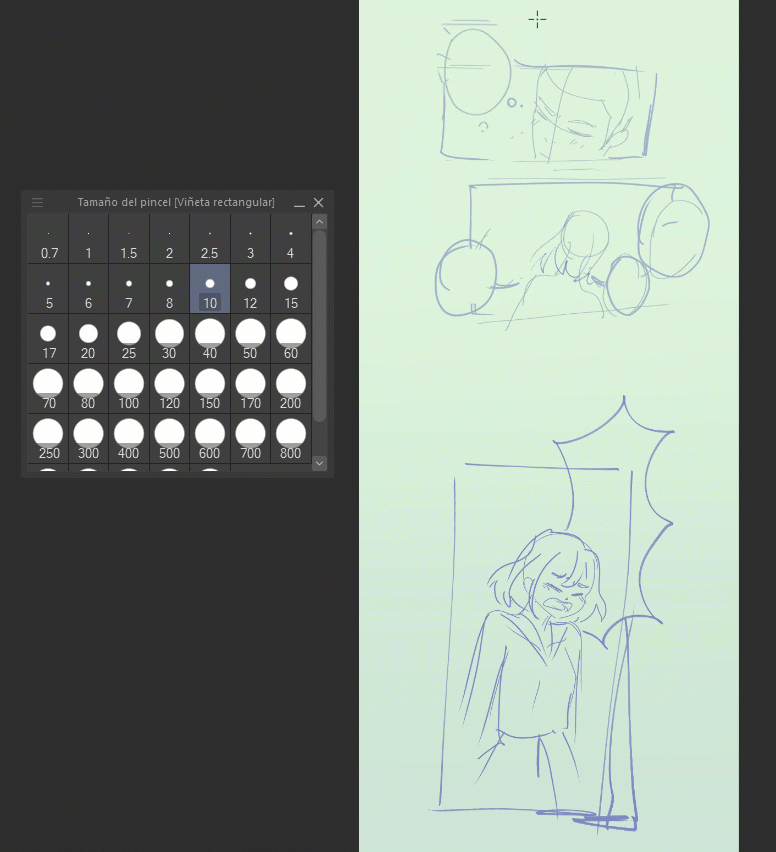
We can also choose the smoothing level of the border:
Under “smoothing” is the “brush shape” section, there if we display the panel we can see that there are many shapes to assign to our border.
We can make the border look more interesting and dynamic, let's go back to the “brush size” bar and click on the icon at the end, it will show us a small window. where you can activate a box called "Random" and also assign a minimum value. What this option will do is that randomly, for the sake of redundancy, it will change the size of the shape assigned to the vignette border.
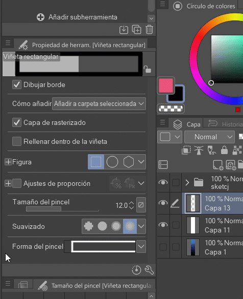
Here is a comparison of several forms:
Designing borders for vignettes (???????????????=
When we make the border of the vignettes not visible, (by unchecking the “draw border” box) get creative and manually draw the border
3. Modify your vignette
3.1. The power of Object
Remember how I mentioned that this tool would be our best friend? Well, here I tell you why.
It turns out that with this tool we can modify vignettes: we can move them, adjust their scale, rotate, change borders, etc. but we go step by step.
The first thing we must do is with the object tool touch the vignette folder or the vignette border on the canvas, this will show us options that will allow us to modify the border.
The white dot on the top edge allows us to rotate
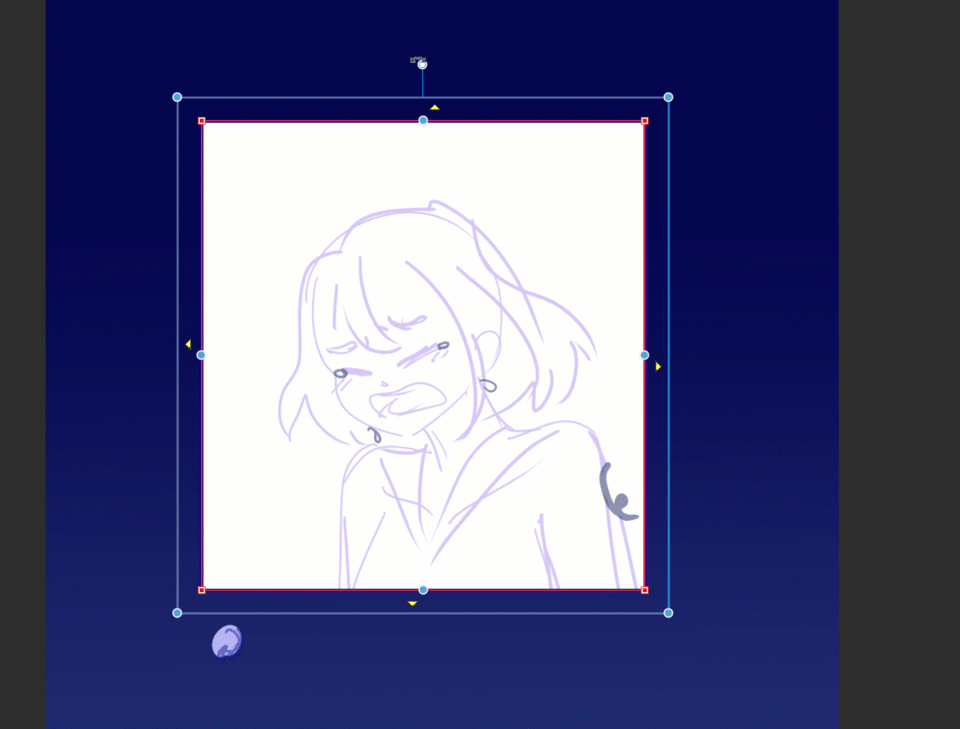
The blue dots inside the blue line allow us to change the scale of the vignette as we please.
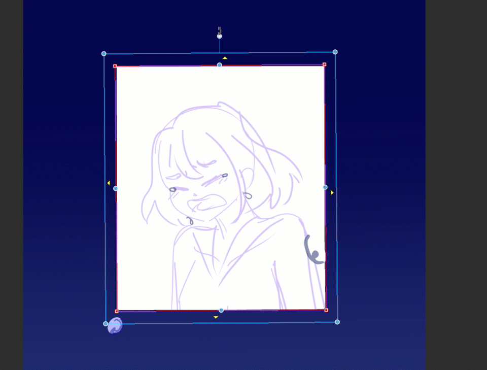
If we land on the blue line we can move the vignette to any part of the canvas we want.
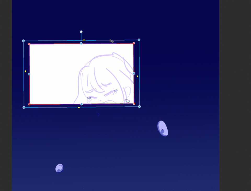
The blue dots on the red bullet line allow you to move the edges of the bullet, allowing you to change the scale in a more controlled way.
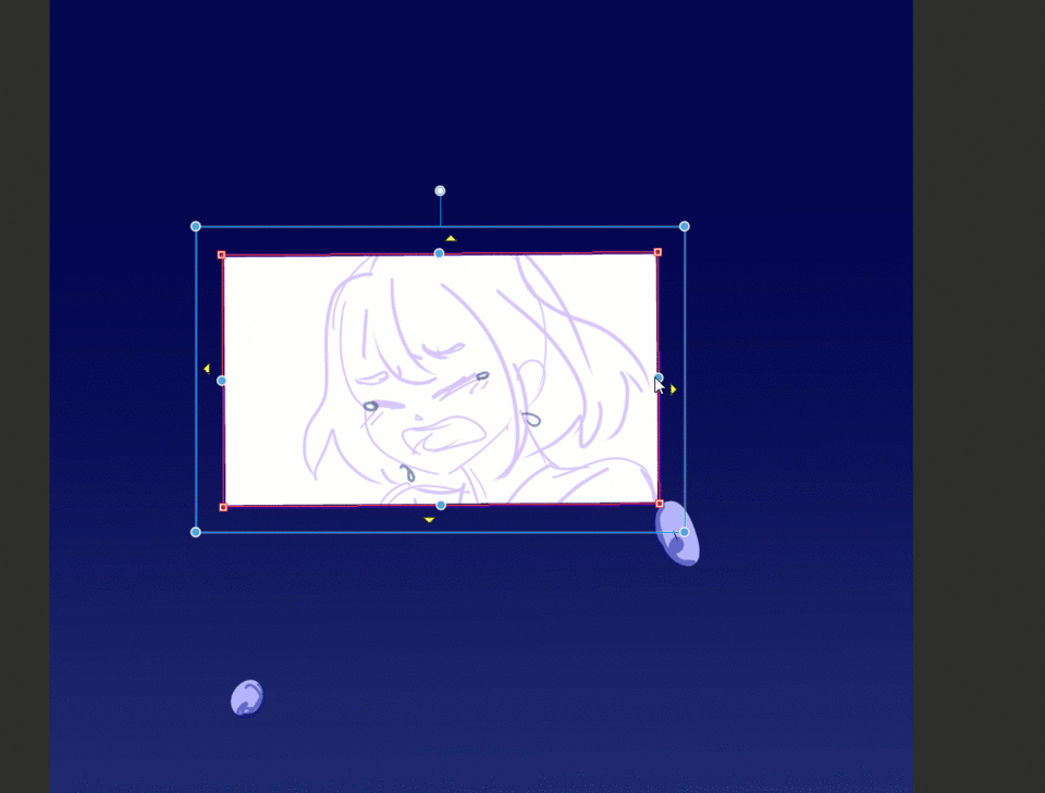
Additionally, if there are other bullets around it, the bullet will respect the space between them, avoiding any possible overlap.
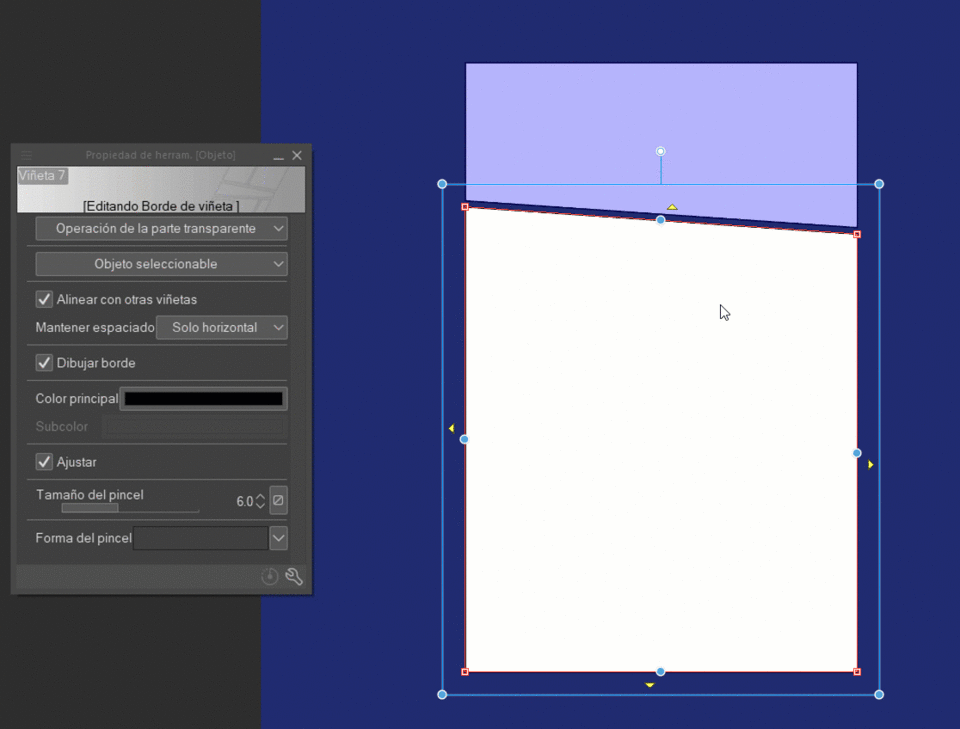
You can deactivate this if you wish: see tool properties (object), and where it indicates “maintain spacing” it displays the options and you can deactivate it, if you have not changed how it comes by default it will be in “only horizontally” mode ”.
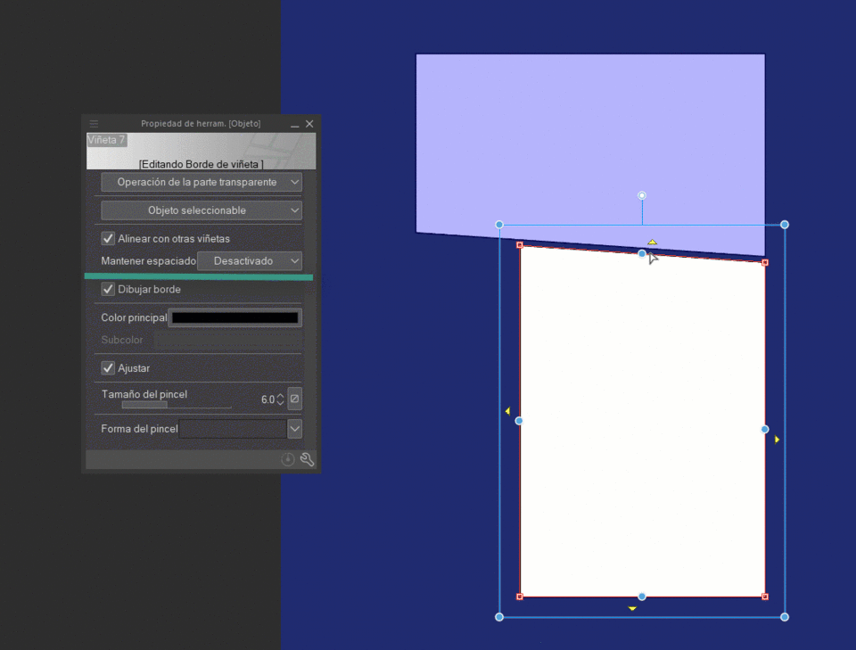
There is also the option to “keep all” so you will take care to maintain the spacing both horizontally and vertically.
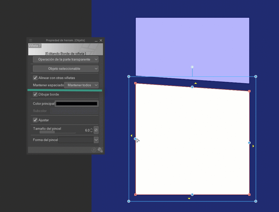
The red squares at the tips will allow us to change the control points of the border of the vignette, again, if we have the maintain space with “horizontal only” or “keep all” adjust the changes you make in the vignettes your surroundings.
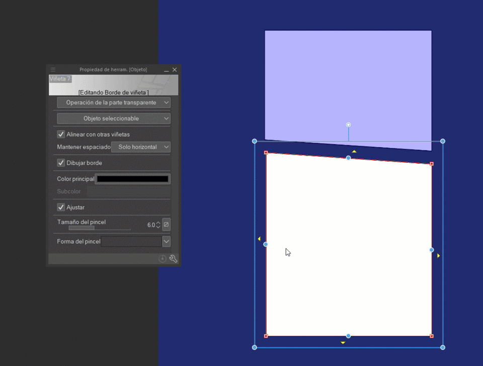
By default, the “Align with other vignettes” box is active, as its name indicates, it helps us align the edges and control points to the adjacent vignettes. I like that it does not restrict you if you do not want to align them.
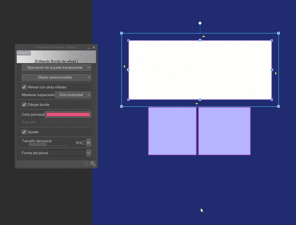
On the object you can also: Change the border color, the border size and its shape, you can even remove the border if you want!
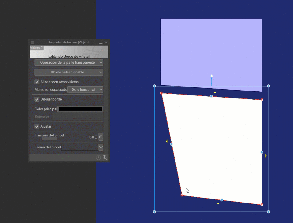
The yellow triangles on the edges of the panel allow you to move the edges of the panel until they overlap those of the surrounding panels. If there are no other vignettes, the vignette will stick to the edge of the canvas.
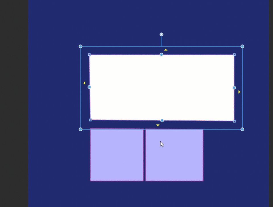
If you have several bullets in a single folder, when using “object” the same options will appear for each of the bullets, with the difference that the blue line and the blue dots will affect all the bullets.

We can modify the borders independently or as a group, depending on where we touch the border, if we touch the space inside the blue line we can modify several vignettes at the same time.
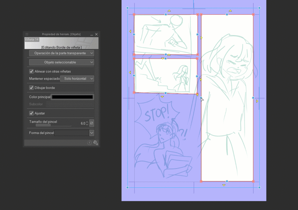
If we want to select a specific vignette we touch the red line, to avoid moving anything unnecessary I always deactivate the “maintain spacing”.
We can now start modifying our vignettes individually as we want.
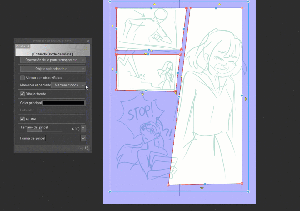
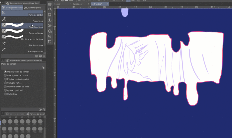
In the case of vignettes created with the tools: “polyline vignette” and “vignette border pencil”, the previously explained applies the same, on the other hand, I consider that depending on their complexity it may be better to use the “tool” line correction” there I feel that making certain adjustments is more comfortable.
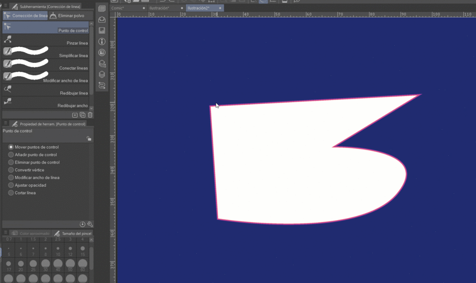
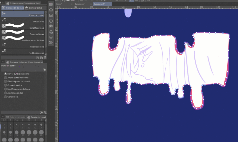
The ones I use the most are: move control points, add control points, delete control point and convert vertex.
Two other tools that I use a lot are “simplify line” and “redraw width”.
Bullet Split Tools
The two tools split the vignette but are approached slightly differently:
1) Split the bullet folder
2) Split the border of the vignette
In both, the division can be made into three different states:
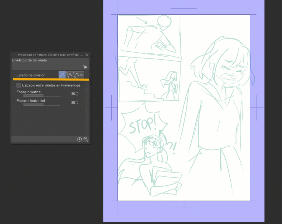
Divide with a straight line
We touch the part of the vignette where we want to start the division, by default it will be horizontal, if we want to make it vertical or diagonal, we click and hold and we give direction to the line, if you want it to be perfectly straight press the "shift" key ”.
When you release the held click, the division will be ready.
Split with polyline
First we touch the point where we want to start dividing (we do not need to leave the click held) with each click you make a point will be made from which it will allow us to rotate the division line, to finish, we press the “enter” key, and it would be finished the division.
Divide with spline
This division state is similar to the previous one, we click where we want to start and then where we want to create a curve, when we are satisfied we finish the division with the “enter” key.
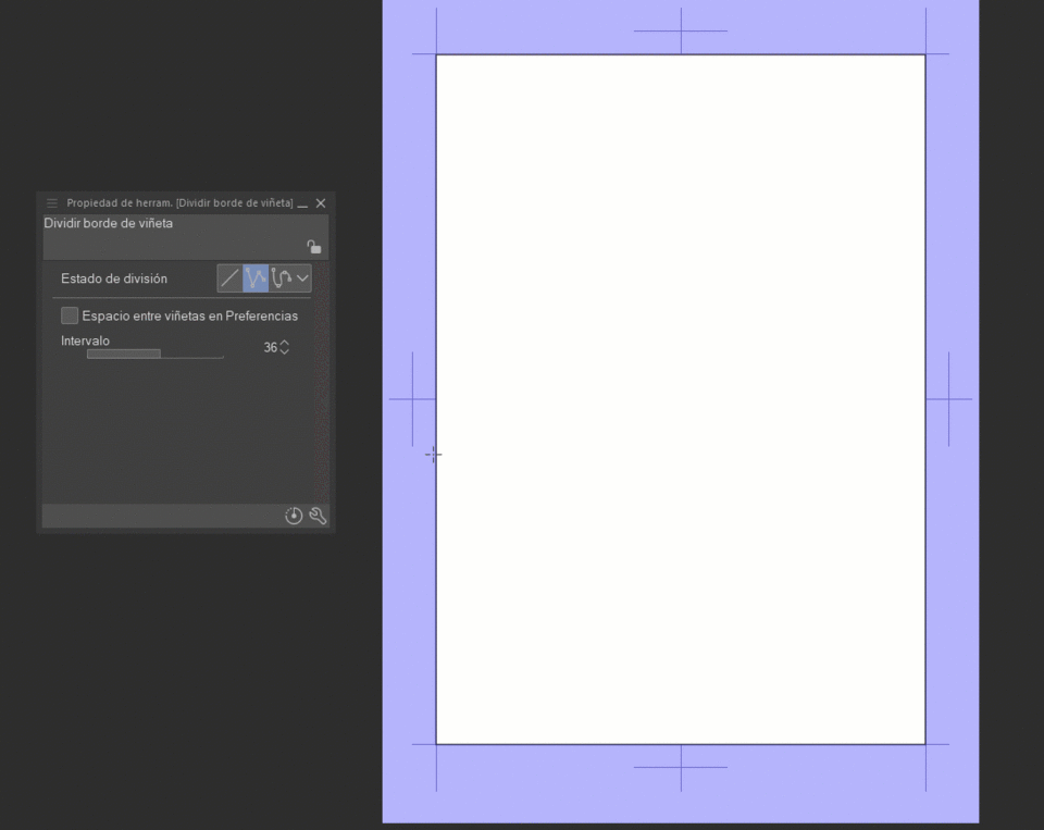
Both tools allow us to change the space in the divisions both vertically and horizontally.
Dividing with a straight line allows you to change the space vertically and horizontally. In the case of division by polyline or with spline it is a single interval for any direction.
Both tools allow us to change the space in the divisions both vertically and horizontally.
As mentioned before, the biggest difference in both tools is that it is split, in the “Split Bullet Folder” tool you have three split methods:
1- Divide the folder and duplicate content.
2- Split the folder but this new folder is empty.
3-The folder is not divided, but rather the bullet edge, and the parts remain inside the folder.
Templates that save the day
If you're a bit short on time you can always use a template! Clip Studio has many pre-made comic/manga templates to choose from.
You just have to go to: File > New > Select any of the comic canvases (except the webtoon one) > activate the template box, when you activate it, a window will appear with the options so you can choose the one that works best for you, click “ accept, and that's it.
If the box does not appear, click on the button next to the box and the menu will appear there.
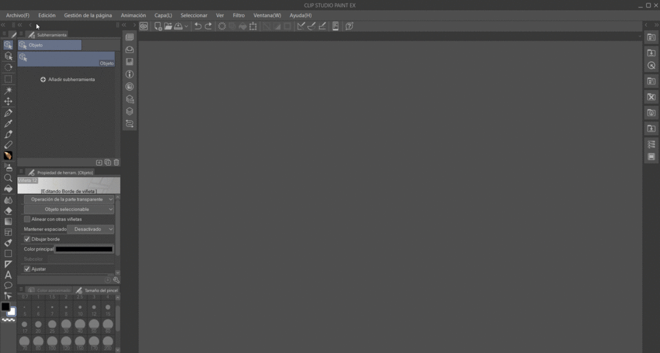
I usually use the basic template of a frame and start working there.
I recommend having the configuration of your canvas clear, since if you make a comic the size of the canvas and the margins must be the same for better harmony. When I make comics I do it for the web, so my ideal resolution is 72 dpi and depending on how detailed I want the comic and its content, I usually choose between A4-A6 size and the basic template.
Put what you have learned into practice!
Now you know everything you need to create vignettes, I invite you to put it into practice! Remember that each artist has their creative process and their way of doing things, I invite you to practice and discover yours.
If you don't know where to start, I usually follow the following steps to make comic panels:
1- create your canvas (you can use a frame template) or place your base template. Guide yourself with your sketch to get started.
2-divide the sections of your page:
first the largest divisions and then the smallest.
and that's it, now you can draw your comic without a problem!
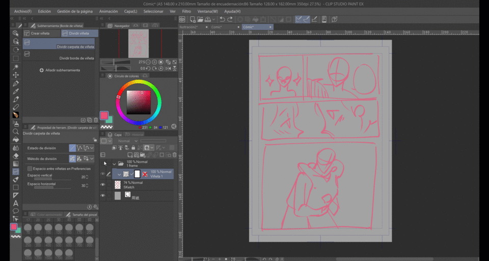
Depending on your tastes, and the type of composition that the panels of your comic have, you can create your panels without using the tools to divide panels as much as it is your choice.
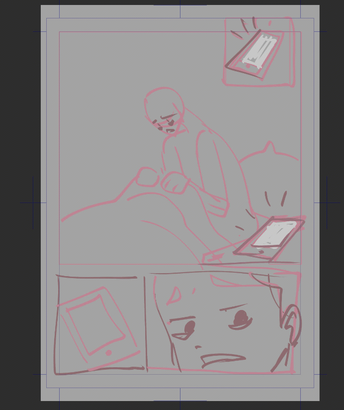
Improve how you tell stories with your vignettes.
Now that you know how to create vignettes like an expert, I'll leave you some tips so that you can make the most of what you've learned and tell your story as clearly as possible!
Reading flow
The speed at which your story unfolds can be controlled through the size, layout, and amount of detail within each panel. By varying these elements, you can create a sense of rhythm and cadence that enhances your storytelling.
Remember to define if you want your comic to read from right to left or vice versa, and always maintain that direction throughout your story, since changing the reading direction of one or more pages can be confusing for readers , understanding how the reader will perceive the page and making it as easy as possible will make your pages pleasing to the eye and easy to read.
Use small panels for quick actions
Small panels tend to be read more quickly, the eyes spend less time on them. These are best used for quick actions and inserting panels. Many of these small panels together can give the impression of a brief succession of small actions.
Use large panels to emphasize and slow down the pace
Adding a larger panel would cause the eye to linger on this larger panel for a longer time, so we can use this to show landscapes or give emphasis to an action/event that we want to have a slower pace.
If you are doubting whether a page is easy to read or not, show it to someone you trust, your comic page, without drawings, if you want only the speech bubbles, without dialog, ask that person Have it read in the corresponding reading direction and see how easy to follow your bullet layout is.
The power of dialogue
Use speech bubbles strategically to guide the reader through your comic to create a fluid, readable experience.
To do this, we take into account how we want the reading order to be and we work based on that. You can use the speech bubbles to indicate which box is next.
Dialogue placement can help improve reading flow
draw a line of how you want your vignettes to read and then place the bubbles and dialogue following that same line, you will not always be able to guide the flow in this way but it is something that but when you can apply it do not hesitate to do it, that way This way you can contribute to the reading flow.
I remember not to make the dialogue complicated to read and to follow a logical order.
Final
Thanks for making it this far in the tutorial! I hope it helps you, it was great to do it! See you in the next tutorial!


Comment