✨👾 Galaxy Monster Tutorial 👾✨
Welcome to my tutorial where I will explain the techniques used in the thumbnail's art work!
All of the brushes and materials used in this tutorial are Clip Studio defaults!
📝 Sketch Design Process 📝
Starting my drafts I had two goals in mind:
1️⃣ make it cute
2️⃣ have a geode/rock inspired design
Taking inspiration from real life things help creature designs to be relatable. If the design is not grounded, and has no basis in reality, it won't have as much of an impact. On the bright side, we can exaggerate real life elements to create something supernatural and magical.
My real life inspiration were rocks. I gave it a human element with big eyes in proportion to head size. We are programmed to find big eyes cute, so it's useful to take advantage of that in your art to evoke emotions.
⭕ Each Section of the design was done on a different layer and with a different layer color. This helped me to make new variations of the design and non-destructively edit them.
Some of the most eye-catching creatures are creatively fused with the mundane. My geode head creature was inspired by squids. Most monsters are a combination two or more elements to create something unique to the viewer.
⭕ Decide on your strongest design with thumbnails.
Put all of your design variations on one canvas, and pick the one that resonates with you the most.
Rough Sketch to Grayscale
Step ①: I complete the rough sketch of my creature design.
Step ②: I clean up the linework and make a white base layer covering the creature's body, using the fill tool and g-pen. I also use the gradient tool for the background.
I like to start paintings in black in white to firmly establish values. This method will allow me to freely customize the color of this character later with color blending mode layers.
Using the color slider on HSV with the saturation at 0%, I slide the value bar to get my desired grey. I use transparent and opaque watercolor for painting, and the blend tool to smooth out values.
Step ①: I start off with using transparent watercolor from the top of the head on a new layer, clipped on top of my white base.
Steps ②-⑤: I use the transparent and opaque watercolor to define values. Occasional use of blend tool to achieve smooth transitions of value.
🖍️ Coloring with the Color Blending Mode🖍️
The best blending mode for coloring monochromatic art is Color. It keeps the black and white values of the base layer while taking the color of the blend layer.
Steps ①-②: Using the color blending mode on a clipped layer I paint a blue wash with the opaque watercolor, and purples with transparent watercolor. Most of the values were already done with on the black and white stage. To make dark areas more interesting, I paint them with greens or a deep purple.
Step ③: I use the glow dodge blending mode on with any light color and watercolor brush to create highlights.
Space Slime 🍞🥓🍞 and Gradient Map Sandwiches 🥪
What's a monster without powers and special effects? 👾⚡
To make the space slime effect we have to make a 3 Layer Sandwich. As shown on the below image. Note that the upper 2 layers are clipped to the bottom layer.
🍞Top Layer: A Gradient Map
🥓Middle Layer: This is the layer you will be drawing on for the effect!
🍞Bottom Layer: A Black Layer on the Screen Blending Mode
Time to build this sandwich. Below image shows how to locate the gradient map function.
This is the gradient map I will use for this painting. It looks weird now, but when clipped to the black screen layer, the gradient will not affect your entire canvas. 🥪 It will only affect what you paint in the sandwich. 🥪
⚠️Important Note!: Make sure the left end of your gradient map is ⚫black⚫, and the right end is ⚪white⚪. If you don't do this, this gradient effect won't work! Feel free to put whatever colors you like in the middle.
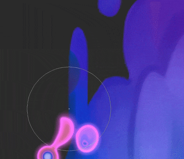
Step ①: Now it is time to start painting the jelly. I like to use a soft or hard airbrush for the effect. This has to be done in pure ⚪white⚪ to get the most of out this effect. This airbrushing is done in the middle layer.
Step ②: When we arrange the layers of the sandwich in the correct order, the effect occurs.
Experiment with different colors and gradient maps!
The above image is the gradient map 🌟before you clip it into the sandwich layer structure.
The below image is the result of clipping it into my sandwich layer structure.
Here's what it's like to paint with gradients!:

✨ Eyes ✨
Since we're making a cute monster, I'm giving it big shiny 🔮eyes🔮.
Step ①: I like to start with a mix of light colors on a normal layer using the transparent watercolor. Then I create a multiply blending mode layer and use more light colors to darken the eyes.
Step ②: I use a light white on a Glow Dodge layer to brighten areas of the eyes.
Using another Glow Dodge Layer I use a several bright colors and small hard airbrush to create the 🌠star trail🌠 effect at the bottom of the eye.
Step ③: With another Glow Dodge Layer I use the running Color spray airbrush with a bright color at the bottom of the eye.
Step ④: Finally, I use more multiply layers to darken areas of the eye, and glow dodge to add specular highlights. The slight tinge of rainbow is covered in the "🌈 Rainbow Shine 🌈" section of this tutorial.
🌌 Galaxy Background 🌌
Step ①: Use a G-Pen and a dark purple to create a base for your galaxy.
Step ②: Using a material texture to mimic the effect of stars.
⚫Go to the Material palette, and open the Monochromatic pattern folder which is located within the Texture Folder.
⚪Select the Mortar material (or another texture) and drag it onto the canvas.
⚫Decrease the size of the material so that it appears more fine.
⚪Use the clip to below layer function so that the texture is only seen on our purple galaxy.
⚫Select the mortar layer, then open the Layer property palette and click the Texture combine icon. ⭕You could achieve a similar texture combine effect by setting the texture's layer blending mode to overlay.
Step ③: Use the spray air brush, and using a low brush pressure to paint the galaxy with dark saturated blue, pinks, and purples.
⚪Clip this layer and all future layers to the base layer.
⚫Set the blending mode to Add Glow
Step ④: Use the droplet spray brush with a very light white-blue.
⚪Then lower the [particle size] in the brush's settings to the size you want for your 🌟stars⭐.
Step ⑤: Brighten your droplet layer from Step ④ with CSP auto action Add glow.
⚫Go to the Auto Action Palette
⚪Within the Default set, play the Glow auto action
Step ⑥: Use the Hard Air Brush with various colors, like saturated blues, purples, greens, yellows.
⚫Paint it in small circles to making glowing stars.
⚪Set the blending mode to Glow Dodge.
Step ⑦: Use a large sized soft airbrush with various saturated colors.
⚫Set the blending mode to Glow Dodge.
Step ⑧: Use the transparent watercolor with a dark purple to shade around the ends of your galaxy
⚪Set the blending mode to Multiply
Step ⑨: Finally use a large sized white airbrush to brighten the entire galaxy. Paint with light pressure.
⚫Set the blending mode to Glow Dodge.
I repeat the above process for my background. However I use strokes of bright color on the glow dodge layers to emphasize the glowing of the stars. And I use blue and red multiply layers in the corners of the background for a fading to dark effect.
🌈 Rainbow Shine 🌈
Step ①: Use a pen to make white blotches of varying size.
Step ②: Use a blur filter
⦿We will use motion blur. It is found in the filter menu, It is found in blur section, of the filter menu, on the menu bar (as shown in the image below).
⦿It is important to adjust the angle function to get the rainbow rays in your preferred direction.
Step ③: Make a new layer and use the rainbow gradient on it. Then clip the rainbow layer to the blurred layer below. You can select the Gradient tool by pressing the shortcut "G."
⦿For the rainbow gradient use either the circle or rectangle shape with the "repeat" edge process.
Step ④: Use the Gaussian Blur filter on the rainbow layer to smooth it out.
Step ⑤: Merge the rainbow layer with the blurred layer. Now to attain a heavenly effect, change the blending mode to Screen.
The below image shows the above steps.
I repeat the process for my painting, however I use the radial blur for the rainbow streaks near his arms.
Motion blur is used for these eyes
Again I use Gaussian blur and change the layer mode to screen after merging the layers.
Now our rainbow light gives off a subtle effect.
🍭 Revisions And Color Swaps 🍭
Working in gray scale is convenient because now I have the freedom to experiment with other palettes. This is somewhat different from using a Hue correction layer because I can remap the color variations of this painting entirely, not just shift the hue. I paint in new layer with the color blending mode to try out different color concepts.
Additionally, I lighten parts of the grayscale layer and redefine shapes to achieve a stronger design. The rocky head portion of the design was flat in the previous iterations, so it needed more definition.
Final Image:
Thank you for reading this tutorial! 💕🙏
Please feel free to ask any questions about the process.


Comentario