Creative use of Masks: Tips and tricks
Hello everyone! in this tutorial, I will go through some general tips when using layer masks, and a couple of more fun and advanced tricks to use in our paintings, animations or for finishing effects.
I hope it helps!
Quick intro to Layer masks
Layer Masks are a really powerful tool to work in a non-destructive way because you can re‑edit the masks without losing the pixels they hide.
First, let's quickly review how they work:
When we create a layer mask, it appears as a thumbnail beside the layer.
■ The concept of masks is pretty simple, the mask is a grayscale image, the black parts hide the originals pixel while the white reveals.
▼ [1] Here i prepared a simple example illustration to review the basic mask operations. I have a tomato drawing in a separate layer. we are going to apply layer mask to this layer.
▼ [2] Lets create a layer mask. To do it we can click the icon to create a layer mask on the [Layer] palette, or go to [Layer] menu → [Layer Mask] → [Mask Outside Selection] (as stated on the manual If a selection is not created, the mask applies to the entire layer.)
TIP: if you press alt+click the layer mask icon it will create a black mask, so all the layer is hidden. this is useful when we want to hide all the image data and then reveal the parts we need.
▼ [3] Now that we created the layer mask we can use the Eraser tool (Shortcut E) or use any brush and paint with transparency (shortcut C).
IMPORTANT: First, make sure that the layer mask is selected, just click the layer mask thumbnail (a black border appears around the selected layer to edit).
■When painting with transparency we hide the layer, but the original pixels remain untouched.
To reveal the hidden pixels just paint with any opaque color.
■ Keep in mind that we can use any brush tool to paint with transparency on the layer mask as well as the filling tools, so please experiment with decorative brushes to achieve various effects.
▼[4] An example of the masking process. Pay attention that we don't lose any information on the original layer we just hide and reveal. (Non-Destructive Workflow)

NOTE: We can use Layer masks on all the layer types not only Raster.
This is especially useful when working with tone and fill layers, as well as images and patterns, and Correction Layers because we can keep the editability of these layer types.
If you want to learn more about layer types please read this tutorial. ▼
Basic operations | Editing layer masks
To Make working with masks easier let's List the basics operations we can do to the layer masks and also some terminology I will keep using during the tutorial.
■ Later I will show u examples of the practical use of these functions when working on some more advanced masks. I hope it makes sense.
Some basic operations:
●Delete: Select the [Layer] menu > [Layer Mask] > [Delete Mask] to delete the layer mask from the selected layer, or click and drag the layer mask to the trash icon on the [Layer] palette.
●Apply Mask to Layer: [Layer] menu > [Layer Mask] > [Apply Mask to Layer] to combine the layer and the layer mask together, this substracts the mask from the original pixels.
■NOTE: When we apply a mask to the layer it becomes a Raster layer, regardless of the original type.
●Move: We can move the mask from one layer to another by Clicking and dragging the mask on the [Layer] palette.
●Copy: We can copy a mask from one layer to another by ALT+Click & Drag the layer mask thumbnail on the [Layer] palette.
●Invert: if we press CTRL+I the hidden and revealed areas will switch.
●Enable / Disable Mask: SHIFT+Click the layer mask on the [Layer] palette or [Layer] menu > [Layer Mask] > [Enable Mask]
●Show / Hide Mask Area: We can show the masked area by ALT+Click the layer mask on the [Layer] palette or [Layer] menu > [Layer Mask] > [Show Mask Area]
■NOTE: To change the way the mask show go to [File] menu > [Preferences] > [Layer/Frame]
In the Mask Tab, it's possible to change the color and the opacity. I changed it to a 100 Opacity bright green to make it easier to see the mask area when editing.
●LINK /UNLINK: To link or unlink the Mask to the layer we can click between the thumbnails or go to [Layer] menu > [Layer Mask] > [Link Mask to Layer].
■NOTE: When Linked a check mark will appear between the layer and mask thumbnails on the [Layer] palette
■IMPORTANT: When unlinked we can Move and transform the layer and the layer mask independent of one another, this is really useful, I will use this on more practical examples later.
▼ In this example i unlinked the layer and the maks and then selected the original layer, not the mask, to move or transform (CTRL+t) inside the mask.
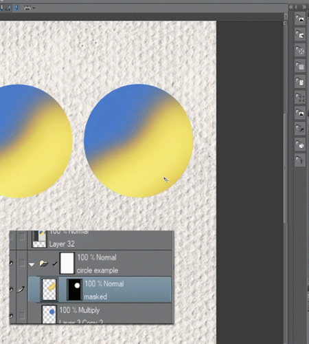
■Note: We can use Tonal correction on the layer mask by going to [Edit] menu > [Tonal correction], for example Tone Curve or Levels, to change the mask data. Also we can use Filters such as Blur.
Understanding Clipping masks
Clipping Mask are a fast way to mask a layer to already existing layer pixels.
■Note: For example, we can use clip masks to add shadows to hair on a separate layer, apply a texture or to color the lines.
Lets Test how they work:
▼ [1] in this example I have prepared separate layers, one for the lines, another for de solid color and a couple of layers to clip.
▲[2] I created another layer Above the Lines layer and then Painted some random colors with a big soft brush. When we clip to the layer below it will only show on the opaque pixels of the layer below, in this case the lines.
▼ [3] Lets clip the color layer to the lines, to do it we select the above layer and click the [Clip to layer Below] button on the [Layer] palette.
As you can see the color only show on the lines.
▲[4] I repeated the same steps for the solid color inside the circle but using a textured brush.
As you can see clipping masks are a nice way to add detail over previously painted areas without making a mask.
■Note: We can stack multiple clipping masks over the same layer. and we can clip Groups too.
Also, we can combine the clipping mask with a regular layer mask to keep refining the image.
Creative Use: Masking images into editable text
Let's combine some of the Basics concepts we just learned to apply an image into editable text.
▼ [1] here I prepared a simple editable text layer and an image texture. using mask we don't need to raster the image so it keeps the original data.
▼ [2] Then let's Clip the Image (Gold) layer to the editable text layer. First, we select the image layer and then we press [Clip to layer Below] button on the [Layer] palette, this apply the gold texture to the text.
▼ [3] Now lets further edit the image texture by combining the clipping mask with a normal layer mask. Let us create a layer mask on the texture layer and paint with a brush to hide some parts and reveal the text layer below.
■Note: To show the advantages of using editable layers I changed the color of the text layer to a magenta. This can be changed at any time without losing quality.
▲[4] Now i edited the gold texture. To do it first i unlinked the layer mask by clicking the check mark between thumbnails.
Then I selected the object tool (Shortcut O) to move and scale the image inside the layer mask.
■Note: We can keep making changes to the masks or the image, this is the power of Non-destructive workflow, so don't be afraid to experiment.
▼ Editing the unlinked Gold texture:
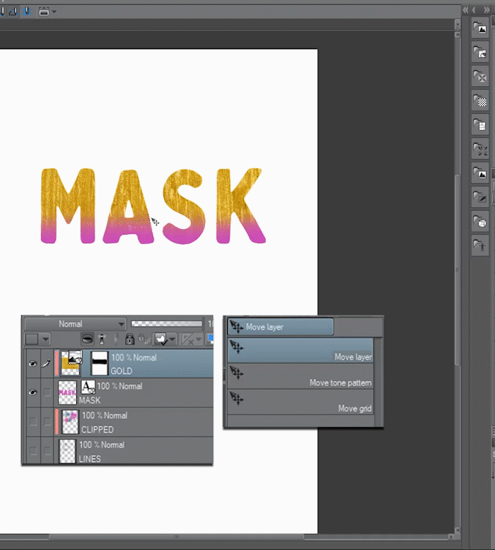
▼ End Result:
Masking and clipping differences: Blending Modes
When we work with clipping and masking we note that they behave in a very similar way, but there is a key difference when we use blending modes.
■Note: I will use blending modes in the practical examples but I will not dive deep on how they work because it goes past the scope of this tutorial. If you want to learn more about them please read this tutorial. ▼
▼ [1] To explain the differences I prepared two copies of a Blue Circle with a yellow layer on top.
In one of the circles, the yellow layer is Clipped while on the other the yellow has a mask.
To get the masked one, we create a selection based on the circle, to do it we can CTRL+Click the layer thumbnail or go to [Layer] menu > [Selection from Layer]. Then we create a mask with this selection loaded.
■Note: if we unlink this layer mask it will behave very similar to the clipped one.
▼ [2] Now lets set the Blue circles With the multiply Blend mode. here we can see the differences, when working with a clipping mask the yellow layer on top follows the transparency carried by the blending mode while with the masked one we retain all the yellow information.
▼ [3] Layer Folder and masks: We can use a Folder to organize our work but also we can use them for effects and production. They let us stack different layer masks to make more complex masking and keep editability on all of them.
■ For example, we can group a couple of correction layers, texture, etc and then apply a layer mask to the whole group to reveal only the parts we need. or use a layer mask on the group to define the boundaries we need instead of duplicating layer masks from one layer to another.
To create a layer folder we can click the icon on the [Layer] palette or for a more convenient way we can select the layers we want to and then go to [Layer] menu > [Create folder and insert layer] to create a folder and insert the selected layers inside.
■ TIP: I assigned the shortcut CTRL+G to [Create folder and insert layer] this way i can select the layers I want to group and then just use the shortcut.
Just treat the mask on the folder the same way as any mask.
Here I painted with transparency and a textured brush ▼
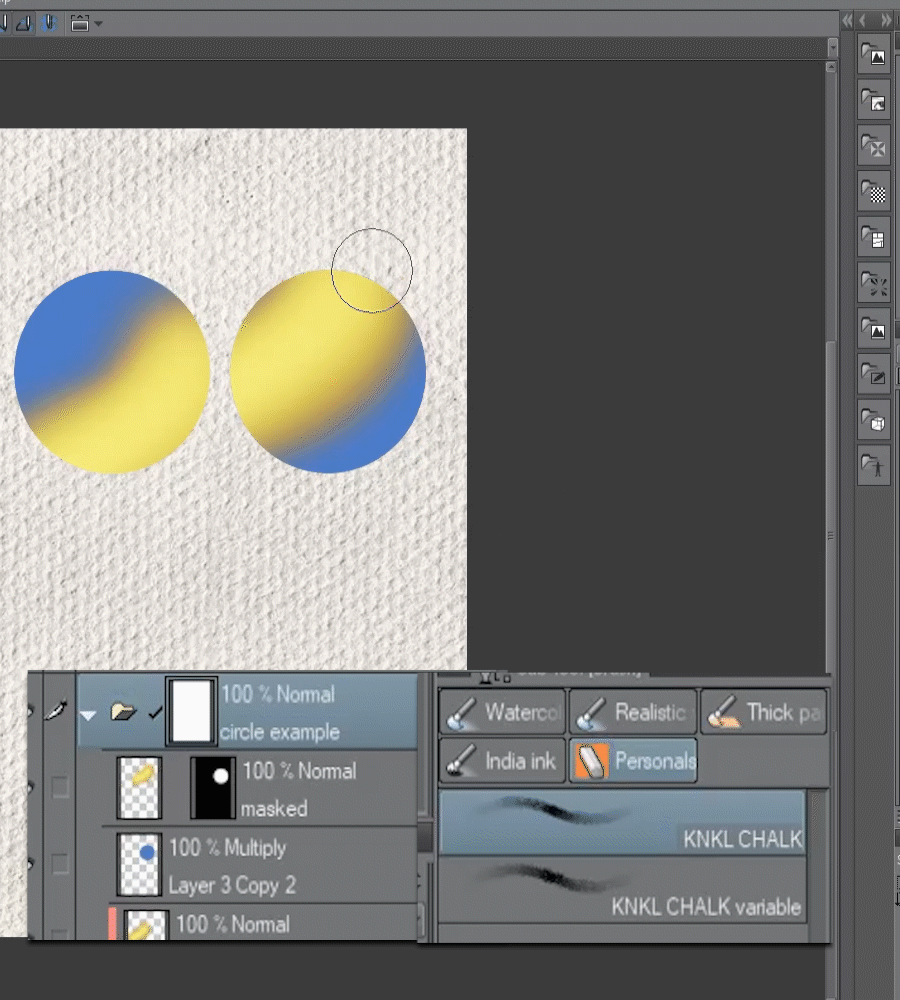
Quick Mask and Selection Layers
Selections are an essential tool for working in digital art. They are various ways and of creating them, just as the Lasso tool, Marquee tool or the [Auto select] tool.
One easy and powerful way of creating selections is by using the Quick Mask Mode.
▼ [1] To use the Quick mask just go to [Select] menu > [Quick Mask], it will create a [Quick Mask] in the [Layer] palette (by default appears as 50% opacity Red for reference)
▼ [2] Now we can start filling this layer with any fill or painting tool. I used the fill tool with the option to refer to other layers. When we paint with opaque color it fills with the default red, and we can erase it by painting with transparency

▼ [3] When we are done filling the areas we want to select, we go again to [Select] menu > [Quick Mask]. This will delete the Quick mask layer and turn the filled areas into a selection.
■SELECTION LAYERS: Now that we have a selection we can create a Selection layer to save it and reuse it later.
▼ [4] Let's create a Selection layer. With a selection active, we go to [Select > Convert to Selection Layer]. This creates a green layer by default, don't worry this serves only as a reference.
■NOTE: We can go to [Select > Convert Selection Layer to Selection] or CTRL+click the thumbnail to Load the selection. Also its a good idea to keep all the selections layer inside a folder for organization.
Creative Use: Masking Editable Fill layers and patterns
■In the previous example, we created a Selection layer. Now let's use this selection to mask editable fills to experiment with color.
▼ [1] First we load the selection. [Select > Convert Selection Layer to Selection].
With this selection active, we go to [Layer] menu > [New layer] > [Fill]. This Creates a fill layer with a mask reflecting the selection.
■Note: By selecting the Fill layer with the Object tool (shortcut O) we can quickly edit the colors by changing the color sliders or inside the [Tool Property] palette. This allows us to experiment with color in a Non-destructive and easy way.
I put the fill layer below the door lines and also inside a folder to stack masks. [Layer] menu > [Create folder and insert layer]
■Lets add some texture by applying a mask to the Layer folder, this won't affect the mask on the fill layer, so we can work without fear of making mistakes or losing data.
▼ [2] First add a Mask to the Layer Folder, and with a Textured Brush and transparency color we paint some texture to the fill layer (we are hidding pixels).

■Now lets experiment with colors. By using the Object tool and moving color sliders.
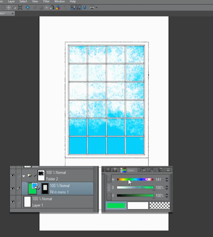
Let's keep experimenting using the basics of masks.
▼ [3] Now i added and image as texture. To reuse the Fill layer mask i duplicate it by ALT+Click & Drag.

[4] Then i unlink the mask and apply a transformation on the image (CTRL+T). ▼

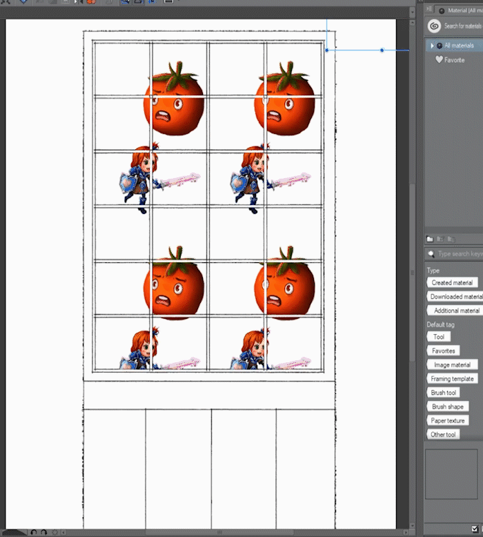
■Another Example: This time lets work with Patterns.
▼ [5] First let's create a pattern from an image. Here I have a couple of characters.
To create a pattern we go to [File] menu > [Import] > [Pattern from Image]
This opens the [Open] dialog box and we can select the image we want to make the pattern.
▼ [6] Then We Reuse the mask from the fill layer and edit the pattern with the object tool or the [Tool Property] palette.
■NOTE: this is just a simple example, please experiment with patterns to achieve different results.
Images as masks: Brightness to opacity
Let's explore a way to turn images into masks by converting the brightness of a layer to transparent.
■NOTE: This can be useful for example to make specific changes to an image shadows or to apply a distressed texture to a layer.
▼ [1] Here I prepared an example with an image layer (keep out) and a texture layer to get the selection for the mask.
▼ [2] Then we turn the texture layer bright pixels to transparent by going to [Edit] menu > [Convert brightness to opacity].
This function turns the white of the image to transparent and keeps the dark areas.
■NOTE: when we apply this function the opacity varies between Black 100% opaque and White 0% opacity
■ Now we can load the result as a selection by Ctrl+Click the layer thumbnail or using [Layer] menu > [Selection from Layer] > Create selection
▼ [3] With the selection loaded we can hide the texture layer and create a mask on the image (keep out) layer. This will mask the image with the texture. We then unlink the mask to find the part we want by moving the mask.
■Note: i need more contrast to achieve the distressed effect i want, so i will edit the layer mask by going to [Edit] menu > [Tonal correction] > [Level correction] and adjusting the contrast with the sliders.

▼ [4] Here as a quick example i added another layer of detail by clipping a blue color layer with a mask and putting the two layers inside a folder.
Then i added the texture from the watercolor paper of the background to the Folder mask following the same process as before
■ Now i will show a technique that we can use while finishing an illustration or to achieve deeper control of effects.
▼ [5] Here I have a flat illustration of a character. I will use [Convert brightness to opacity] to separate the Shadows and the highlights and create masks for each one. This will give us great control of the finishing process.
■NOTE: we can use the masks to add tonal corrections, textures etc, to the shadows and lights independent of each other.
First, I create two duplicates of the original layer, one for shadows and the other for the highlights.
Then go to [Edit] menu > [Convert brightness to opacity].
■IMPORTANT: To create the selection of the highlights I will invert the layer by pressing Ctrl+I before applying [Convert brightness to opacity].
▼ [6] Now we can load the layers as selections. We create two layers, one for each and apply a layer mask. I named the layers to help me stay organized.
■NOTE: Once created we can edit the masks if we need more contrast the same way we did before, To Show what areas are masked press Alt+click on the mask thumbnail.
▼ [7] with the masks created we can explore all the finishing touches we need. Always working in Non-destructive way, and combining all the basics techniques.
In this example, I added a bit of glow by changing the LIGHTS layer to add (glow) blending mode and added some color to the shadows.
■NOTE: as I keep repeating this is just a simple example of the functionality, apply the concepts to your own work and don't be afraid of trying different combinations.
Selecting and Masking Objects from Photograph
I will show you a way of selecting and masking Objects from a photograph by using an Old Tv.
▼ [1] First, we duplicate the original photo and change the [Expression color] to Gray from the [Layer Property] palette. To avoid misalignment between the mask and the original layer avoid moving or scaling the layers.
■NOTE: our goal is to create areas with great contrast and clean edges to select the parts of the image we don't need. in this case i will turn the background to pure black and the Tv Screen to White.
▼ [2] I added a Level Correction layer to edit the contrast, making most of the background black and keeping the tv edge fairly clean. To create it go to [Layer] menu > [New Correction Layer] > [Level Correction].
Then I create a Merged copy of the visible layers by going to [Layer] menu > [Merge visible to new layer]
▼ [3] Using a combination of selections and filling tools such as the Lasso, and The brush tool I painted the flattened layer to get clean edges and pure colors whenever possible. This is necessary to achieve a good selection with the [Auto select] tool.
■NOTE: An easy way to refine areas of grey next to black or white without losing the edges is by using the brush tool with an overlay blend mode. Then we paint with opaque black or white and it will only target areas that arent 100 pure.
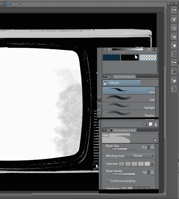
▼ [4] Now that we have clear areas and edges we can Create a layer mask on the original layer. Using the [Auto select] tool lets select the areas we want to mask and fill in the layer mask.
■NOTE: When we are happy with the results we can apply the layer mask by going to [Layer] menu > [Layer Mask] > [Apply Mask to Layer].
Now we have the TV isolated to use it on any project we want. (We can also save it as png to retain transparency)
Creative Effect: Textured Drop Shadow
Lets create a simple effect using the basics of Layer masks.
▼ [4] Here i have an illustration of a tomato with a drop shadow over the grass.
First, create a layer and set it to multiply with reduced opacity. Then create a layer mask on the shadow layer and paint with a vegetation or texture brush to integrate the edges of the shadow to the floor.
■NOTE: This is a simple effect but using the basics we can obtain great results, and edit it if necessary.

Creative Effect: Editable Character Glow
Let's keep combining techniques with more practical examples:
This time we are going to create a Glow effect behind a character to achieve a cool and magical look always working non-destructively.
▼ [1] Here we have the character, a girl with a sword. We want to apply a finishing effect to the illustration to make it pop, or for example to make game promo art.
The first step will be loading the original layer as a selection to make a mask.
Ctrl+Click the layer thumbnail or using [Layer] menu > [Selection from Layer] > Create selection
▼ [2] With the selection active we create a Fill layer Below the original layer by going to [Layer] menu > [New layer] > [Fill]. And then we unlink the mask.
■NOTE: Remember that we can change the color of the fill layer with the Object Tool or from the [Tool Property] palette.
▼ [3] Let's apply a filter to the mask. in this case, I will use a motion blur filter to create the Glow behind the character.
■First, we need to select the mask layer by clicking on the thumbnail. > Then we go to [Filter] menu > [Blur] > [Motion Blur]. This opens up a dialogue to modify the settings of the filter.
We Play with the settings until the desired effect is achieved and press OK to apply the blur to the mask.
Then we turn on the original layer above and the basic Glow effect is done.
■Note: we can still change the color of the fill to try different results.
▼ [4] We can keep experimenting by mixing the basic techniques we learned so far.
In this example, I Duplicate the fill layer and change the color. Then i set the layer blending mode to Add (glow) This results in an Effect with more brightness and color shift.
▼ [5] to further edit the result in this example I added a Gaussian blur to the Top fill layer mask, Filter] menu > [Blur] > [Gaussian Blur].
>Then i changed the color of the top fill layer to Green using the color sliders with the Object tool selected.
The result is a softer Glow blur.
▼ [6] We can try masking the effect to make it appear as it glows only from the Sword.
To do this we put the fill layers inside a Folder, to stack the masks. Then paint with a soft brush to hide the pixels we don't need.
■Note: We can keep combining basic techniques and filters and get all the results we can imagine.
The finished result▼
Creative use: Corrections layers and masks
Correction layers are really useful for finishing illustrations because they can modify the color and contrast of all the layers below them, we can modify their settings and also we can use clipping and layer masks with them adding another layer of customization to the finishing process.
■Note: We are going to explore some uses for correction layers as well as experiment mixing the techniques we learned earlier.
▼ [1] A basic use of correction layers is to polish the final image, such as using a tone curve layer to add contrast or a vignette effect.
First we create a tone layer, from [Layer] menu > [New Correction Layer] > [Tone Curve]
and we play with the settings to add contrast to the image.
■Note: When we create a tone layer a dialog box opens with the settings for the type of correction we picked. Here We modify the settings, and press OK when done. If we need to edit the correction layer we can double click the layer thumbnail to open the settings.
▼ [2] The new correction layer has a layer mask created by default. we can use this mask to hide the effect the same way we use masks on other layer types.
■TIP: if we want to modify just a portion of the image, a good practice is to play with the effect settings to achieve the result we need i then fill the mask with transparency to hide all the effect.
Then we can paint with opaque color to reveal the effect only in the parts we want.
▲ here we achieve a vignette effect by revealing the tone layer only on the edges of the image.
▼ [3] We repeat the steps but with a Hue/Saturation/Luminosity layer, we use this layer to adjust the colors of the image. Here I desaturate the image and then I just apply it to the tomato.
▼ [4] to add brightness to the characters I created another tone curve layer and then reveal it only over the characters.
■NOTE: we can use blending modes with correction layers to achieve different results, as well as the layer opacity. in this example, I set the tone curve layer to Add (Glow) and lower the opacity to make the effect less obvious.
Sometimes is better to exaggerate the effect before masking, to help us paint over the areas we want, then we edit the Correction layer to get the correct result.
▼ [5] Let's Experiment using image textures to mask Correction layers, to see what kind of results we can get.
I placed a texture similar to clouds, then [Edit] menu > [Convert brightness to opacity] > Ctrl+click thumbnail to load the dark parts as a selection.
Then I use this selection to mask a Hue/Saturation/Luminosity layer.
▼ [6] Here I duplicated (ALT+Click & Drag ) the mask from the Correction layer to a fill layer set to Add (glow) to get a color cloud glow effect.
▼ [7] Let's try other types of texture.
First, we apply a Canvas or distressed pixel texture to the Hue Layer. The result is textured desaturation. It gives an old effect.
The other one is textured horizontal lines, I apply that to a fill layer set to Add (Glow) and the result looks like an old screen with some interference.
■NOTE: Experiment with other textures and combinations.
Creative Use: Glitch Effect
Let's use a combination of filters and masks to achieve a distorted or glitch look. This effect seems complicated at first, but it's just a stack of layers with different basic techniques applied.
▼ [1] To Start let's try a moderate distorted and distressed effect.
First, we need to duplicate the Base illustration layer. Then we use the Fish Eye filter to transform the layer and distort it. [Filter] menu > [Distort] > [Fish-eye lens] it will open the dialog with the settings. when we are happy with the results we press OK to confirm the changes.
Lastly, we copy the Distorted horizontal lines masks from the last example and adjust the contrast using [Edit] menu > [Tonal Correction] > [Level Correction].
Here is the result ▼
▼ [2] Let's try a more extreme glitch effect. This time we use the Wave filter to get the distortion we want. [Filter] menu > [Distort] > [Wave] and then we paint a mask to reveal only the parts we want.
▼ [3] We can stack a couple of layers to achieve a more refined look.
In this example, I duplicated the Glitch layer and set it to Add(glow). With the mask unlinked we can move the effect around until we like how it looks.
>Then I created a layer set to the Color blending mode and filled with Cyan.
This layer is clipped to the duplicated glow layer to get a color Glitch Glow.
■NOTE: I also added other layers for texture color correction.
▼ [4] Finally to get a more organic look I selected the Glitch glow mask and applied a motion blur filter. [Filter] menu > [Blur] > [Motion Blur].
I played with the settings until I liked the End result.
Here is the Final Effect ▼
Creative Use: Heat Wave | Glass Effect
Following steps similar to the previous example we are going to create a Heat wave or distorted glass effect.
▼ [1] To a duplicate of the base layer we apply the wave filter. [Filter] menu > [Distort] > [Wave]
This time we play with the settings until we get a curved smooth wave.
Then we apply a [Filter] menu > [Blur] > [Gaussian Blur] to achieve the effect we are looking for,
▼ [2] To create a glass effect i created a layer folder to add a mask, then i created a color dodge layer to tint the glass.
Quick End result▼
Animated effects: Keyframes and masks
Let's have fun animating masks to create finishing effects. I will Quickly go through a couple of effects.
Explaining the animating functions of clip studio goes beyond the scope of this tutorial so if you arent familiar with animation please read this tutorial. ▼
▼ [1] The Basics of animating masks are activating keyframes.
First, we create a layer folder to group the layers we want to mask, and we paint the mask Then we unlink the mask.
On the animation timeline, we press the button to activate keyframes on the layer.
In this example, I added frames on the mask position. for the start and the end.
Clip studio generates the interpolation between keyframes and creates the animation for us.
▼ [2] Here i show the first and last frame and how the mask position changes.
Now lets see it animated ▼

The mask reveal the character. but if we press CTRL+I on the layer mask we invert the masked areas. Creating a disintegration effect. ▼
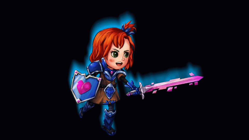
Following similar steps, i created this sheen animating the mask of a tone curve layer▼
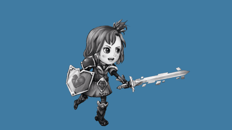
If we modify the scale instead of the position we can create a pulsating glow. ▼

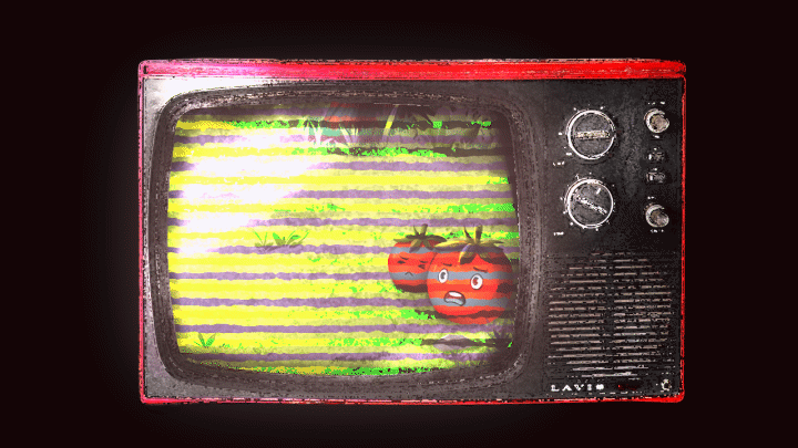
Now using all the techniques for masking we learn I created a more complex animation ▼
Closing thoughts
Well, this is the end of the tutorial. I hope it wasn't too complex.
I tried to be thorough with the explanations of all the functions and techniques, so maybe i talked too much, I'm sorry.
I didn't have time to go into detail in the animation part, maybe for another tutorial.
Layer masks are confusing at first but following the basics operations, we can achieve great results. I hope you can use some of my tips on your own work and remember to experiment and combine techniques.
The most important thing is to be creative. Please don't be afraid to try new things.
See you next time. Thank you for watching.




Comentario