Secrets to make your art POP | Pop Art Tips
So, what’s in store for you in this tutorial?
1. What is Pop Art?
2. The Power of Complementary Colors
3. How to add After Effects
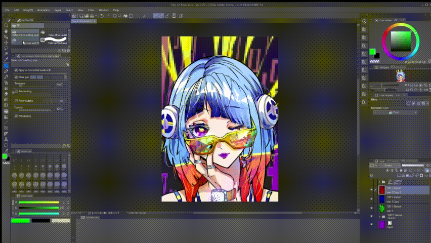
I was wondering how to use colors in the best way, and then pop art popped into my head. So, for this tutorial, I’m going all-in with pop art. Get ready for some bold colors and fun patterns!
What is Pop Art?
Pop Art emerged in the 1950s and 1960s as a vibrant art movement that drew inspiration from everyday life, commercial culture, and mass media. Artists like Andy Warhol and Roy Lichtenstein used bold colors, strong outlines and familiar imagery from pop culture, like comic strips, advertisements and consumer products, to create artworks that challenged traditional art norms.
Pop Art was a reaction against elitism in the art worlds and aimed to make art accessible to everyone. It used bright, saturated colors, repetitive patterns, and humor to comment on contemporary culture. The movement’s influence is still seen today in modern art, fashion, and design, making it a lasting and relevant part of art history.
By understanding complementary colors and the vibrant world of Pop Art, you can bring energy, balance, and cultural relevance to your own artistic creations.
How to choose a color scheme? The Psychology of Colors
Are values important in Pop Art?
What are values?
In art, values refer to the lightness or darkness of a color. Values are crucial for creating depth, contrast, and a sense if three dimensionality in a composition.
You’ve probably heard artists talk about how values are key for contrast in a drawing. But with pop art, you can toss that complicated stuff out the window! Here, the colors do all the heavy lifting. You can forget about realism and just go wild with the colors—mixing hues, playing with warm and cool tones, and dialing up the saturation. For this tutorial, though, I’m sticking to my personal favorite: complementary contrast.
Complementary Colors:
What are Complementary Colors? Complementary colors are pairs of colors that are directly opposite each other on the color wheel. Examples include magenta & green, purple and yellow, blue & orange. These color pair are often used together because they create strong visual contrast and can make each other stand out. In Clip Studio Paint, the color wheel is set up with complementary colors directly opposite each other, making it super easy to spot the complementary pairs.
Depending on the hue or shade, complementary pairs can change—like how green can be the complementary color of a warm-toned purple.
No color wheel? Just go to >Window > select Color Wheel
How to use complementary colors to your advantage?
Each color in a complementary pair evokes different emotions and feelings:
- Blue: coolness, calmness and distance
- Orange: warmth, energy and joy
When you use complementary colors together, they balance each other out. This balance is due to how our eyes perceive light. The contrasting wavelengths of light from complementary colors stimulate different parts of our eyes, creating a vibrant dynamic effect.
1. Color Scheme
2. & 3. Color Scheme
Approach:
Create a base color layer for each part of your drawing that needs a different color.
Go to Edit > Tonal Correction > Hue/Saturation/Luminosity. Adjust the Hue to your liking and choose a color scheme you like. Don’t overthink it—you can always tweak it later!
Optional: If you want to go extra colorful, combine two pairs of complementary colors.
I went with the first color scheme for my drawing.
Tip: Experiment with different color combos and go with whatever feels right to you! <3
After Effects
Chromatic Aberration
Before
After
Add a splash of colorful outlines to give your picture a dreamy, surreal vibe with a touch of chromatic aberration.
Select all the layers you want to apply chromatic aberration to by holding down Shift and clicking on the first and last layers in the group.
Merge visible to a new layer to keep your separate layers intact while creating a new merged layer on top.
Duplicate the layer twice by right-clicking on it and selecting "Duplicate." Then, create three new empty raster layers above each duplicated layer.
Add each RGB color to the empty raster layers. For a clean effect, use the Color Slider with the settings shown. Then, set all RGB layers to Multiply. (Green: R:0, G:255, B:0; Blue: R:0, G:0, B:255; Red: R:255, G:0, B:0)
It should look like this:
Merge the Multiply layers down.
Set the two top layers to Screen
Move each layer with the move tool to create the chromatic aberration effect

After positioning the RGB layers, merge them together and add a Mask Layer(top right corner) to hide the chromatic aberration in areas where you don’t want it.
Halftones
You can add halftones to add colors, depth and texture to your drawings. It’s a popular method of many comic or manga artists.
Use the lasso tool to select the areas where you want halftones. Then, click on the halftone icon. You can adjust the color, density, frequency, and shape of the halftone in the "Layer Property" panel.
Blending Modes
Linear Burn
I used linear burn for the glasses because it blends the colors with the background, creating a transparent effect that keeps all the saturation and vibrancy intact.
Hard Mix
For some extra flair, you can add special effects using a texture template. I used the "Drawing Paper" texture from the "monochrome pattern" folder. Just drag the texture onto your canvas and set it to Hard Mix blending mode for some cool effects and colors. (I actually ended up using a normal paper texture layer without the blend mode because it gave me more of a pop art vibe, but I thought the original effect looked cool too, so I kept it as a draft!)
Tip for Background: For the Background I used the Mosaic effect Go to >Filter>Effect>Mosaic and play around with it.
Final Results
Last but not least
Want to see the full drawing process in action? Check out the speedpaint I made using Clip Studio Paint over on my TikTok page! The link to my profile is in the description—just pop over and take a look.
Pro Tip: If you want to record your own timelapse, just go to Files > Timelapse. It’ll automatically start recording every time you work on your drawing (even if you’re just staring at it with Clip Studio Paint open—so watch out!). When you're done, head to Timelapse > Export to save it, and don't forget to turn off the timelapse recording afterward, or it'll be deleted. Enjoy the tutorial and happy creating!


Comentario