
When painting an expressive portrait, the human eye is vital to communicating emotion, character and inner thoughts. This guide will walk you through the basic anatomy of the human eye, my rendering process and tips for recreating certain looks in a semi-realistic style. Clip Studio Paint offers an array of tools that can help us through this process, let’s begin!
Basic Anatomy
It is important to first understand the anatomy of the human eye. At a very basic level this comprises of an oval with pointed ends and a circle for the pupil contained within it. However on closer inspection the eye not only has several other elements to account for, but even this pointed elliptical shape can be fashioned into an almond, hooded or slanted shape among many others. Below I have painted a quick diagram identifying the various elements in the anatomy of an eye which I will be paying close attention to during this process.
1. Eye Crease
2. Upper Eyelid
3. Eyelashes
4. Iris
5. Pupil
6. Sclera
7. ‘Waterline’
8. Tear Duct
9. Lower Eyelid
Sketching the Eyes: Proportions, Angles and Perspective
The proportions of the head can be divided horizontally into four equal parts.
Notice how the majority of the eyelid sits at the very bottom of the second quarter whilst the rest of the eye fits snugly at the very top of the third quarter. We can therefore conclude that the eyes are situated approximately half way down the head. The distance between the eyes is generally said to be ‘one eye space apart’, in other words, there should be enough room to fit a third eye between the two you will have already established. This distance is also similar in width to the nostrils. It can also be observed that the human face is roughly ‘five eyes’ wide (with the outer blue division marks on my diagram curving as the skull does).
Conversely, the shape and proportions of the eyes can warp when the head is turned at certain angles or viewed from certain perspective points, to better demonstrate this, I have sketched four human heads (barring the eye area) at varying angles or perspectives.
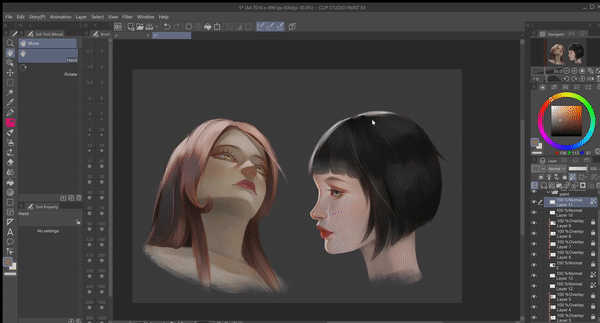
To begin, I select one of my favourite pencils from the Sub Tool [Pencil] panel, the “Perfect Pencil (with tilt support)” which can be downloaded for free from the Clip Studio Assets library. This is my preferred tool when sketching.
With the information about proportions and positioning which we explored above, I will now draw a rough sphere to represent the eyeball.
I reduce the opacity of these spheres to around 20% and create a new layer above. In this new layer I proceed to sketch in the characteristic tapered oval shape of an eye. Think of the eyeball as a three dimensional object rather than a flat plane. It’s important to consider how the oval shape would look when it curves around the surface of this sphere. Note:
The right oval appears to be slightly compressed in the 3/4 facial view
Thinner/narrower ovals in bottom-up perspective view
An almost cone like shape rather than an oval in the profile view. Only half of the oval can be seen in this view and the inner corner appears outside the sphere.
Tip: It may help to turn on the [Grid] function on your canvas to help you decide the correct proportions when drawing a face that is tilted at a certain angle. To do this go to [View] Menu > Grid. You may also want to adjust the size of the blocks to your liking, to do this go to [View] Menu > [Grid/Ruler Settings]. Change the value in [Gap] to a higher number for bigger blocks or a smaller number of smaller blocks, my preferred setting is usually 1000px.
For reference, I have made a number of sketches with various other angles that you may wish to consider. Study how the shapes distort depending on the viewing angle.
At this point I can begin to add some detail. In the inner corner of the eye I define the tear ducts which are a triangular shape which rounds out at the tip, some eyes tend to have a slight concave part on the underside. The tear ducts connect directly to the ‘waterline’, so I make a line parallel to the lower part of my oval and attach it to the tear duct area. The eye crease can now be drawn slightly above the oval, this will create the illusion of an upper eyelid, the crease is a simple line that follows the curved shape of the uppermost part of the oval. Similarly, I draw a very faint line below the oval to create the illusion of a lower eyelid (note: if you define the lower eyelid more than this it may appear like heavy eye bags or wrinkles which is appropriate if your character is older.)
When drawing the iris there are a few things to take into account. Namely size, shape and position. The horizontal size of the iris is almost 2/4 of the visible eyeball area. In terms of vertical space, when your character is looking straight ahead, the very top and the very bottom of the iris is usually hidden behind the eyelids, this may vary slightly depending on eye shape.
However the shape and position of the iris changes depending on the angle of the character’s head, and where they are looking.
Tip: It’s also a good idea to flip your canvas to check for irregularities. Click the [Flip Horizontal] button in your [Navigator]. Your sketch should look uniform and proportionate when the canvas is flipped.
Knowing where to place the pupil can be more complex than initially expected. The pupil is situated inside the Iris, not on top of the cornea. Essentially, when viewed in profile, the pupil looks as if it is placed at the back of the iris.
Eyelashes
Replicating the natural look of eyelashes depend on “stroke quality”, each stroke must be planned meticulously so as to avoid the look of ‘spider legs’. First, we must understand that lashes grow from the inner side of the eyelid, it’s important that you don’t make the mistake of drawing eyelashes that appear to grow from the outer lining of the eyelids with no sense of direction.
You should also note that:
Eyelashes are thickest at the base and taper out, eventually coming to a fine point at the end.
Eyelashes tend to take on a curved shape.
They fan out and grow away from the opening of the eye.
Lashes clump together at certain points.
Lower lashes are considerably thinner and smaller than the upper ones.
There tends to be more volume at the outer corner of the eye and less volume as they get closer to the tear duct.
It can be challenging trying to figure out the correct direction and curvature of the eyelashes in relation to the angle at which the eye is drawn at. To combat this issue, I have devised a method which may serve as a guide. I think of the lashes as a single object and proceed to draw a polygonal structure on the lash-line, this acts as a three-dimensional mesh on which the lashes can be applied. I switch to the [Watery] brush in the [Watercolor] sub-tool which has a translucent paint application and tapered end which is excellent for recreating the natural look of eyelashes. The 1.9.7 update also introduced a number of tapered brushes, you may prefer to use the [Tapered Watercolor] in the [Realistic Watercolor] sub-tool. After dropping the opacity of the polygonal structure, I create a new layer above. I draw a single lash at the inner corner, middle and outer corner of the eye within the ‘mesh’ I created. Now I can fill in the rest with a number of quick, confident brushstrokes in between all three marks. I also tend to line the eyelids thickly and add more layers of lash hair for female characters.
You can observe this process in more detail in the video clip below, additionally, I achieve thinner and lighter lash hairs for the inner corner of the eye and lower lash by varying my line weight simply by applying more or less pressure on my pen.

Base Color
At this stage we can begin to apply some color. I start by blocking in flat colors comprised of the midtones with any hard edged opaque brush. Notice that the sclera has a slight cool or warm hue (depending on the environment) and is not merely white or a light grey. I then proceed to protect the alpha channel with the [Lock Transparent Pixels] function in my layer settings so I don’t inadvertently paint outside the bounds of the eye area during the rendering process.
Light and Shadow
Here I begin to establish some values, that is, the lightness and darkness of a color which helps to build up some form. To do this one must decipher where the shadows will fall on the eyeball relative to the light source. For this step I use the “FLAT OIL!!” brush which can be downloaded for free in the Clip Studio Assets library:
I find that rendering the sclera first makes for a smoother workflow, so this is where I’ll start. For the shadows I pick a color that is darker than the base I applied earlier, and shift my hue to a slightly warmer tone if my light source is cool, or conversely, a cooler tone if my light source is warm. I apply the color to the relevant areas making sure to create hard edges where strong shadows are created by the eyelid for instance, and drag the paint out with less pressure on my pen to create a lost edge where shadows are the weakest. Similarly, I pick a lighter color for areas that are lit up.
I also add a little red or salmon pink on areas closer to the opening of the eye. Since the eyeball is a rather reflective surface, it can be observed that the color from the underside of the eyelids is often reflected on the eyeball when viewed at most angles.
Using a saturated red color I paint the tear ducts which get slightly lighter in the middle. With a more pinkish tone I color the ‘waterline’ or under-eyelid area which almost appears white in stronger lighting, I use my brush to blend it into the tear duct.
I use the same method to build up values on the iris. I’m not concerned about mimicking the intricate patterns within the iris in a hyper realistic style, I prefer the look of a painterly style with loose brush strokes to hint at the patterns within an iris. For the pupil I start with a very dark shade from the color of the iris as a base and build the pupil up with an almost black tone on top to create a smoother transition between iris and pupil.
To finish up, I use a combination of the oil brush and [Blur] in the Sub Tool [Blend] panel, applying the [Blur] tool around the bottom of the iris so that the color seeps into sclera somewhat.
Highlights
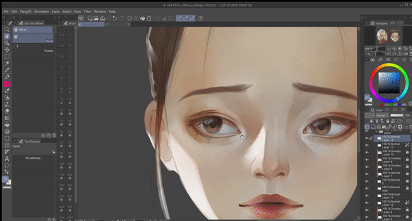
A common mistake beginners often make is to create a perfectly symmetrical mirror of the reflections and highlights on the other eyeball. In the image below, I illustrate the correct way highlights should be painted.
As you can see in my final render, I didn’t go overboard with highlights, applying to only a few areas will make the eyes appear more realistic.
Bonus: Rendering Teary Eyes
Teardrops can be a challenging thing to render effectively, I have broken up the way I learned to render teardrops into simple steps which may help you render your own teary eyes for the truly grief-stricken individual!
1. Eyebrows play an important role in portraying a sense of melancholy, generally the brow should be sketched slightly straightened and curled upwards at the inner corner when an individual expresses sadness on their face.
2. I render the eye with the steps I established above.
3. In a new layer, I then begin to sketch teardrops using a series of elliptical shapes. Remember that liquids conform to the shape of the surface it’s occupying.
4. I fill the teardrops with flat colors, if the teardrop is sitting above the sclera, fill it with a shade several tones lighter than that of the sclera, likewise, I fill the teardrops which have spilled onto the facial skin with a tone several shades lighter than the skin tone.
5. Pick colors from the area surrounding the teardrops and apply them roughly atop the flat colors. This will create the illusion of refraction later on.
6. On a new layer above the painting, and using an almost black tone, outline the teardrops with line weights that vary from extremely thick to barely visible.
7. Change the blending mode to [Overlay] and reduce the opacity to around 60%.
8. In a new layer above, add highlights, given that tears are highly reflective it’s okay to be liberal with your highlights here.
9. Create shadows underneath the tears.
10. Merge your teardrop layers and erase harsh outlines using [Soft Eraser] for a more realistic look.
11. Add damp spots or ‘smudged mascara’ with a dark and desaturated color.
12. Finish with [Sparkle A] pen in Sub tool [Decoration] and blur the edges to reduce intensity. Apply sparsely.
Afterword
Thank you for reading my tutorial, I hope you have found this guide useful, if you have any questions or suggestions for future tutorials, please feel free to leave a comment below!
Les utilisateurs qui ont aimé cette publication


Commentaire