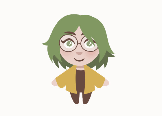
ANIMATING CHIBIS IN CLIP STUDIO PAINT!
Hello! Today we will look at how to draw little chibis and then animate them in simple, cute ways, all done in Clip Studio Paint! We will be using tween animation, but later also combine it with some frame-by-frame animation. Finally, I will show you how to incorporate the animation into a software like Streamlabs.
You can view a video version of this tutorial here:
DRAWING THE CHIBI
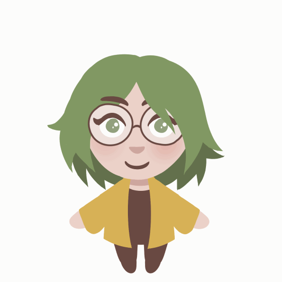
Let’s get started by actually drawing the chibi. For this example, I decided to work with lineless artwork. This simple way of rendering a character fits the equally simple and cute chibi look that we want; and it also comes with another huge benefit.
With no lineart to think about, it’s a lot easier to animate things and not have to worry about lines matching up perfectly.
When creating an illustration for the kind of animation we want to make, we need to keep a few things in mind:
1. Work with Vector Layers:
This helps retain better image quality when transforming artwork (compared to using Bitmap/Raster Layers). For more info about Vector Layers, check out my other tutorial:
Keep in mind that we will not be able to lock a layer’s transparency to recolor parts of your drawing. However, you can still clip a layer to a layer below to achieve a similar effect.
2. Create Layers for each element of the illustration:
For tween animations to look fluid and alive, we need to ensure that we have control over a sufficient amount of elements of the illustration. Each layer will be able to be animated on its own, and so it makes sense to split up the character into a lot of parts.

3. Overlap elements:
Make sure to set up elements in a way that there will still be detail even if other elements overlap them. This way, when you move the elements, they will look as though they are connected.
4. Create Folders for grouped elements of the illustration:
This means that we will group together elements that belong together - for example: The folder “left arm” contains “upper left arm”, “lower left arm” and “hand”. This later will allow us to animate the entire arm at once, rather than always having to animate each individual part. It’s a huge time saver!
SETTING UP THE ANIMATION
Once we have the drawing done, let’s start preparing the animation. Switch to an Animation-focused workspace. To find out more about workspaces in Clip Studio Paint, check out my other tutorial:
Alternatively, simply start by going to “Window” and select “Timeline”. Now press the “New timeline” button.
Let’s pick a Frame rate of 12 and a Playback time of 24. This means that we will have 12 frames per second, giving us a two second animation with the 24 frames of playback. If you want to have animations with more frames, you will need to purchase the EX version of Clip Studio Paint. However, for the simple animation loops we want to create, the 24 frames available in Clip Studio Paint Pro will be sufficient.
Since we have a lot of layers, we may want to simplify the animation timeline by disabling the thumbnails. We can do so by opening the menu, clicking “Thumbnail size” and selecting “none”.
Now let’s prepare our illustration elements for the animation process.
Step 1: Select all the layers (and folders) and click the “Enable keyframes on this layer” button.
Step 2: Select each layer (and folder) with the Object tool and adjust the Center of rotation. This is the little cross that shows up in the middle of the canvas. Move it to each joint of your illustration - where one element overlaps with another. So for example, for the hand layer, move it to the wrist. For the lower arm layer, move it to the elbow. For the upper arm layer, move it to the shoulder.
These are the very first steps we need to take to get started with our animation. Once you are done, it’s always a good idea to save the file!
ANIMATING CHARACTERS WITH TWEENS
Before we actually start animating, let’s briefly think about what we want the animation to look like. I sketched out two different animations here: A simple idle animation, and a “BRB” animation to use when the stream is paused.
Since we already know that we want to make two animations, let’s duplicate the current timeline where we’ve already set up the Centers of rotation. Go to the menu, select Timeline and then “Manage timeline”. Here you can duplicate the current timeline.
But now let’s actually animate.
When you were adjusting the Center of rotation for each layer, you might have noticed that it created little diamond shapes in the timeline. This means that you created a keyframe.
To create our animation we will need to create more keyframes. Let’s move to the middle of our timeline, frame 12. Now let’s rearrange the individual parts of the character to look like our sketch. We can do this by moving them, rotating them and resizing them.
The differences may look subtle when laid out next to one another, but for an idle animation, we don’t actually want something flashy and crazy, so don’t be afraid to make subtle changes. In motion, it’s still going to be noticeable!
We can even deselect “Keep Aspect ratio” in the Tool property window and now squash or stretch elements. However, I would recommend not to try and combine this with ALSO rotating elements. In my experience, this has always led to a bug where the element would reposition itself. I cannot say whether this is a global issue or only present on my computer.
We can test out the animation already and will see that Clip Studio Paint automatically creates all the frames in between these keyframes. You may want to make additional keyframes to create more steps in the animation, especially in the case of the “BRB” animation.
Finally, since we want the animation to loop, let’s make sure the animation ends how it began. If we right click on the diamond of the first keyframe, we can copy it. Now we can right click on the last frame and paste it. This way, the same transformations are applied as in that first frame.
Animation is a trial and error process. Keep testing the animation, keep adjusting the positions of elements, keep adjusting the timing of motions, keep trying new things. It may take you a while until you get to a place where you’re happy with the animation!

ANIMATING TEXT FRAME BY FRAME
Let’s switch over to our “BRB” animation. I’ve already set up the animation of the character. To add the “BRB” letters above the character, let’s create a new Animation folder (A). Next, select the first frame where the letters need to show up (B) and click “New Animation cell” (C).
Simply draw in the letter. Then, select the next frame and draw the letter again. You can press “Enable Onion Skin” (D) to see the previous frame highlighted. This way, you can just trace over the letter. By redrawing the same letter again and again, we create a cute wobble effect. Keep going until you have completed this for the entirety of the animation. At the end, I decided to let the letters shrink and then “pop” to disappear. This helps make the loop feel more natural than just having the letters disappear without any particular effect.

EXPORTING THE ANIMATION
Now that we are done, we will want to export our animations. You may want to export them as a GIF if you plan on using them on social media or elsewhere. However, since we want to use the chibis as part of a Stream overlay, we need to select the “Export animation > Movie” option.
But before we do so, make sure to deactivate our “Paper” background layer. This way, we can export the animation as a transparent file to overlay over elements in Streamlabs.
These are the settings I use for the export:
If you used a different frame rate for your animation, make sure to enter that here! It will not default to the one you used when setting up your timeline.
INTEGRATING THE ANIMATION IN STREAMLABS
Now that we are done with the animation, let’s integrate it into Streamlabs. Select the “+” icon in the “Sources” menu and select “Media Source”. Now navigate to the file. Make sure to select the “Loop” option.
To switch between the two states of the animation, it makes sense to duplicate your current scene. In the new scene, now add a new “Media Source”. Make sure to toggle “Add a new source instead”. Now simply place the "BRB" file. Make sure to scale and position the two animations at the same place. After you have done this, you can delete the previous animation by selecting it and pressing the “-” icon. You can now switch between the two animation states by clicking each respective scene.
THANK YOU
I hope this tutorial has been helpful. If you have any questions or would like to share what you made when following these instructions, feel free to leave a comment! :)
Also, be sure to check out my wife cassiejwl on Twitch for crochet and gaming streams, who I made this animation for!


留言