Tips for rendering abandoned places
Introduction
Hi everyone, my name is Peter, this is actually my first time making a tutorial here. In this tutorial I will explain how to create and render abandoned place. I created something like an abandoned school, I will explain my process and I hope it would help you when creating yours.
Note:
When creating and rendering an abandoned place there are some important things to note.
Idea: you should to be able to imagine what you want to draw and get an idea of it before you start, this is very important.
References: you need to search the internet and get references of what goes with your idea, if you only use what is on your head to produce your piece it won't be as admirable as want it to.
Don't trace your reference, gather as much reference as you can and tap from its ideas to create something new.
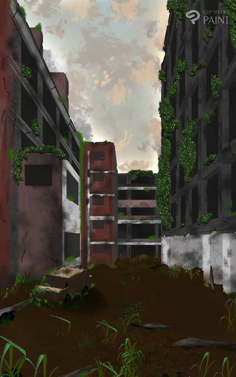
Another important thing to note when drawing abandoned places is to add enough details, details is what make it look abandoned, details like weeds, ruins, cracks, rusts are very important while rendering your project.
Line art
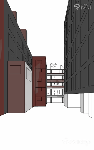
I started my drawing with line art, I didn't sketch though, I used the one point perspective ruler for my direct line work.
In case you are wondering how perspective ruler works, you can check out the basics here;
Painting/colour block
It's time to start painting since am done with my line work, I painted with a simple hard brush and I used the polyline selection tool to avoid painting out of the line.
I painted the building before I started painting the windows, I simply added another layer on top of the initial layer and I started painting the windows.

I reduced the opacity of the windows a bit and then blurred it using the guassian blur function to give it some depth.
Then I started erasing some of the edges of the building to make it look old and feels ruined a bit. This step could be done at any point in the drawing, I decided to do mine before adding details to the building.
Details
We are now in the most important part of the process which is adding details. I added the building details before adding the cracks and ruins. I created a new layer and clipped it on top of the building's paint and then I started painting few details for the building not much of details though just some strokes on the building.
Adding Cracks:
I used few brushes from clip studio assets to add cracks to the building.
Using the brush might not be as easy as you thought though so am going to explain how I use the brush to add cracks.
First, create a layer on top of the layer you want to apply the crack then pick a color that is slightly darker than the colour you are applying it on.
It doesn't look so much like a crack until you go to edit>tonal correction>level correction then use the bar to adjust the colour of the cracks. The level correction function works by adjusting Shadow and highlights.
Adjust the colour till you get the best possible result.
Adding some stains:
Not stains exactly:-), there are some Black stuffs that are found on buildings wall especially old ones. We are going to use the default cross hatchet brush for this process. I simply colour pick a black colour and started painting some part of the building with it until am satisfied.
Adding weeds:
I started adding weeds with some brush from clip studio assets. You can check them out here.
Even though I didn't get my desired result while using the brush, I simply edit using the tone curve function to get my desired results.
I keep editing and adding more details to get the best possible results.
Ground rendering
It seems we are done with the building so it's time to start painting the ground.
I created a new folder below the building folder and I started painting it flat.
I use the default ground brush on CSP to add some ground texture on it and since it is a old building there will definitely be weeds I use the weed brush on it and I also use the default weed brush on CSP to make it look satisfying.
I also added some pebbles and stones on the ground using this asset.
Here is the result of the process;
Rusted car
I decided to add a car on the illustration just to give a nostalgic feeling of what this place once was.
I imported a 3d model of a car-shaped object I modeled on Android. I made it align with the perspective of the painting.
Thanks to the CSP latest update I was able to adjust the lighten and shadow of the object.
I created new layer on top of the 3d layer and clipped it on it (note: set the layer mode on overlay). I painted the the car with a creamy like colour you don't need to bother on the shading :,-).
The car looks good, how about we make it look bad by adding some rusts. Rusts are mostly deep Brown in colour and since they are caused by air and water, the roof of the car will be more rusty. I used CSP default airbrush (spray) to add scattered rust on the car and hard brush to add rust to the edges I also use the cross hatchet brush at some point, here is the result.
The weeds must have lurked themselves on the car if it has been abandoned for long, so I used the weed brush to add some weeds round the vehicle.
Sky
The sky is a very important part of the process because it gives the mood of the place, I decided to make the sky feels like its evening for some reason that is hard to explain, I think I just felt like the evening sky Matches the buildings more.
I created a new layer below all the layers then I painted something like a dull blue colour.
I then adjust the tune of the colour edit>tonal correction>colour balance
I used some downloaded brush from the asset store to add some dark clouds on it and I also added some light glows using airbrush.
Finishing
You can start adding few more details or removing some unwanted stuffs on your art, infact you can merge all the layers and change the colour tone of your work, just make it look as good as you can.
Here is the timelapse of the whole process:

I hope you found this tutorial helpful, thanks for reading and I wish you luck in your art journey.


留言