Exploring the Depths of Compositions in Character Art | Tips
INTRODUCTION;
Hello 🌷,
I'm May, and I sincerely hope for everyone an enjoyable day.
In this art tutorial, I'm gonna explain simple step by step tips on how to understand and work with art compositions and dive slowly into the world of character art ~
Here's the video version of this tutorial, Feel free to look into it 🌙:
◇ Art Compositions;
Is the art of arranging, placement, and organising the visual elements of an illustration.
Putting the elements together like a puzzle to create balanced and visually aesthetic illustrations.
That refer to; the focal point placement and arrangement, the story, meaning and moods of an illustration including colours, the perspective and movements, the shapes, the spacing, the contrast and balance of an illustration.
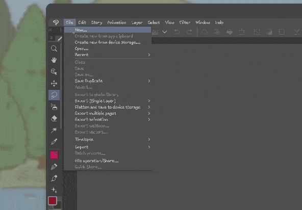
I'll be using Clip Studio Paint app for these tutorial.
• these are the brushes that I'll be using for sketching and colouring;
FOCAL POINTS;
Focal point means; the main focus of an interest in illustration.
That draws and guides the viewer's most attention to a specific elements, it is on of the keys to guides and leads the viewer on a journey across and through the illustration.
There are many ways to point out and positioning the main subject of an illustrations, using the focal point placement techniques; such as shapes like circle, square as well as triangular, rule of third, central or symmetry, lines, golden ratio, rule of space and many more.
For this tutorial, I'll show you three of my favourite ways to determine the positioning of the focal points, especially in character art compositions: triangular technique, rule of third and central technique.
The placements and arrangements of a single or multiple focal points is the key that affects overall illustration.
The triangle or pyramid, rule of third, central and symmetry placement techniques are simple yet powerful, that's why I thought it’ll be suitable for beginners to follow along with me studying the art compositions.
◇ Triangular or Pyramid;
I really like to put and positioning a character and object together in a triangle or pyramid shape.
It helps with creating balance and stability of an illustration.
Like this;
The triangle shaped focal point has a strong foundation that grabs attention to the elements around or inside the triangle;
This means that by drawing characters or objects inside a triangle and making it match the shape perfectly, It will give the artwork or illustration a stable and balanced look.
Also, by aligning characters or objects with the triangle, it creates a sense of harmony and makes the character stand out more.
Play around and rotate with it, here is another example;
to work with the upside down triangular composition as well as the rotated triangular composition.
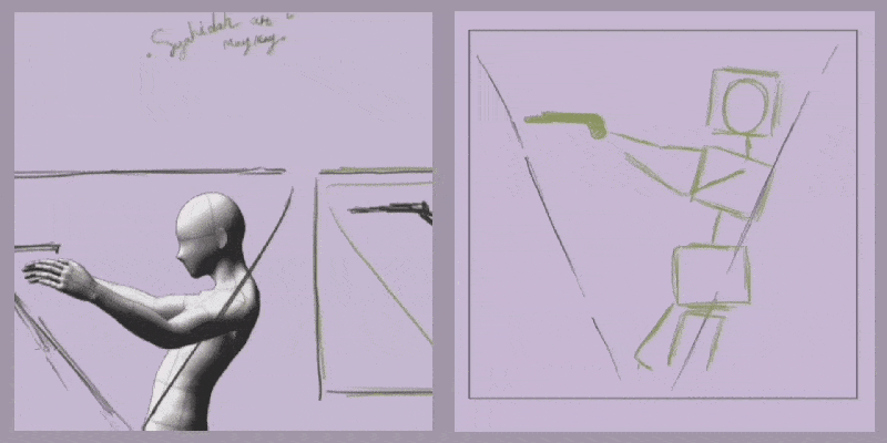
The triangular shape adds structure to illustrations with its sharp lines and defined edges.
There are many ways to work with a triangular shape, such as using the triangular negative space composition.
The triangular negative space, is an art compositions technique that explore the empty space by arranging characters, objects or elements of an illustration to create a triangle shaped space or gap between them.
》Step by Steps;
- First, decide the triangular position and whether the main focus is positive or negative space.
- Second, create the character's dynamic poses to fill the triangular shape.
- Third, have fun and start experimenting with it.
◇ Rule of Third;
Rule of third is a focal point technique to easily put and place character or an object for creating balance, focus, fun and an exciting illustrations.
By dividing an artwork into nine equal parts of grids [ of two horizontal and two vertical lines ],to create balanced visual interest.
This means by positioning the key elements along the grid lines or the crossed points.
such as these sketches of two characters and two different sized pizzas that are placed at the opposite of each point.
By dividing the [ 3x3 ] grid into four intersections or cross points where the guidelines
[ the horizontal and vertical lines meet ], it creates nine equal parts of an illustration that add structure to guide the eyes going around it.
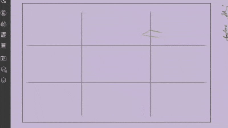
When using the rule of thirds, it helps place both characters or objects in the perfect spots.
This technique helps make the elements visually more exciting as well as to guide the viewer's eyes around the compositions.
◇ Center or Symmetry;
The last focal point that I'll talk about in this tutorial is center or symmetry.
Simply put the main character or an object right in the middle of your illustration to draw the attention, perfectly balanced and equal on both sides.
With these examples;
This technique is all about putting the focal point right in the center, it works for both asymmetrical shapes, making them stand out.
As well as for perfectly symmetrical and mirrored shapes.
Below is my previous illustrations that uses center and symmetrical composition.
I'll be using this Clip Studio Paint symmetrical ruler to use with symmetrical focal point;
• here is how to locate and use the symmetrical ruler:
》Step by Steps;
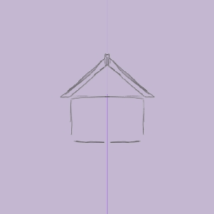
- First, select the ruler tool and choose symmetrical ruler.
- Second, click the canvas and drag the direction you want.
- Third, start creating te symmetrical and mirrored characters or objects.
STORY AND MOVEMENT;
Both stories and movements of an artwork are equally important to create engaging illustrations.
◇ Story and Mood;
Communicate through the illustration;
By giving the character or illustration a story, concept, and colours that match their characteristic or environments.
By asking questions to yourself, for example;
• Which characteristics and personality described the character?
• What kind of mood or emotions are being displayed?
• Which type of genre is this illustration based on?
In art composition, understanding the time of day and seasons is very important in setting the right mood for the story.
》Colours In Art Compositions;
It acts as a storyteller that helps convey and complement the character's emotion and the overall illustration.
This means;
Colours play such a crucial role in setting the mood and helping with telling a story in illustration.
Using these types of colour wheel to help with choosing the colour that works well together: analogues, tradic, monochromatic, complementary.
In creating enchanted, mystical, and magical scenes;
Deep shades of colours like purples, greens, and blues are suitable to get the combination for mysterious and magical scenes.
Also, adding a touch of pastel and soft colours such as purple and pink, it creates a dreamy and calm mood in magical scenes.
When it comes to joyful, bright mood with a combination of calm and peaceful scene, pastel colours such as bright pink, yellows, light greens, and pastel blues are the main choice to get the feelings of joy, calming, and excitement in illustration.
On the other hand, if I'm going for a mysterious, thrilled, and spooky vibe, dark colours like maroon, deep purples, dark greens, and vibrant oranges are my friend.
These colours create a scene that is both mysterious and thrilling.
Choosing the right colours is the key;
It has the power to express different emotions through an illustrations.
◇ Movement;
Determine and plan how to visually represent the story, visual flow or sense of movement within the illustration.
Using dynamic poses, gesture, expression, perspective, motion, and speed lines;
When it comes to movement in character art composition, it's all about capturing the moment; like running, jumping, or flying.
》Poses;
Start by drawing the character in a pose that clearly express their action and capture their personality and what they're up to.
Example below uses similar pose, but with different vibe;
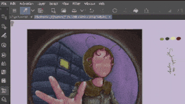
I'll be using the 3d figure on Clip Studio Paint App, to help with exploring different poses and character perspective:
• Try search the available clip studio paint poses material, to get cool poses and experiment with.
》Speed Lines and Focus Lines;
Next, use lines and curves to create a sense of movement;
Straight lines for a more direct and focused movement, and curved lines for a more fluid and energetic vibe.
I like to use the Clip Studio Paint figure tools to get the speed and focus lines, or draw the lines manually using the pen tools.
• here is how to locate and use them for lines compositions:
• Step by Steps;
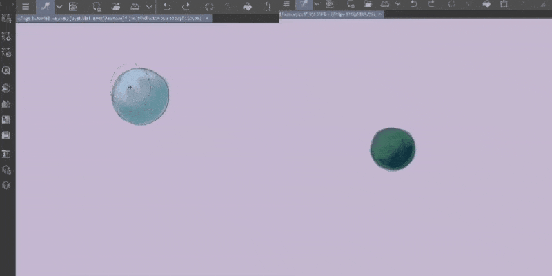
- First, select the figure tool and choose speed or focus lines.
- Second; [ speed lines ] click the canvas and drag the direction you want,
[ focus lines ] drag the circle around the object to get the lines around it.
- Third, start creating and have fun.
》Facial Expression, Hair and Clothing Movements;
Facial expressions are like the cherry on top
of the red velvet cake; it brings a character to life and add to the sense of movement.
Another important key point; that hair and clothing are usually moving gently along the wind.
Here are some of my previous illustrations to help with understanding the compositions for story and movements;
PERSPECTIVE;
Perspective in character art compositions;
It's a technique in creating the illusion of depth and distance for character, object, and illustration by adjusting, changing, and scalling the form and draw the object smaller or bigger based of it's position.
To make a character or an object look closer or farther away, play around with the sizes;
• If it's closer to the eye view, it'll appear larger.
• If it's farther to the eye view, it'll appear smaller.
For example; to make a character's hand look big like 3d and appear coming towards the eye view, make it bigger than the other body parts, as well as for objects.
Draw object that is close to the character appear bigger, like a tree or building to show that it's near.
And, draw the object that is farther away smaller to create sense of distance, like mountain.
CONTRAST AND BALANCE;
◇ Contrast Composition;
It used to create attention and depth to specific elements.
As well as to differentiate elements based on its value, colour, shapes, texture, and sizes.
• Values; experimenting with light shades and darker shades of a colour to creates contrast and makes the elements stand out.
• Colors; use vibrant and hues of a colour, and experimenting with the colour wheel to add effects that make the character on focus.
• Shapes; using different shapes of an elements in illustration to make a contrast between them.
Here is an example to put them together;
use circle and square shapes to differentiate between the character and the background.
use different shades of greens to point out the depths.
between background, middleground and foreground.
• The background; located farthest from the eye view, it
set the overall environment.
• The middleground; positioned in the middle, adds depth and usually the main focus.
• The foreground; closest to the eye view, it creates a sense of closeness.
here I'll be using the Clip Studio Paint's tonal correction tools to determine where to add the contast.
• here is how to locate and use them:
》Step By Steps;
- First, click [ edit ] and select [ tonal correction ].
- Second, choose [ hue/ saturation/ luminosity ] option and drag the [ saturation ] to zero.
- Third, choose [ brightness/ contrast ] option and adjust the [ contrast] option.
lastly, use the opposite of the color wheel.
to make a contrast between colours and create the main attention.
◇ Balance Composition;
It is used to keep the overall stability between the element's visual weight of an illustration.
To make sure that everything looks stable and is in the right place, as well as to arrange the elements in a specific way, like placing objects on one side to balance the character on the other.
Here are a few tips:
• Symmetry; is keeping both sides of the character or objects evenly.
It creates sense of stability and balanced arrangements in a compositions.
• Using the Clip Studio Paint symmetrical ruler is very beneficial to get the balanced symmetry.
• Asymmetry; is when the other side of the element is not symmetrical, but still look balanced.
Asymmetrical balance is an interesting way to achieve visual balance in a composition without mirroring characters or object of an illustration, unlike symmetrical balance.
To keep the artwork or illustration interesting by adding movement to it.
• Visual Weight; Balance the visual weight by pairing heavier or bigger parts with lighter or smaller elements.
Visual weight is a key factor and play such an important role especially in character art compositions,
It assign different levels of importance to elements, such as characters, objects, or backgrounds that helps artists direct the viewer's attention
In character art compositions this technique allows for effective storytelling, mood-setting, and to achieve balance, depth, and visual impact.

PRACTICE;
◇ Sketch and Focal Points;
Determine the illustration story, the canvas size, then the focal points.
Here I'm ombinating two focal point positioning techniques; the triangle and rule of third.
》The pencil tools I'm using for sketching;
- pencil brushes by postdes.
- pencil brushes by default clip studio paint.
◇ Perspective and Movement;
Determine the poses with the help of 3D figure, while deciding which object or body parts that I'll enhance for the perspective.
Deciding how many focal point and where to place the primary, secondary and tertiary focal points that will balance the illustration.
Then, here I'm enhancing the perspective and create movement to it.
Make the edges rounded, because I love adding [ fish lens/ eye ] vibe or perspectiv to an illustrations.
◇ Colour, Contrast and Balance;
Last step is colouring, rendering, creating contrast and balance.
First by deciding the colour palette and setting the base with dim shades.
Then, parting the illustration and start to add colours and rendering each parts.
To determine the contrast I'm using the ClipStudio Paint tonal correction tools,
by adjusting the contrast and saturation.
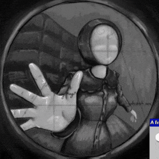
Next, I'll add the tiny tv or monitor in the background to balace the visual weight, and use colour contrast to it to point out the tertiary focal point [ 3rd main focus ].
Finishing up with adding highlights and shading to add dimensions to the character, object and the overall illustration.
》 The soft and thick brushes I'm using for colouring;
- soft brushes pack by Jama Jurabaev.
- thick brushes by default clip studio paint.
The steps that I mostly go through for colouring are:
• setting a soft coloring for the base
• use a darker shade for shading (Use monochromatic or analogues of colour wheel)
• use a lighter shade for highlight (Use monochromatic or analogues of colour wheel)
• blend the colours using low opacity strokes
• keep repeating the steps, gradually change the colours with analogues (next to) of the colour wheel
• when blending, gradually add a vibrant colour to it
• add textures for rendering
• "multiply" with a low opacity, using a
(complementary, triadic or analogues of the colour wheel) for shadow
• "overlay" with a low opacity, using the previous colour to make the shadow less dull
• "add" glow with a low opacity, using a
(complementary, triadic or analogues of the colour wheel) for lighting
• "overlay" with a low opacity, using a
(complementary, triadic or analogues of the colour wheel) for the reflected lights
• keep blending until satisfied
◇ Finish;
CONCLUSION;
Hello everyone 🌙 ~
To be honest, I'm still new to these character art composition concepts.
Here are what I've learned and gathered so far;
The arrangement and presentation of the characters are one of the keys in the concept of art compositions.
There are some cool techniques to use that help upgrading the illustrations.
Eg; the focal point techniques such as, the rule of thirds to place the elements, experimenting with color wheels, and creating the balanced contrast.
By experimenting, it's like bringing the characters to life and letting them express through the illustration.
So, keep unleashing your creativity, explore and experimenting.
Start creating and may your artistic journey be filled with limitless possibilities!
Remember, art is all about imagination, so don't limit yourself and have fun exploring what works best for you.
By the way, I find the concept of art compositions absolutely fascinating, and I wanna dive deeper into it.
Feel free to let me know you if there's anything else you're curious about or if there's something I might have missed.
• This is my other tips and tutorial on how I Illustrate different types of wings, feel free to look into it;
Thank you for reading,
I hope these tips could help and inspire you more 🌷 ~


Kommentar